Sufni – Borrow a Tool
A tool-sharing app with a friendly identity: a green isometric shed, a bold wordmark and a palette taken from the workshop.
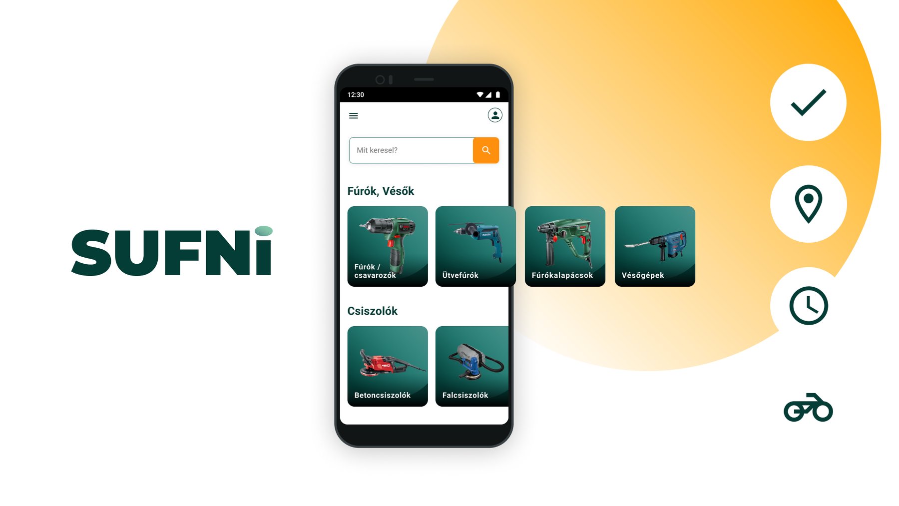
The brief
A drill or a sander often sits unused for most of the year. Sufni (Hungarian for “shed”) lets them borrow one from a neighbour or a local shop instead of buying it. The app had to make borrowing feel as easy and trustworthy as taking a tool from your own shed.
My role
I mapped the user journey and flows, wireframed and designed the app, and created its visual identity: the wordmark, the isometric illustrations, the icons and the colour palette.
Four promises
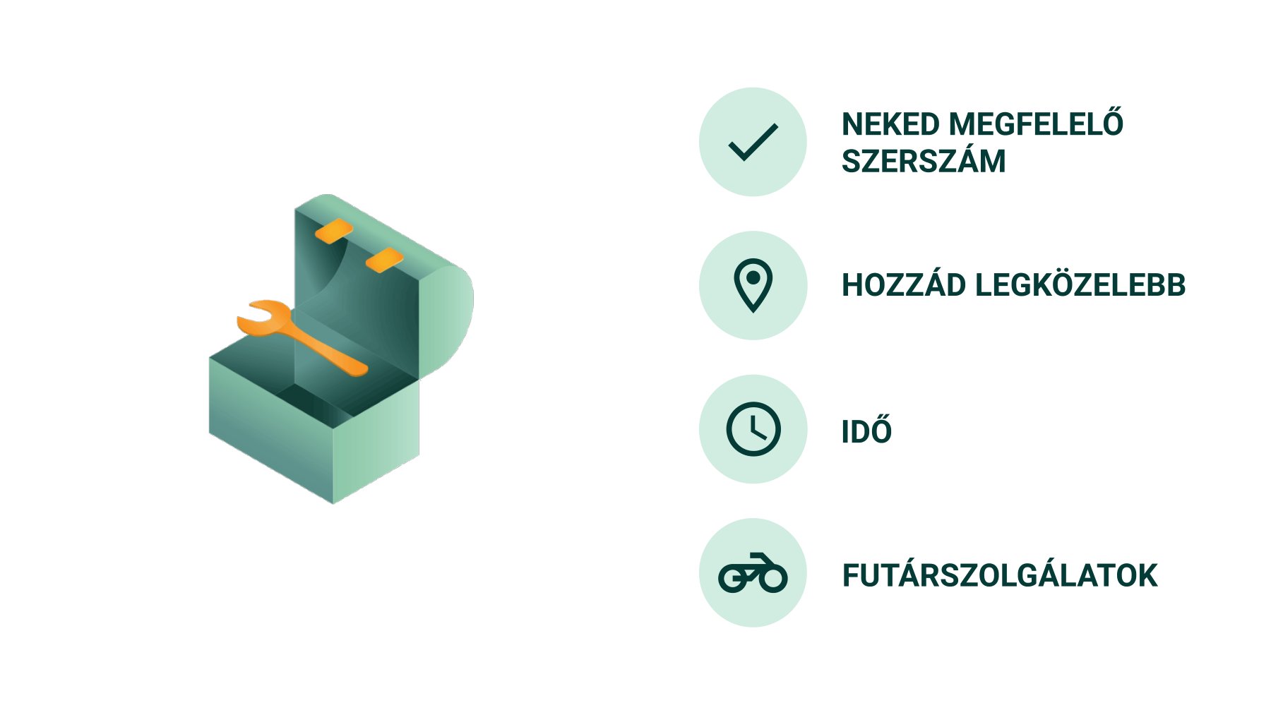
The app is built around four promises, each with its own icon: the right tool for you, closest to you, on your time, and courier delivery. The green isometric shed opens the story, because that is where tools usually live.
Journey and flow
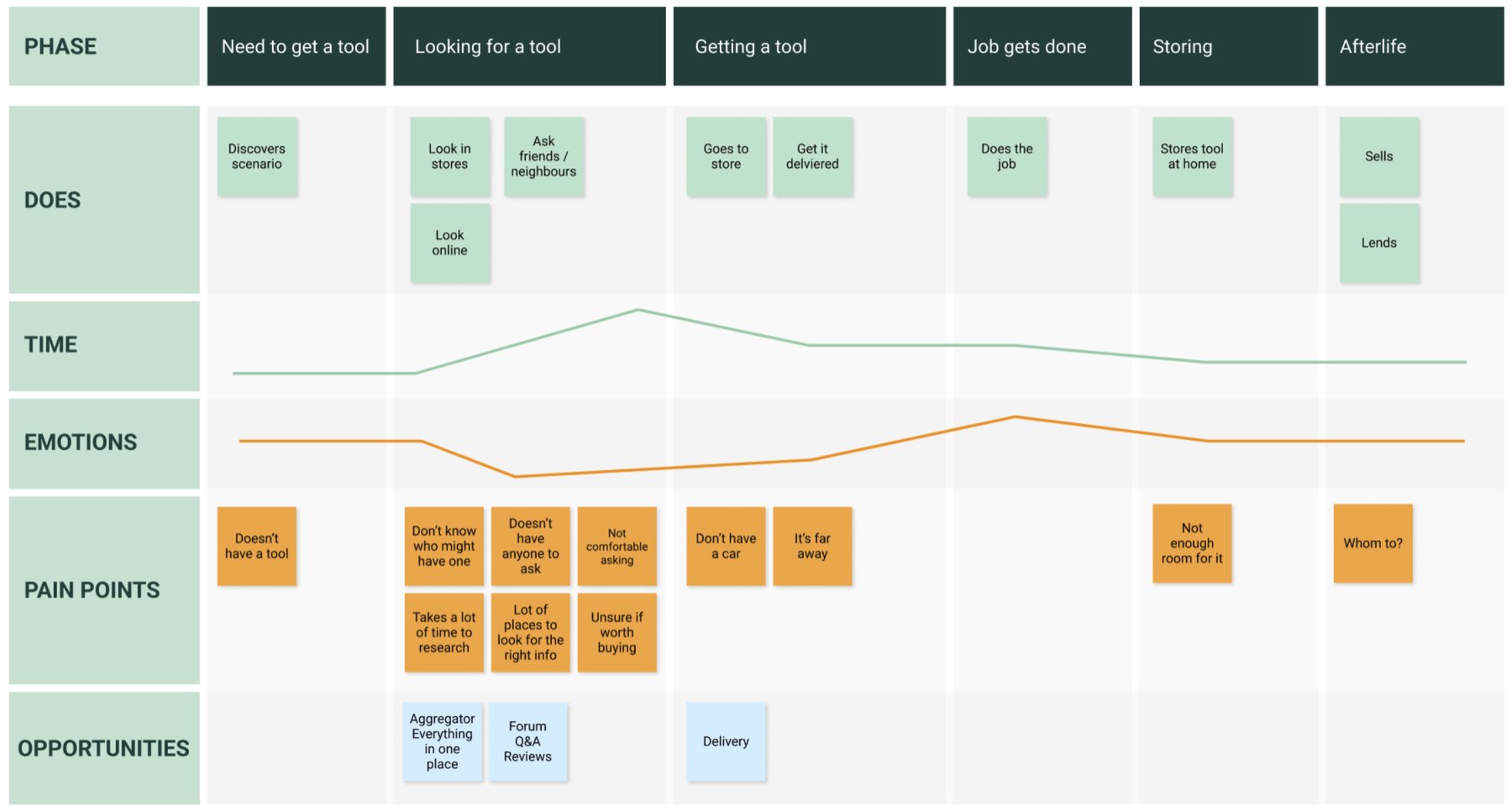
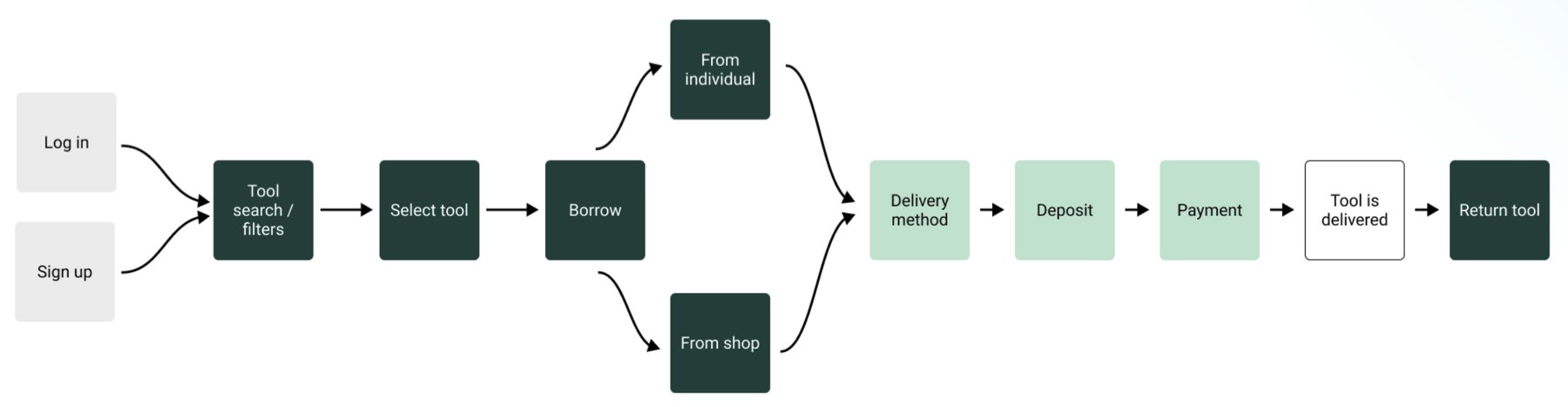
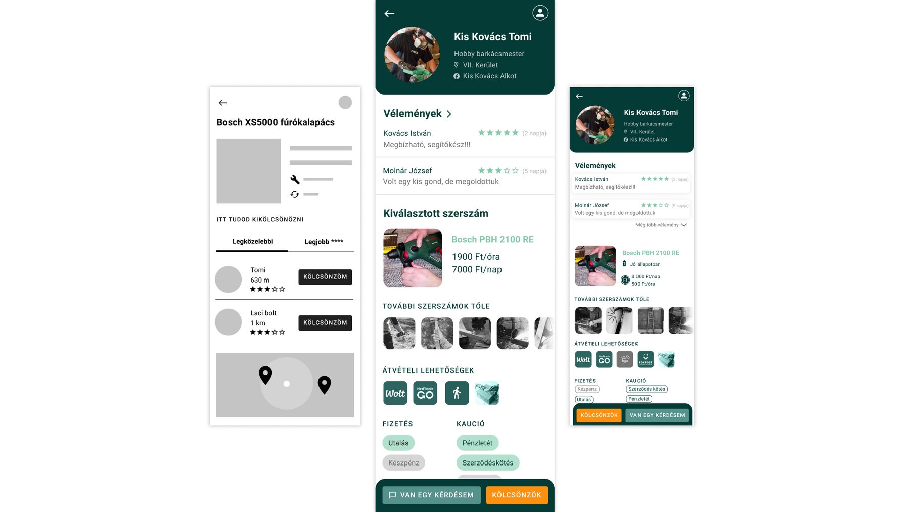
A journey map followed someone from needing a tool to returning it, marking their feelings and pain points at every step: finding the right tool, trusting a stranger, paying a deposit, arranging pickup. The flow below turned those steps into screens.
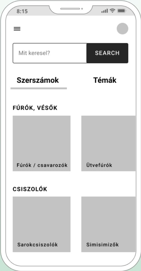
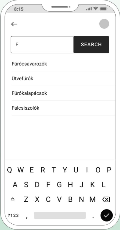
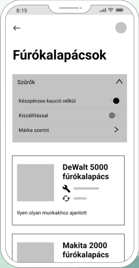
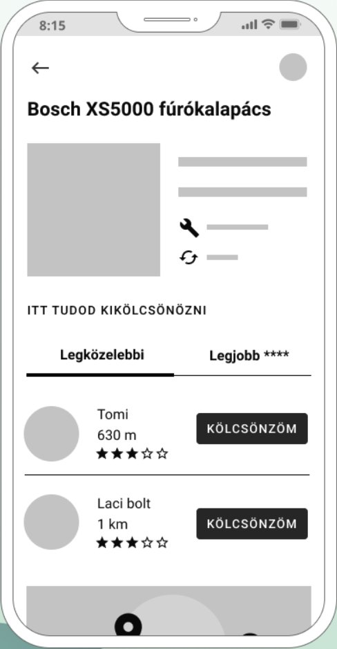
Wireframes
Visual identity
The wordmark is set in heavy capitals with the line “Borrow a tool”. The illustrations are isometric 3D objects (the shed, a hammer, a drill) in soft greens, which make tools look friendly instead of technical. A deep workshop green carries the interface, and one bright orange marks every action, so the next step is always obvious.
- Shed green
#00382F - Teal
#1F5E57 - Action orange
#F7900A - Sand
#F8D488
Screens
Browsing starts with the tools, not the people: large product photos, short specs and a comparison guide (“hammer drill or impact drill?”). Lenders are listed by distance or price on a map, with reviews. Booking, delivery, payment and the deposit each get their own calm step, and the last screens close the loop with an isometric illustration and a review.
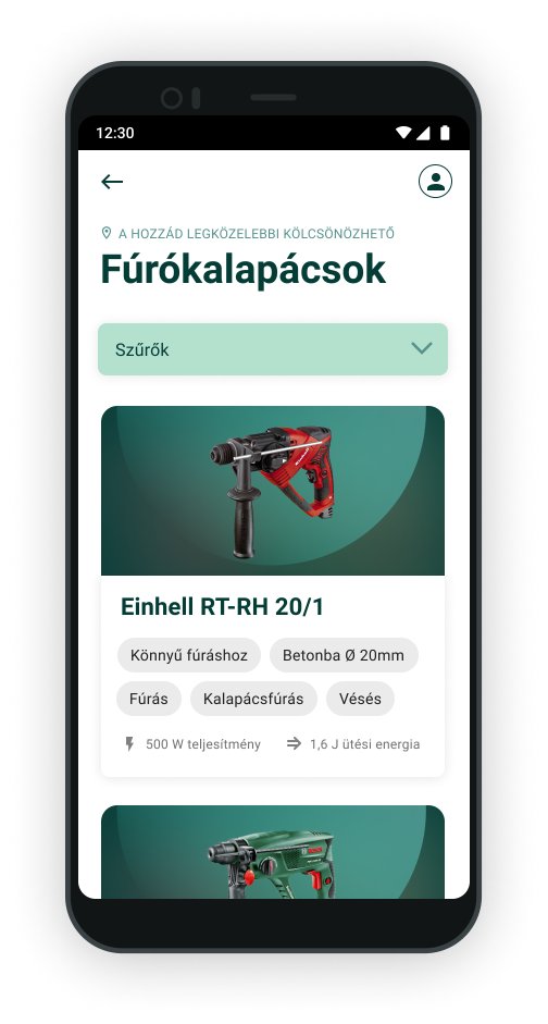
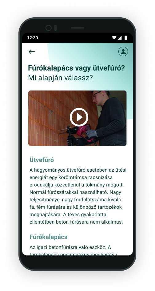
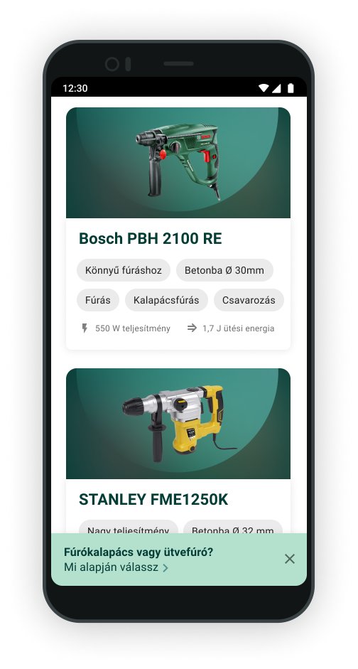
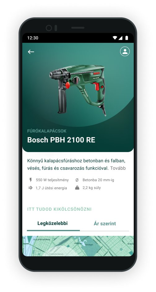
Finding the right tool
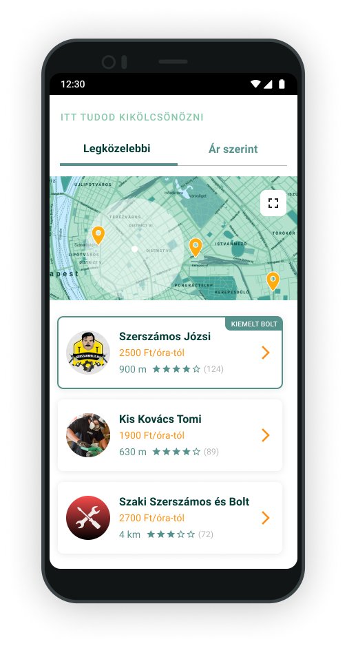
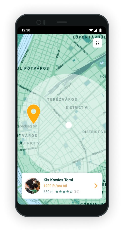
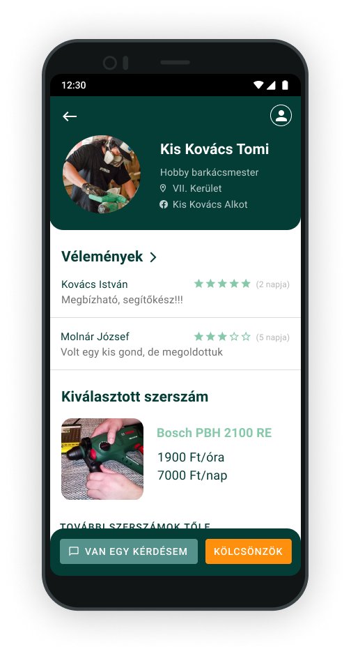
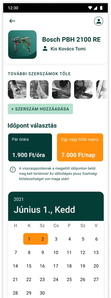
Choosing a lender and a date
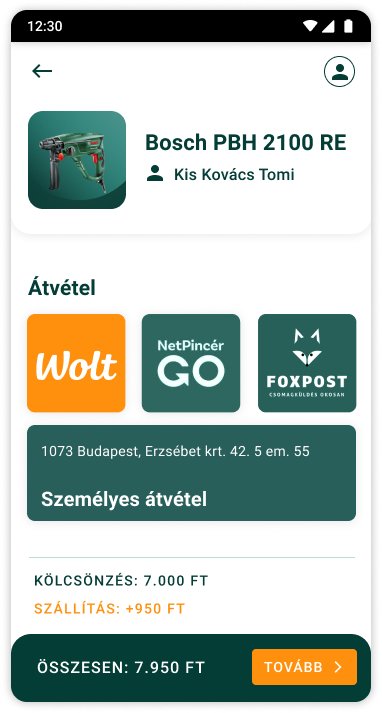
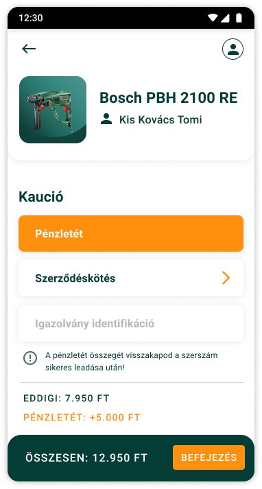

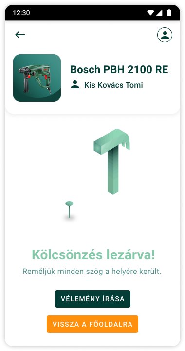
Pickup, deposit and confirmation
Reflection
Sufni was one of my first app projects, and it showed me how much a visual identity helps a product earn trust. The isometric shed made the brand warm and memorable, and keeping orange only for actions made a long booking flow feel simple.