Interactive Digital Signage – eyefactive GmbH Internship
Designing interfaces for screens without corners: round multi-touch tables, transparent HypeBox displays and XXL touchscreens used by brands like BMW, Hyundai and Philips.
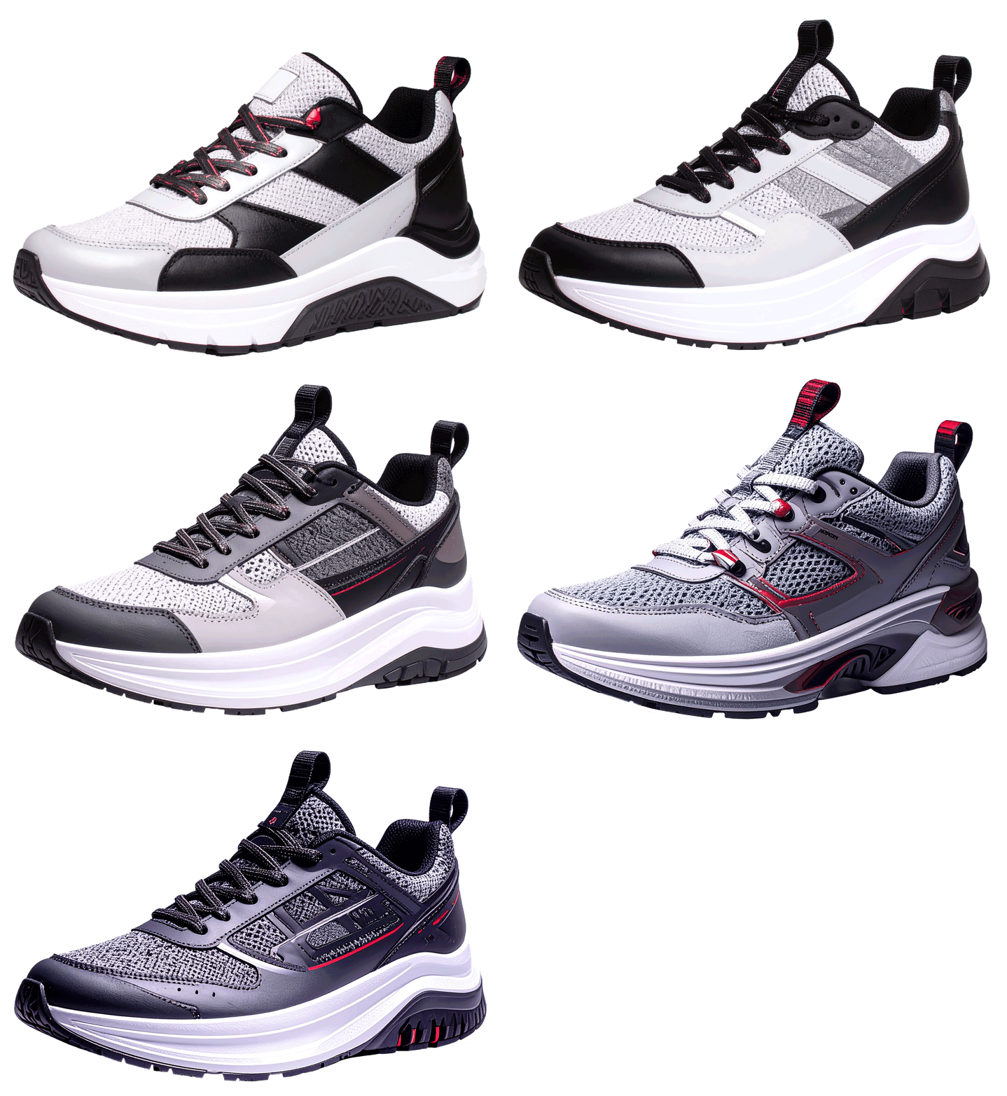
The brief
Standard grids don’t work on a round screen: there is no top, no bottom and no fixed reading direction. I had to adapt layout, type and UI elements to circular displays, transparent boxes and UHD multi-touch walls, and design demo projects from scratch with no provided assets.
My role
As a UX/UI intern I worked across 15+ projects: concepts and layouts in Figma, product imagery with AI tools and commercial libraries, custom UI element sets and animated call-to-actions, building in eyefactive’s AppSuit, and parts of the software guide in InDesign.
Designing for a round canvas
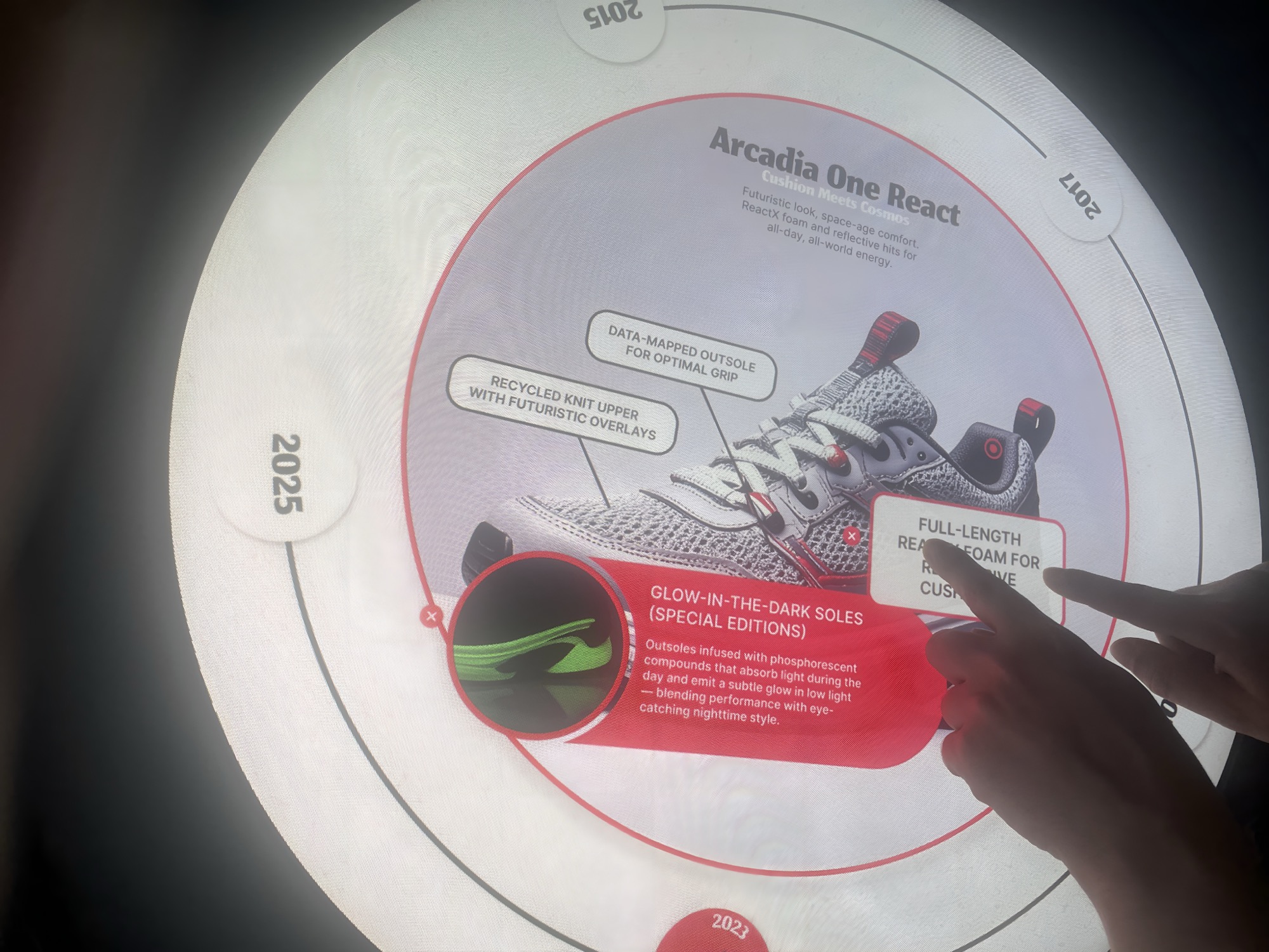
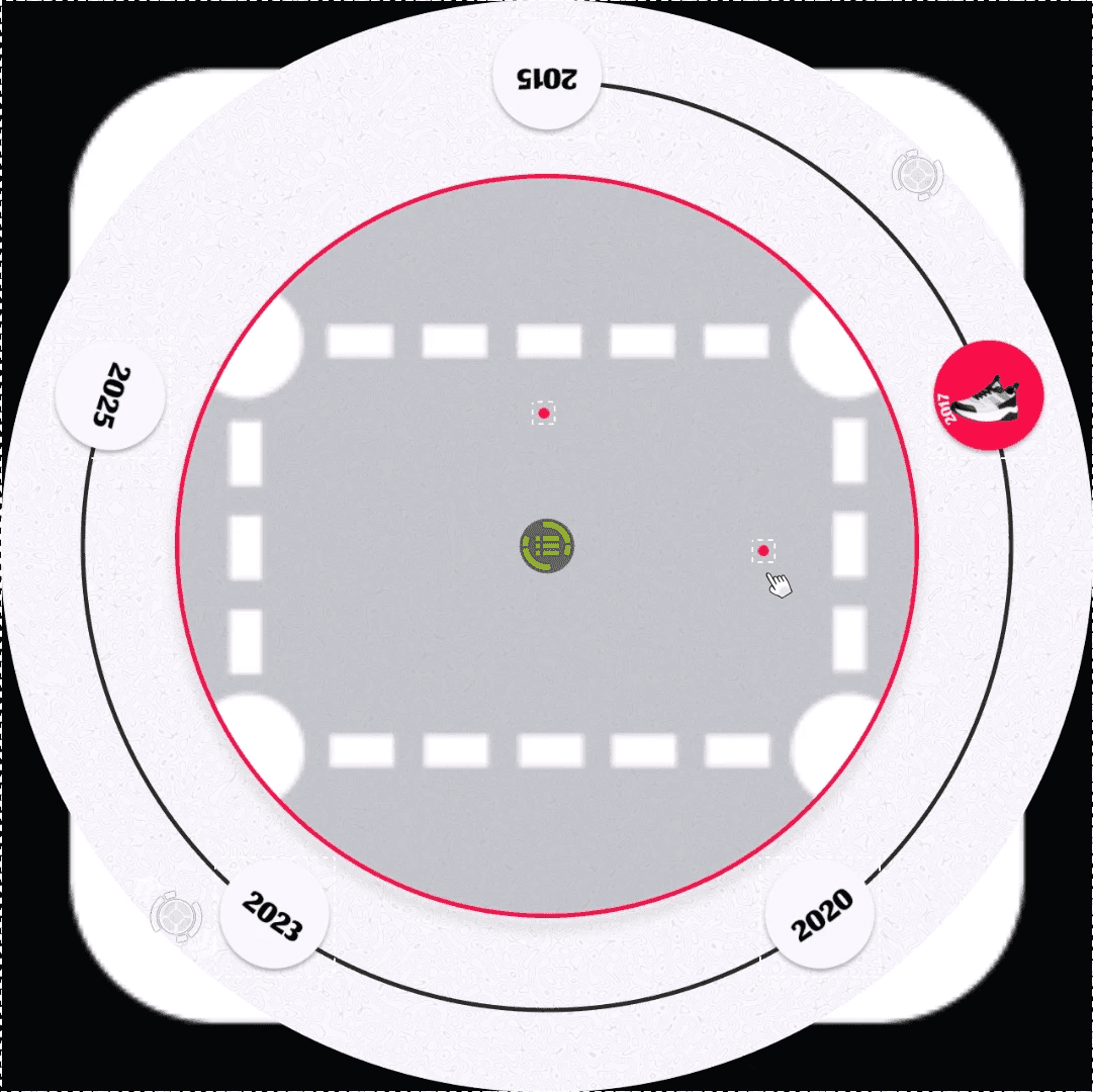
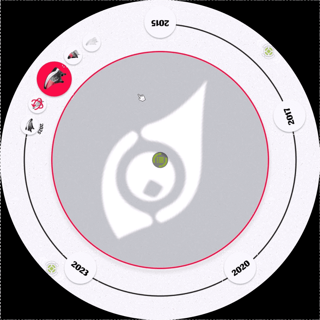
The flagship project was a 360° sneaker evolution timeline for the new Apollo round table, built to show at international trade fairs how a “true round” display can become a seamless experience.
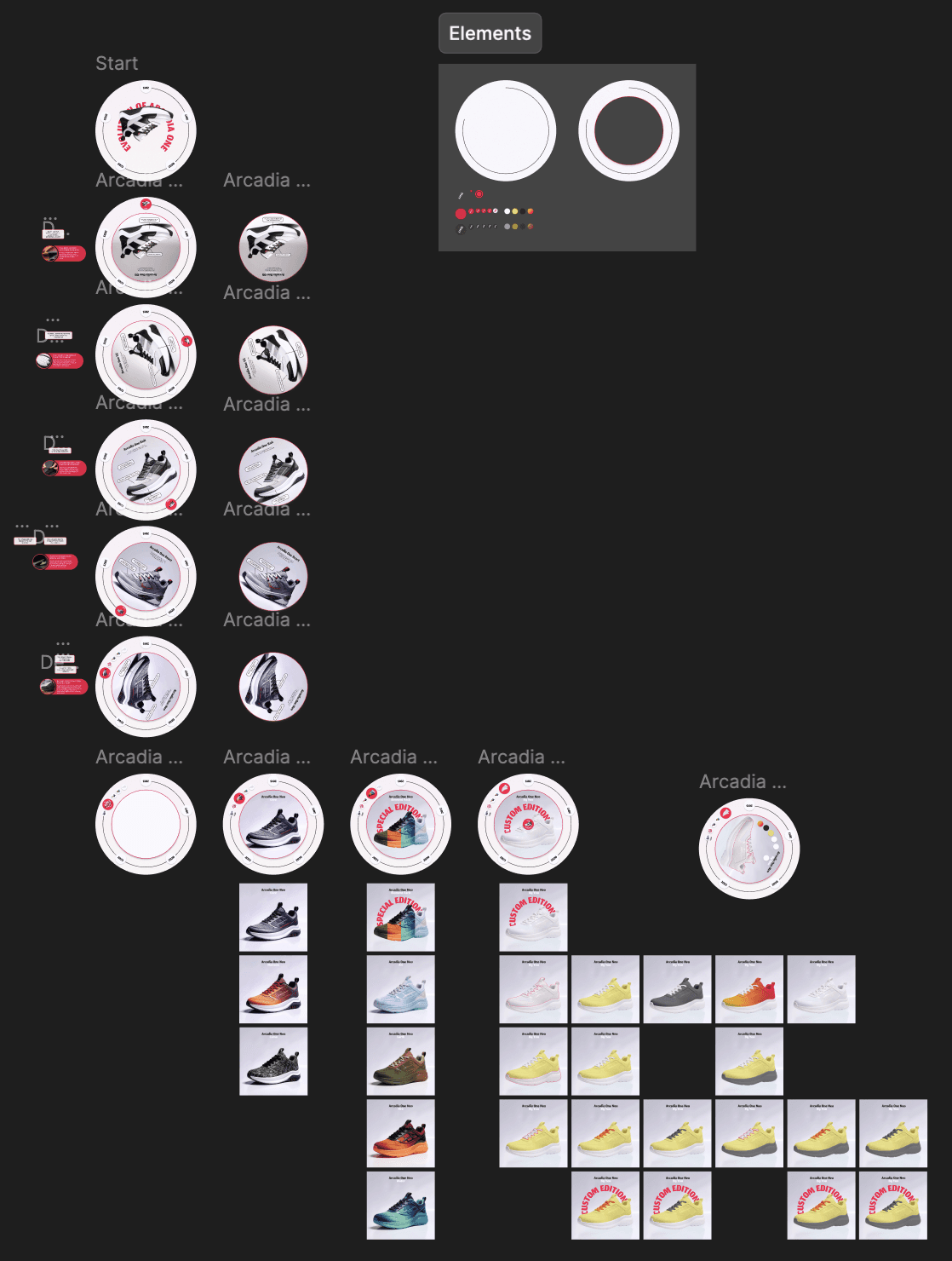
Instead of a top-down layout, I used a circular-outward hierarchy: the product sits in the centre, information opens around it, and headlines run along the rim of the circle so they can be read while walking around the table. A strict palette of white, black and a single red keeps the sneaker the most colourful thing on screen.
The eyefactive website (opens in a new tab) has more about the company, software and hardware.
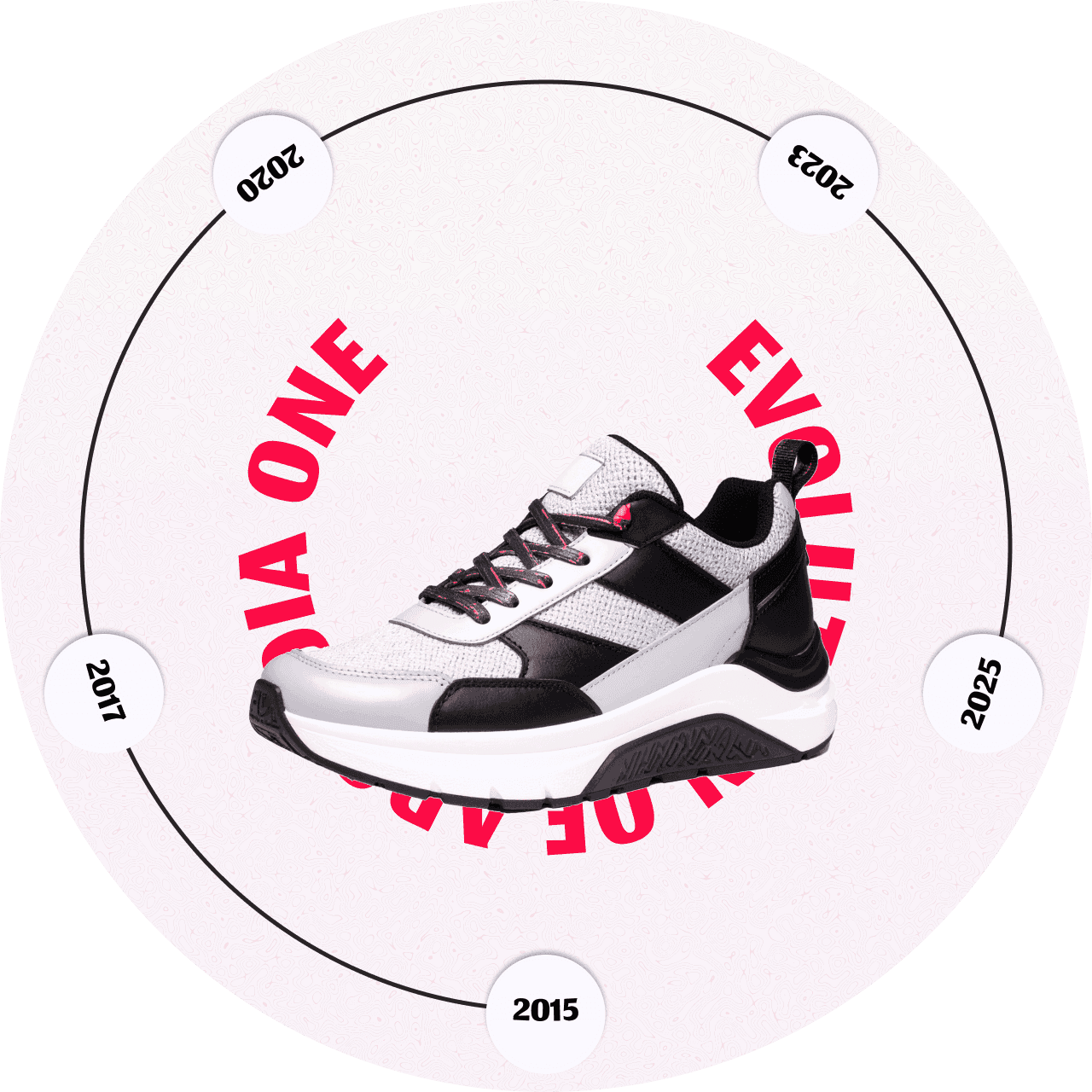
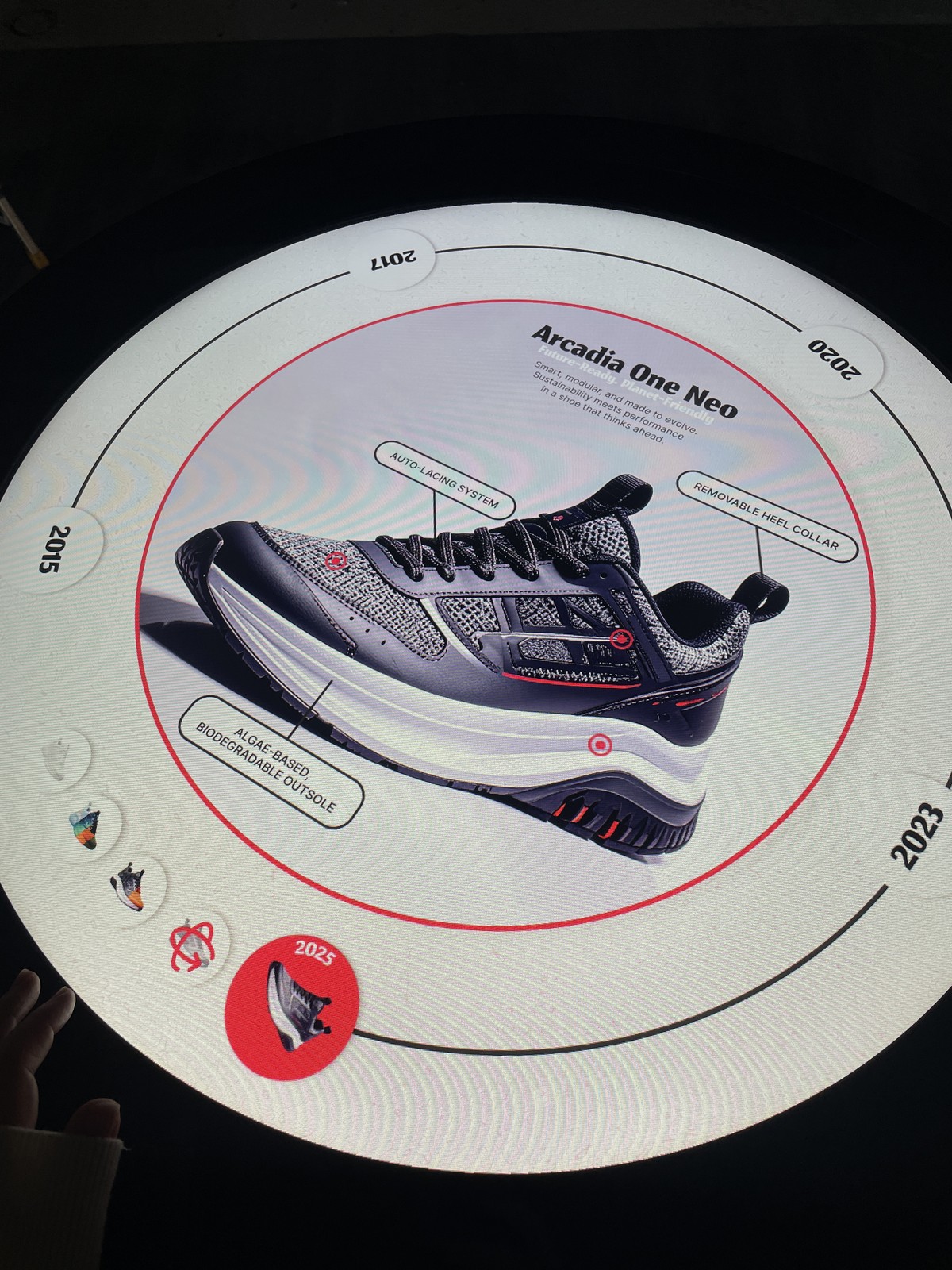
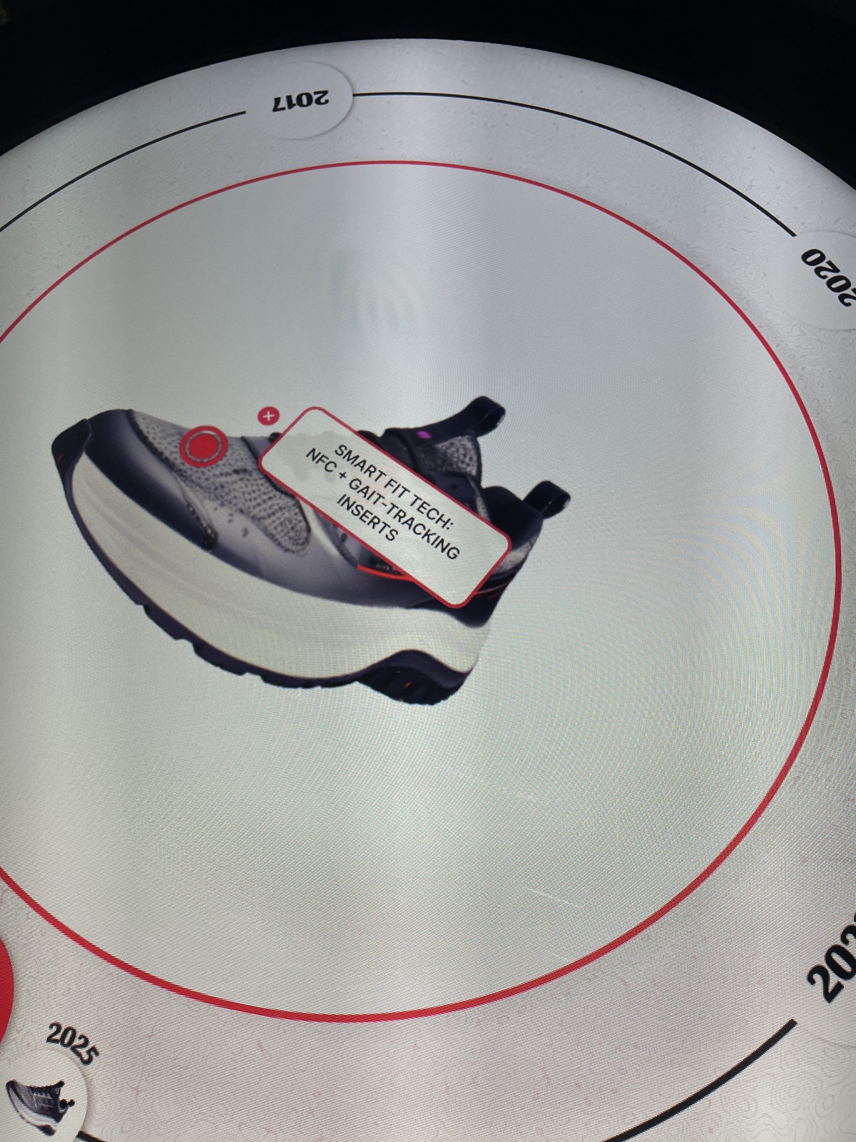
The timeline, the centre display with hotspots, and the 3D model
Three days, step by step
Day 1 · Concept and imagery
- Defined the “Sneaker Evolution” concept.
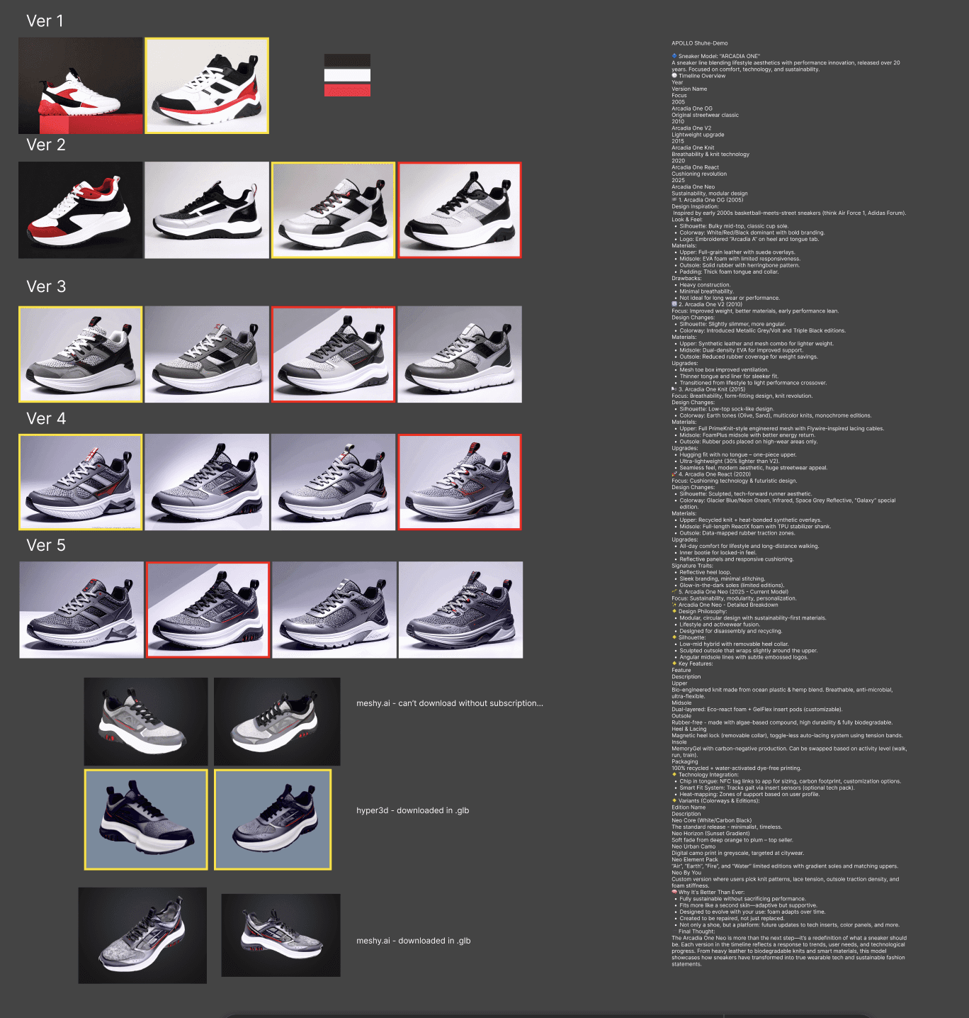
- Generated a consistent set of product images, 3D models and textures with AI tools (Nano Banana, ChatGPT, 3D-model AIs), so every version of the sneaker looks like part of one family.
- Sketched the circular-outward layout and collected the hardware’s size and resolution.
Day 2 · Design and build
- Designed the 360° interface in Figma: the rim typography, the centre circle and the round buttons.
- Moved straight to the final build, using some code for the special hardware.
Day 3 · Testing on the table
- Tested readability and responsiveness on the real hardware.
- Refined with feedback from my mentor (design and interactions), the hardware team and the software team.
- Presented to my mentor and the sales team. On day four, the table went to a trade fair.
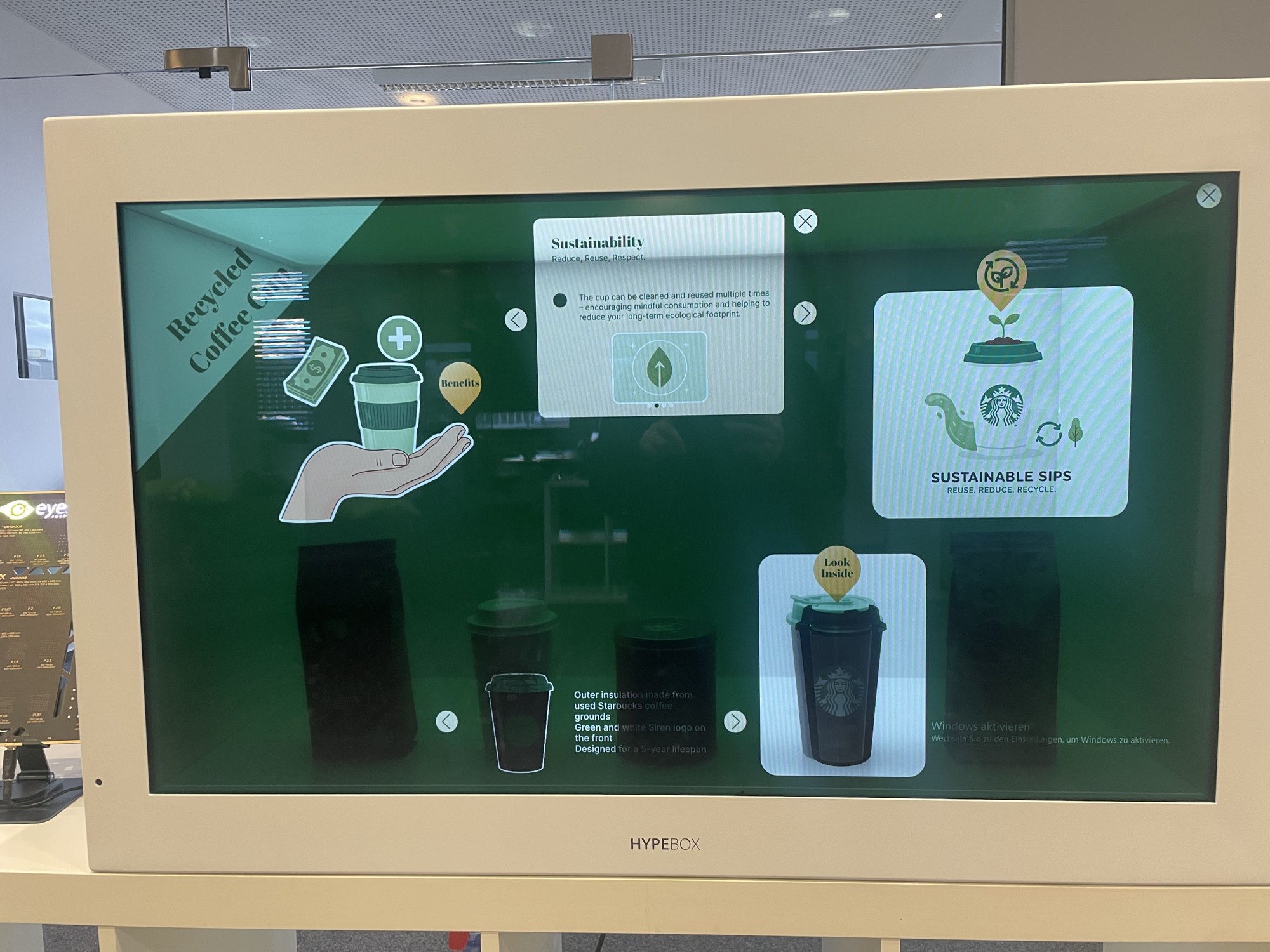
HypeBox: design that frames a real product
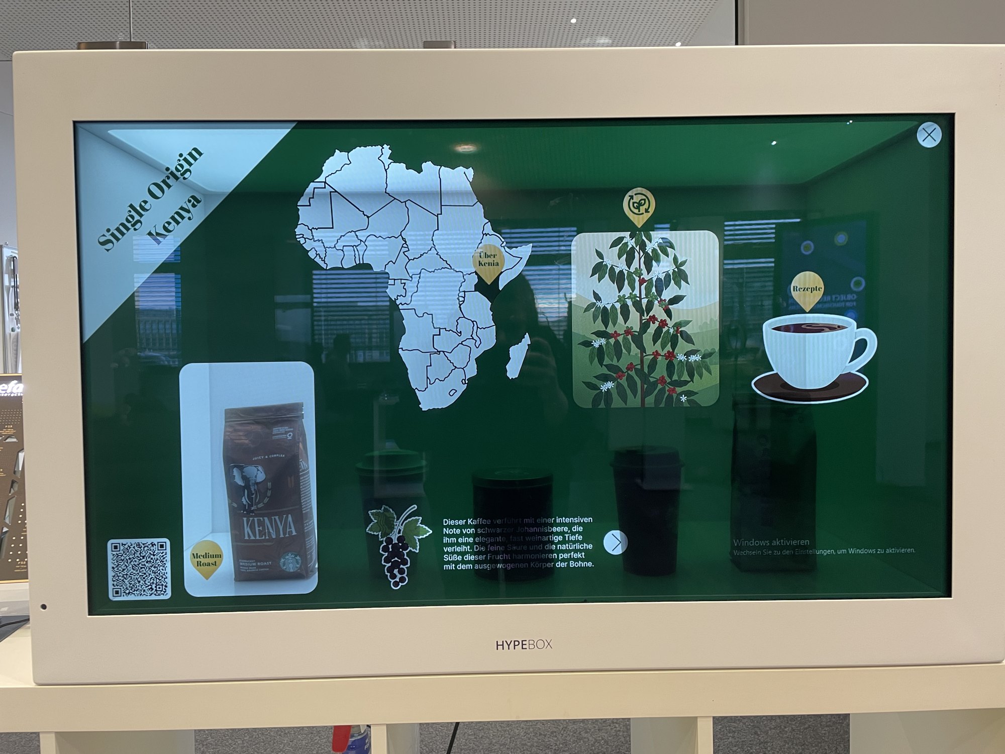
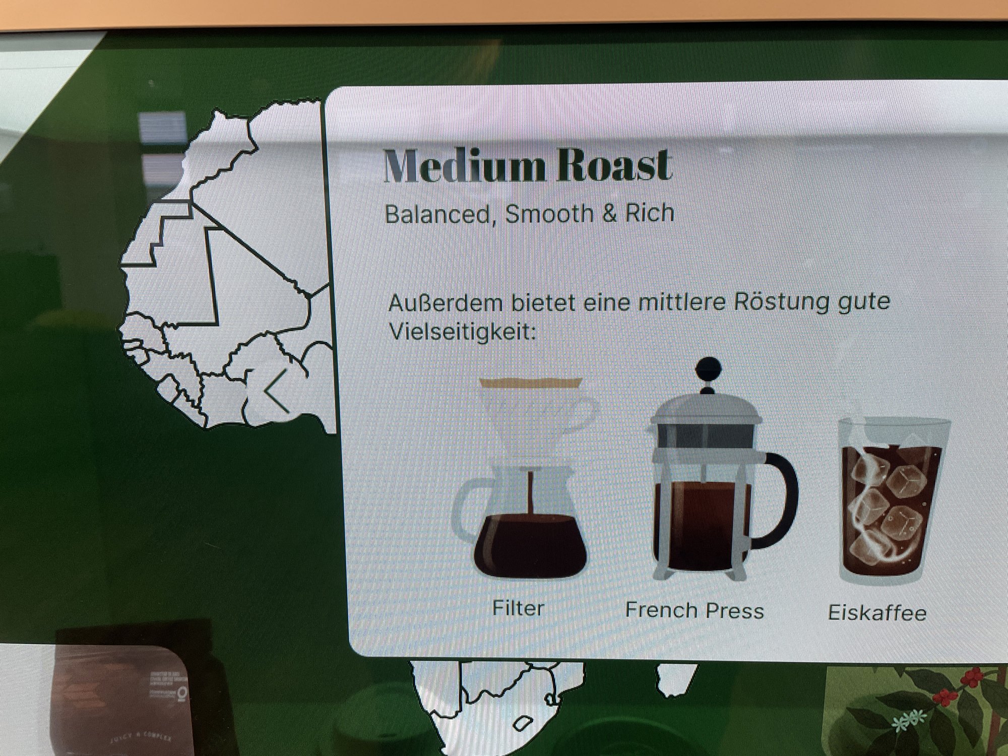
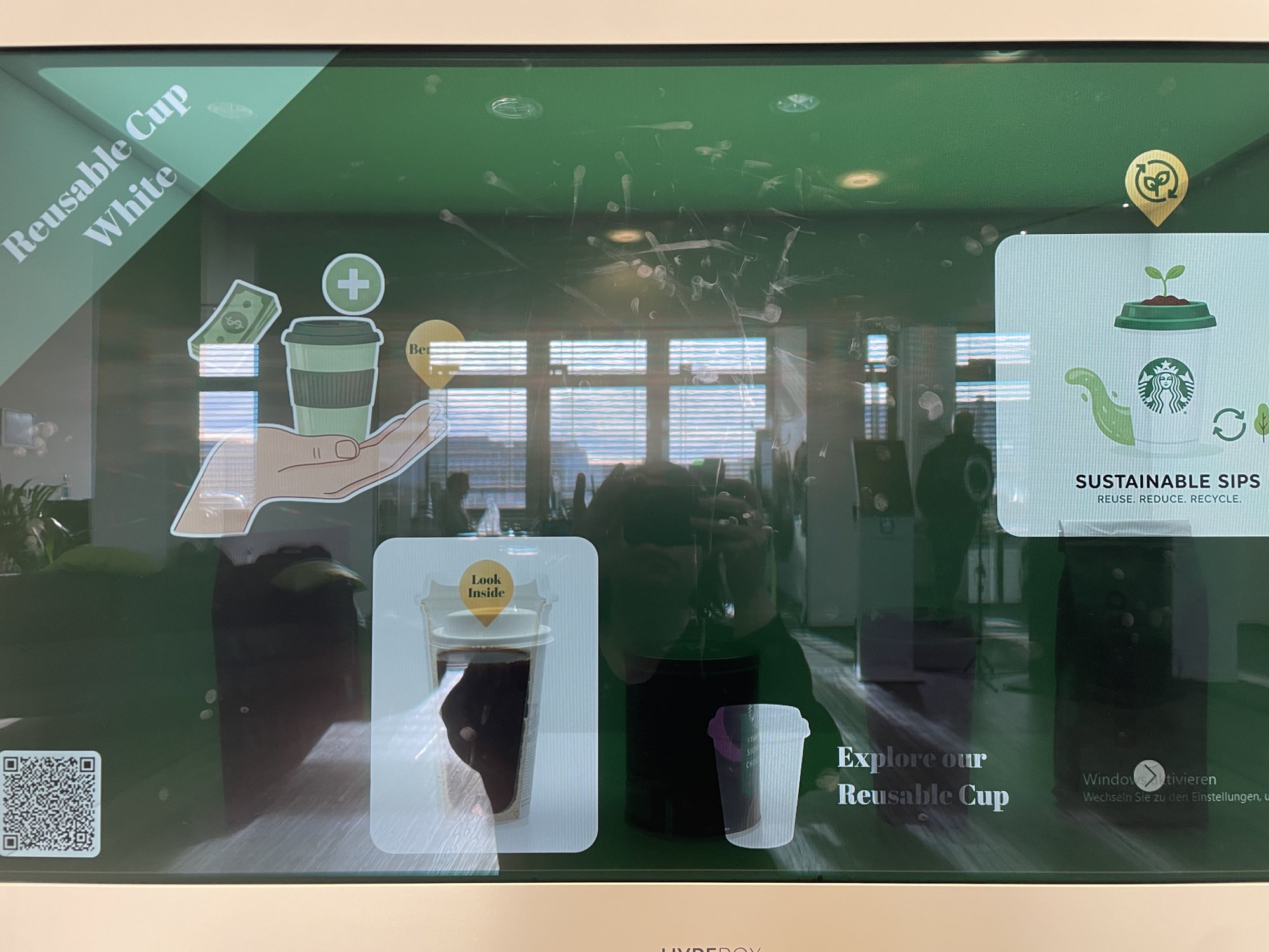
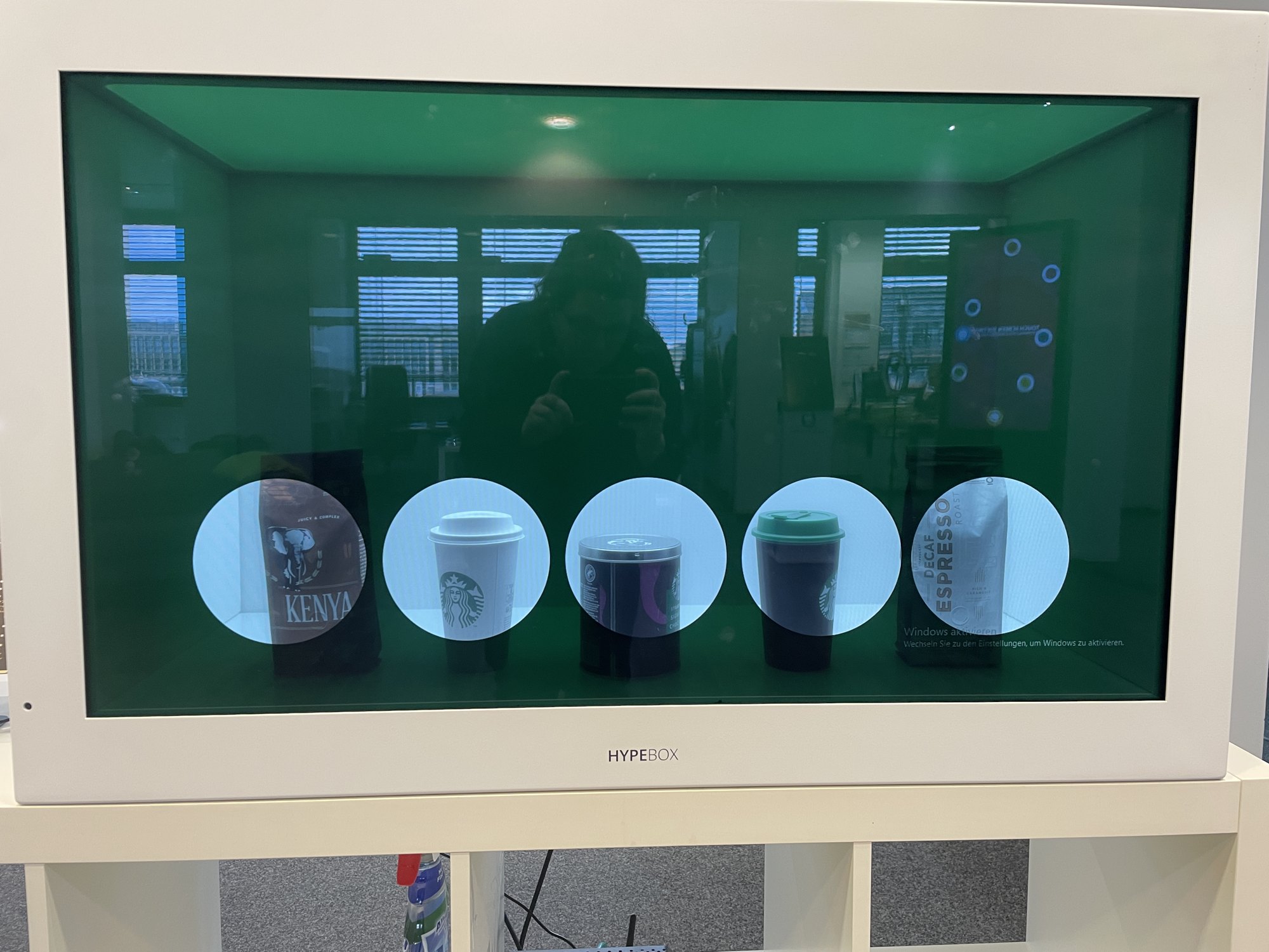
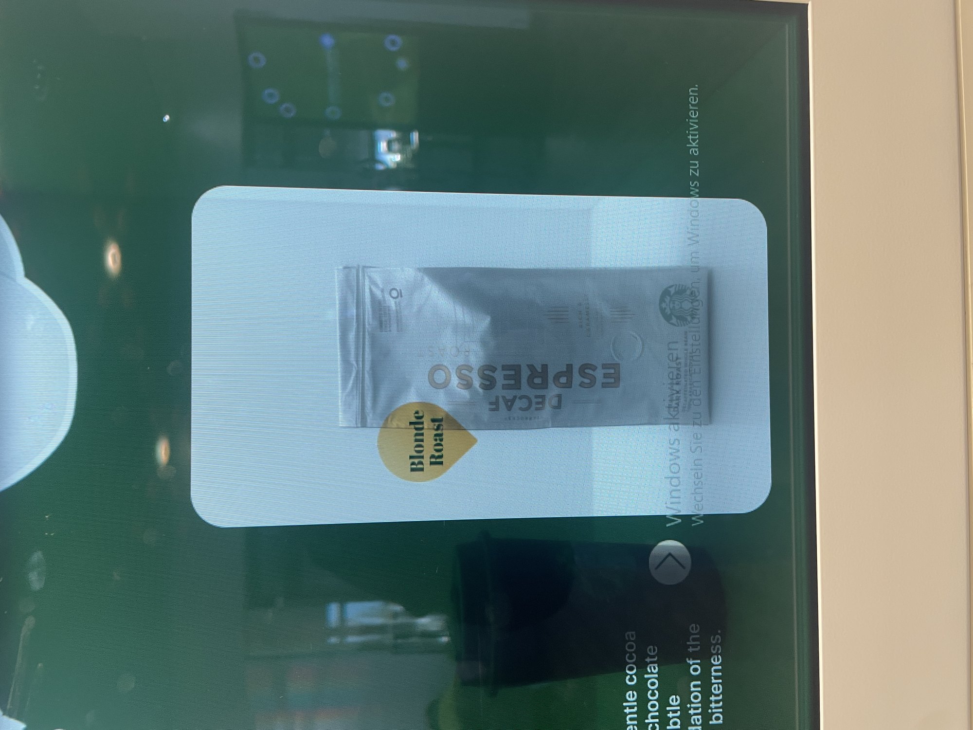
The HypeBox has a transparent touchscreen in front of a real product. Here the design had to step back: light panels, open space and highlight frames guide the eye to the product behind the glass instead of covering it. My coffee showcase opens each product’s origin on an illustrated map, its roast profile and serving suggestions.
UI elements, motion and documentation
Beyond the showcases, much of my work was building visual tools the whole team could reuse:
- UI element setsNew sets of icons, buttons and bento-style menus, designed to fit projects in very different brand styles.
- Call-to-action GIFsShort animations that invite people to touch the screen, plus a documented system for making new ones quickly.
- Trade fair presentationsInteractive company and product presentations: style and structure in Figma, built in AppSuit, refined with the client.
- DocumentationParts of the AppSuit guide on features, UI elements and building a project, laid out in InDesign.
Projects are built in AppSuit, eyefactive’s own software. Its ready-made apps can be customised, and for a more specialised look I overrode built-in styles with XML.
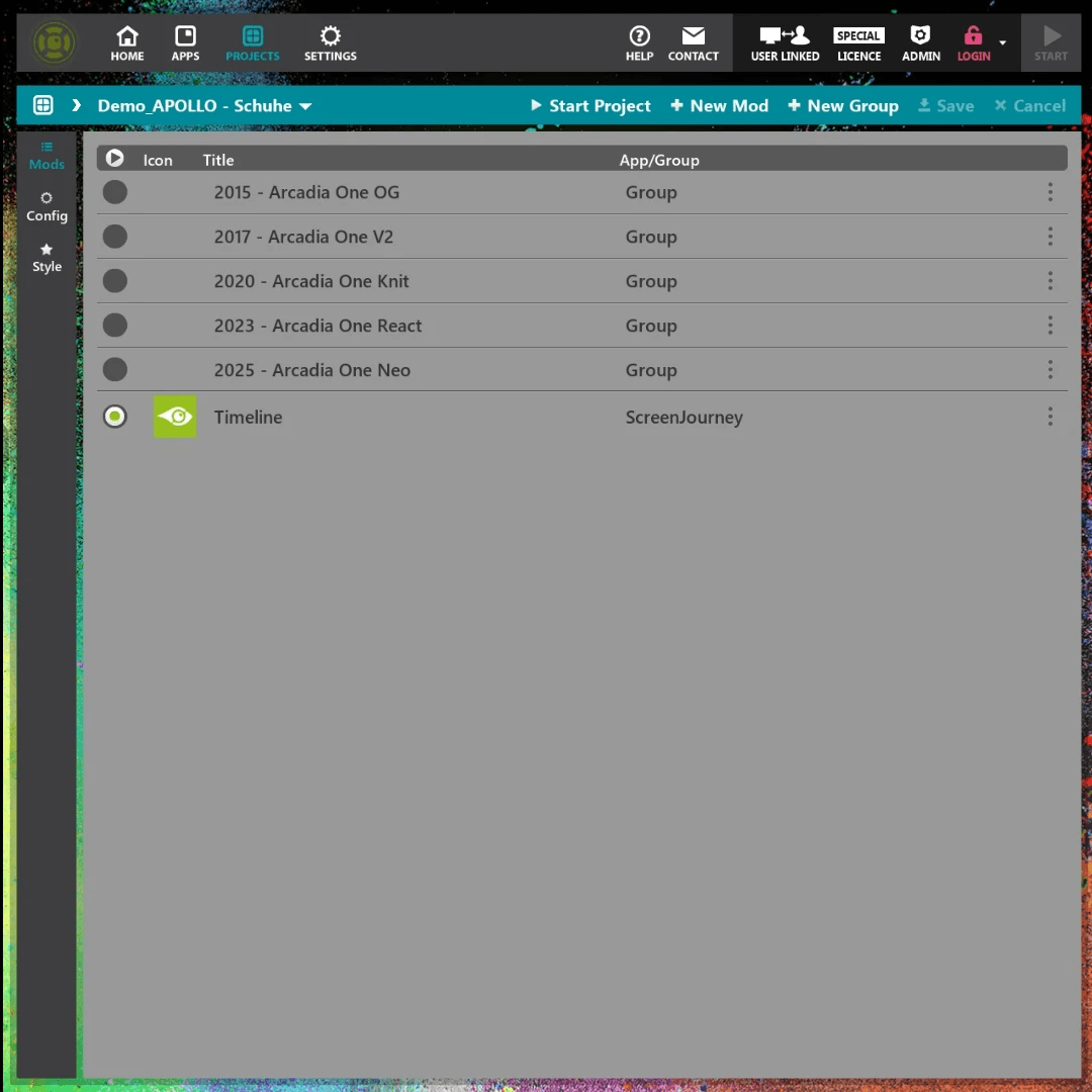
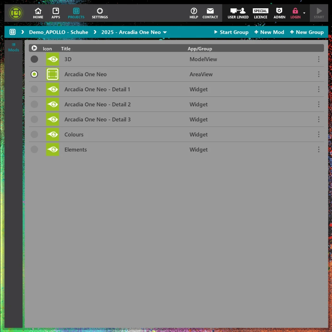
AppSuit: main menu and project editing
Results
- Delivered in three daysA market-ready hardware demo built from scratch in three business days.
- Reusable design languageA layout approach for round displays that eyefactive can reuse for client projects.
- Flagship demoShown at international trade fairs and used by sales as a success story for AppSuit on non-standard hardware.
- Team recognitionI presented my work at the quarterly success-story meeting, in German. While I was there, eyefactive won second place in the Best Retail Cases Award.
Reflection
eyefactive taught me to design for the physical world. Without the safety of a rectangular grid, every decision (where a headline sits, which way text runs, how big a button must be for a hand) had to be tested on the real screen.
Working in a small team of around 15 people, with Kanban in Jira and daily check-ins with my mentor, I was part of every step, from the first idea to the live project.