Life Cycle – A Six-Word Story Zine
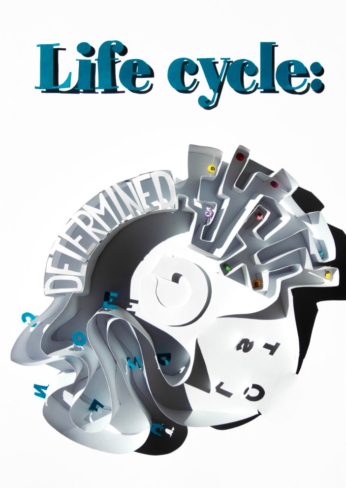
Six words, one sheet of paper: a hand-cut typographic poster that folds into an eight-page zine.
The brief
In our Typography class the brief was to tell a story in exactly six words, then turn it into a zine. The words had to carry the story, so the type itself had to do more than just be read: it had to show what each word feels like.
My approach
Instead of setting the type on screen, I built it out of paper. Every word got its own material, shape and shadow, then I lit the piece and photographed it. The photo became the poster, and the back of the same sheet became the zine.
The story
My concept was to describe how I have moved through life until now. I wanted to show the same loop starting over and over again, and the hope that one day I find my way out of the circle. So the words sit on a ring: reading around it, you always end up back at the start.
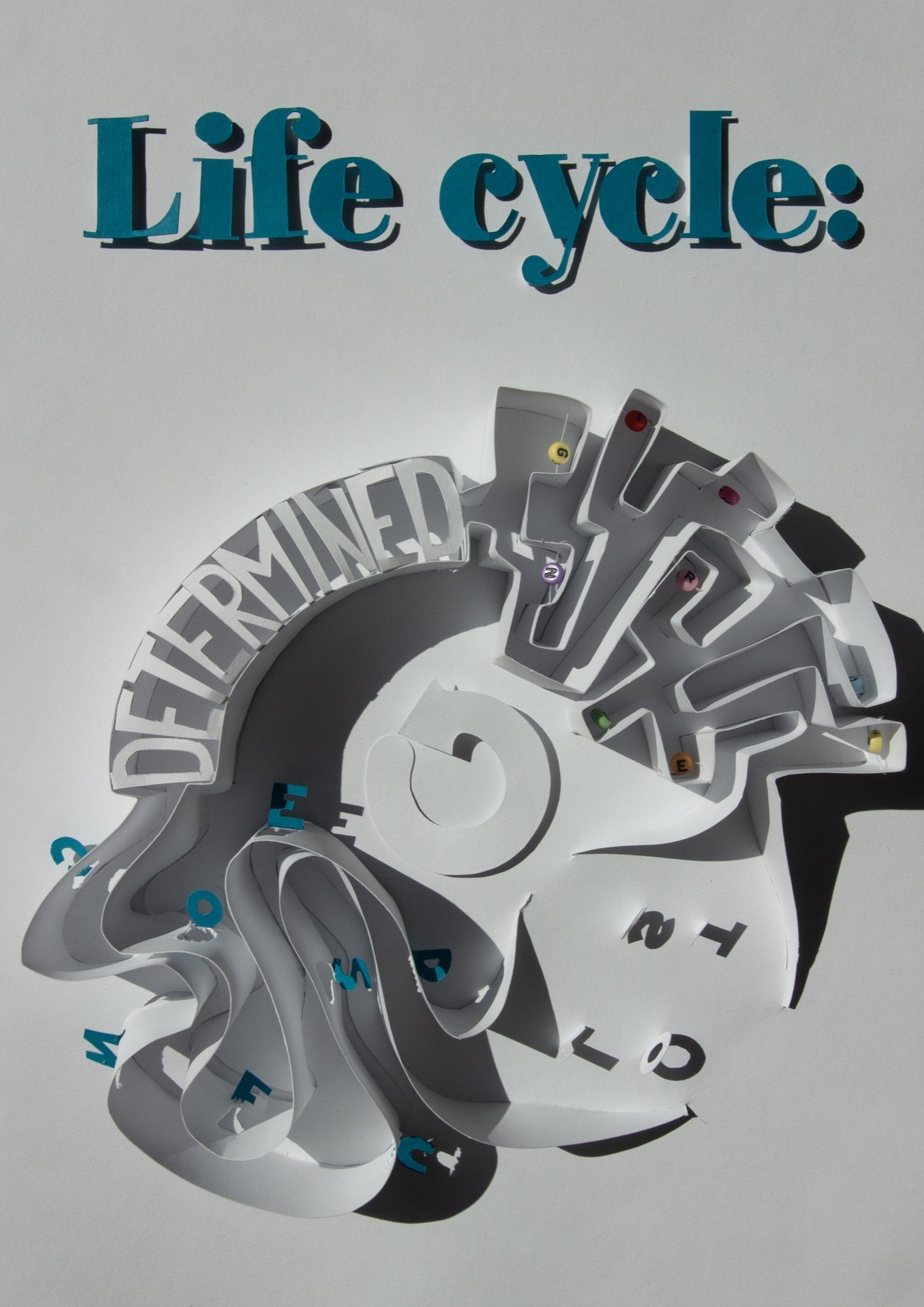
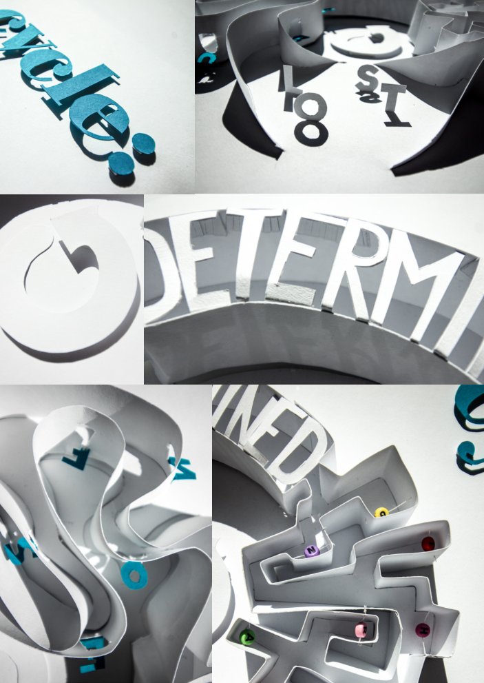
- Life cycle:Heavy serif letters cut from teal card and raised off the page, so they throw a hard shadow. The only colour in the piece.
- DeterminedSolid block letters standing upright in an arc: steady, firm and easy to read.
- ConfusedWavy paper walls with the letters caught between them, floating and jumbled.
- LostA few letters left alone in the open, read more through their shadows than their shapes.
- SearchingA maze of paper walls, with small coloured letter beads hidden in its corridors.
- The centreA spiral in the middle pulls everything back to where it started.
From sketch to paper
I started with a sketch, planning the material of each word and how a lamp from above would throw shadows across the letters. Then I cut the whole ring out of a single sheet, folded the walls up and added the teal letters and coloured beads. The first build was photographed against a dark background; for the final one I lit it so the white paper and grey shadows do most of the work.
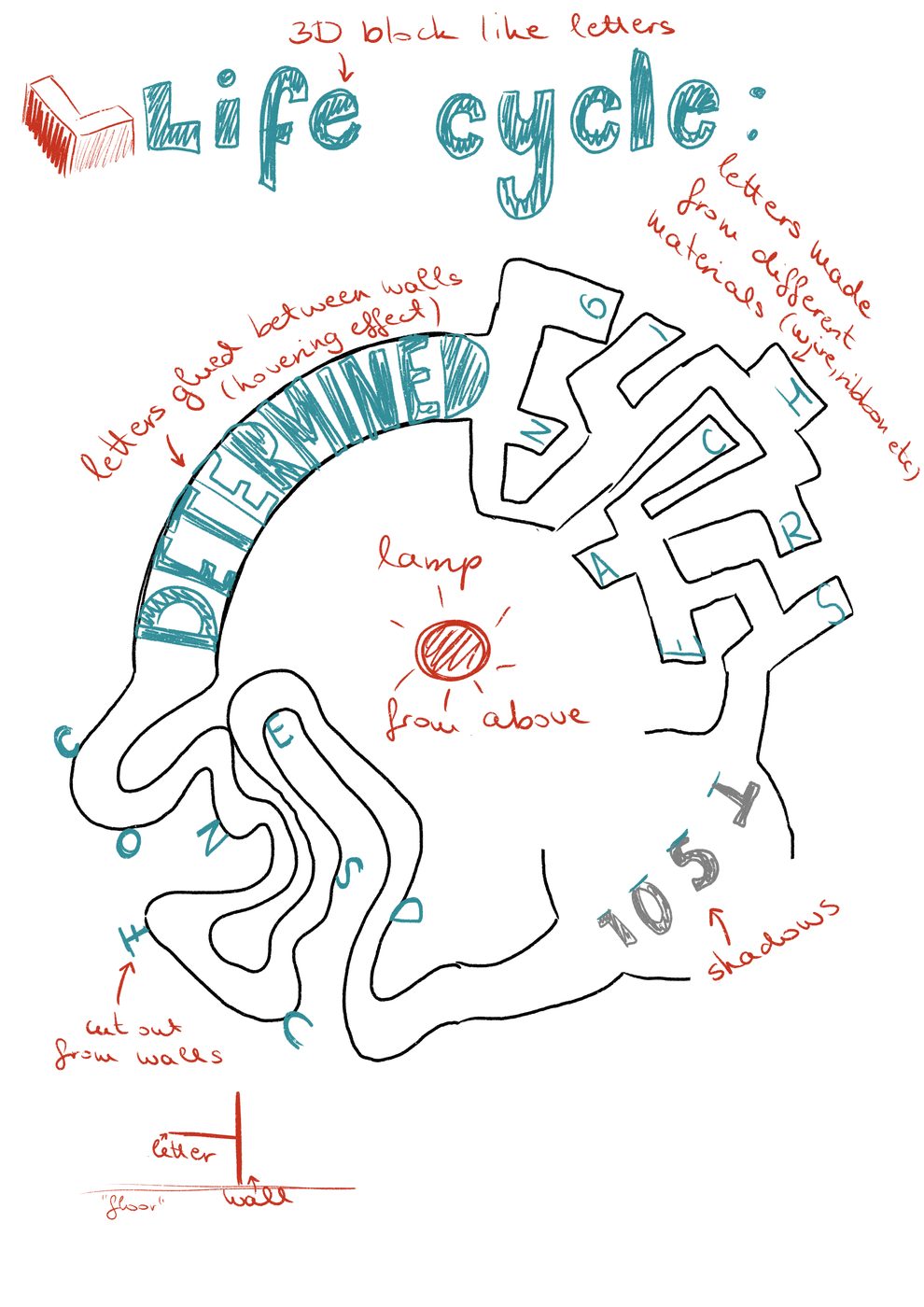
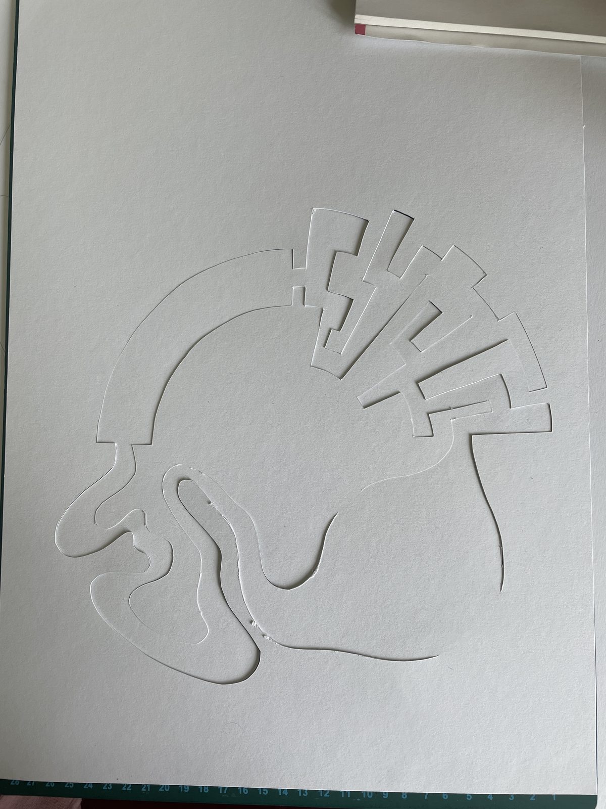
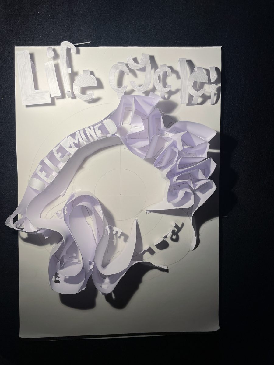
Sketch, the flat cut sheet, and the first build
The poster
The final poster keeps everything in black, white and grey, apart from the teal title and the tiny coloured beads. That way the eye goes to the title first, then follows the ring around.
Because the piece is three-dimensional, the shadows became part of the typography: they give weight to "determined", blur "confused" and are almost all that is left of "lost".
Details
My favourite details from the hand-made poster, and my all-time favourite is the difference between the confused and the searching quarter: one is soft and chaotic, the other strict and full of dead ends.
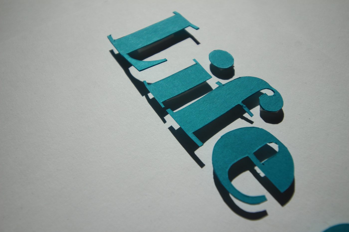
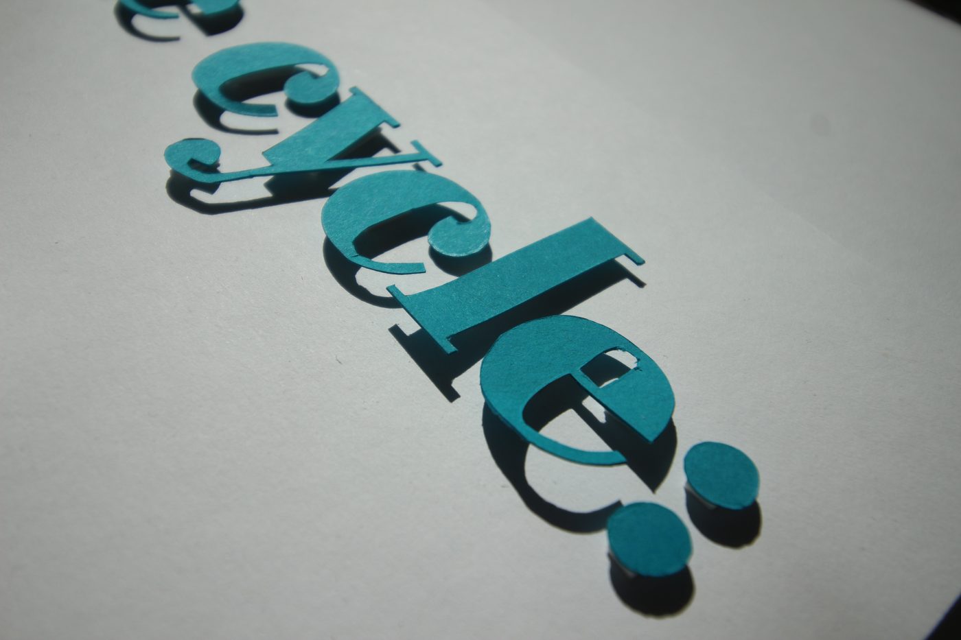
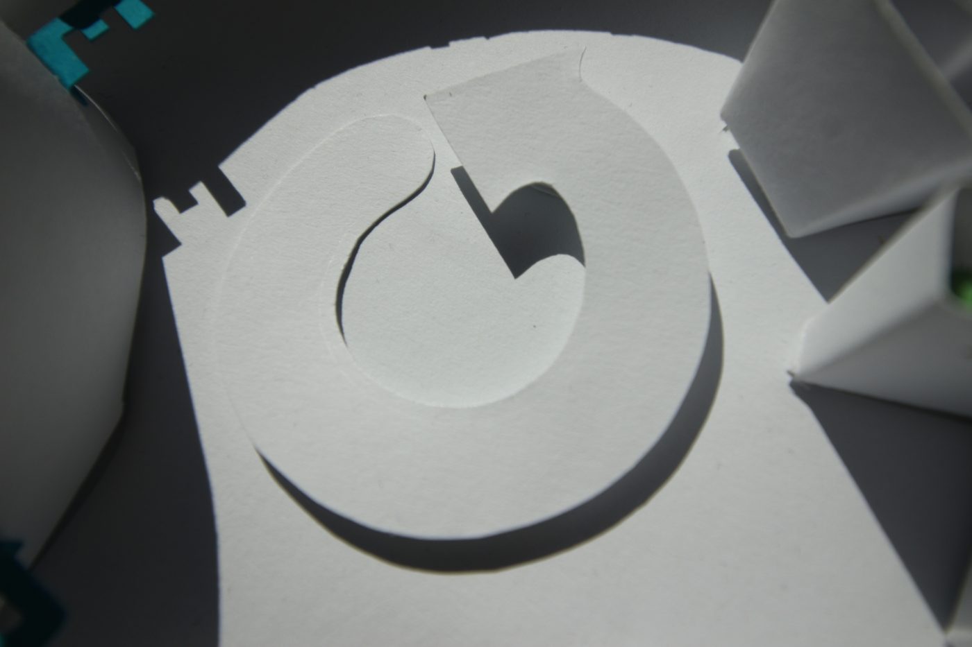
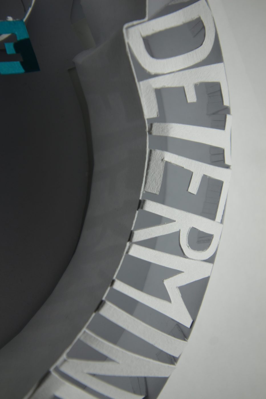
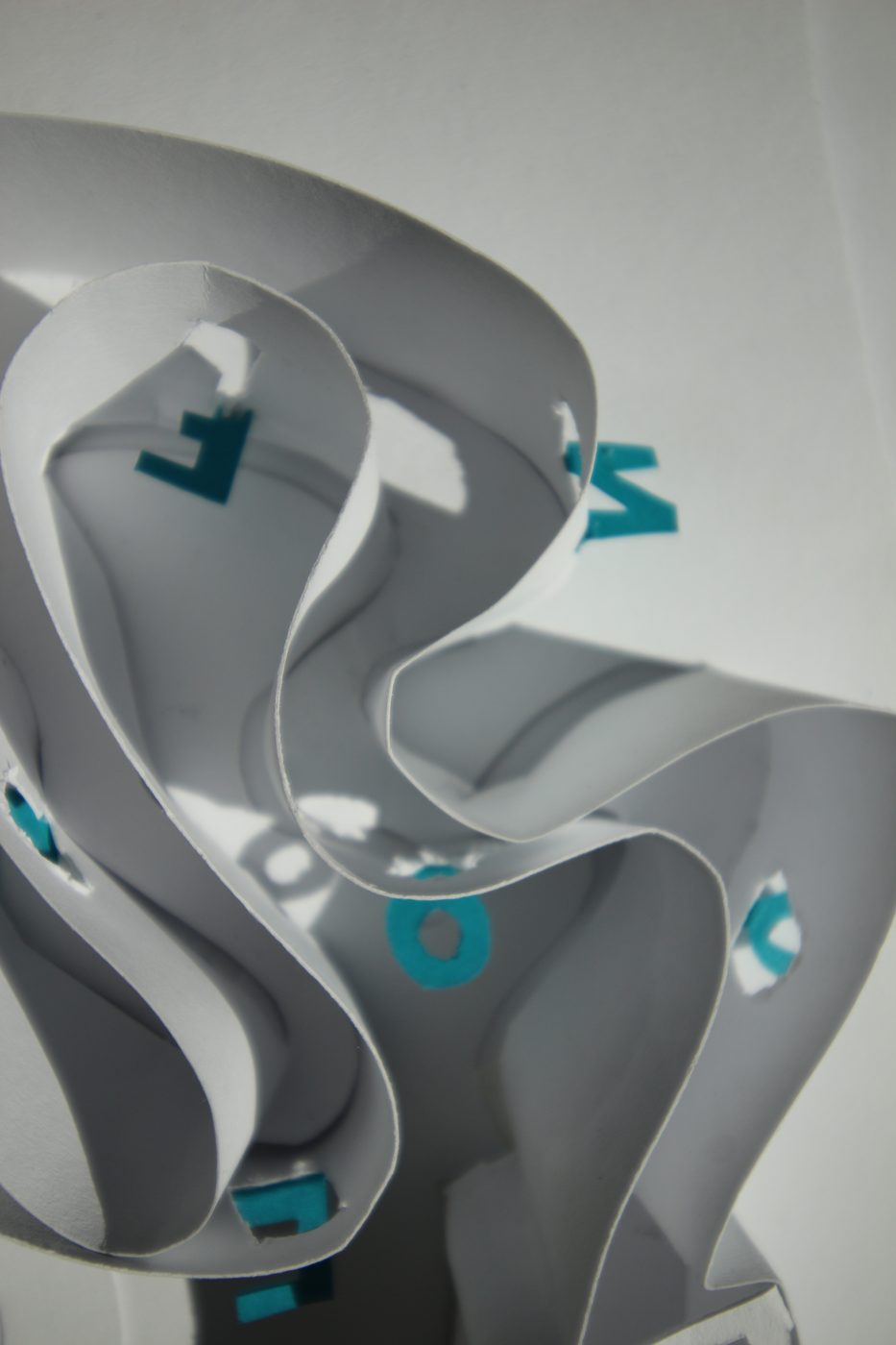
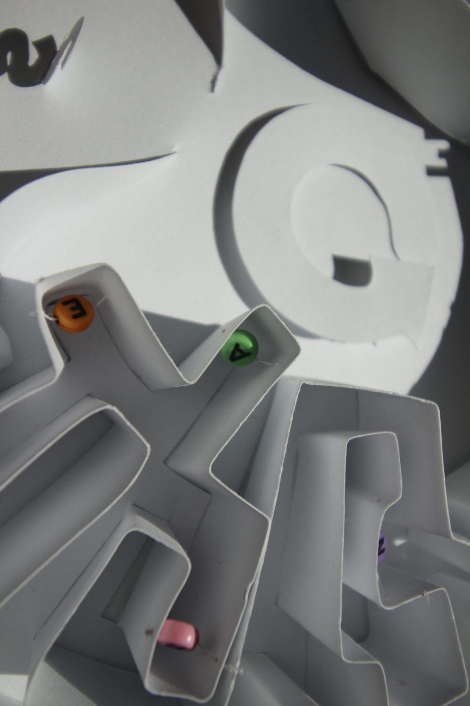
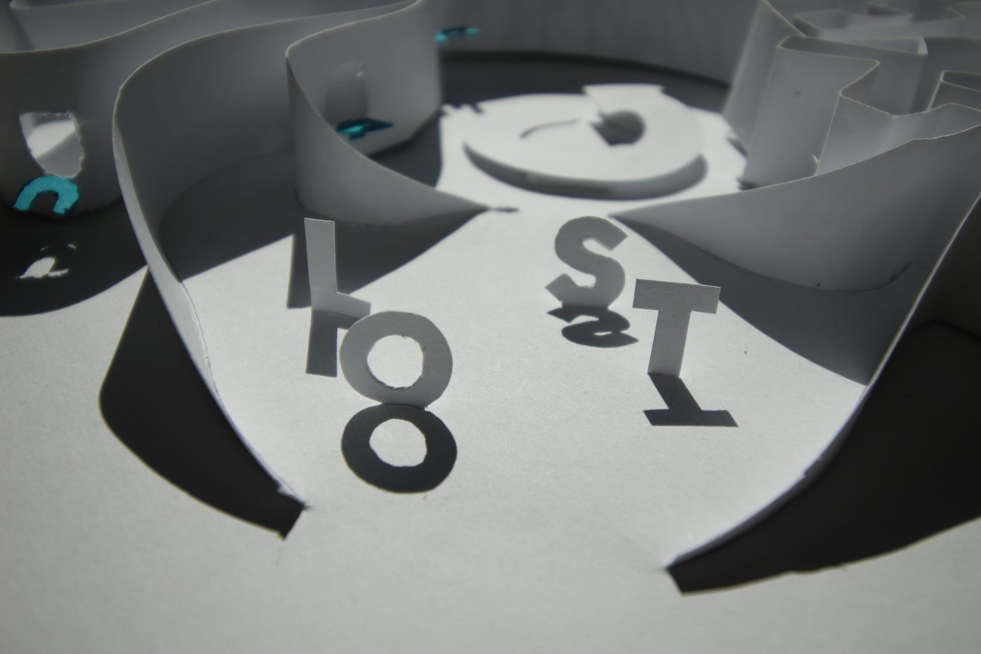
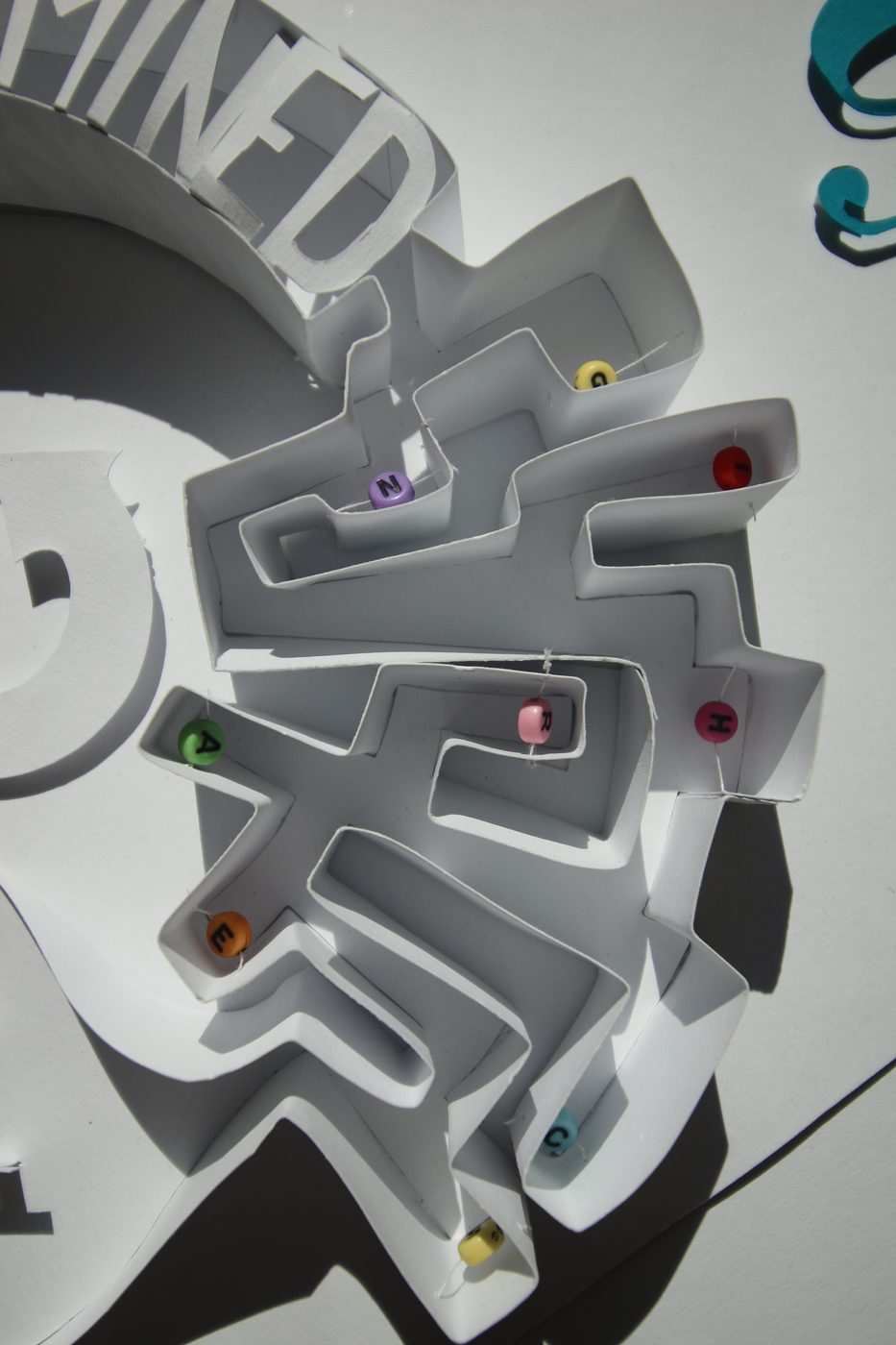
Life cycle, the spiral, determined, confused, searching and lost
The zine
The back of the A3 sheet folds into an eight-page A6 zine. Each word already has a strong meaning on its own, so I designed the inside like a dictionary: one word per page, with its pronunciation and definitions. A bold serif headword against a quiet sans-serif body keeps it calm after the busy poster.
To tie the two sides together, a small poster indicator at the bottom of each page shows which part of the poster the word belongs to.
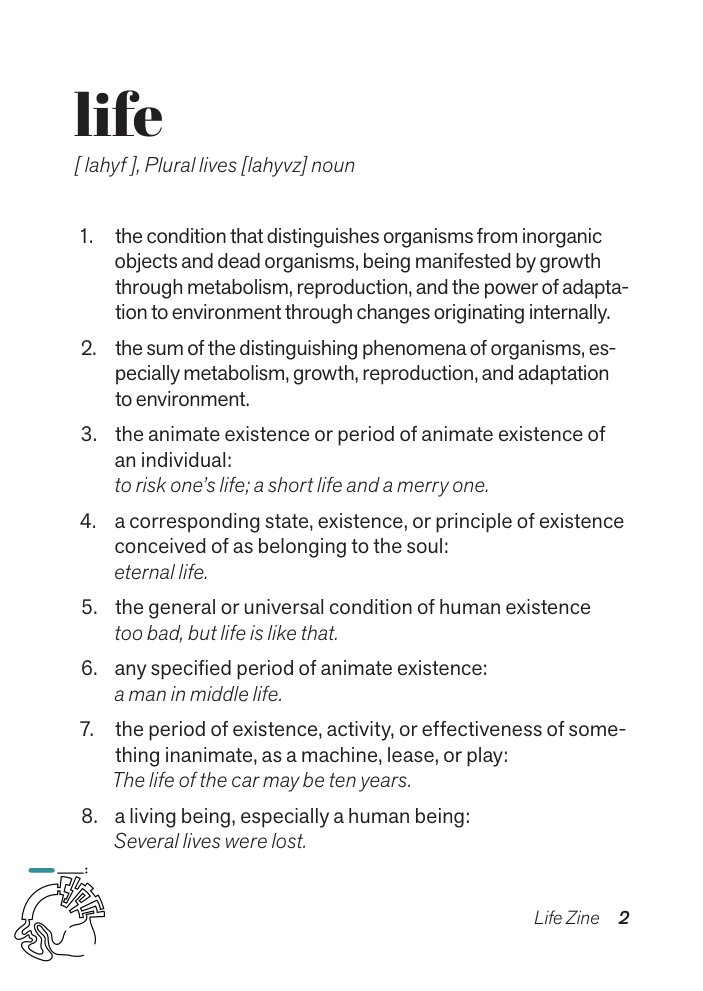
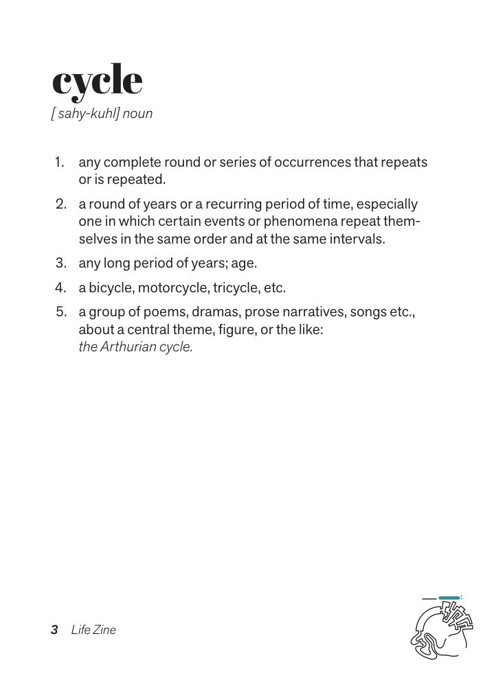
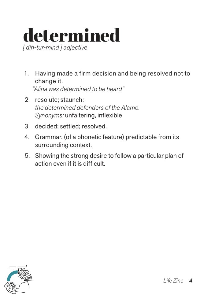
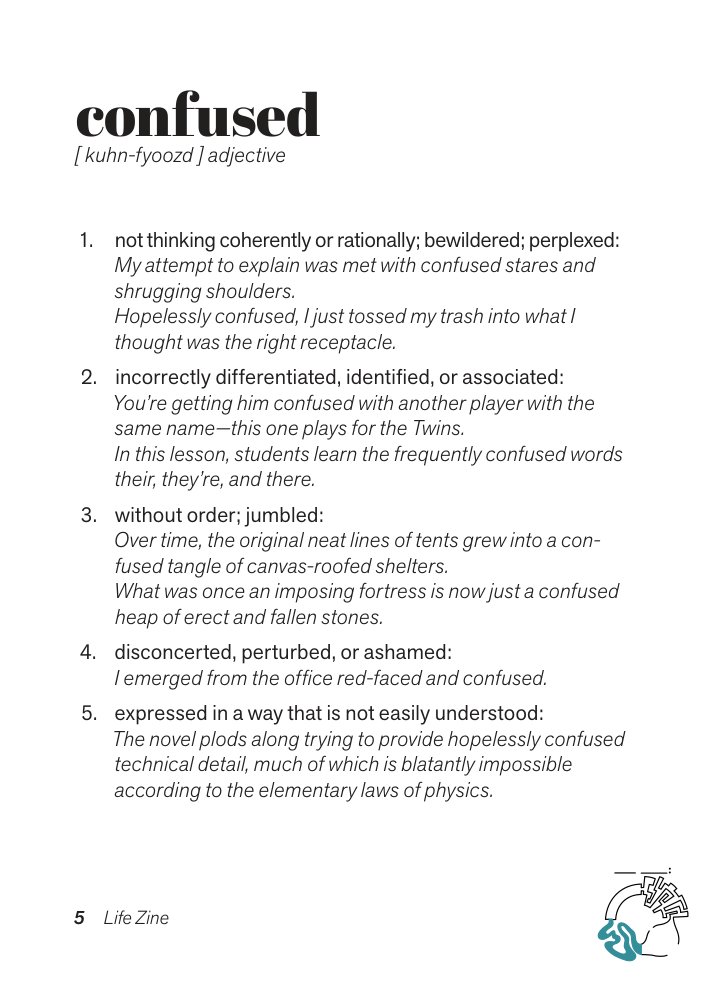
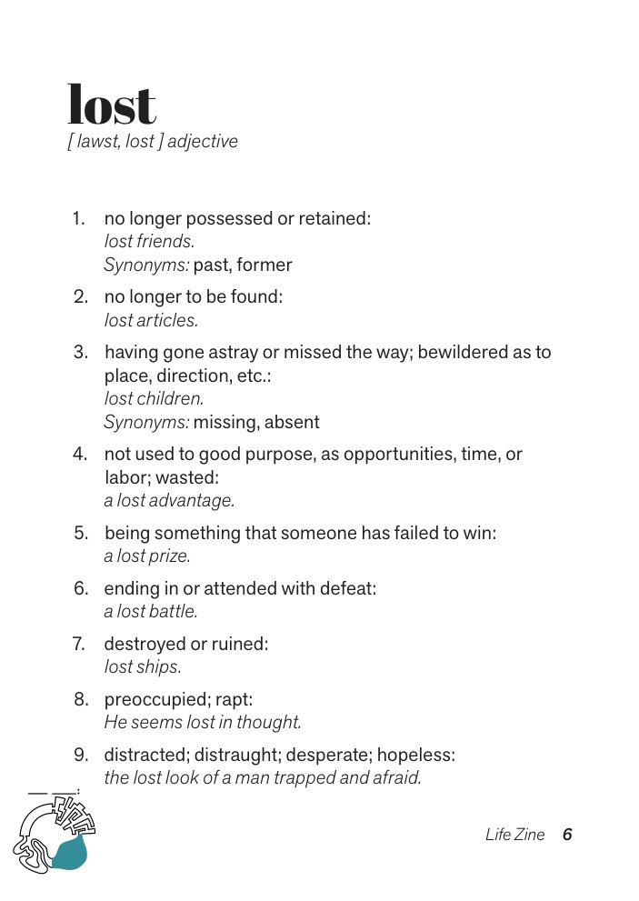
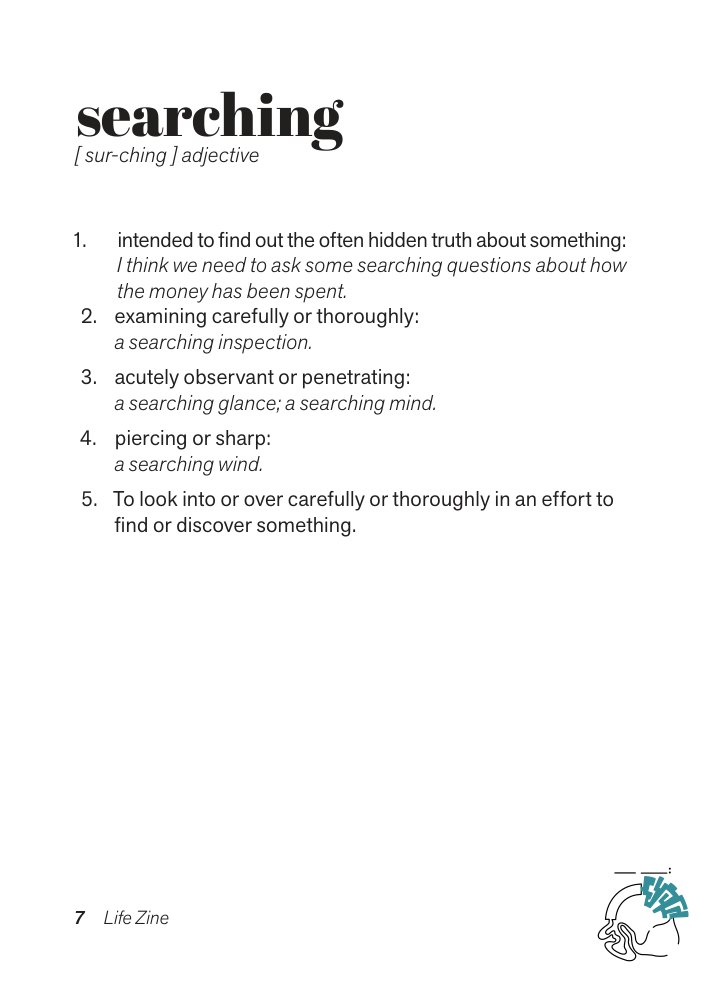
All eight pages, from the cover to the photo collage on the back
Printed
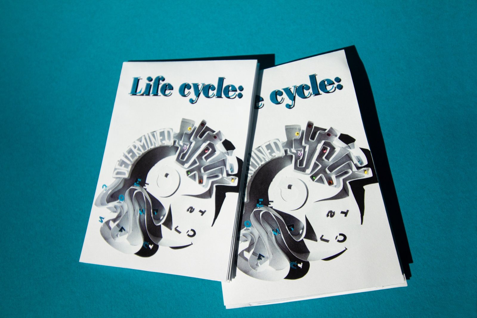
Folded, the sheet is a pocket-size zine; unfolded, it turns back into the poster. Shot on teal, the printed copies pick up the colour of the title.
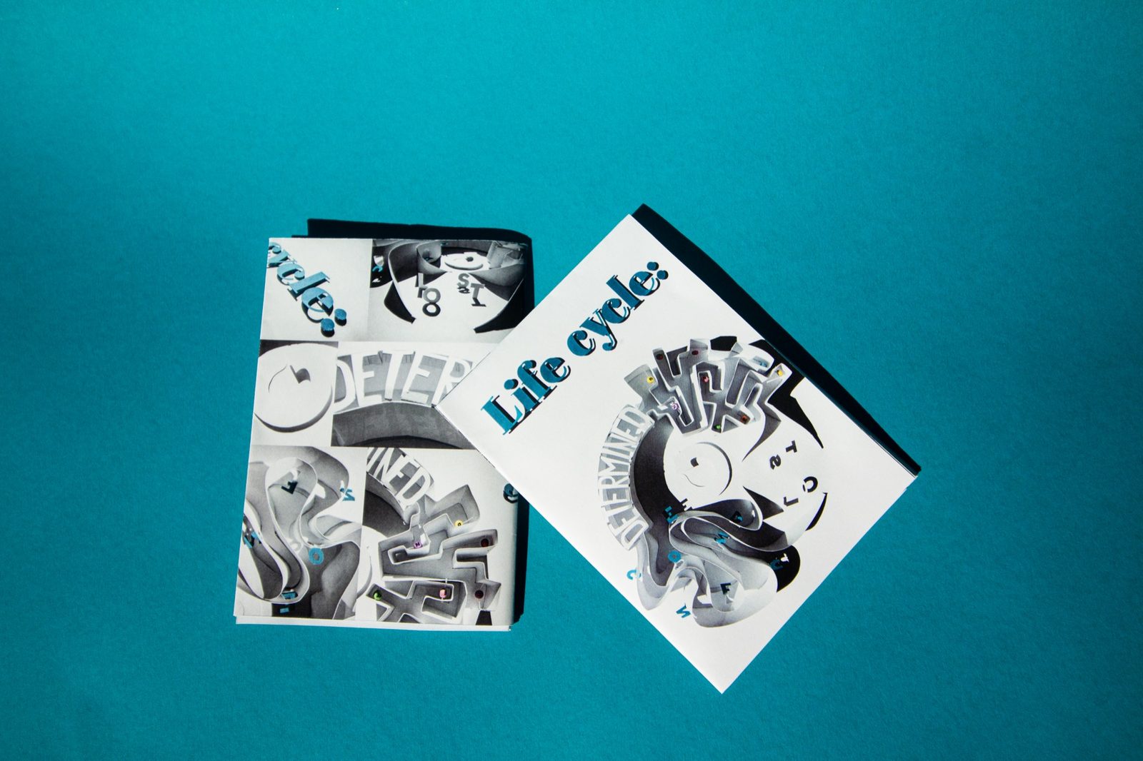
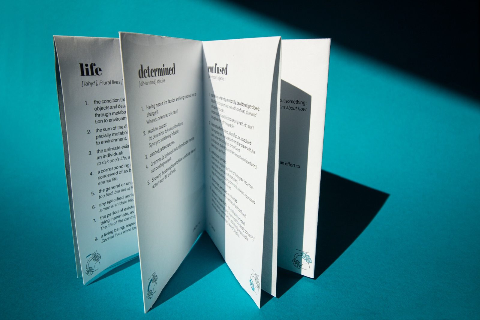
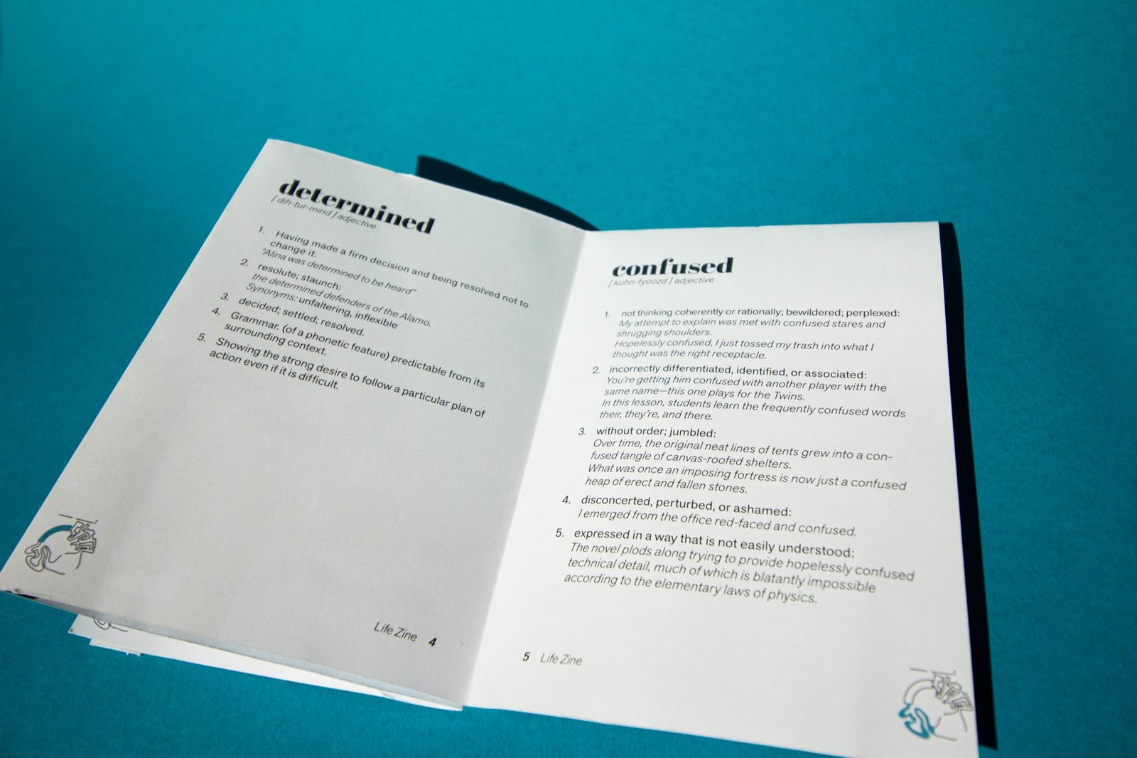
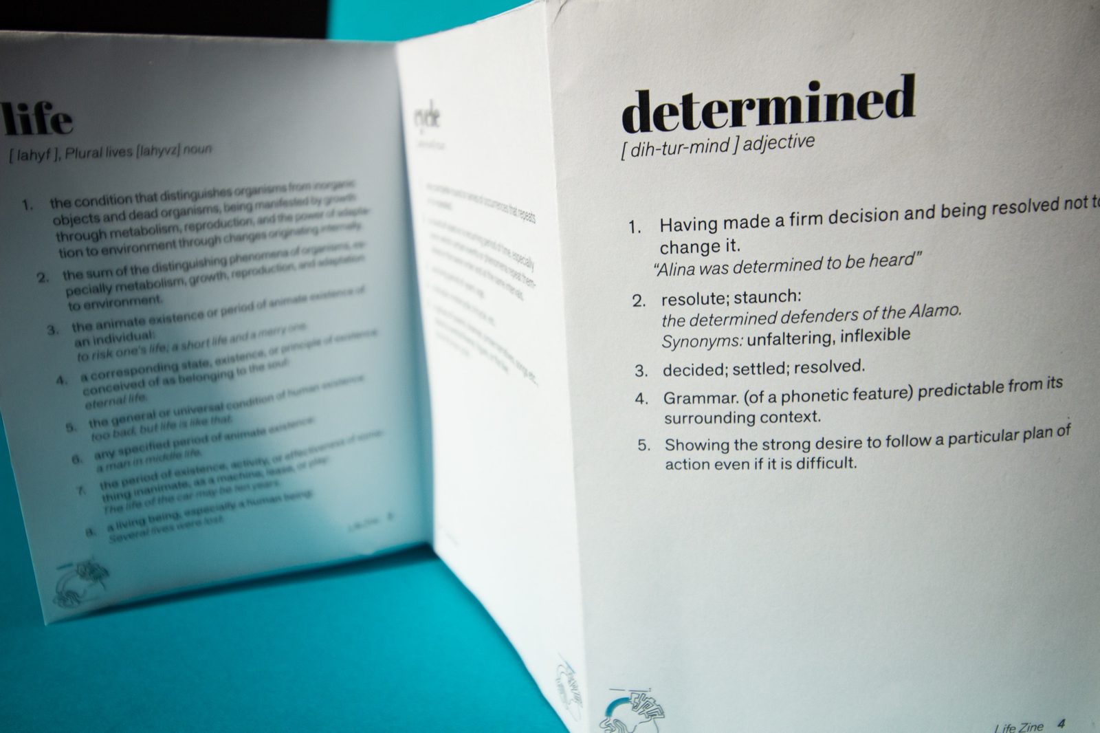
The printed zine
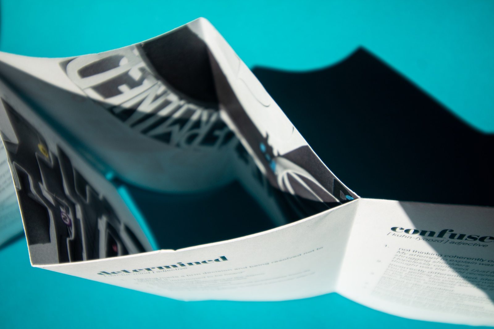
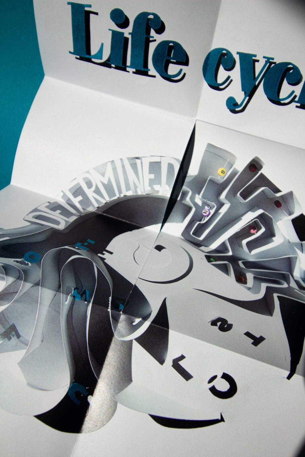
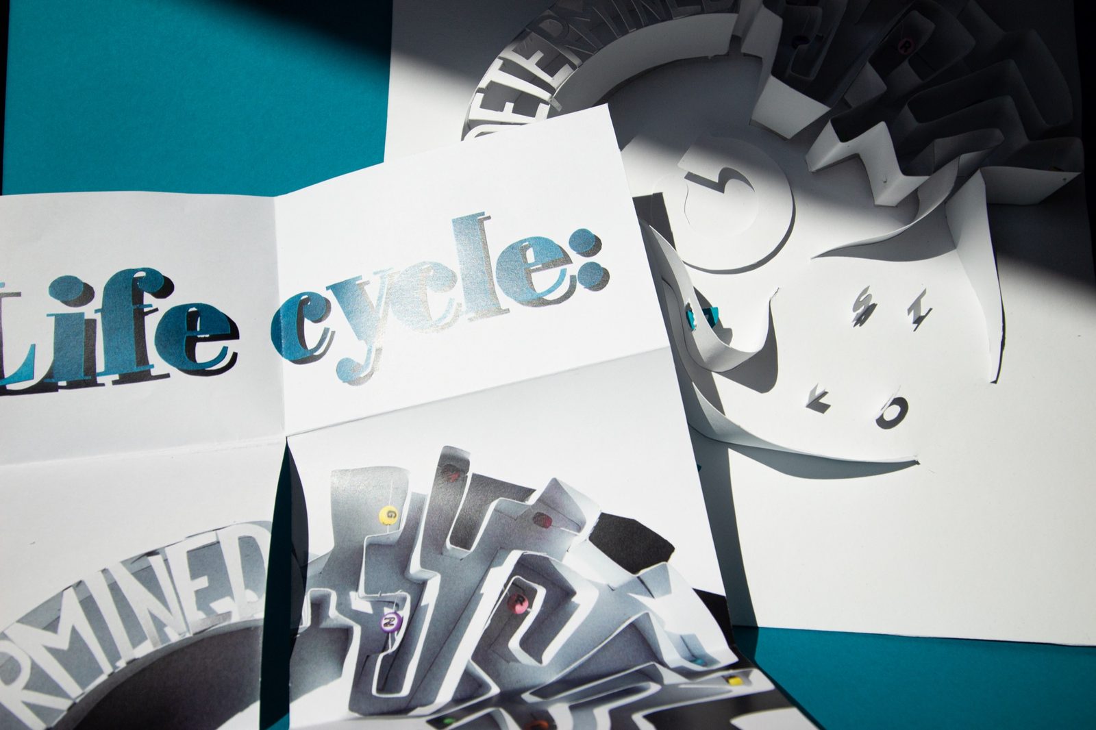
Unfolding into the poster
Reflection
As typography wasn't new to me, I was afraid I wouldn't be engaged enough in the classes. But I was! I especially liked that we had to print, and building a poster by hand was the highlight.
Working with paper, light and shadow showed me how much a letter can say before anyone reads it. In my UX/UI work I hadn't paid much attention to text as a visual element, but this project changed that, and I keep exploring what type can do.