Loupe Theatre Co. – A Rebrand Concept
A new identity for a Hungarian theatre company, built on one simple shape: the circle of a magnifying glass that brings a moment on stage into focus.
The brief
Loupe Színházi Társulat (Loupe Theatre Co.) is a Hungarian theatre company. The concept: a flexible identity that puts the company’s own production photos at the centre and works on posters, social media and cover images alike.
My role
I designed the whole concept: the logo and its versions, the colour palette, typography, graphic elements, and the posters, social media posts and Facebook cover for two productions, Árvák (Orphans) and Becsapódás.
Concept
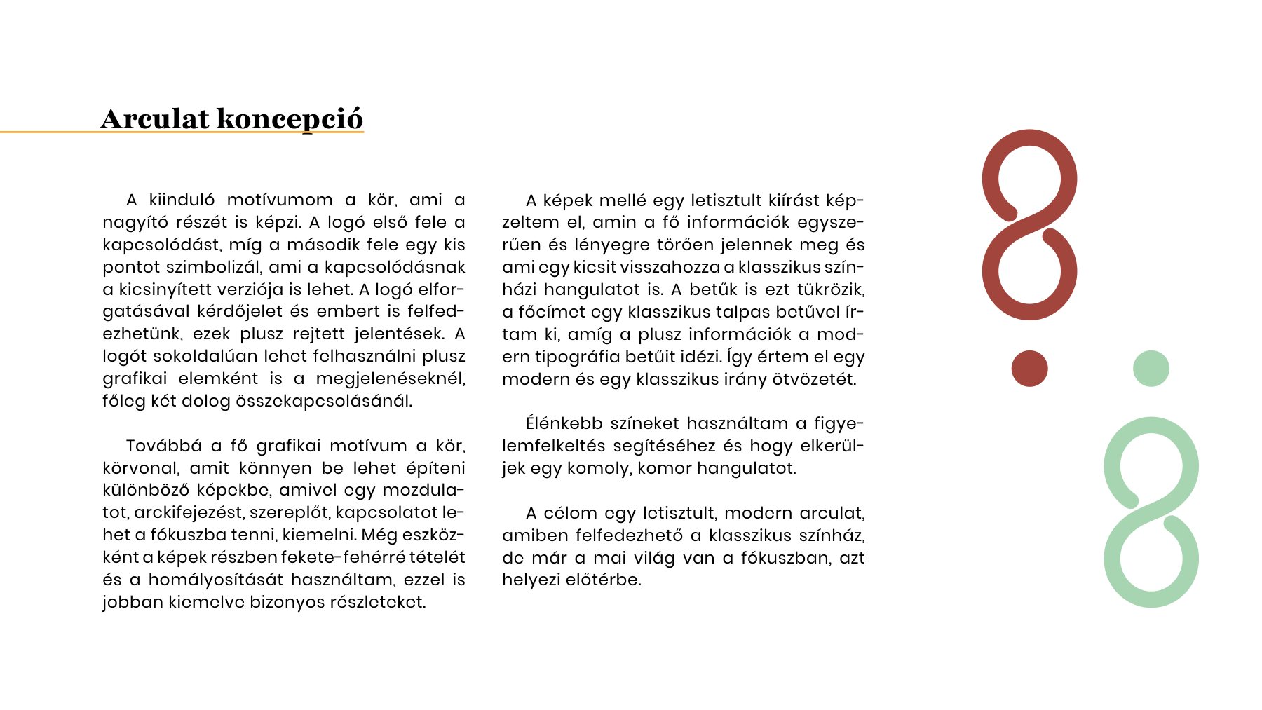
A loupe is a magnifying glass, so my starting motif is the circle, the lens that brings things into focus. The first half of the logo stands for connection, and the second half is a small dot, a miniature version of that connection. Turned around, the logo also hides a question mark and a small human figure.
The identity concept and the colour logo
Logo system
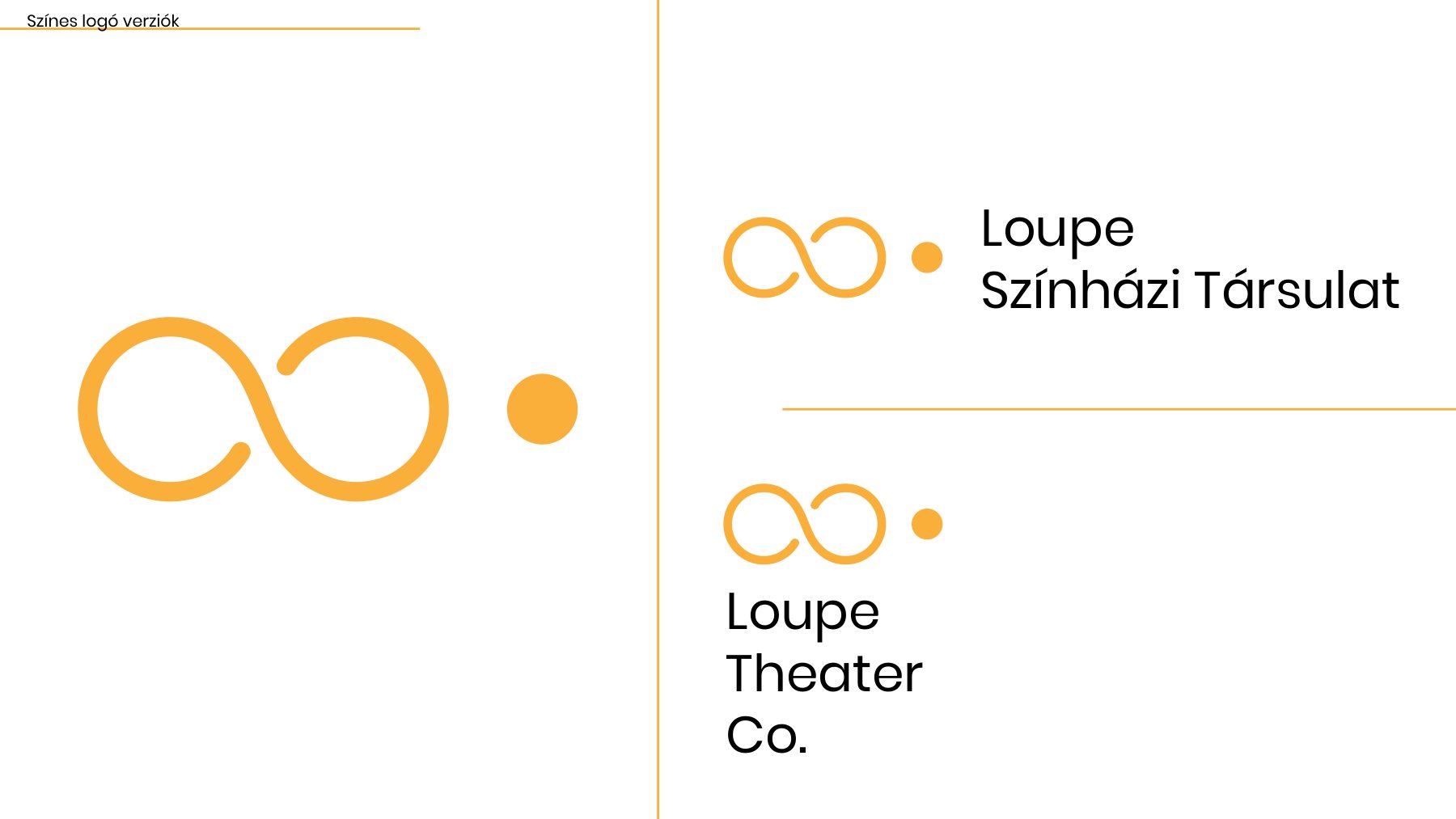
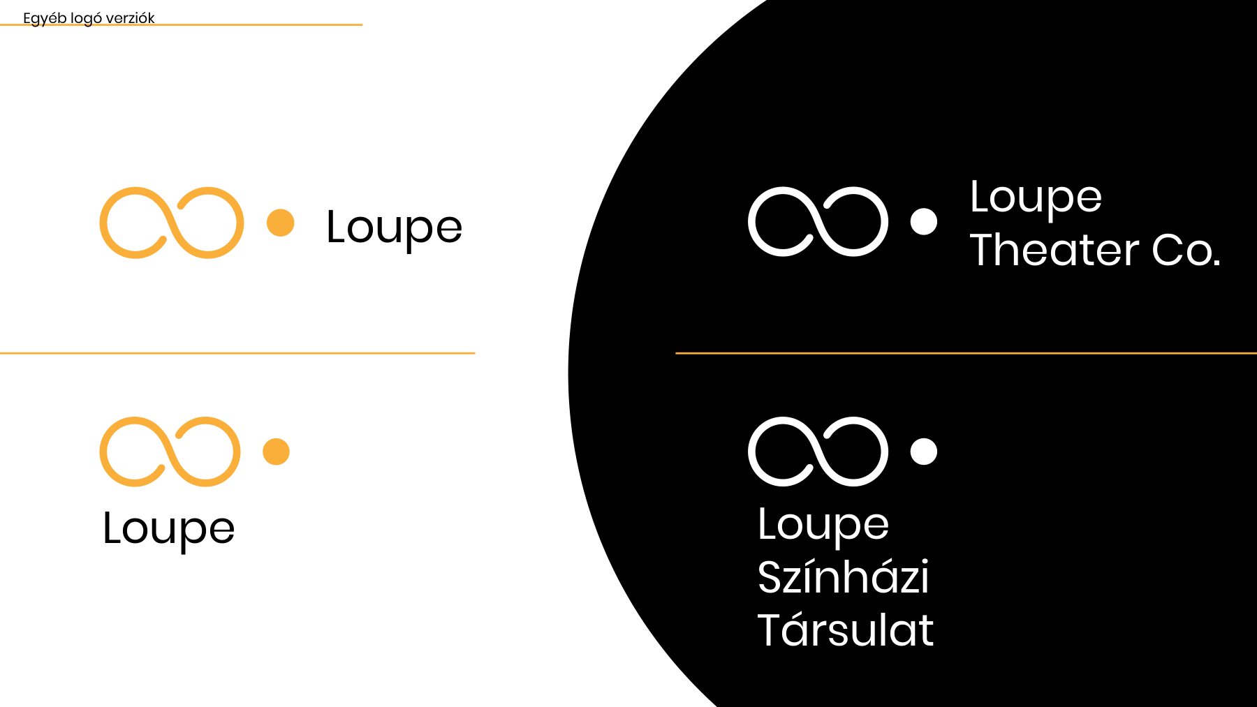
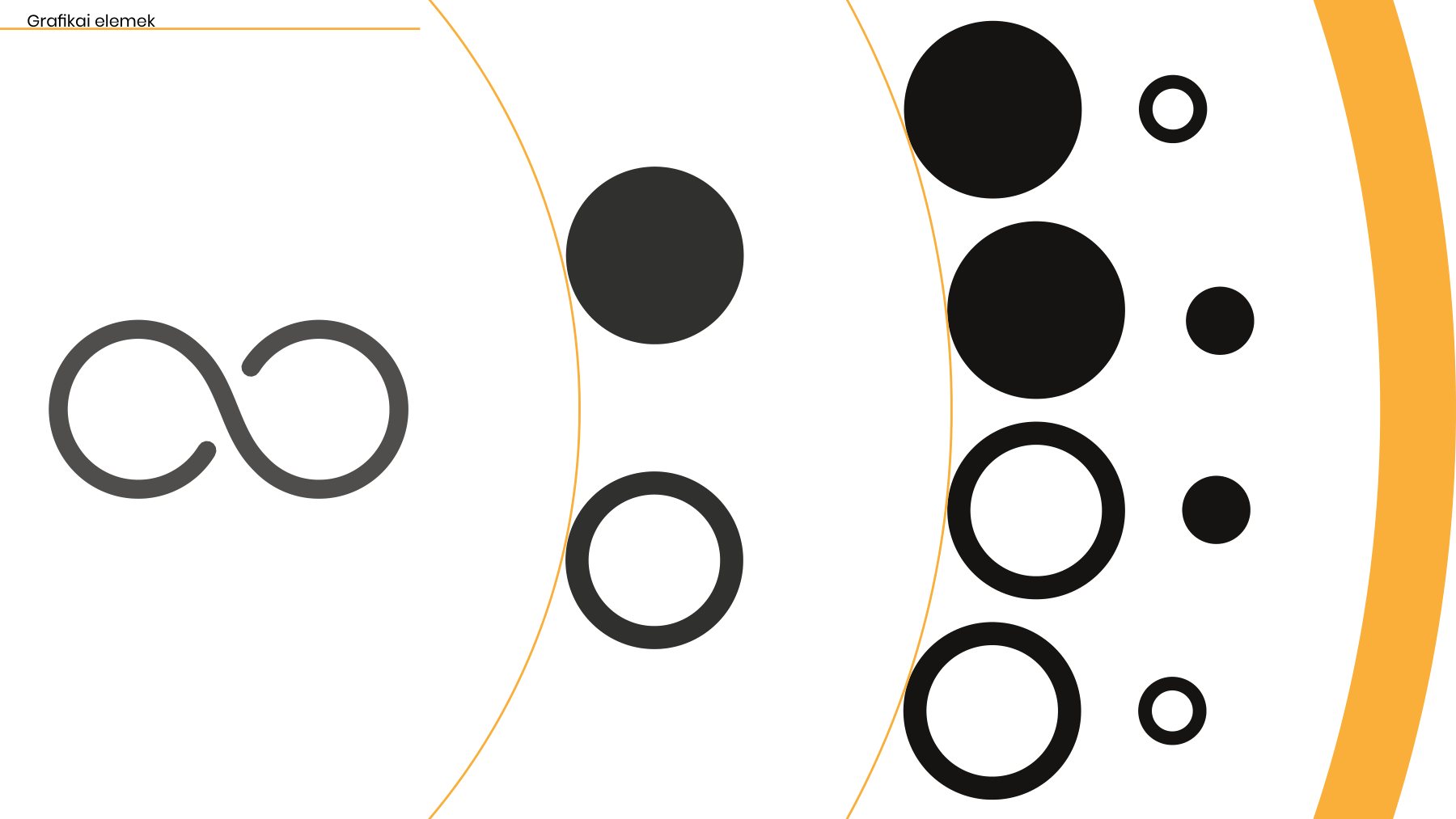
The logo works as a short mark and in full, in Hungarian and English, in colour and in black and white. Because it links two circles, it can also be used on its own as a graphic element wherever two things (two characters, two dates, two productions) need to be connected.
Colour and typography
I paired a classic serif with a modern sans-serif to bring together the traditional theatre mood and a contemporary company: Playfair for titles and longer printed texts, Poppins for the logo, supporting information and longer texts on screen. The palette is bright on purpose, to catch the eye on a busy street or feed.
- Marigold
#FBB03B - Coral
#F47748 - Rose
#F55C72 - Brick
#A2453C - Sage
#A9D5B3 - Green
#2C8447 - Teal
#017681 - Turquoise
#00AAAA - Ink
#161513 - White
#FFFFFF
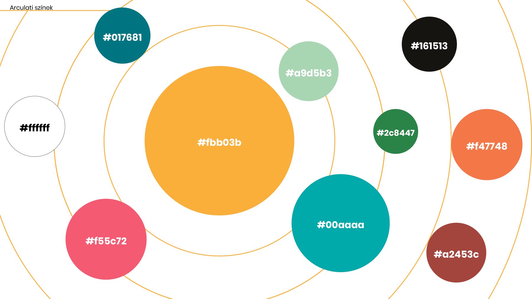
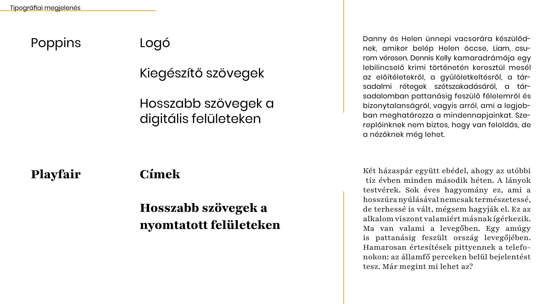
Colours and typefaces
Graphic elements
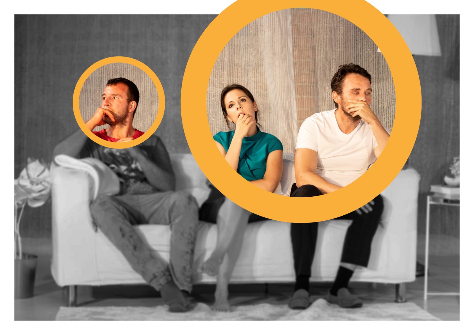
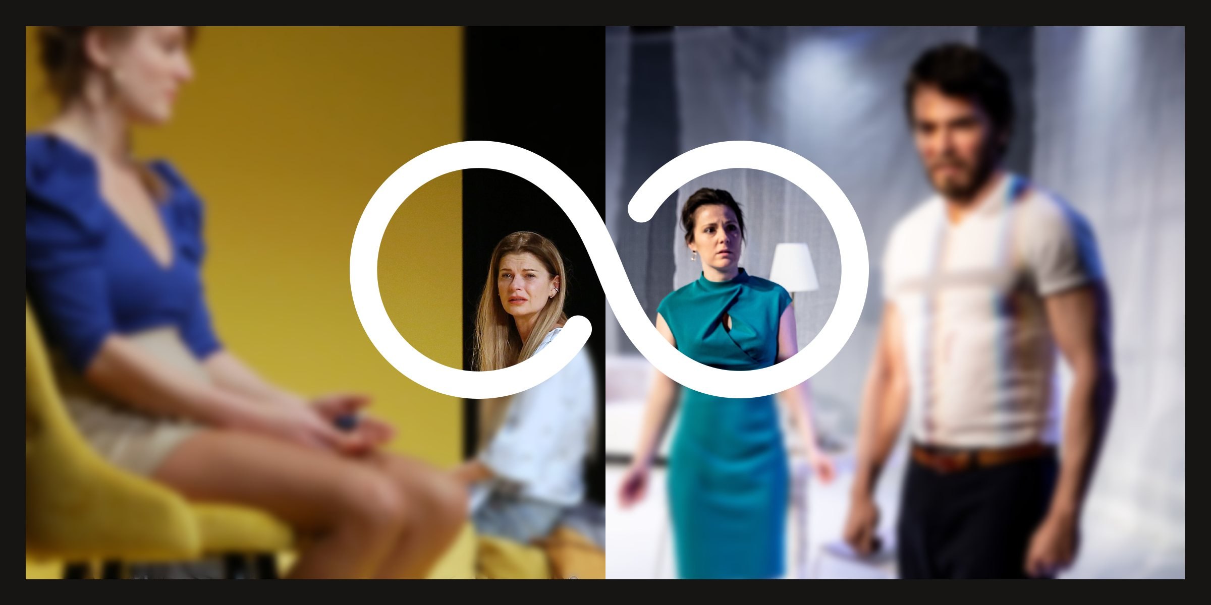
The circle and its outline are easy to build into any photo. They put a gesture, a facial expression, a character or a relationship into focus. To push the focus further, I turned parts of the photos black and white or blurred them, so the eye goes exactly where the circle points.
Posters and social media
Next to the photos, the text stays clean and to the point: the title in the classic serif, the details in the modern sans-serif. For Árvák, orange circles lift the actors out of a black-and-white photo; for Becsapódás, a bold pink arc wraps around the couple.
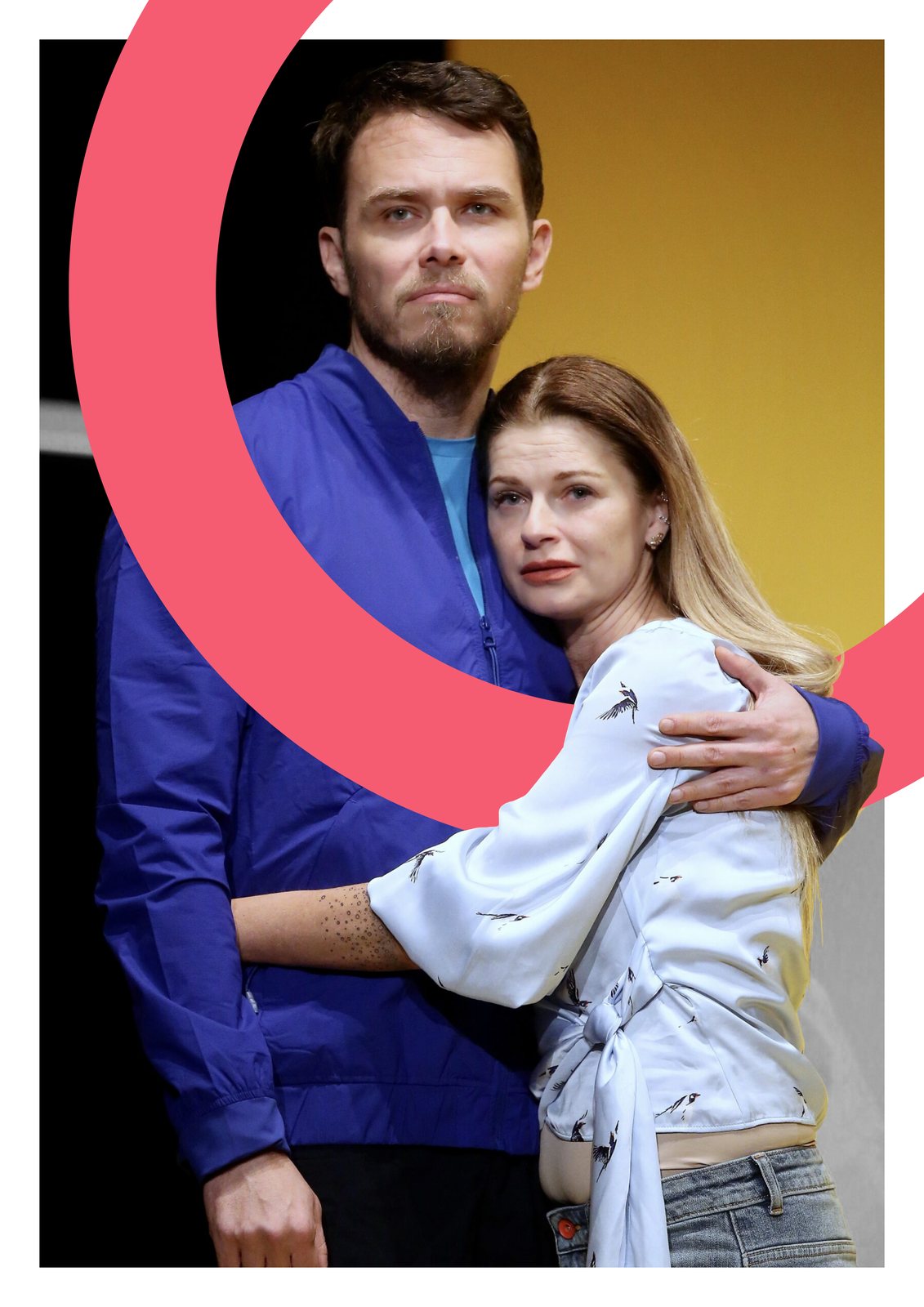
Posters for Árvák and Becsapódás
Reflection
Loupe showed me how far a single shape can go. Once the circle had a meaning (focus, connection), it could frame a face, join two productions or carry a date, and the identity stayed recognisable without ever repeating itself.