re.FURNITU – Old Became New
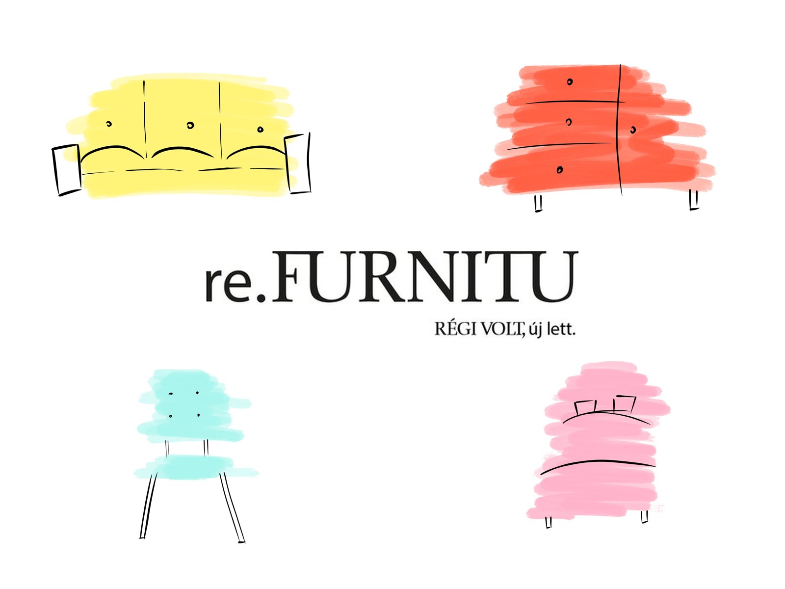
An identity for a shop of renewed vintage furniture: a quiet wordmark, and fresh brush strokes of colour painted over old pieces.
The brief
Design an identity for re.FURNITU, a shop that gives old furniture a new life. Its line says it all: “Régi volt, új lett” (it was old, now it’s new). The identity had to feel antique and sophisticated, and fresh at the same time.
My role
I created the moodboard, logo, colours, typography and supplementary graphics, and applied them to business cards, leaflets and the posters for the shop’s opening.
Moodboard
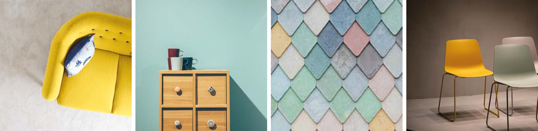
I started with three words: old-fashioned, antique, sophisticated. The moodboard collected bright, freshly painted pieces (a yellow sofa, mint drawers, pastel tiles, colourful chairs): old furniture in a new coat of colour.
Logo, colour and type
The wordmark is set in a classic, refined serif, with the tagline small underneath. Repeated in rows, it also becomes a pattern for backgrounds and posters. Four fresh pastels (mint, pink, yellow and coral) stand for the new coat of paint, with Myriad Pro Regular and Pacific as the brand typefaces.
- Mint
#ADF6ED - Pink
#FEB3CA - Yellow
#FFF478 - Coral
#FF6146

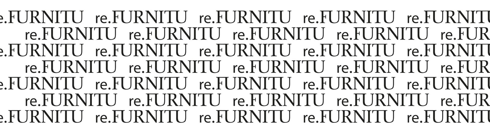
The wordmark and the wordmark pattern
Brush-stroke furniture
The supplementary graphics tell the brand story: thin, simple line drawings of furniture, with loose brush strokes of colour painted over them, as if each piece had just been repainted. Every piece gets one brand colour.

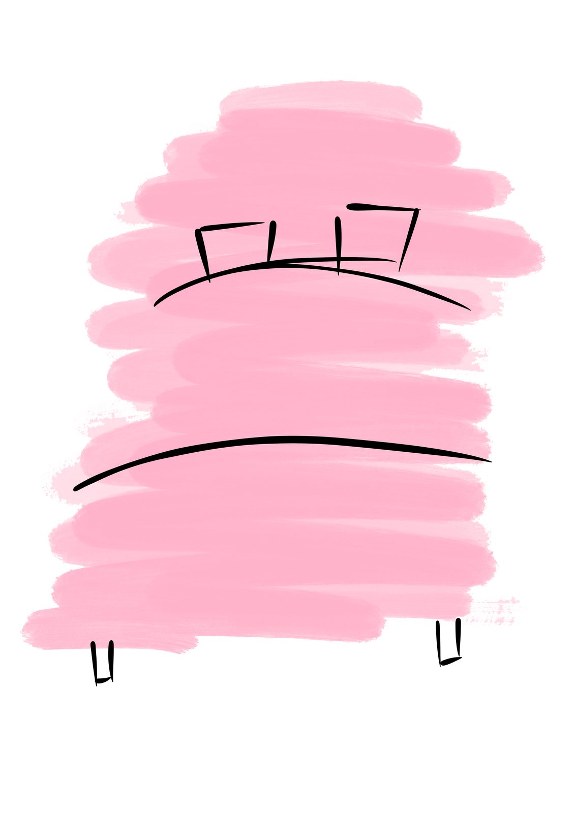
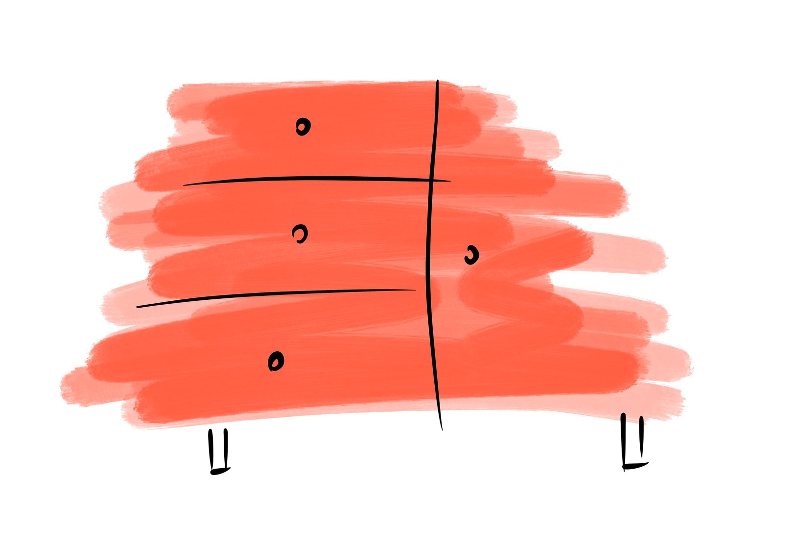
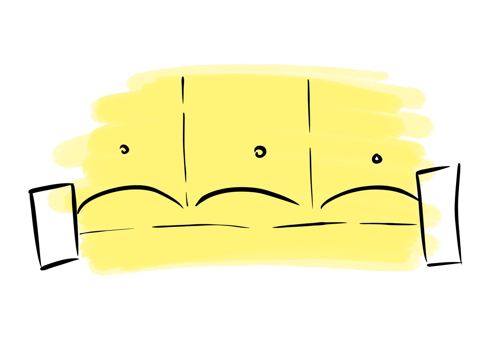
One colour for every piece
Applications
The business cards come in all four colours, each with its own piece of furniture. The opening posters layer a large illustration over the wordmark pattern, with the opening date (17 June 2019) in a dark band at the bottom.
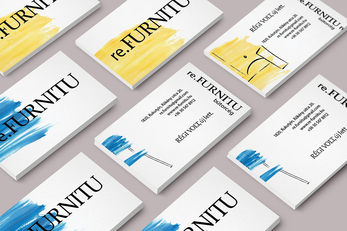
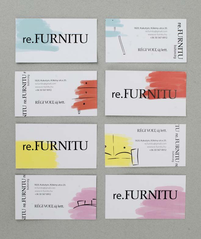
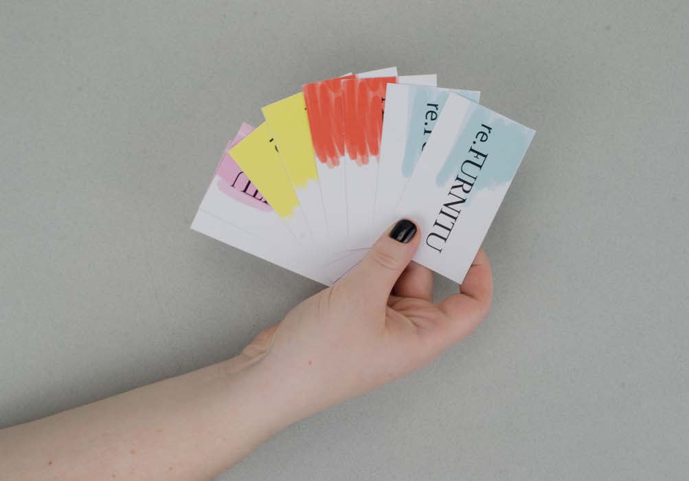
Business cards
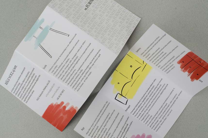
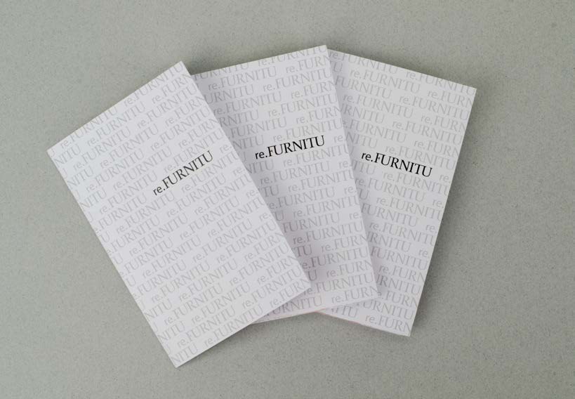
Leaflets
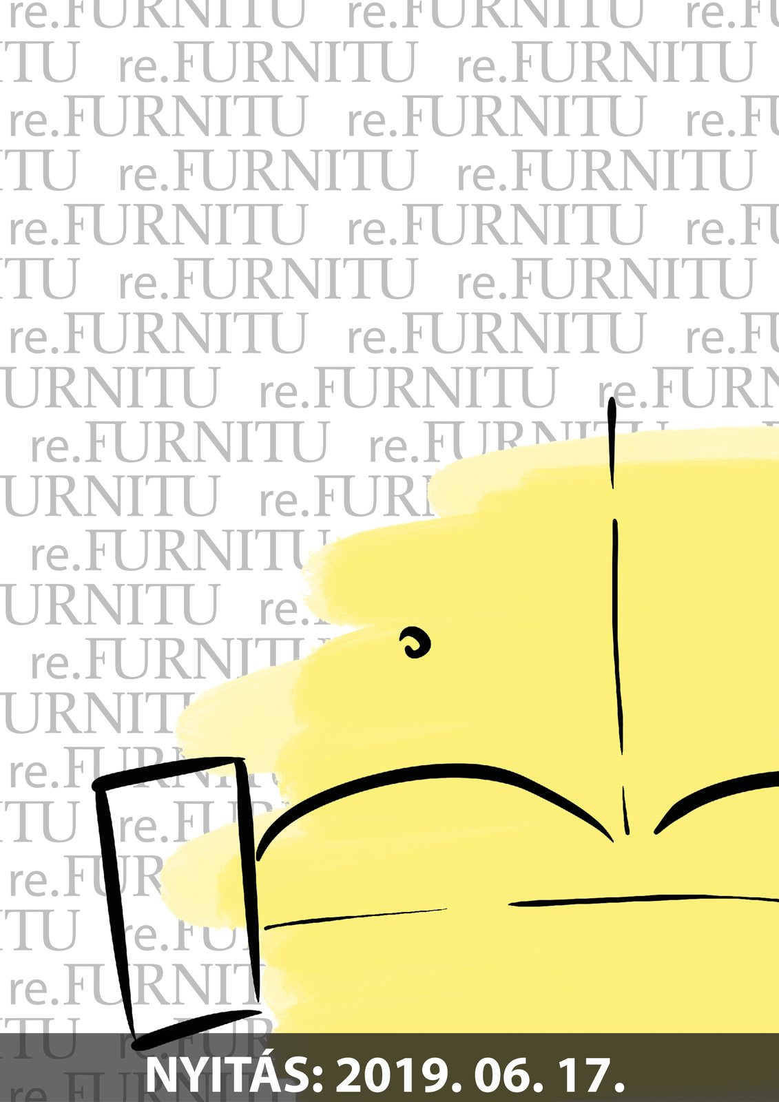
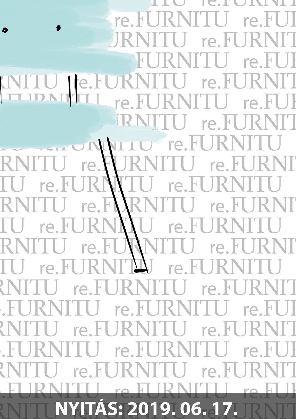
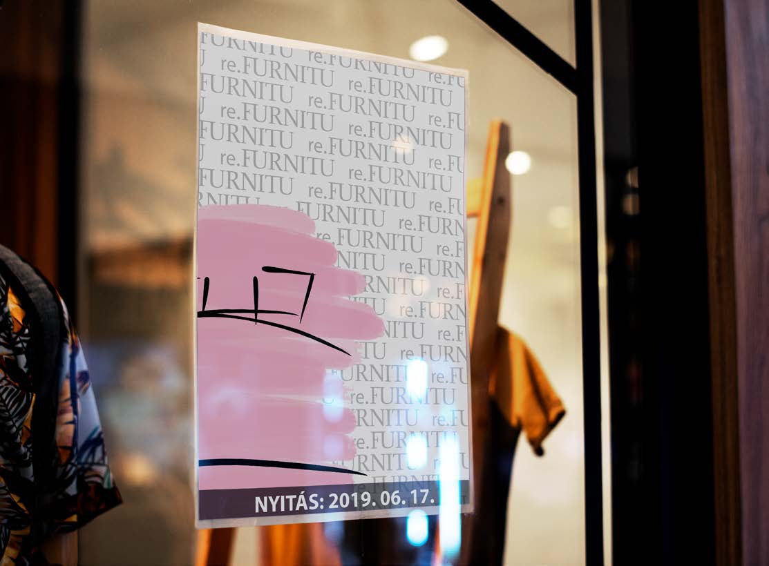
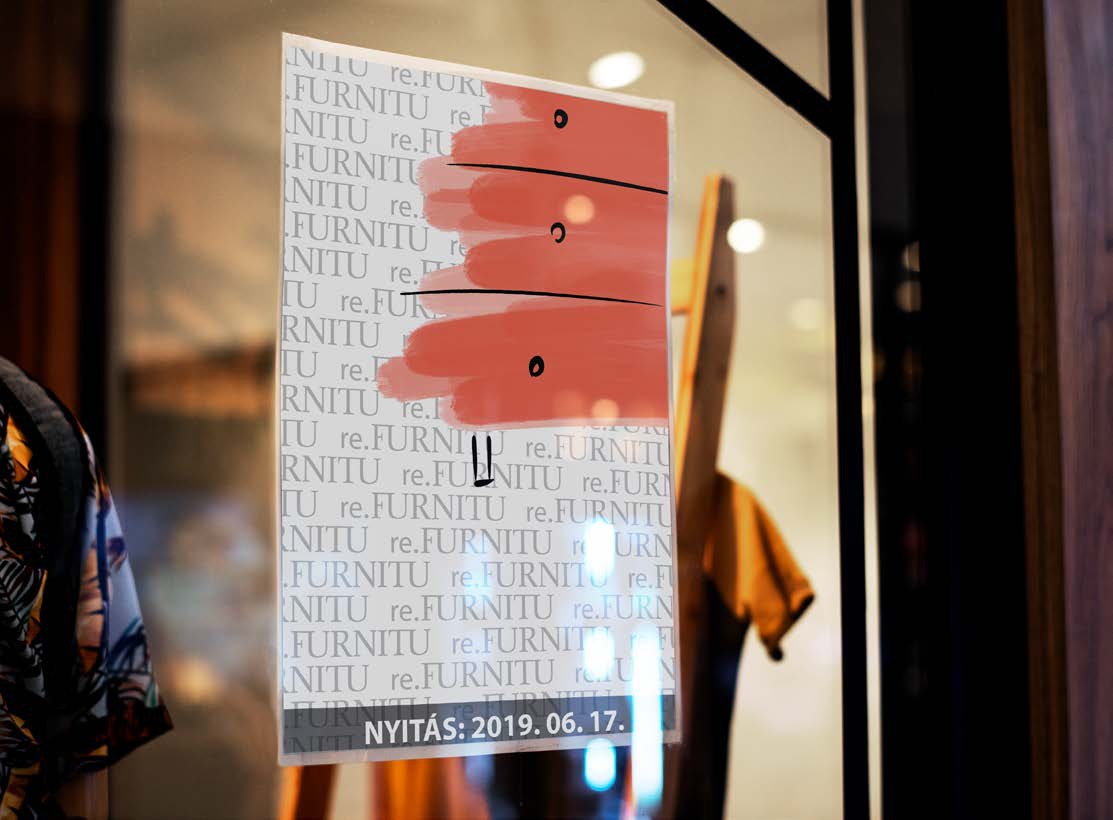
Opening posters, and in the shop window
Reflection
re.FURNITU taught me to let an identity tell a story without words: the contrast between a quiet, classic wordmark and loose, bright brush strokes says “old became new” before anyone reads the tagline.