Posters
Four poster series: typography built from paper and city lights, a haiku for every season, and concept posters for Nike.
The brief
Posters have to work from across a street: one idea, understood in a second. Each series explores a different way of getting there, through type, image or pattern.
My role
Concept, typography, illustration, photography of the paper models, and layout for every poster.
TipoMánia 2019
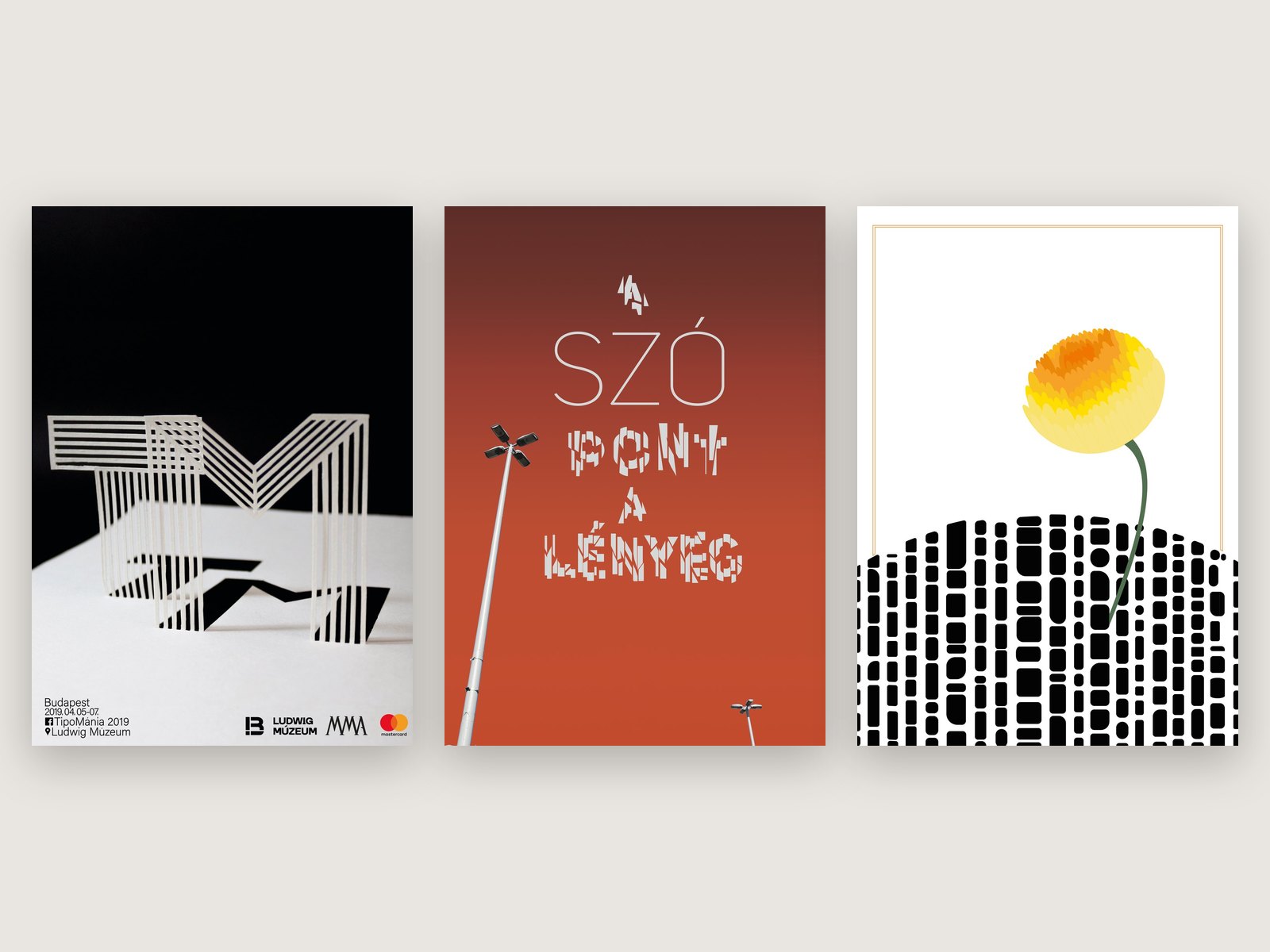
Posters for TipoMánia, a typography event at the Ludwig Museum in Budapest. The letters T and M are three-dimensional paper models, photographed with their long shadows, and the event details sit in a quiet grid underneath.
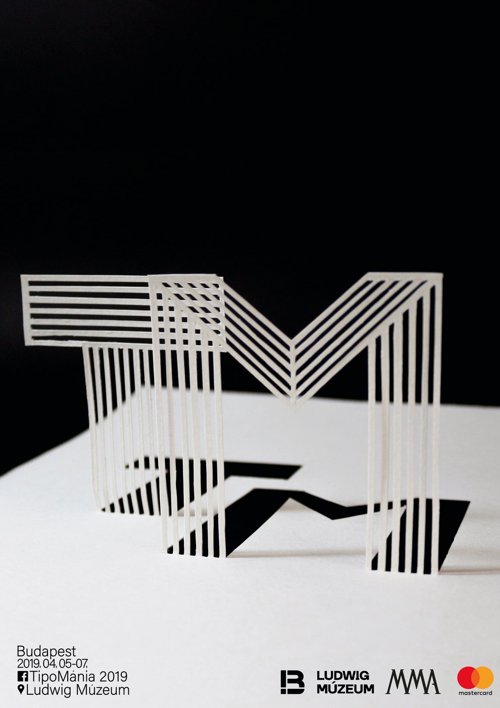
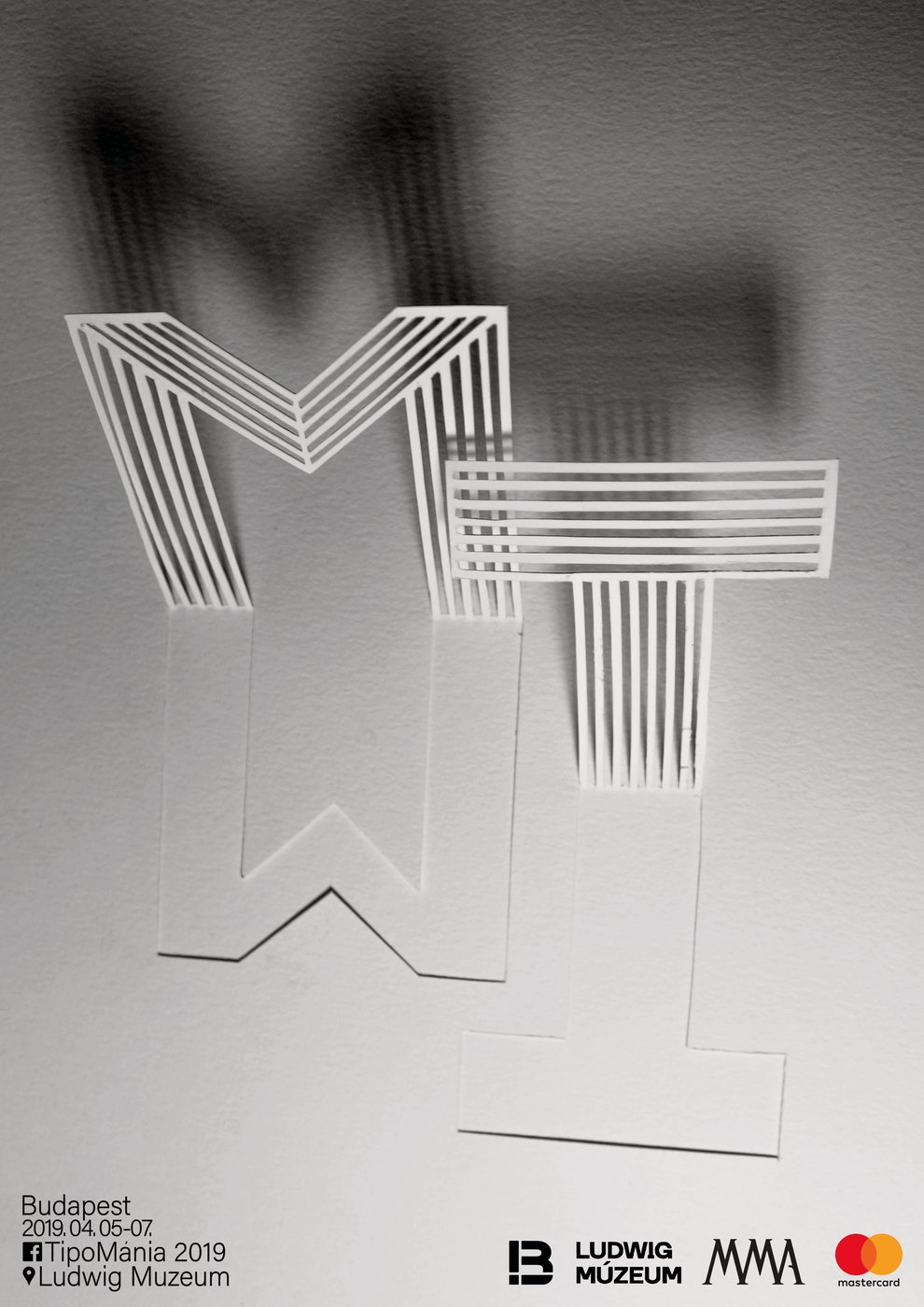
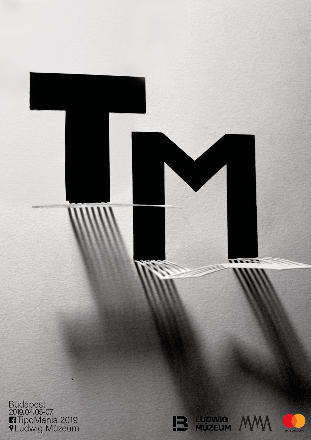
Three versions of the TipoMánia poster
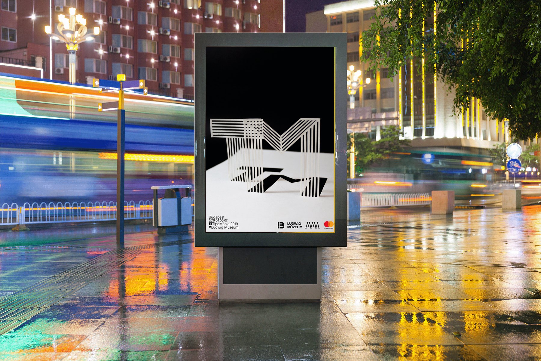
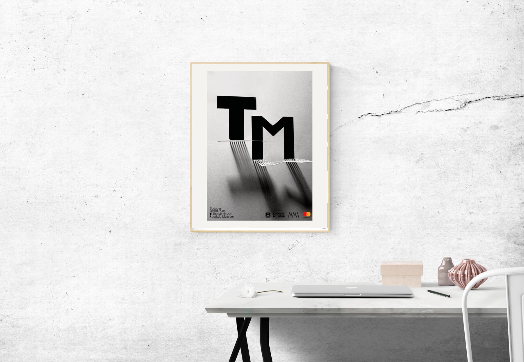
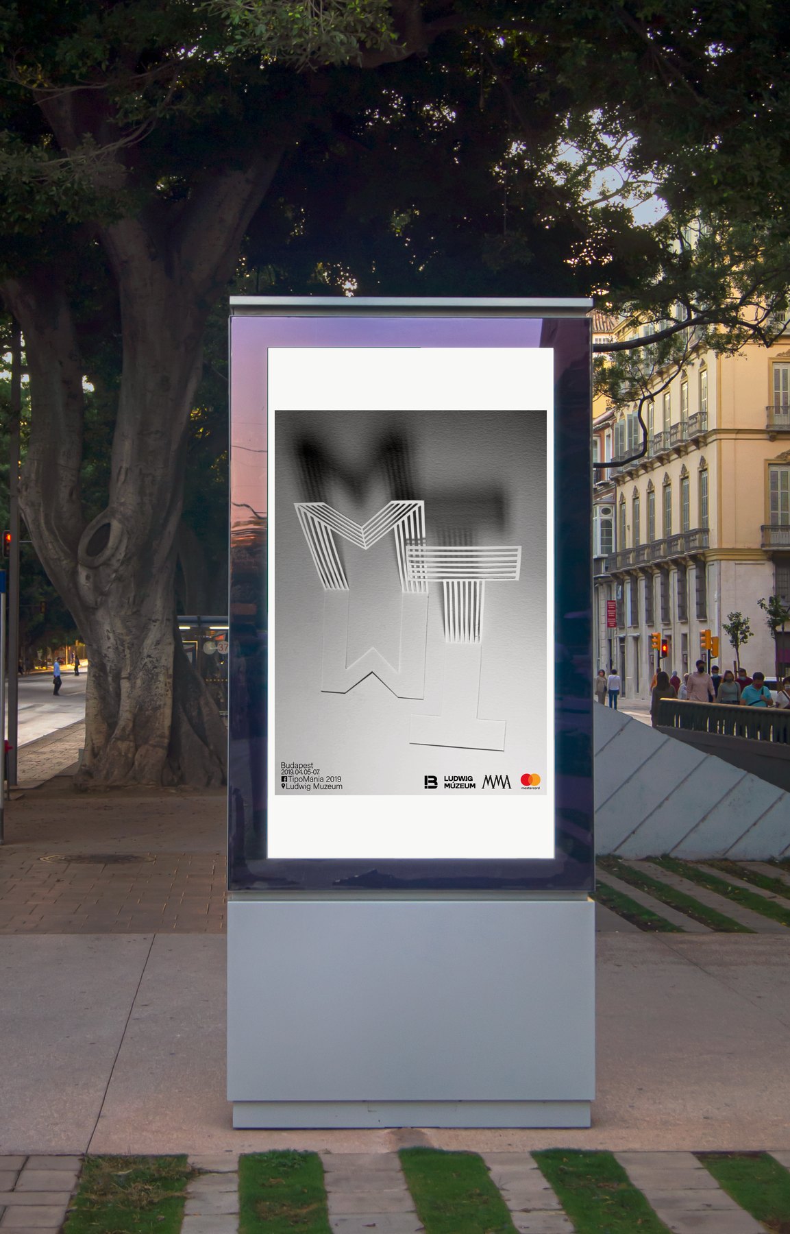
Mockups: on the street, on the wall and on an advertising column
Words in the city
A typographic series set against Budapest at dusk. The letters climb into the street lamps and rooftops, so the words and the city become one image: “Csak a végén egy szó” (just one word at the end), “A szó pont a lényeg” (the word is exactly the point) and “Mégis mi más?” (what else, then?).
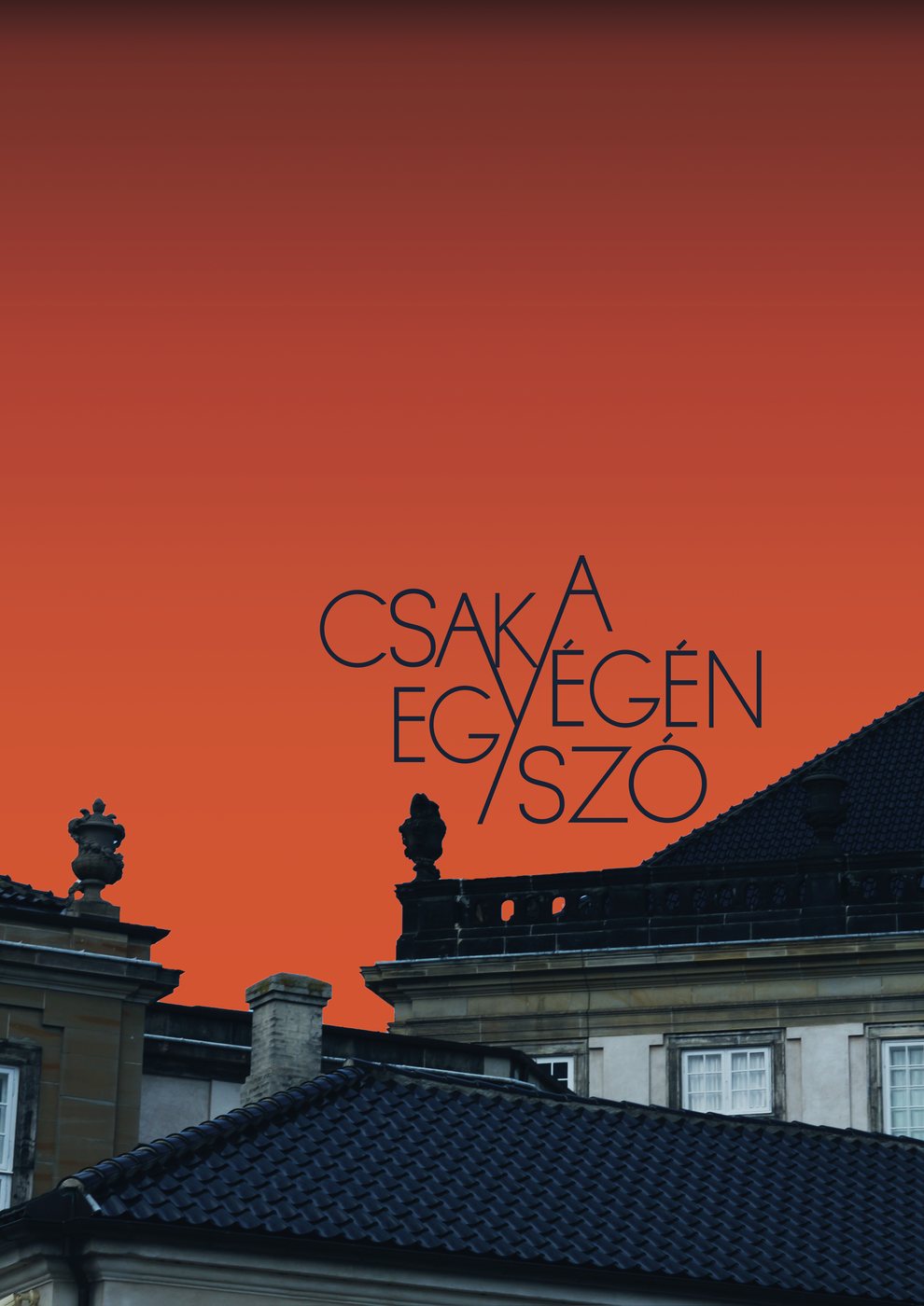
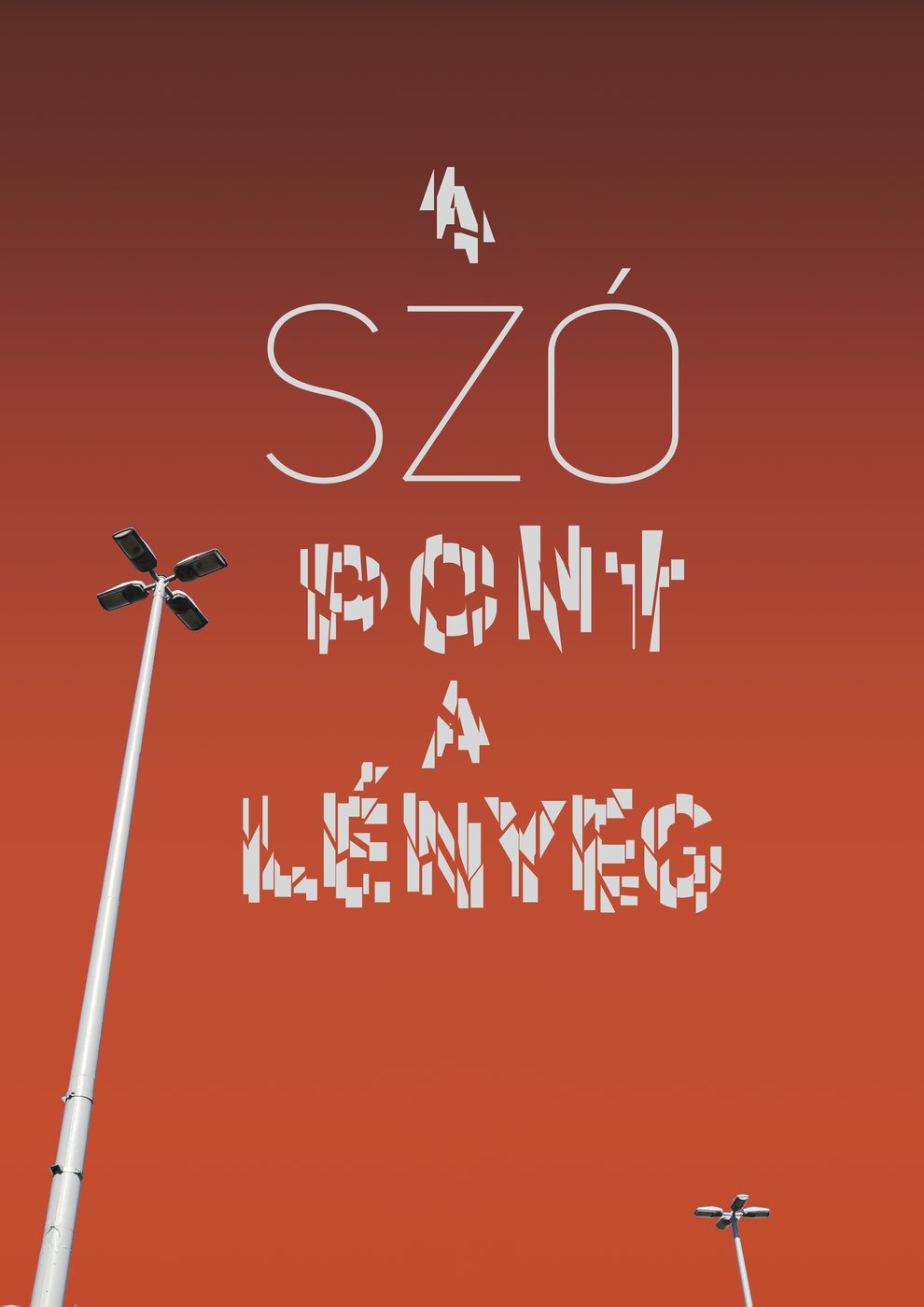
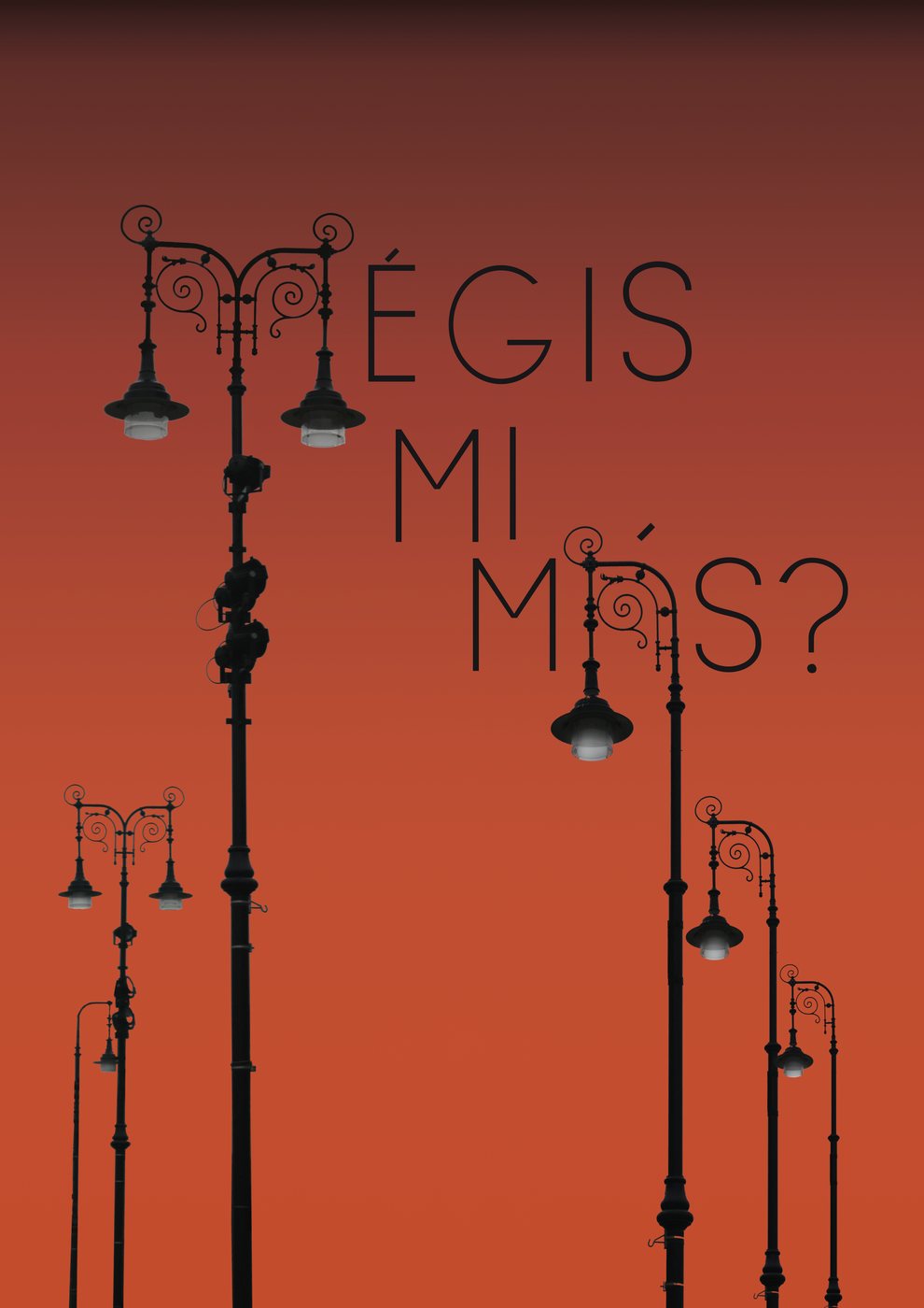
The three typographic posters
Haiku seasons
A series of seasonal posters: spring, summer and autumn. Each one is reduced to a single motif (a butterfly, a crocus, a flower in bloom) resting on a black-and-white pattern that changes rhythm with the season.
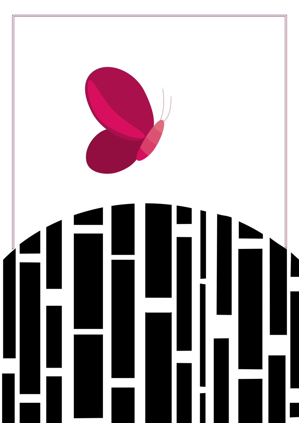
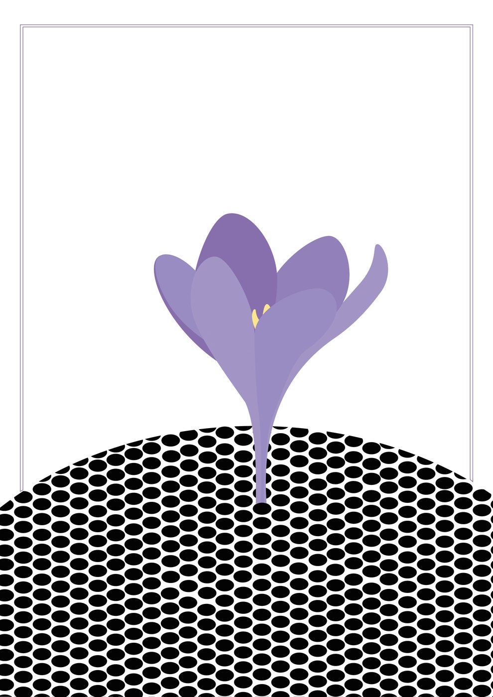
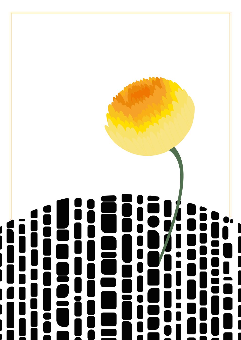
Spring, summer and autumn
Nike concepts
Concept posters around Nike’s voice: short, bold lines in heavy italic type, with the swoosh working as part of the composition, whether it’s splattered like mud across a city street or cut out of a repeating type pattern.
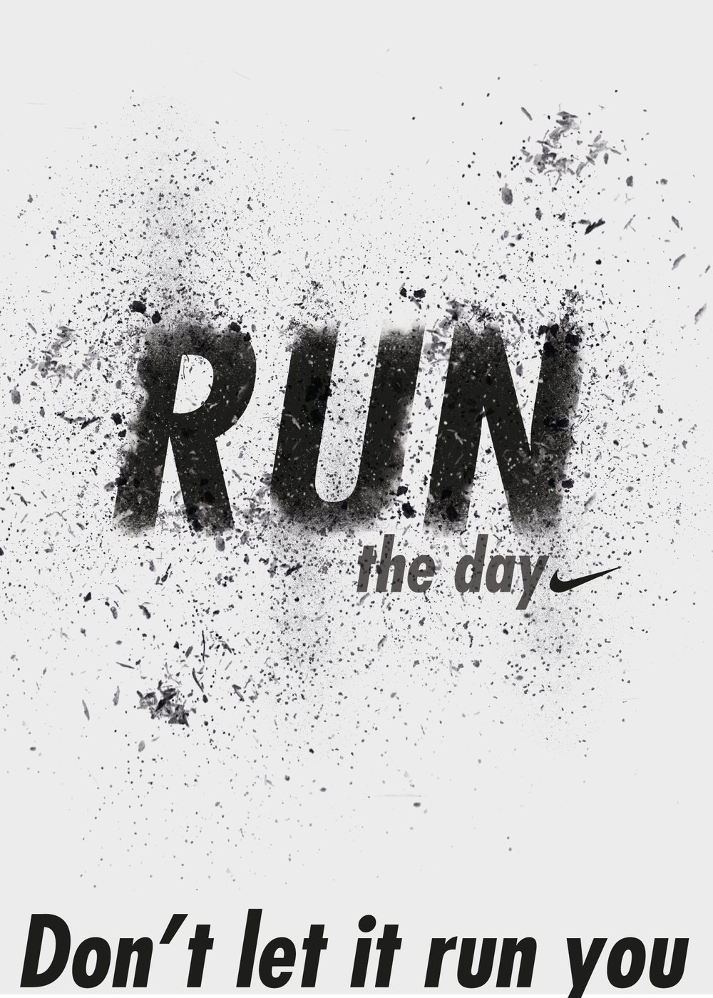
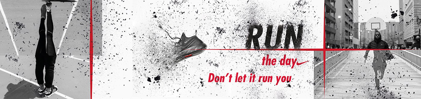
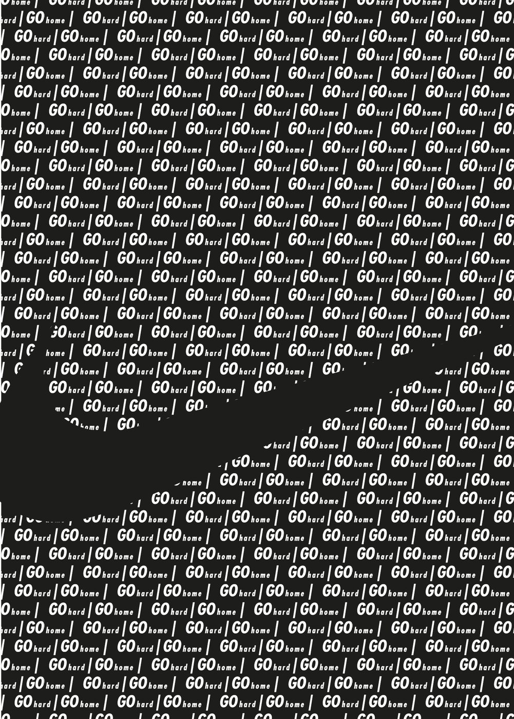
Nike concept posters
Reflection
Working in series taught me to set a rule and then play inside it: the same grid, palette or technique across several posters makes each one stronger, and the set more memorable than any single piece.