PlayCircle – Connect, Host, and Play
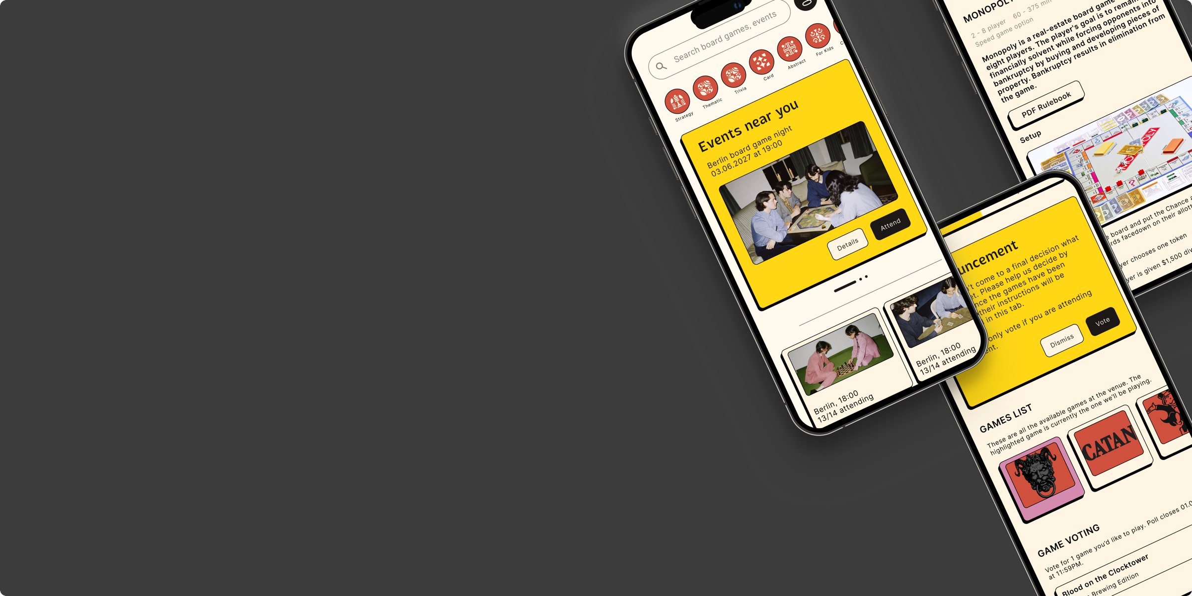
Where cards, dice and good company come together. A board game events app with a playful identity built from the most familiar object at the table: a die.
The brief
Create an app for both active board game players and newcomers, built with the full range of UX methods, from research to A/B testing. We focused on community building: organising and attending in-person game events easily.
My role
A two-person team project. Together we researched, structured, wireframed and tested the app; the brand identity (logo, typography, colour and icons), the component library and the final screens gave it its visual character.
Research in brief
Desk research showed a growing board game market with strong YouTube communities, but no modern platform for in-person events. A survey of active players and beginners pointed to the same pain points: finding events, choosing a game and not knowing the rules. We turned the answers into empathy maps, two personas (Lina, the active player, and Markus, the beginner) and their journey maps.
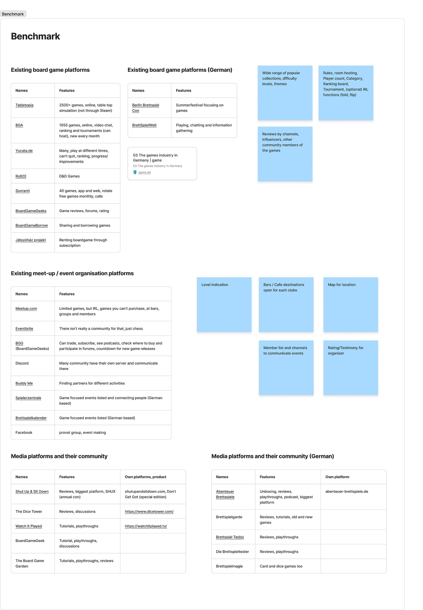
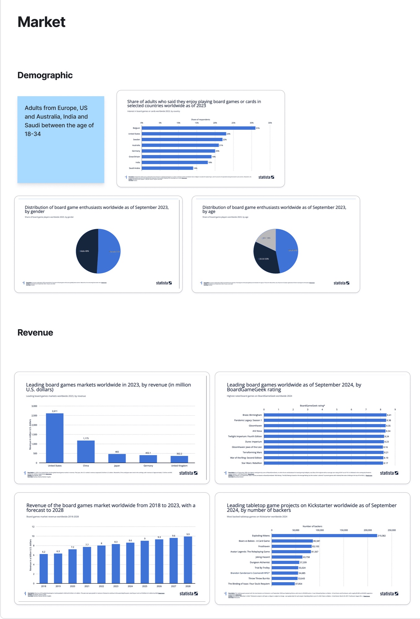
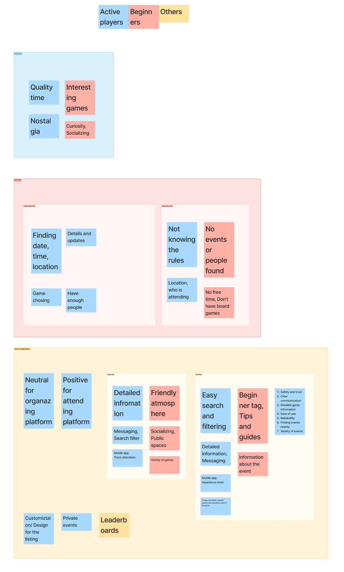
Benchmark, market data and survey insights
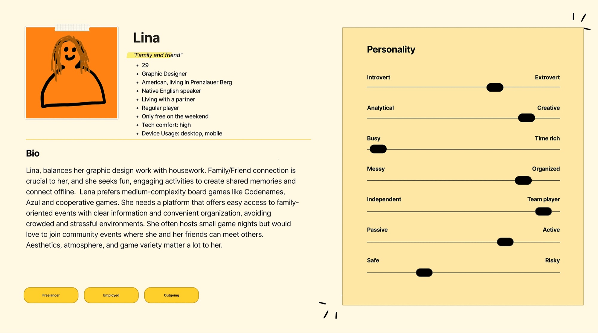
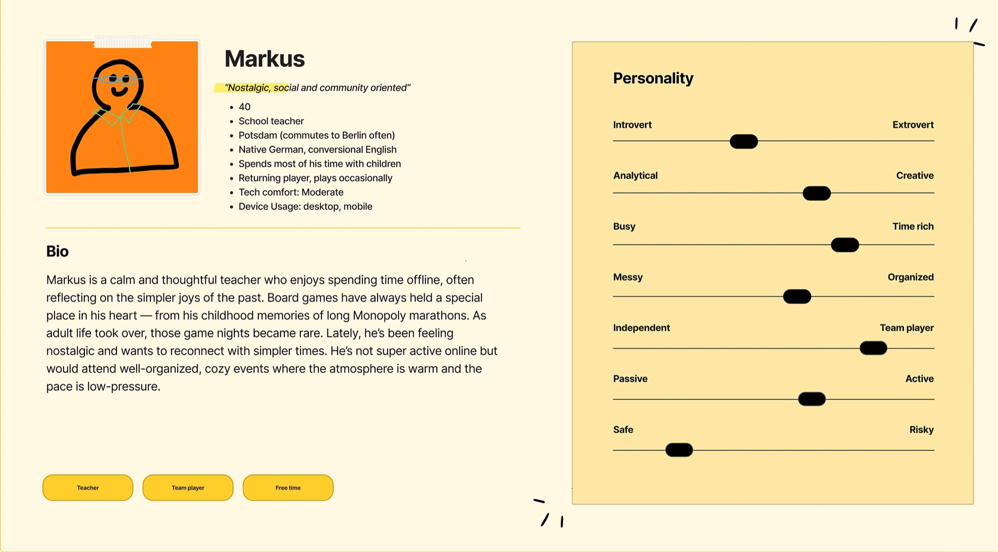
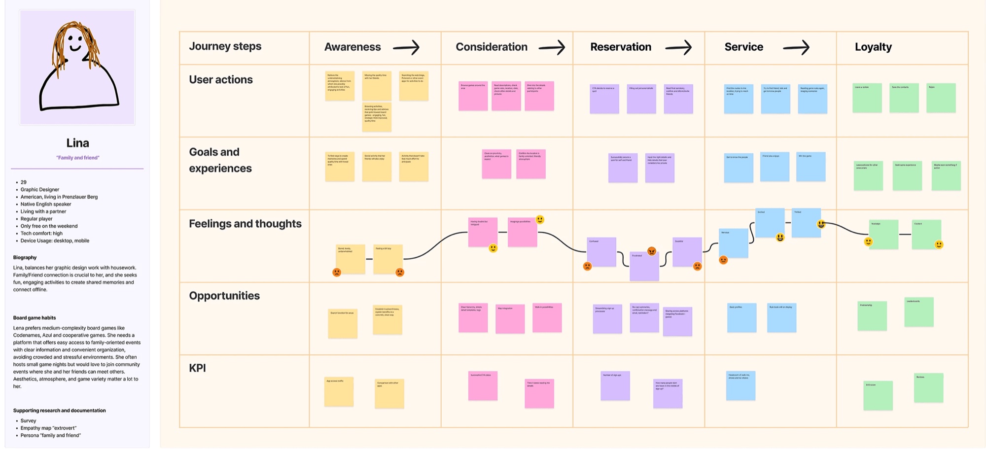
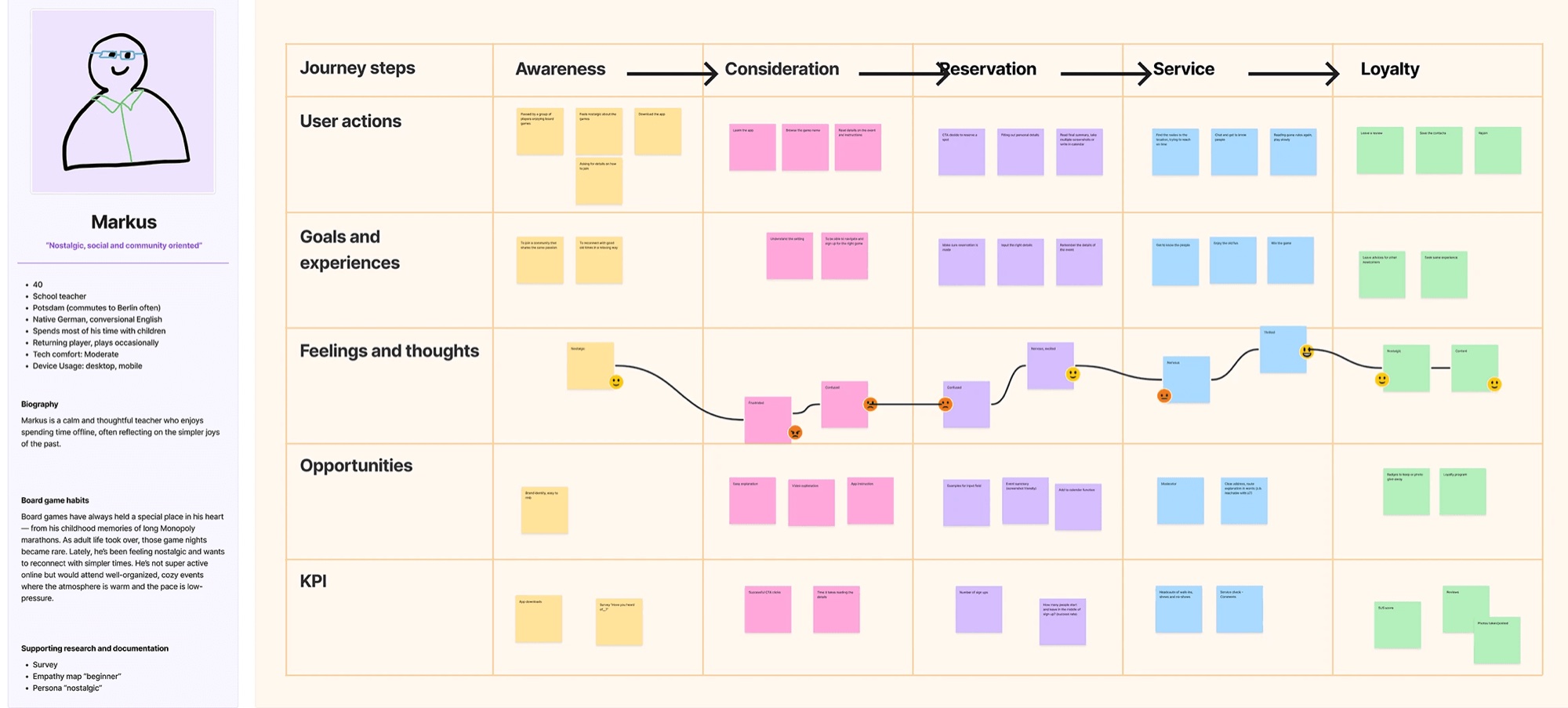
Personas and journey maps for Lina and Markus
Structure and wireframes
Before any visual design we mapped the app into four flows: onboarding, before, during and after the event. Then we wireframed the core functions in greyscale, so layout and hierarchy could be judged on their own, without colour.
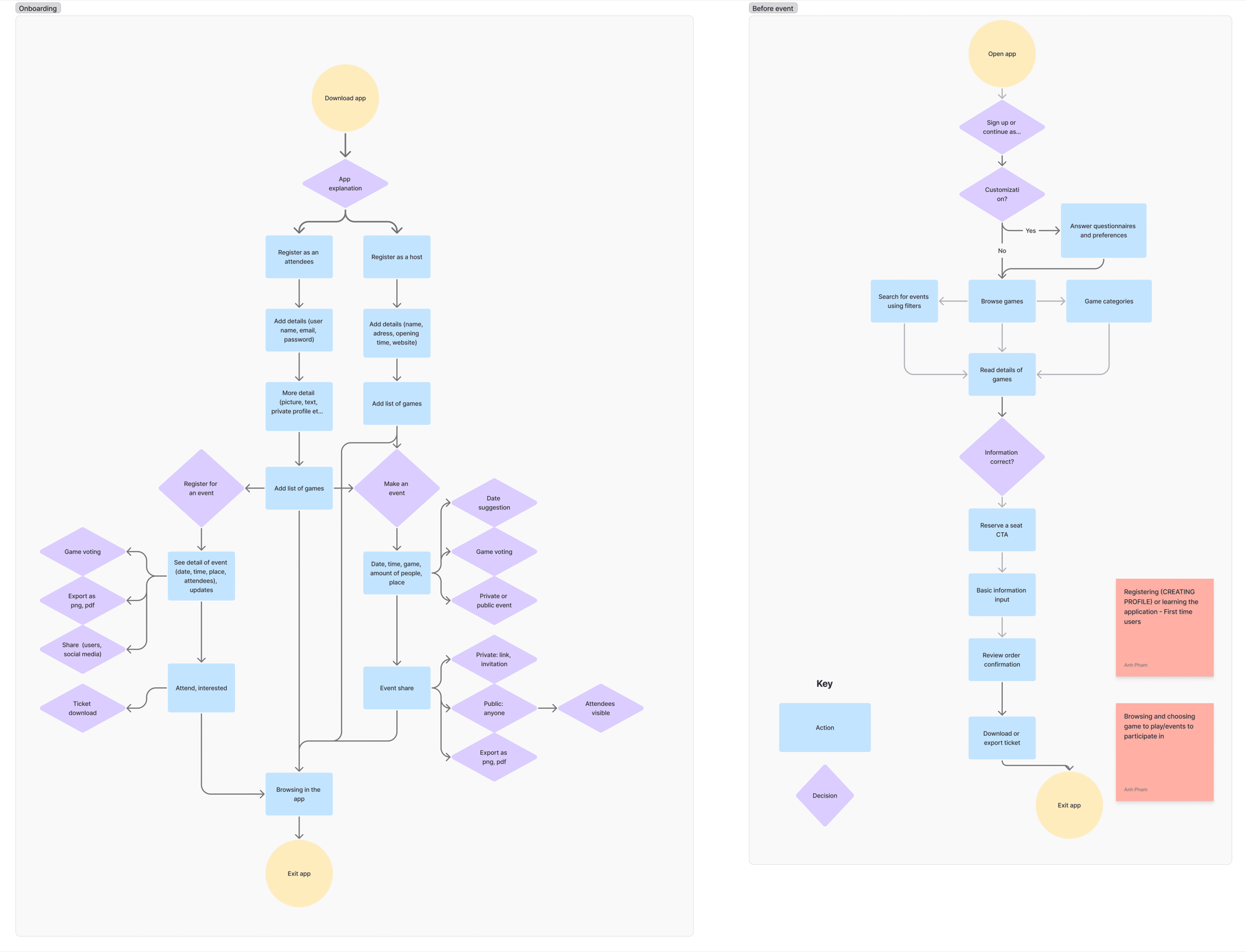
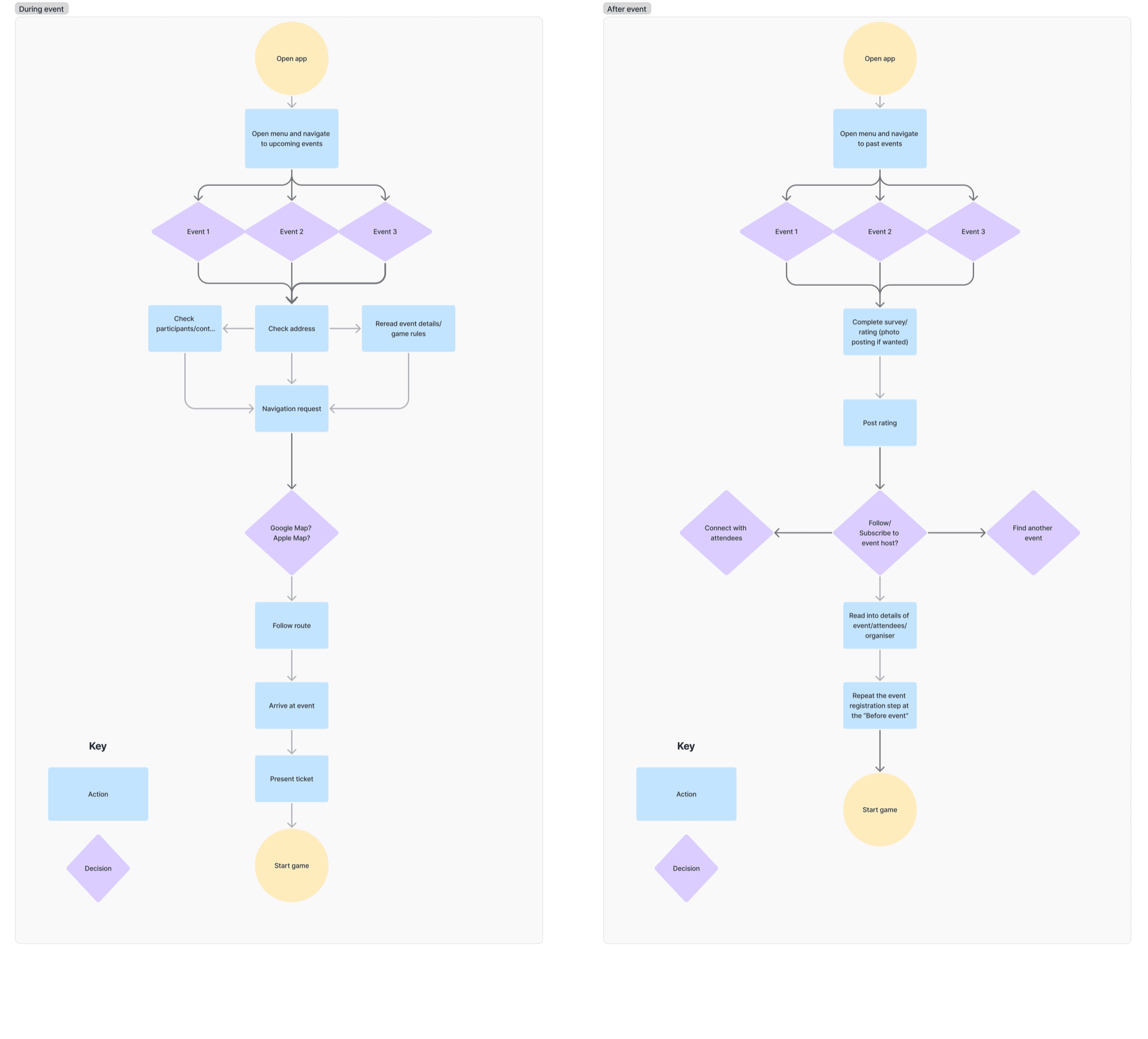
User flows
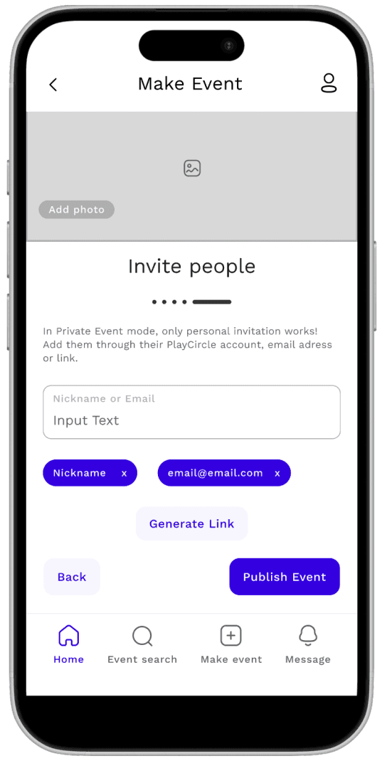
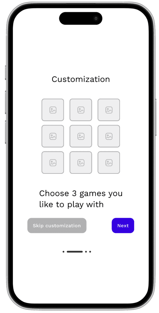
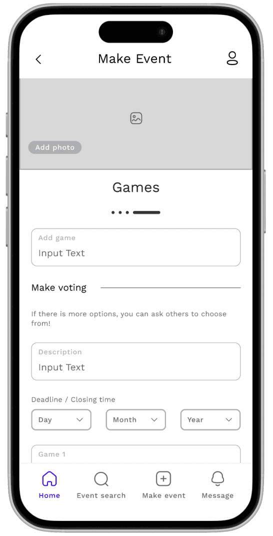
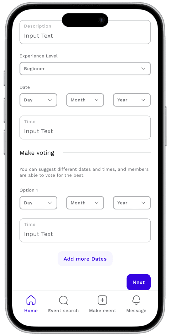
Low-fidelity wireframes
We A/B tested competing layouts with Maze. The biggest lesson: our team, our teacher and other students all preferred version B of the call-to-action placement, but users chose version A.
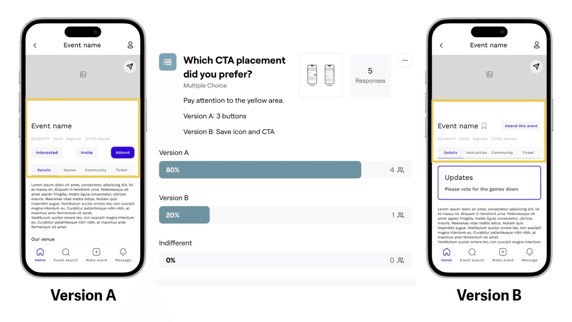
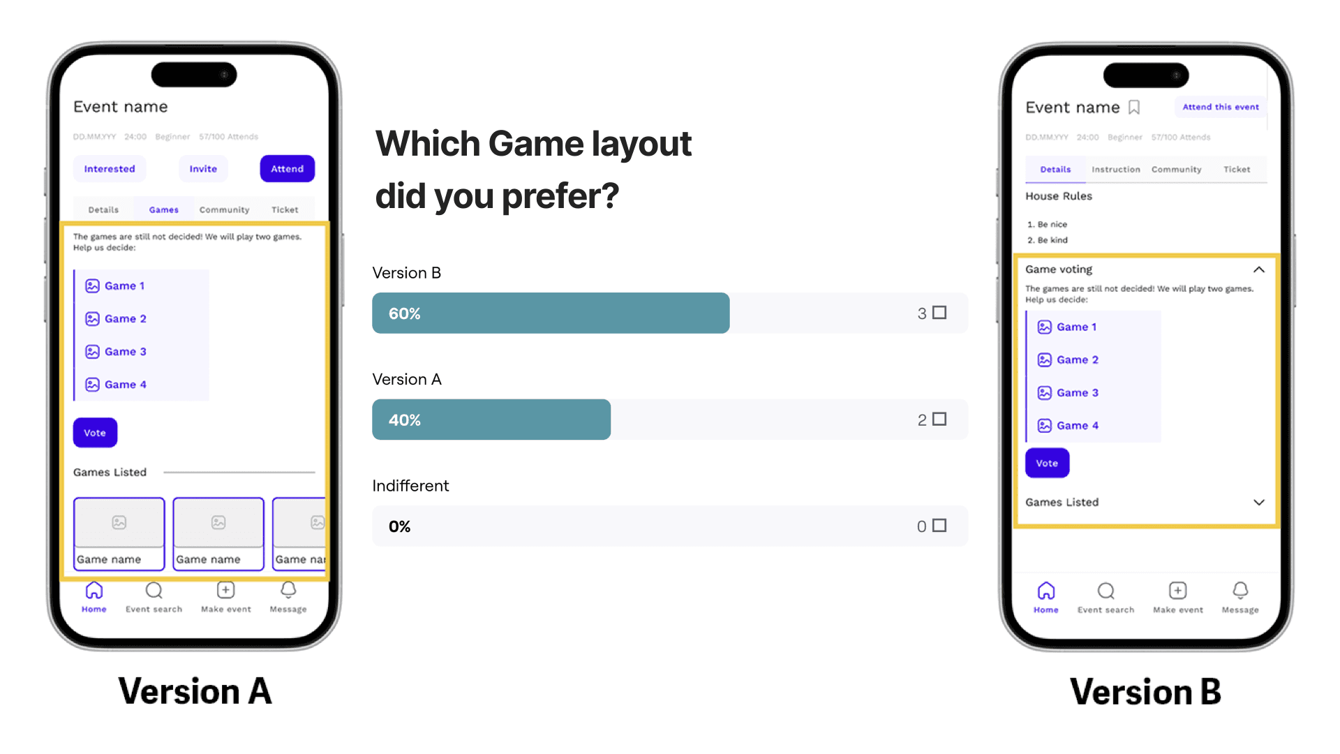
A/B test results
Brand identity
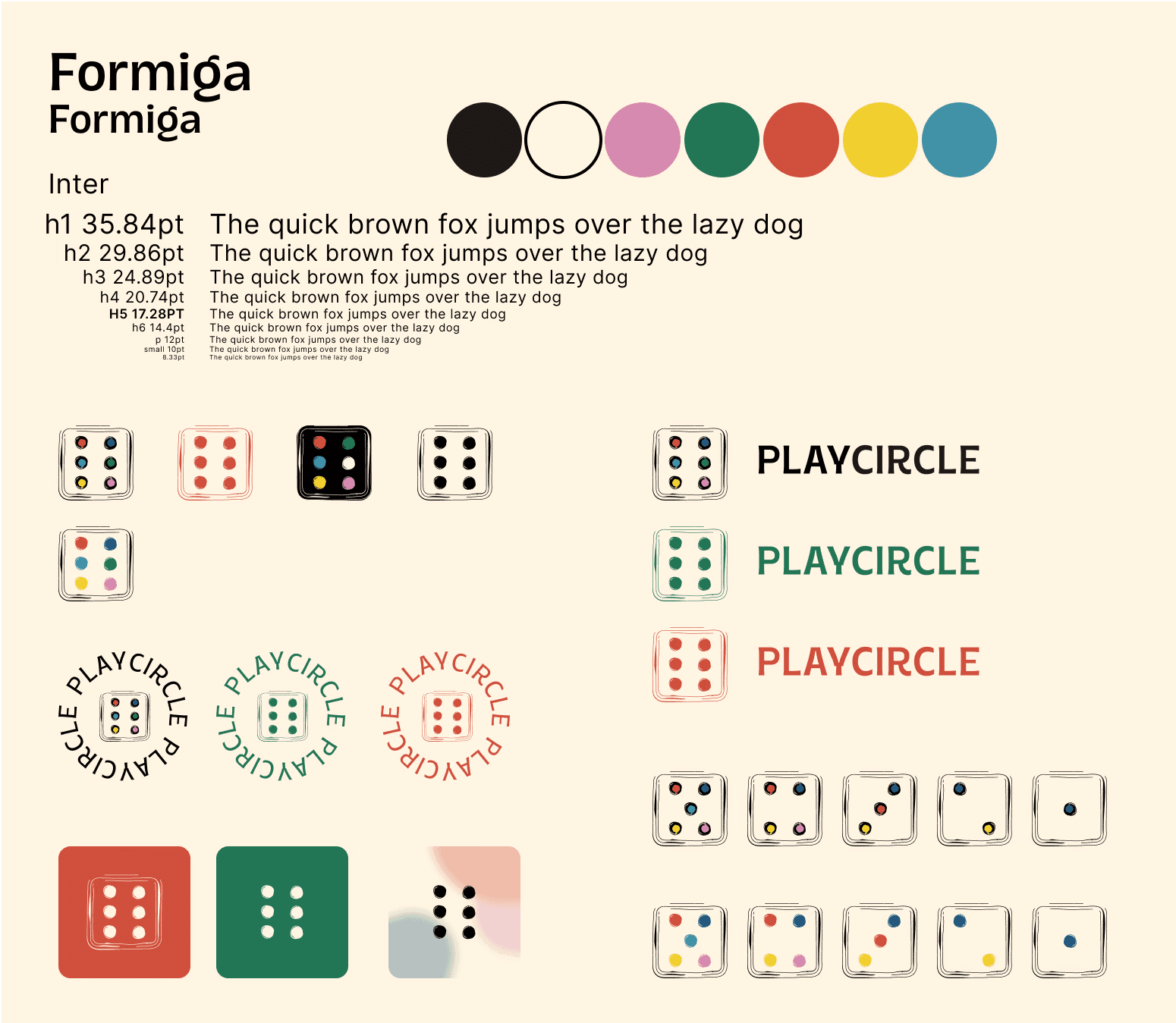
The name says it: people coming together around a table. The logo is a die with coloured pips, surrounded by the word PLAYCIRCLE set in a circle, like players sitting around a game. The die also works on its own as the app icon and as a family of icons, where the number of pips changes from one to six.
- FormigaA friendly, rounded display face for headlines and the wordmark.
- InterA clear sans-serif for everything else, on a defined type scale from h1 to small print.
- Board black
#000000 - Game red
#D0503D - Table green
#227655 - Dice yellow
#F1CF2F - Token blue
#4192A6 - Card pink
#D68AB0 - Paper cream
#FFF5E3
The colours come straight from board game pieces and are always set on a warm cream background, like the paper of a rule book, instead of a cold white.
Components and final screens
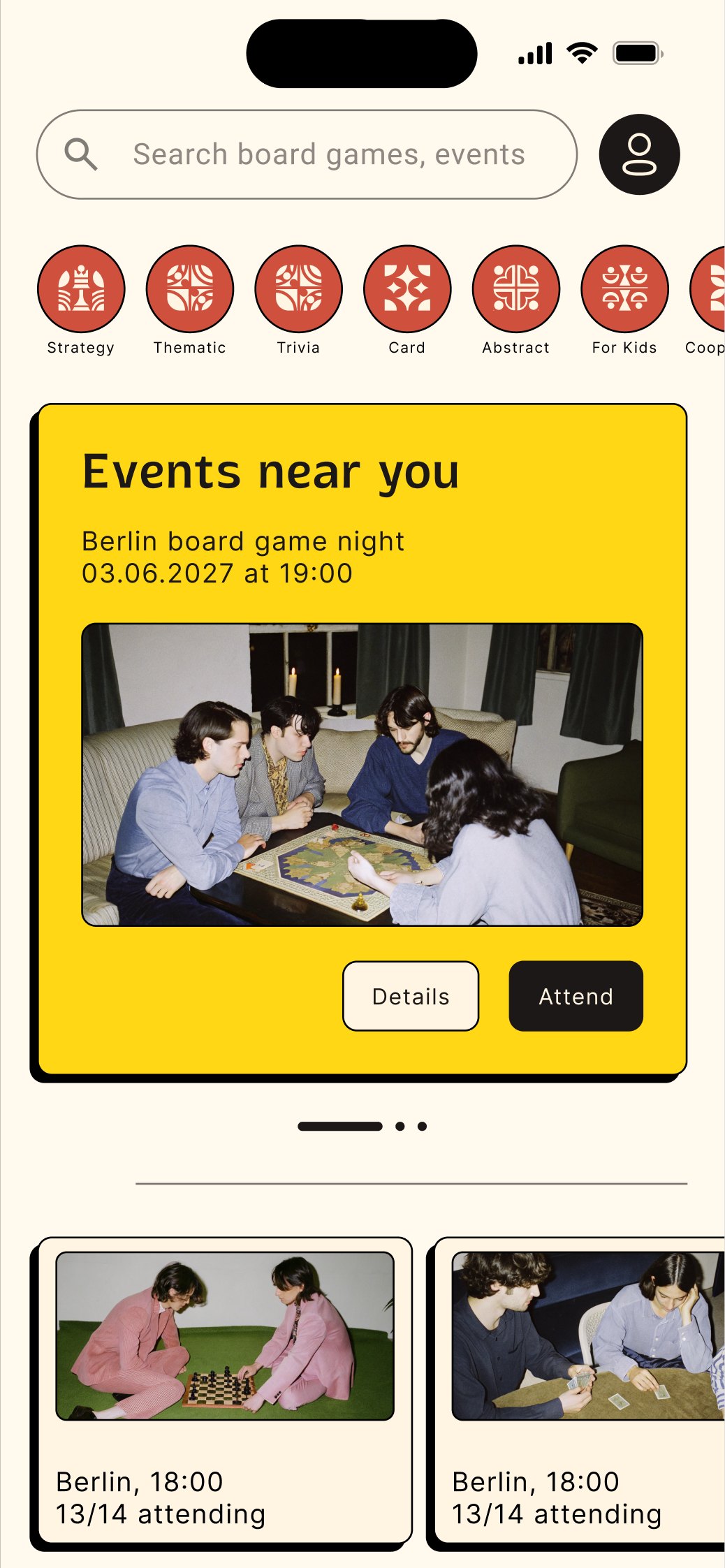
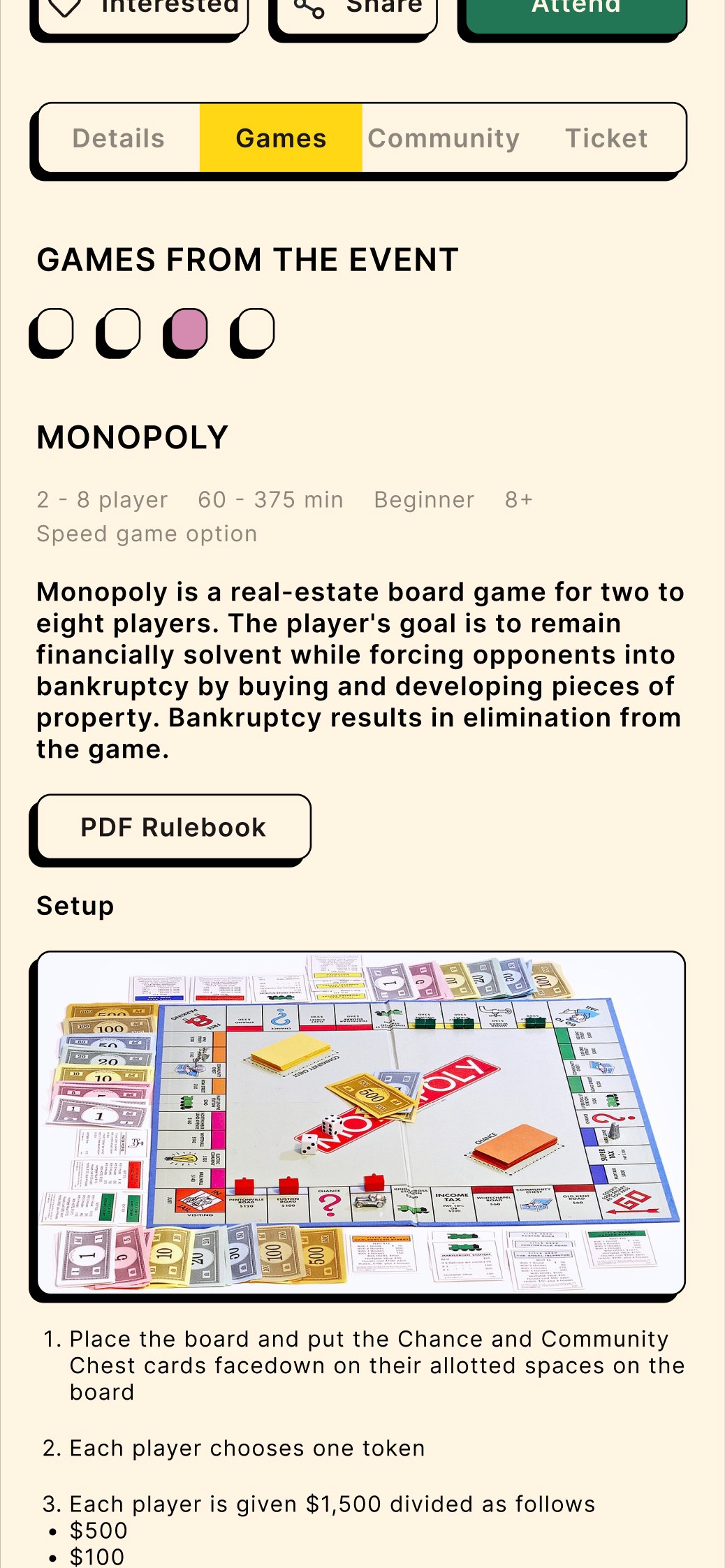
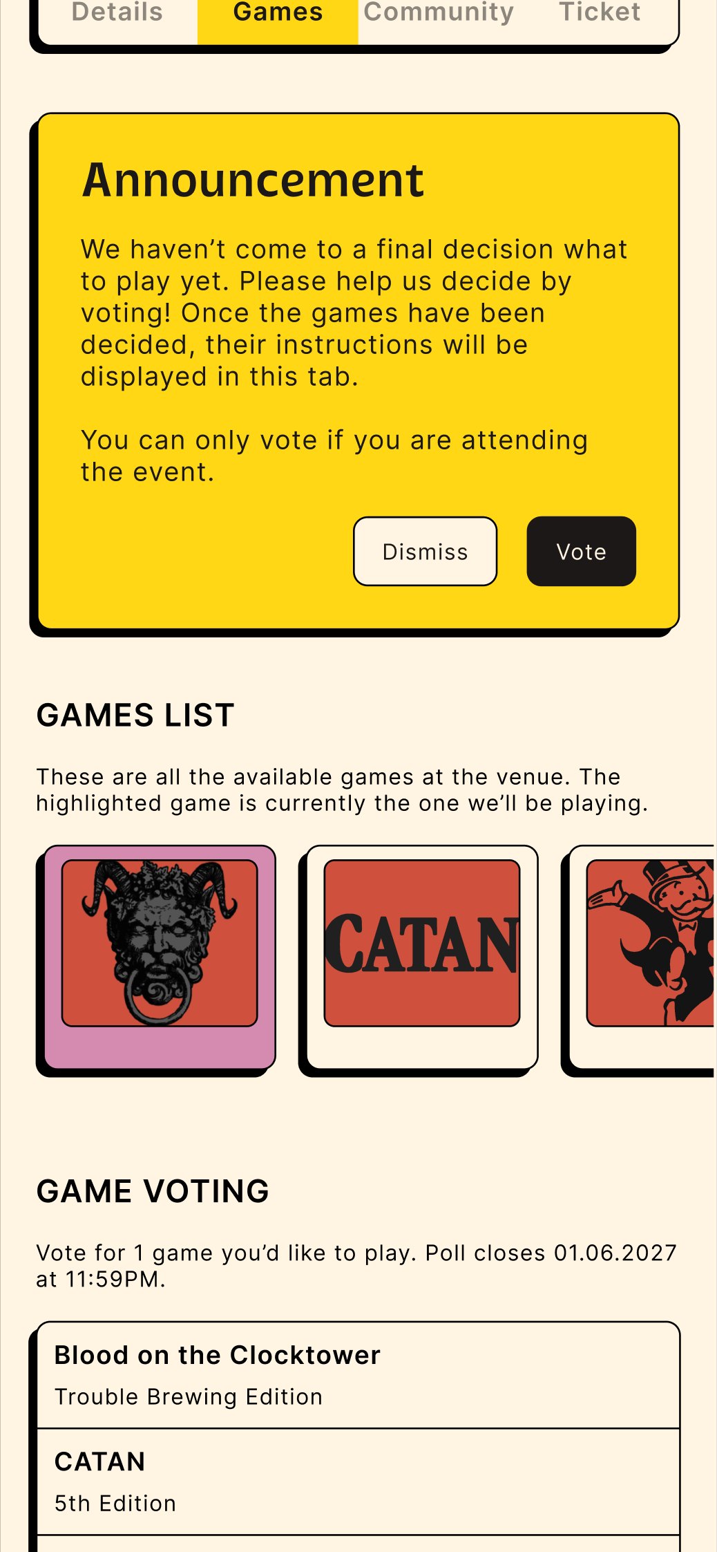
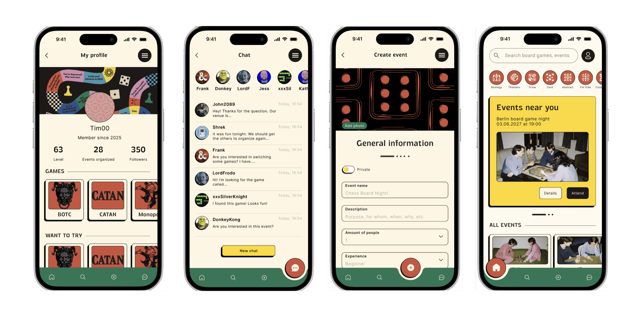
We built the component library before designing screens, so every element shares the same language: thick dark outlines and offset shadows that make cards and buttons feel like physical game pieces, round red icons for the game categories, a yellow card for the featured event, and a green tab bar where a red button moves to the active tab.
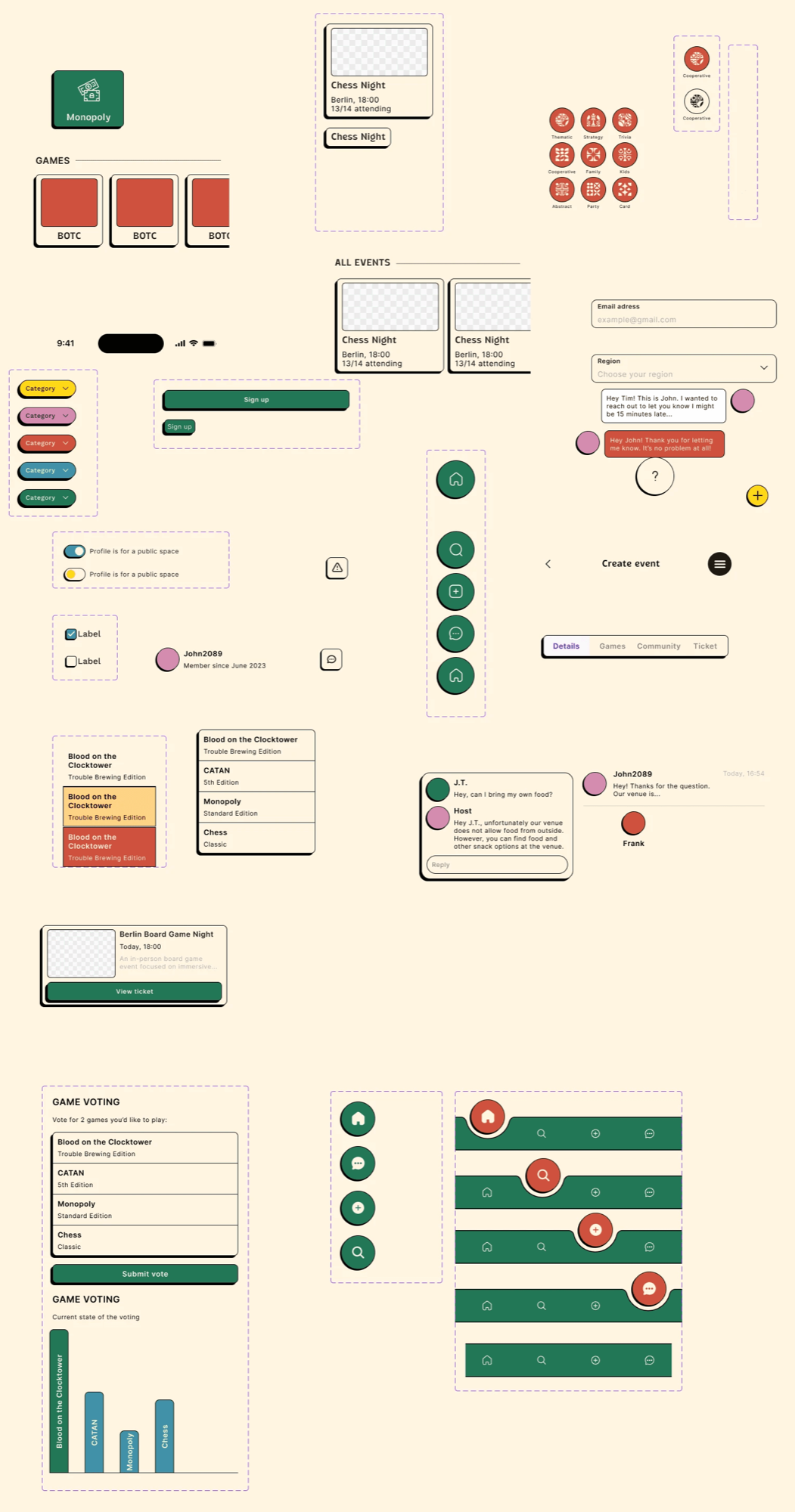
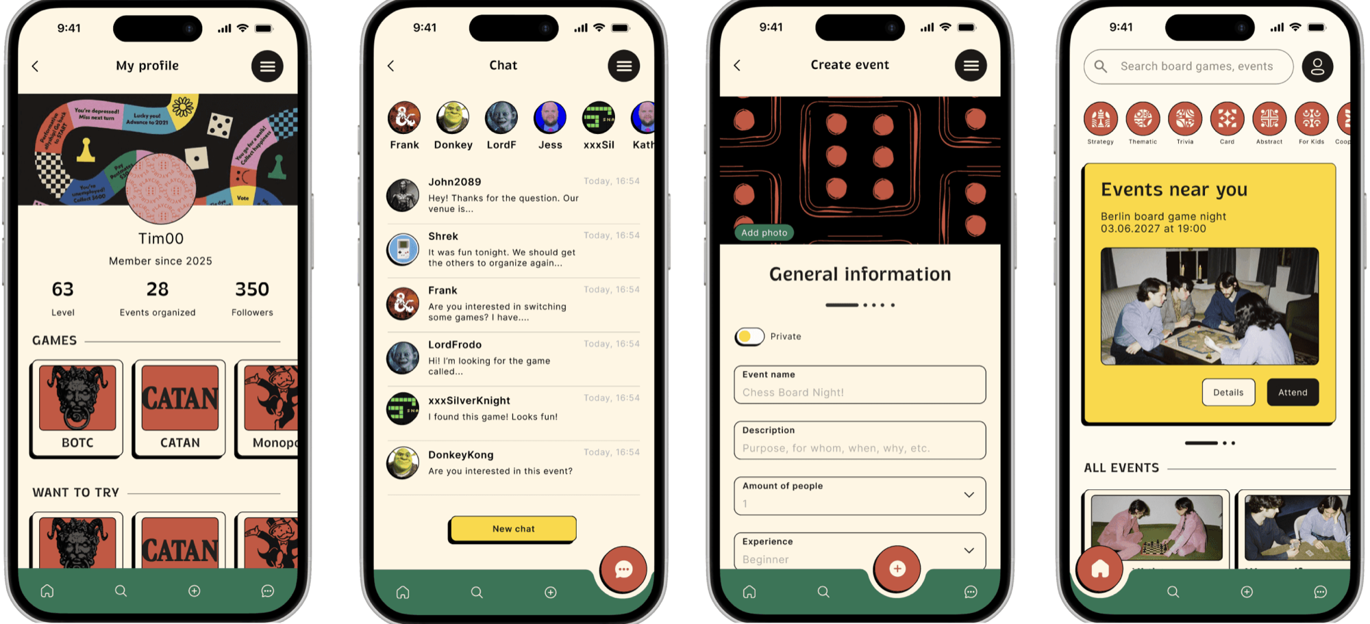
The component library and final screens
Reflection
PlayCircle was born from a simple idea: bridging our digital lives and the physical joy of sitting around a table with a board game. Giving it an identity drawn from real game pieces made the app feel like part of that world rather than another generic social app.
The A/B tests were the most eye-opening part: they reminded us to set our own taste aside and let users decide. And on a personal note, as a huge board game fan, this project is very close to my heart.