Kuvio Kiki – A Pattern Design Identity
A Finnish-inspired identity for a pattern design brand, where the name itself becomes the pattern.
The brief
Kuvio Kiki is a pattern design brand with a Finnish soul: kuvio means “pattern” in Finnish. The identity had to feel Nordic and handmade, work on products as well as on paper, and, fittingly for the name, be able to turn into patterns by itself.
My role
I created the whole identity: research into Finnish folk art, the logo and a custom geometric alphabet, the colour palette, the pattern system, and its applications from packaging and textiles to social media.
Concept
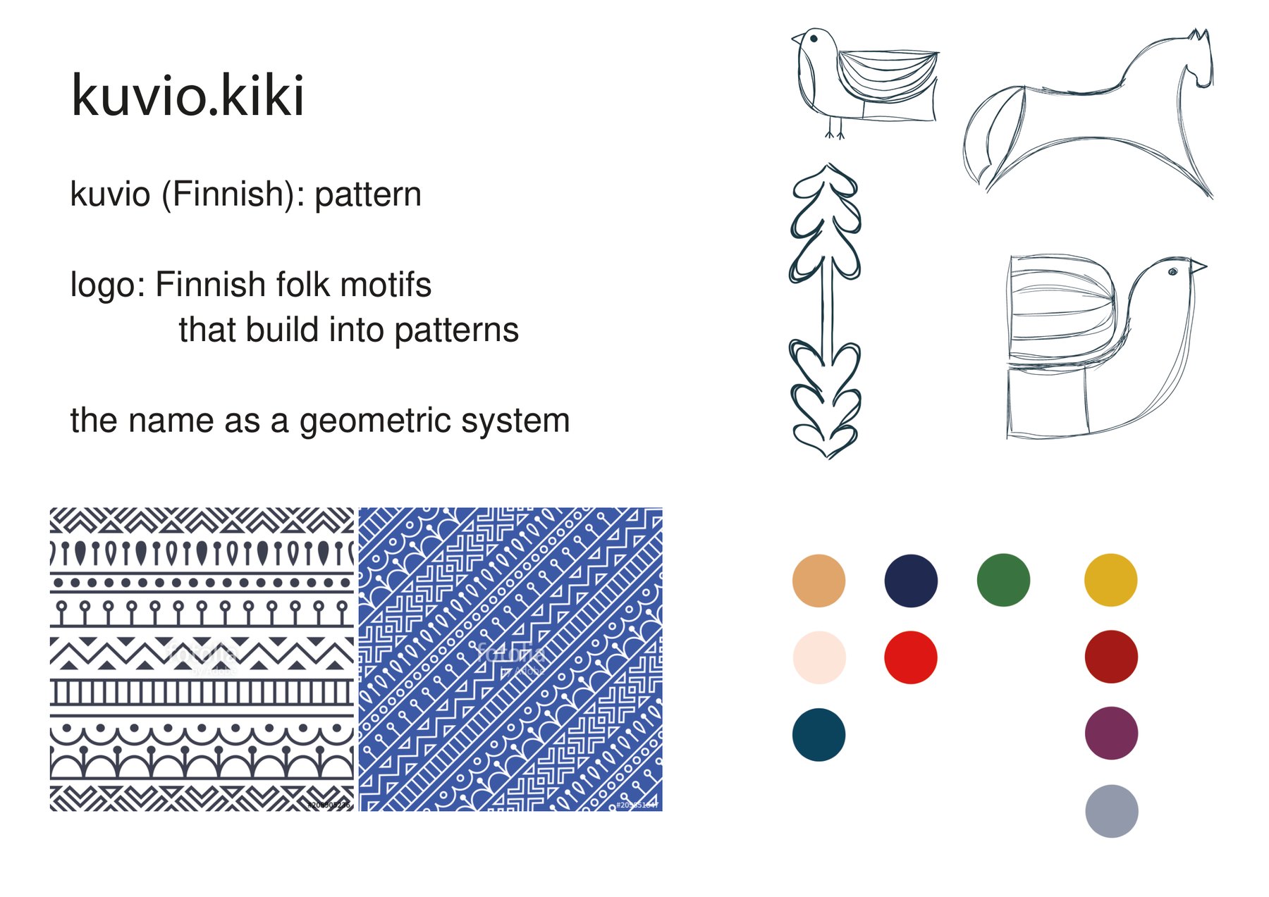
The concept board set three rules for the identity:
- Finnish folk motifsThe visual roots: birds, horses and plant motifs from Nordic folk art.
- Made to repeatEvery element has to work on its own and in a repeating pattern.
- A geometric nameThe name itself is turned into a system of simple geometric shapes.
From folk motifs to geometry
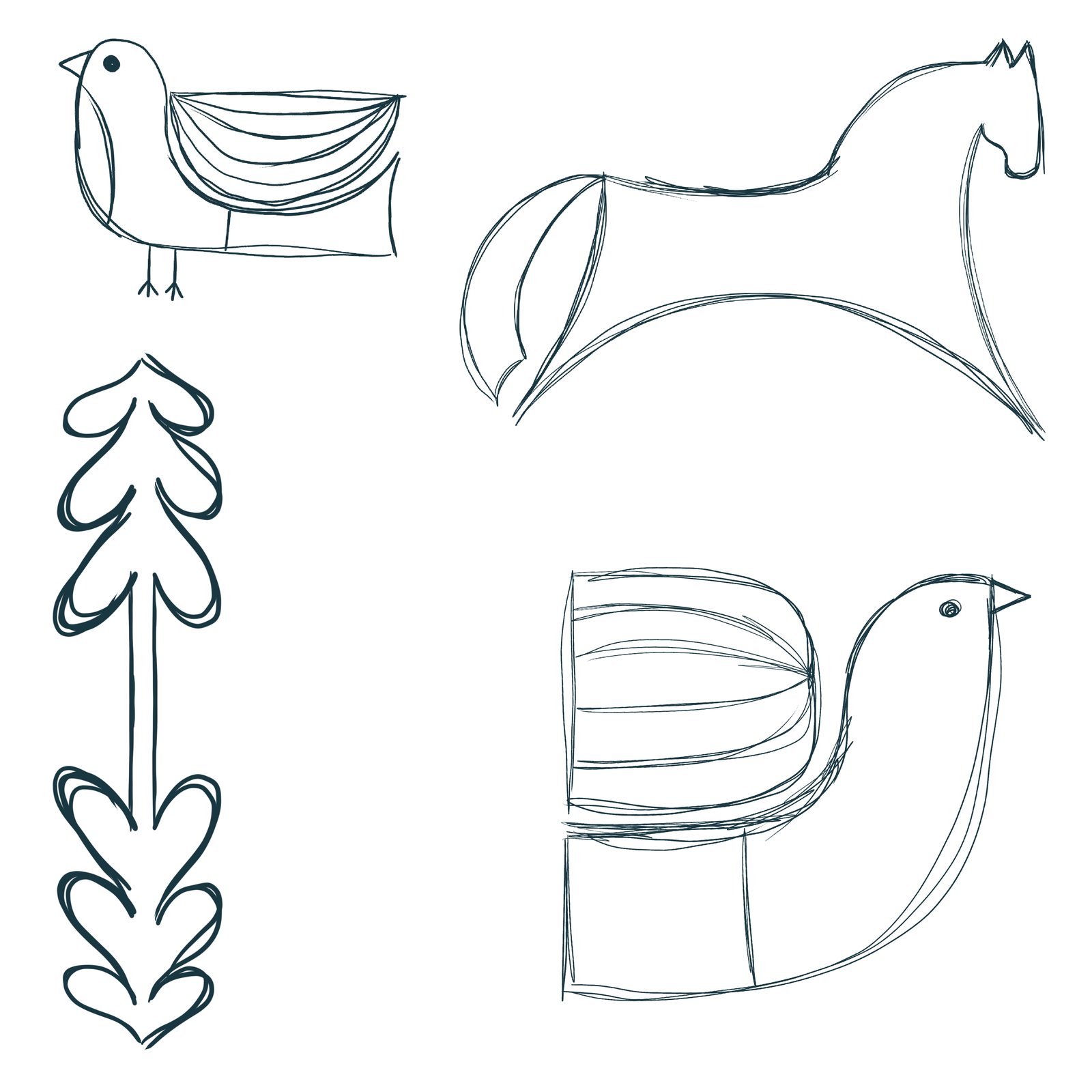
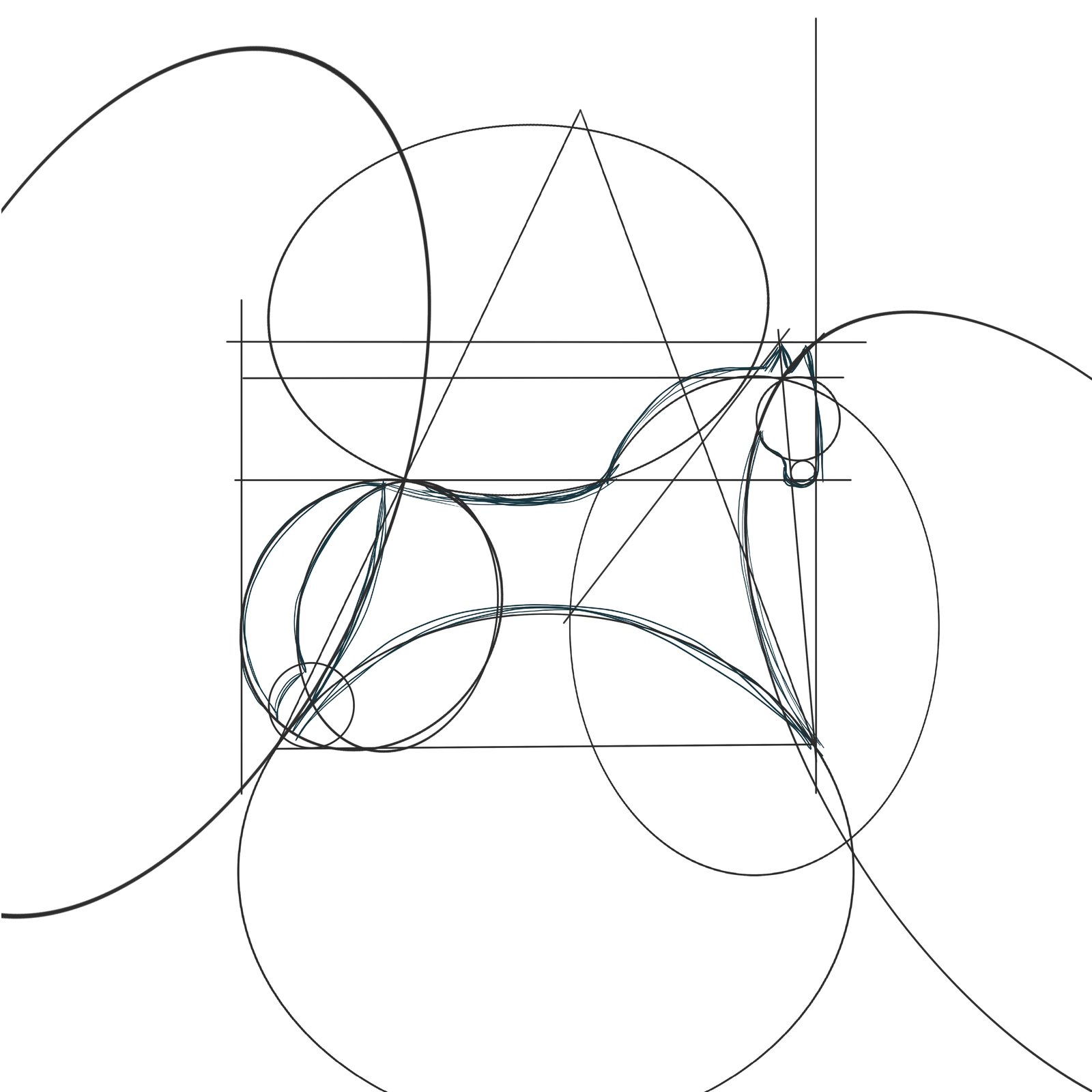
I started by drawing the classic motifs of Finnish folk art: a bird, a horse and a fir-like plant. Then I rebuilt each one on a construction grid of circles and straight lines, so every curve comes from basic geometry. Repeated, the motifs became my first line patterns.
In the end, the detailed folk motifs felt like too much for the simplicity of Scandinavian design, so I took a different turn: I kept the geometry behind them and left the motifs themselves behind. That decision led straight to the logo and the alphabet.
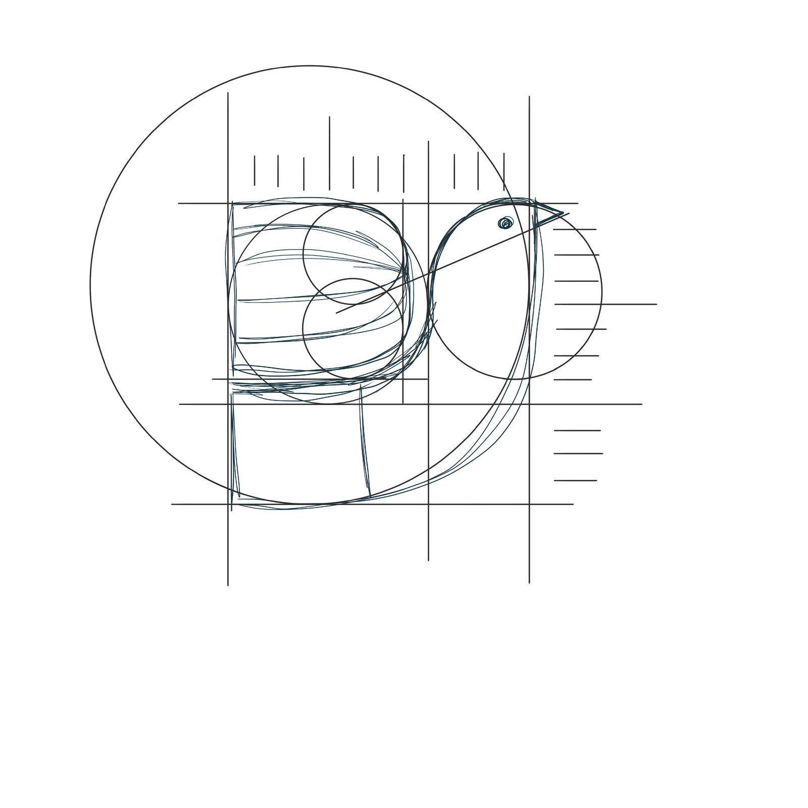
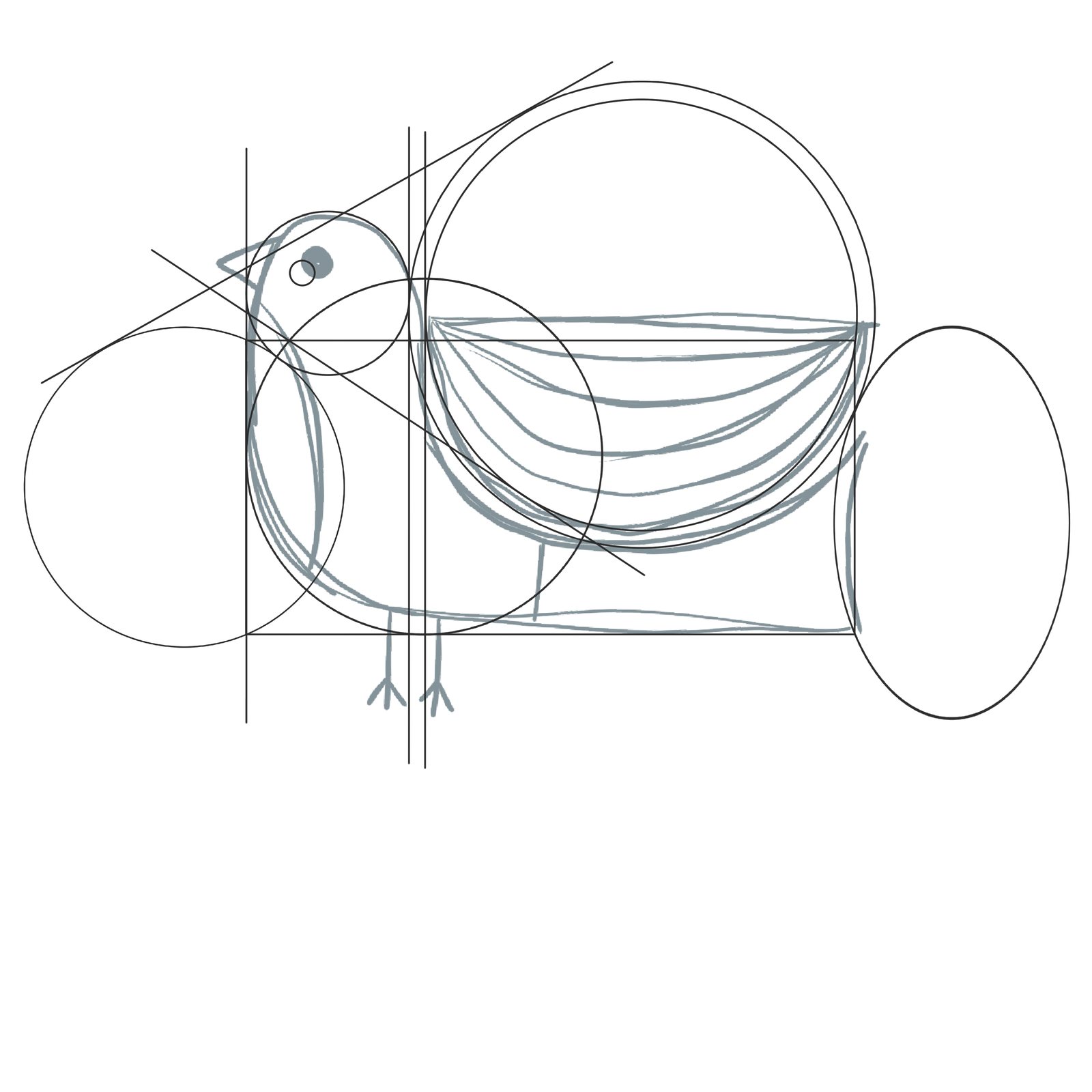
Folk motifs and their geometric construction
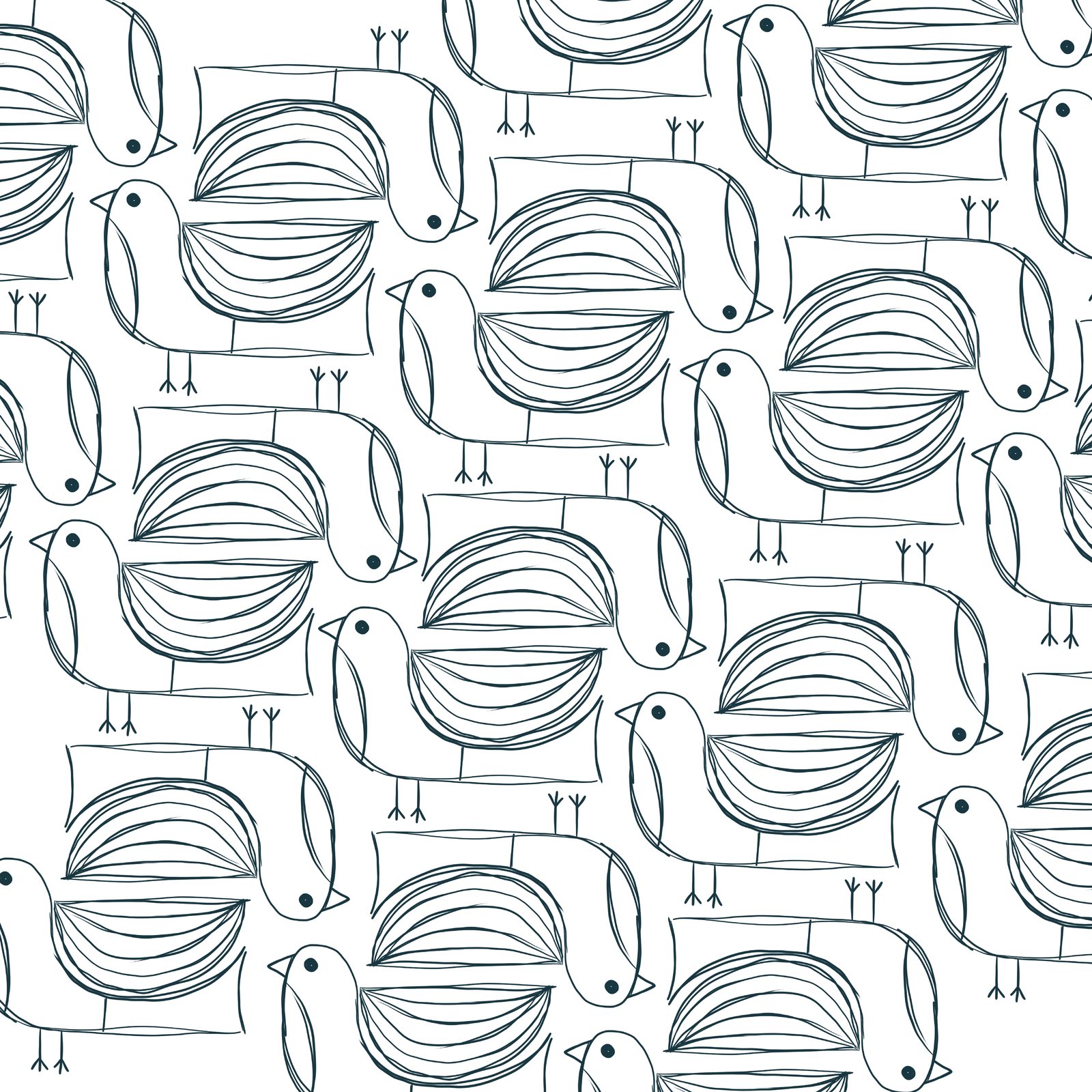
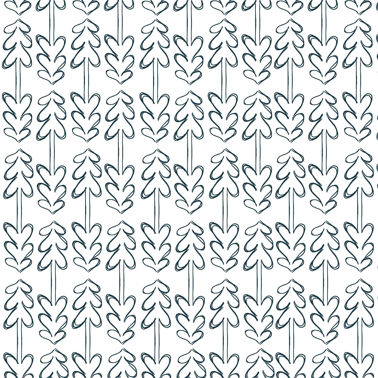
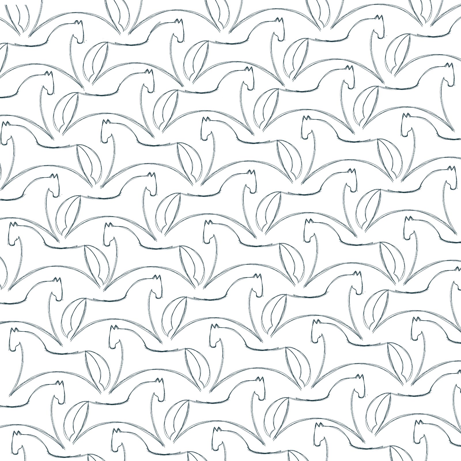
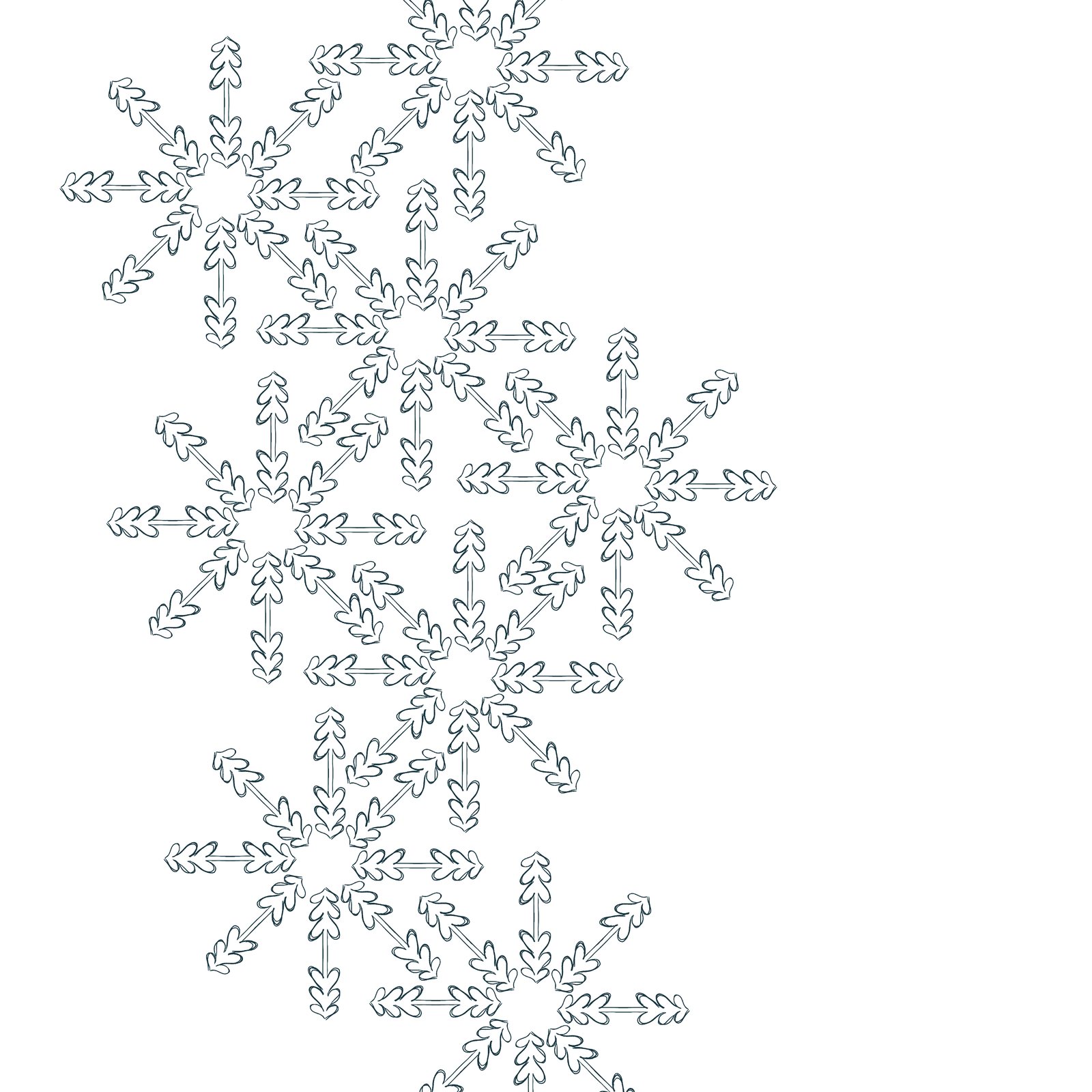
The first line patterns
Logo
For the logotype I tested the name in different geometric languages: letters made only of circles, only of triangles, only of lines, and mixed shapes. The mixed version won. It stacks KUVIO over KIKI in heavy letters cut from basic shapes: a notched K, a round O and blocky strokes. Solid and playful, like a stamp or a paper cut-out.
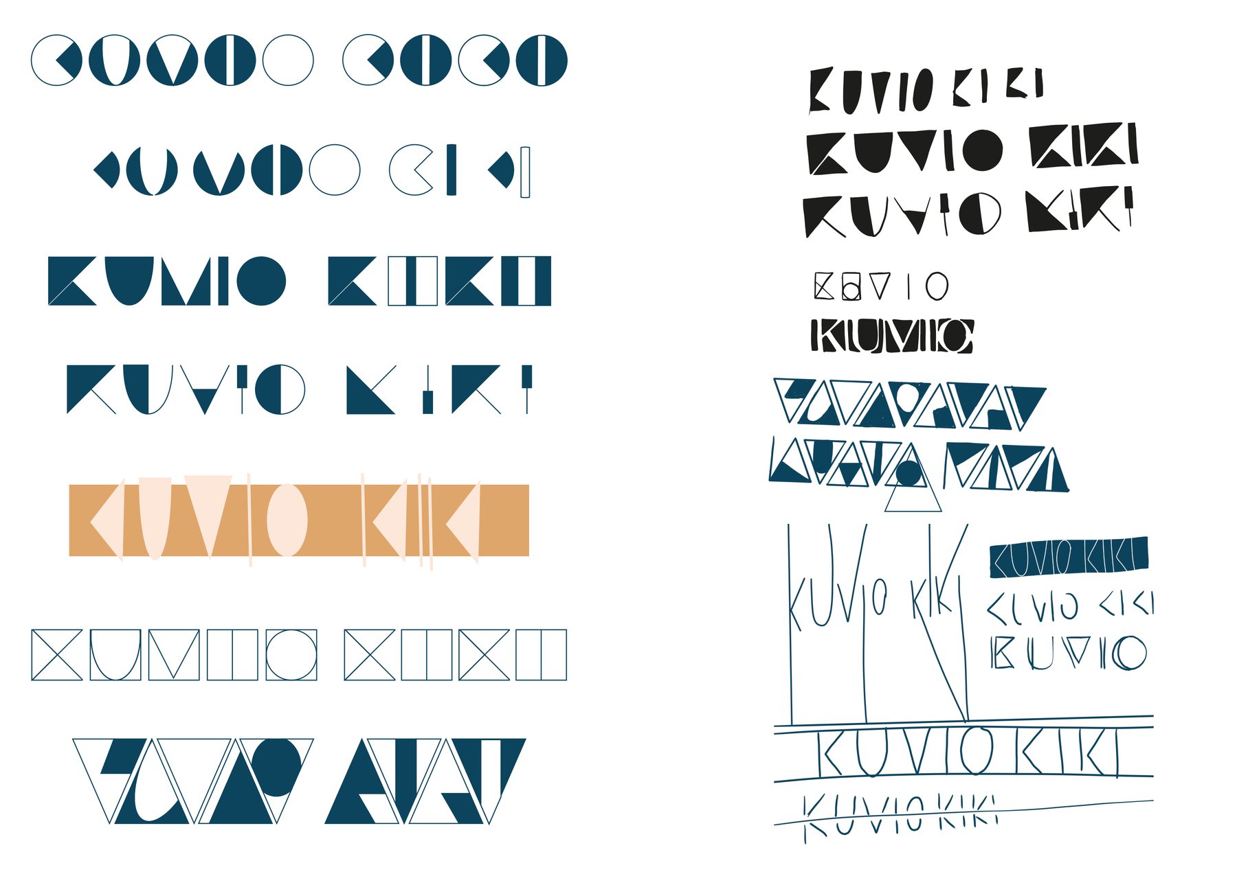
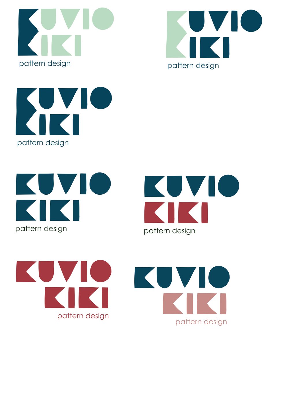
Logotype explorations and the final logo in colour variations
Alphabet and colour
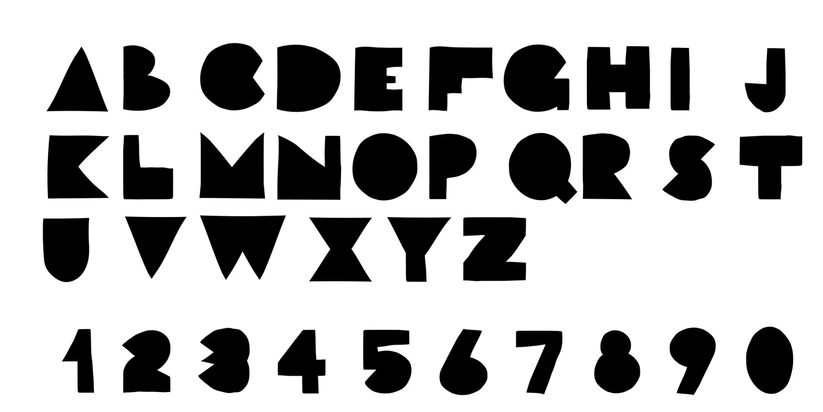
The logo grew into a complete geometric alphabet with numbers, so any word can be written in the brand’s own voice. This is what makes the identity flexible: new patterns and headlines can be set without drawing anything new.
The palette mixes warm Nordic earth tones with a deep teal. The teal carries the logo, and the softer colours come in through the patterns.
- Deep teal
#09465B - Sand
#D89E6E - Berry
#A63841 - Dusty rose
#C38C87 - Mint
#B9DBC2
The pattern system
With the alphabet in place, the patterns write themselves. I built three families:
- Positive wordsJoy, awe, love, hope, kindness, optimism: set in tight rows until they turn into texture.
- Finnish wordsEveryday Finnish words and cultural favourites, from sisu to juhannus and salmiakki.
- Letter confettiSingle letters and fragments scattered across the surface, reading as abstract shapes.
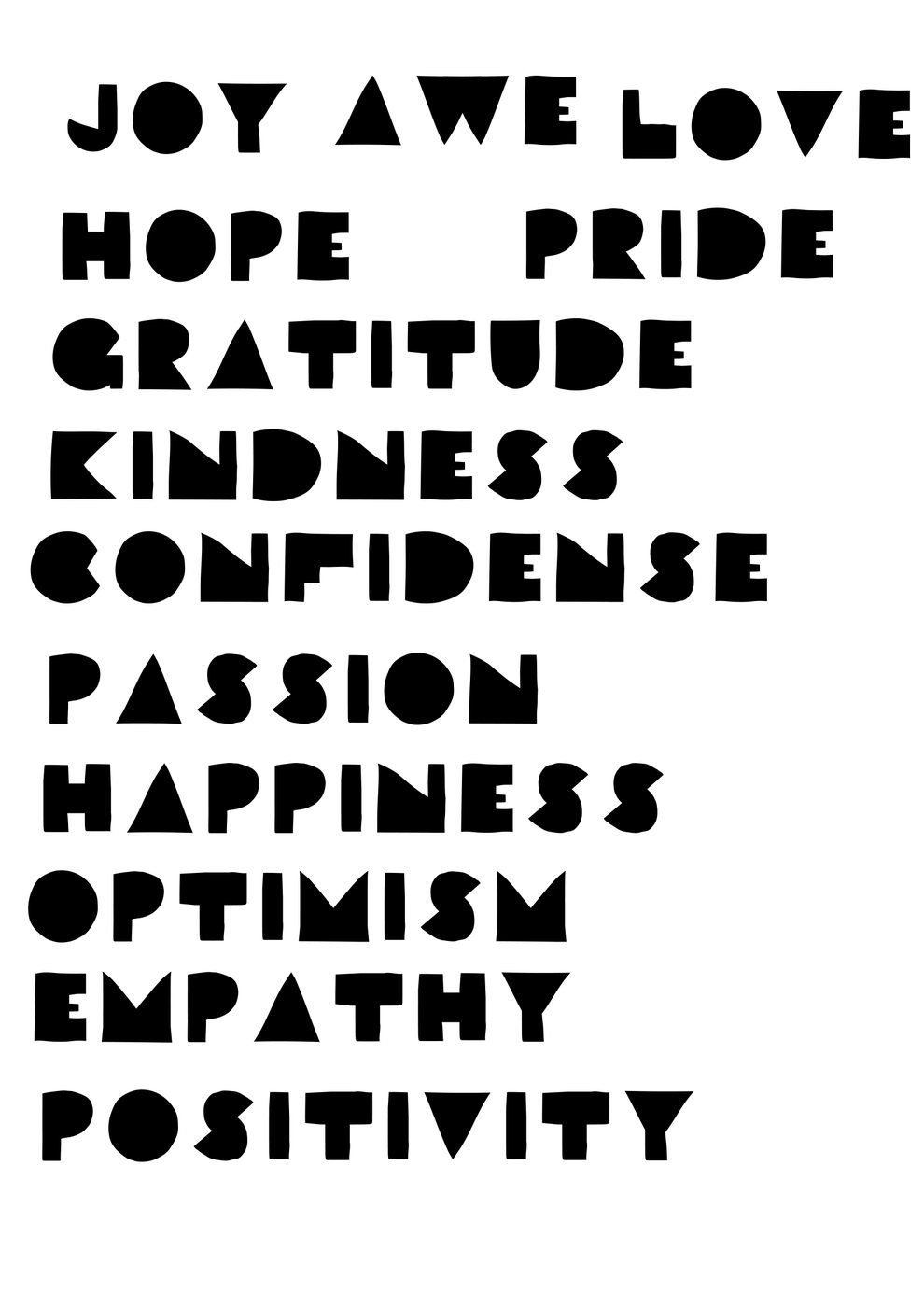
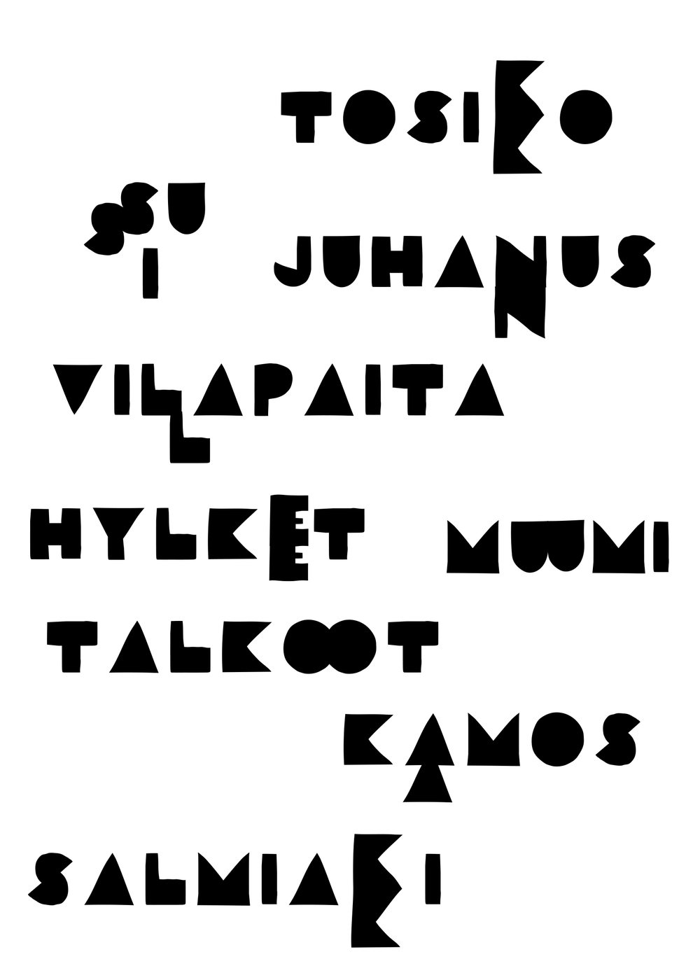
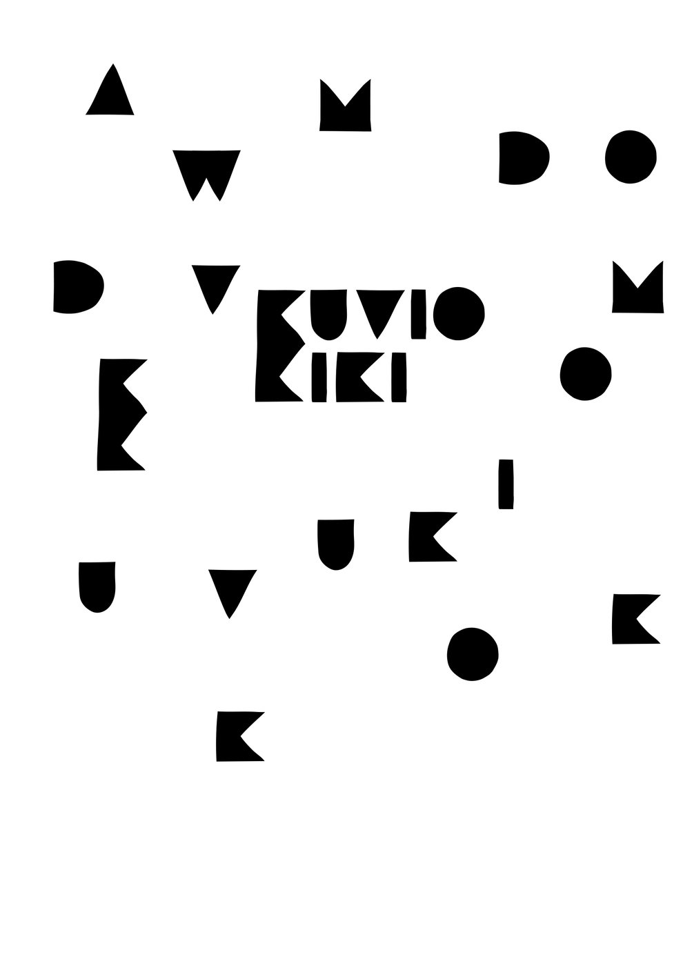
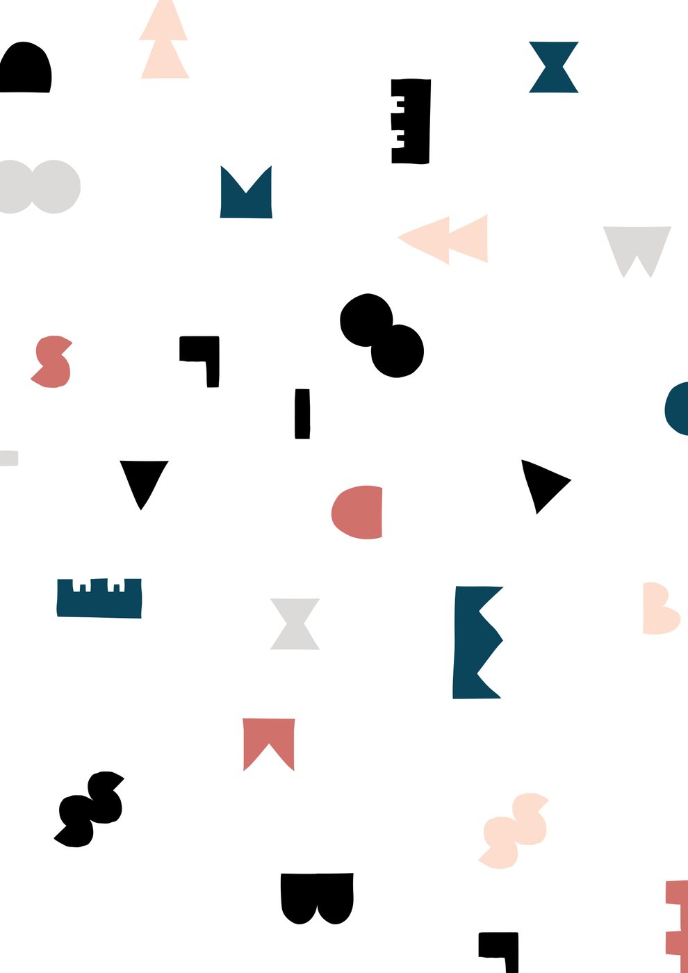
Word patterns and letter confetti
Applications
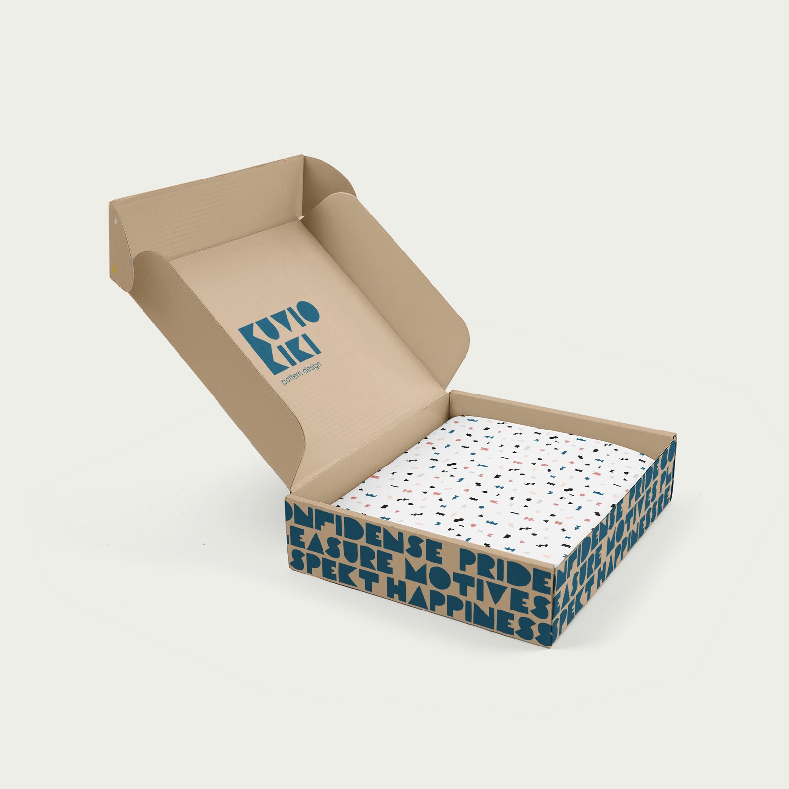
A pattern brand lives on objects, so I tested the system on the things Kuvio Kiki would sell and send. The packaging keeps the lid calm with just the logo, and lets a band of words run around the sides, so the box is branded from every angle.
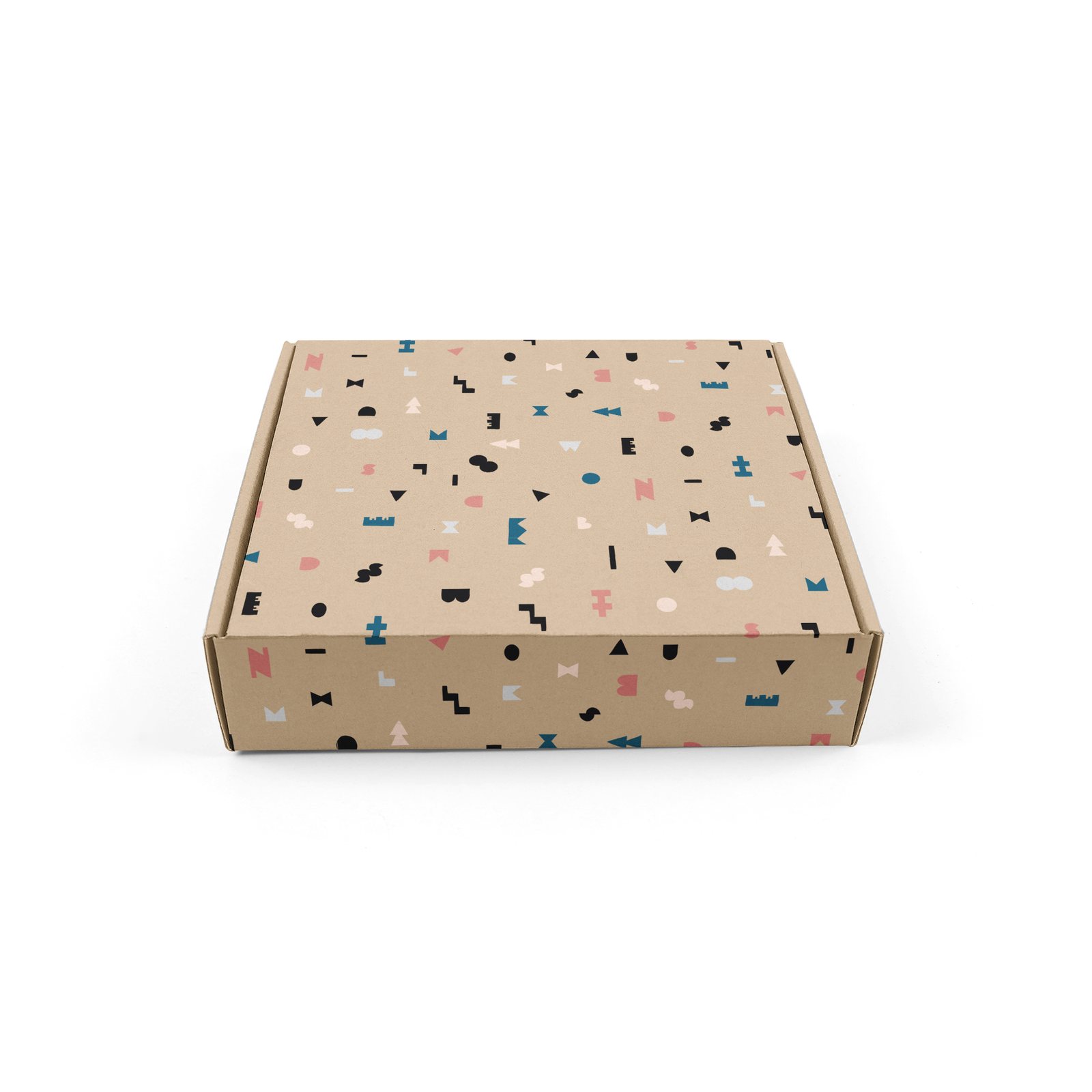
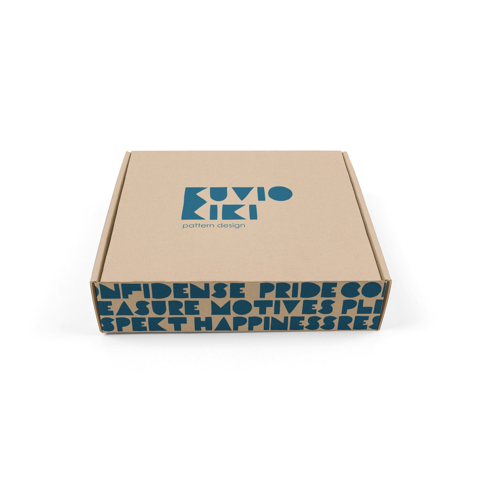
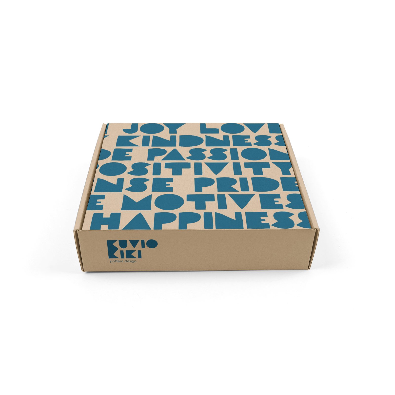
Packaging
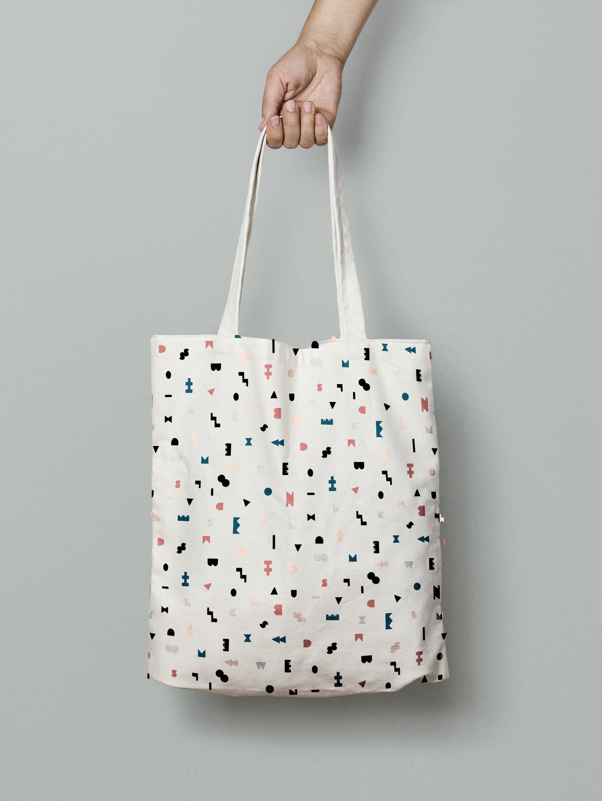
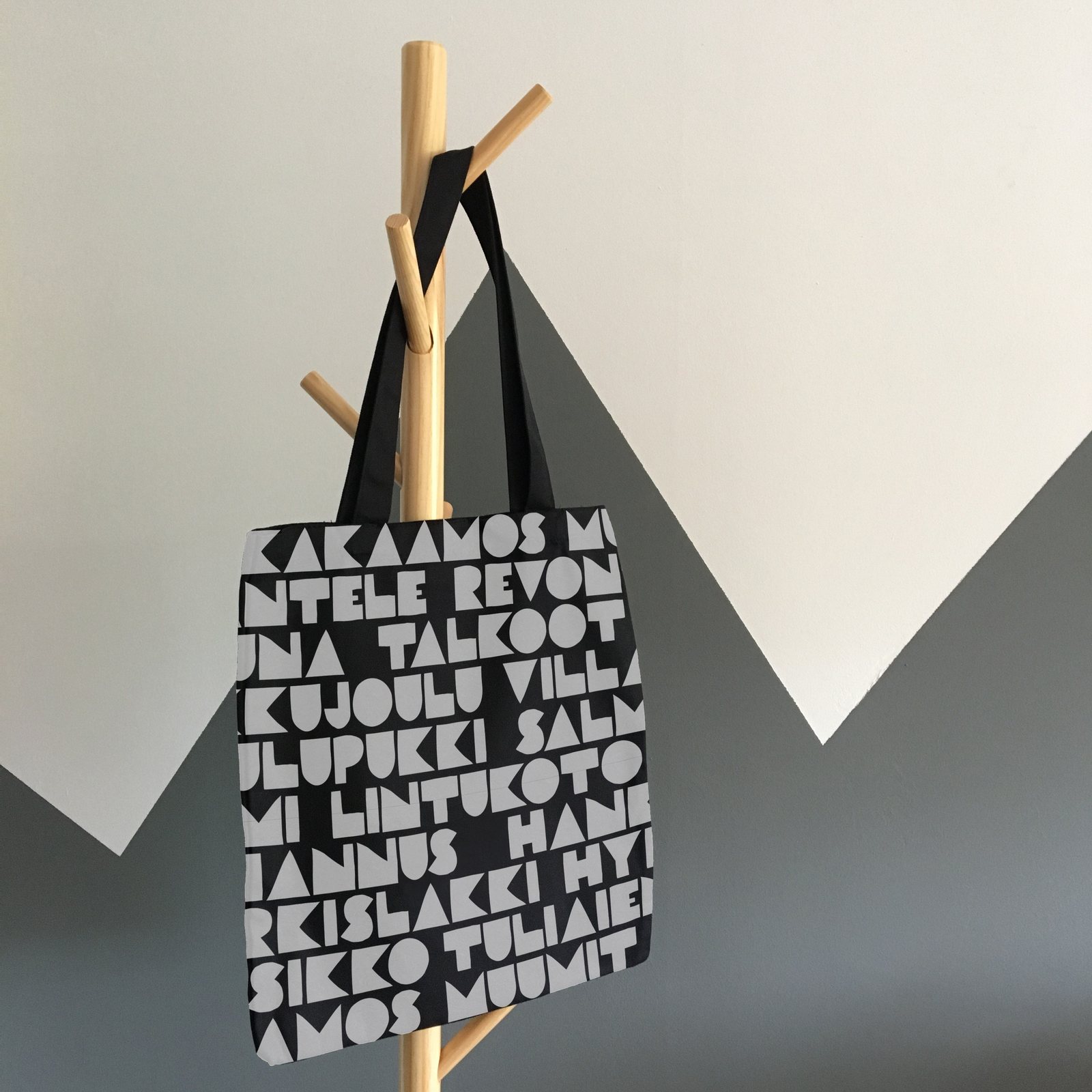
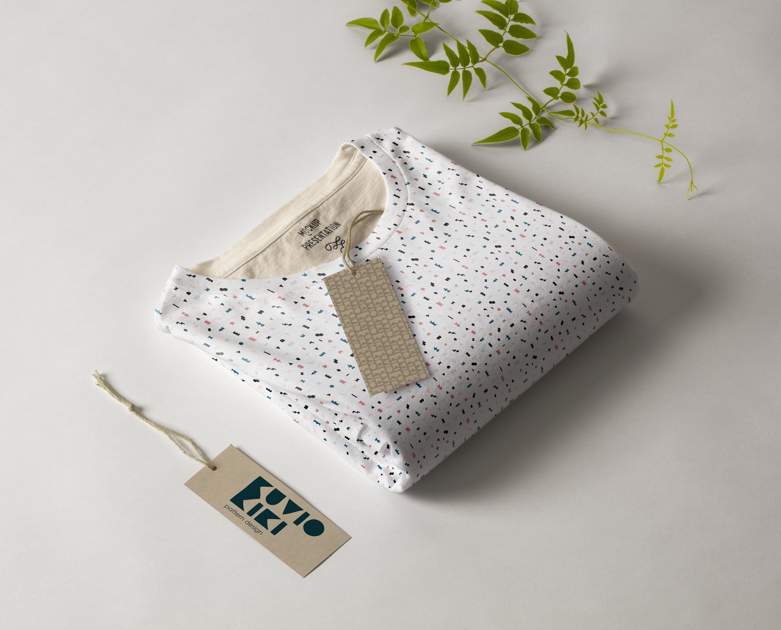
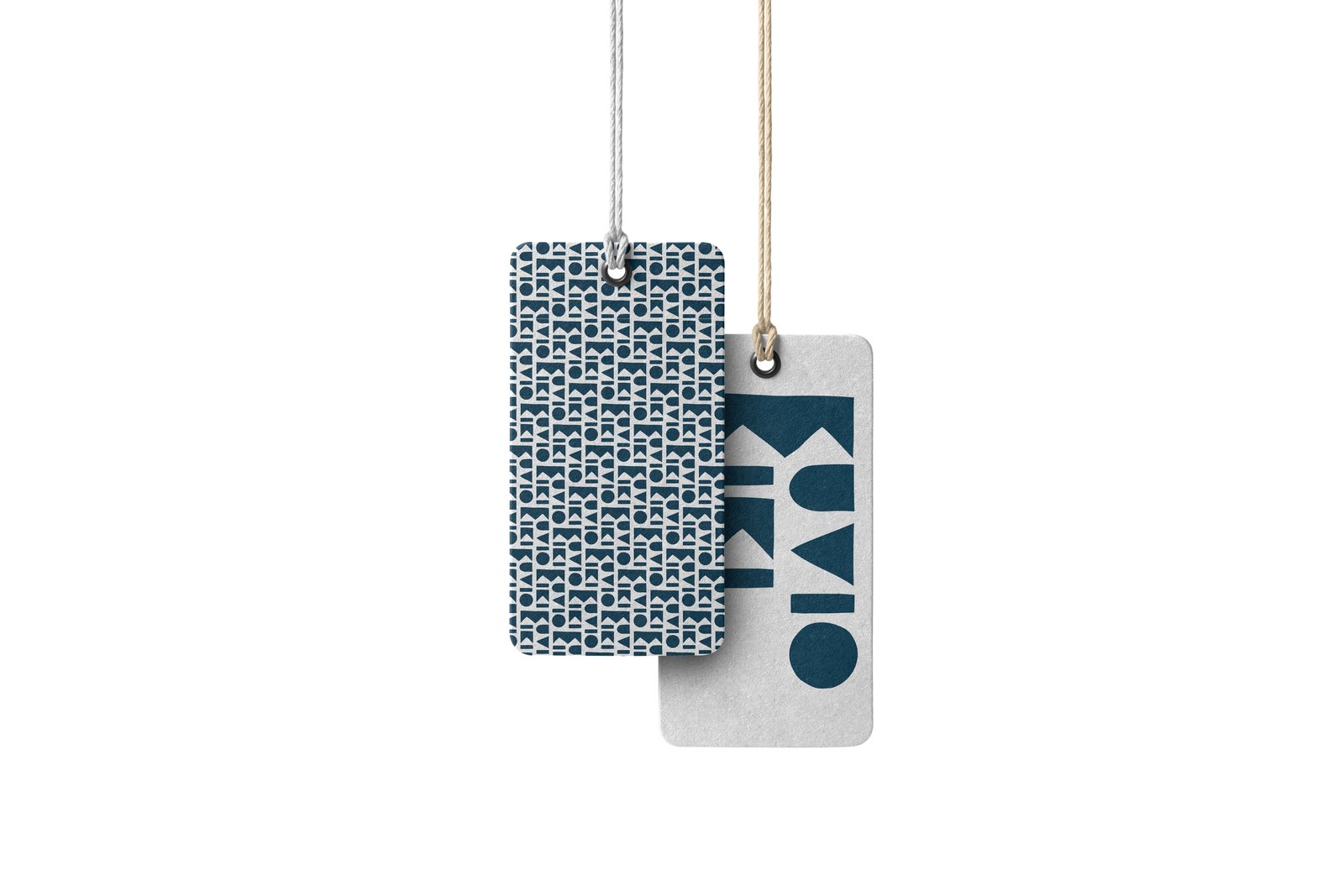
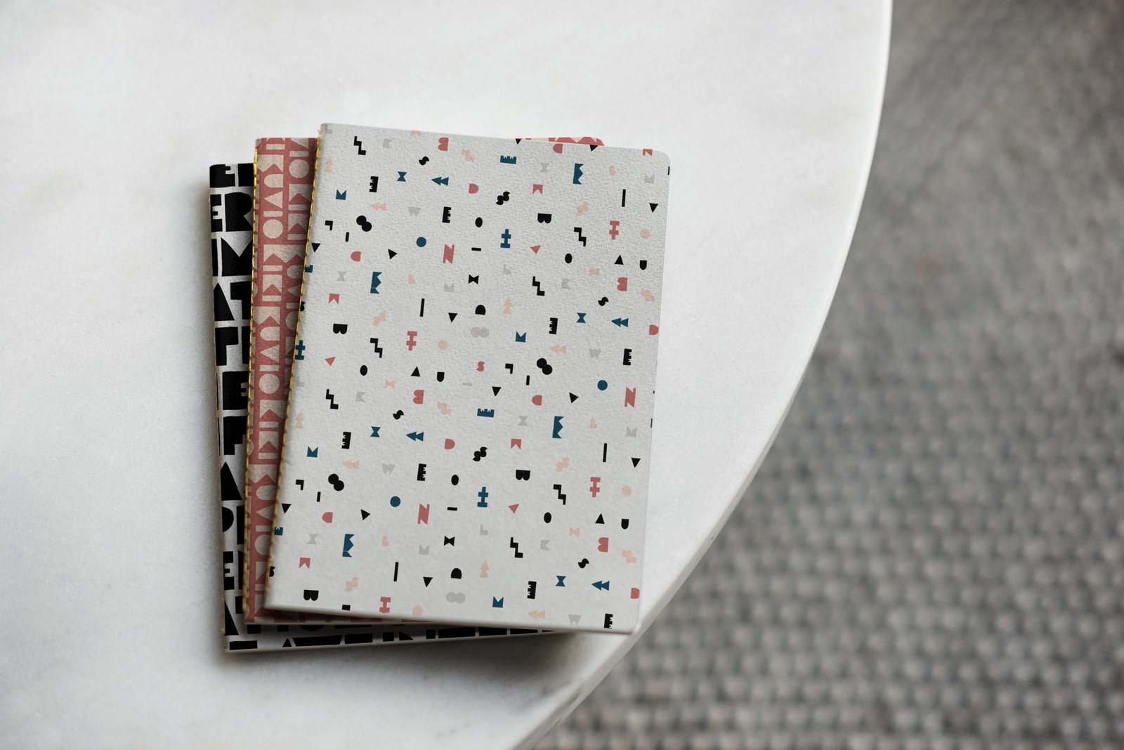
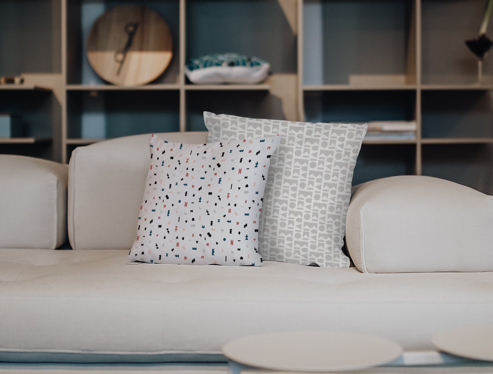
Textiles, tags and stationery
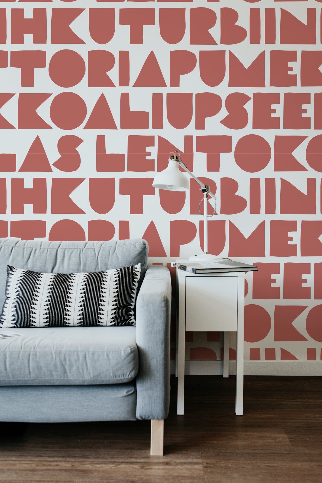
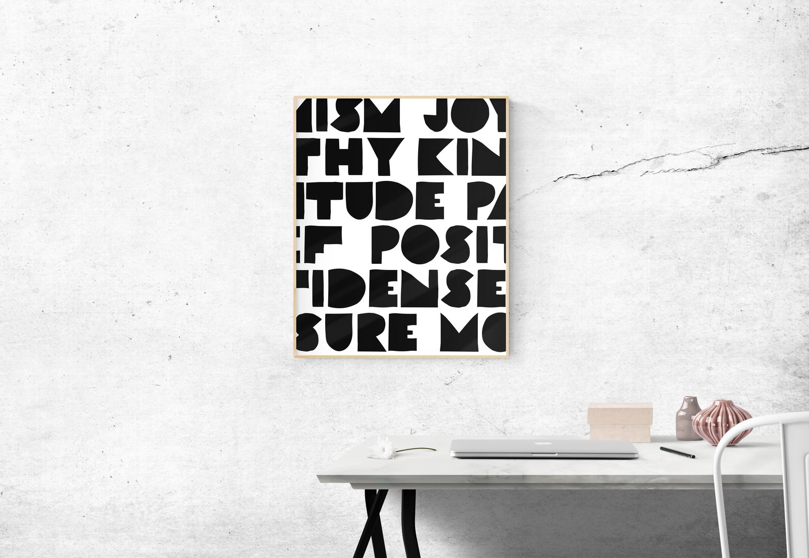
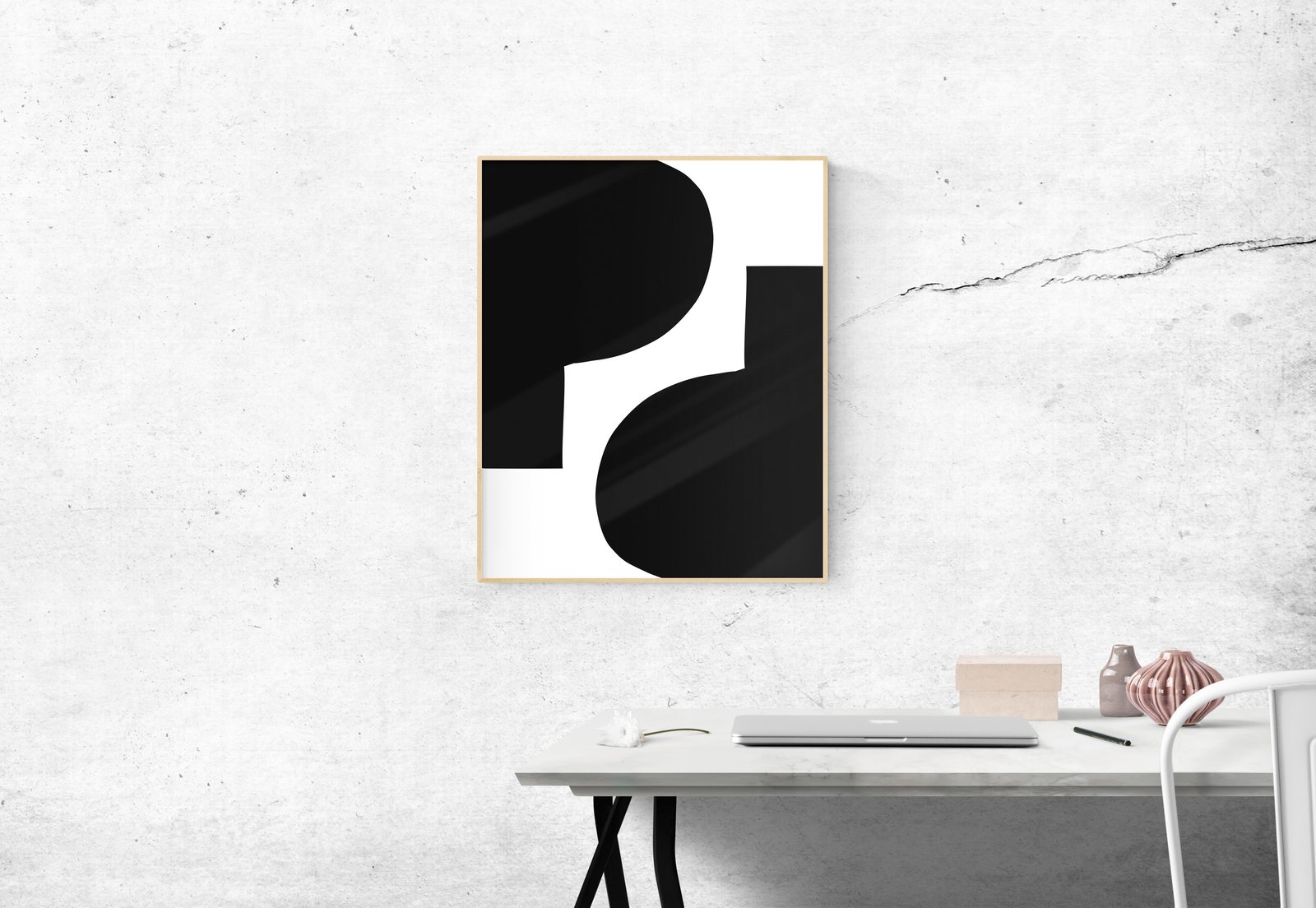
Interiors: wallpaper and prints
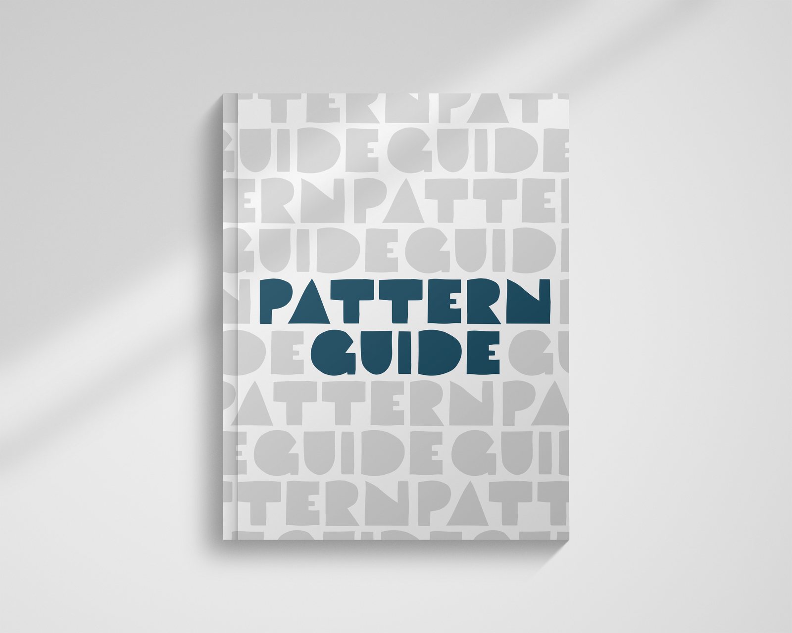
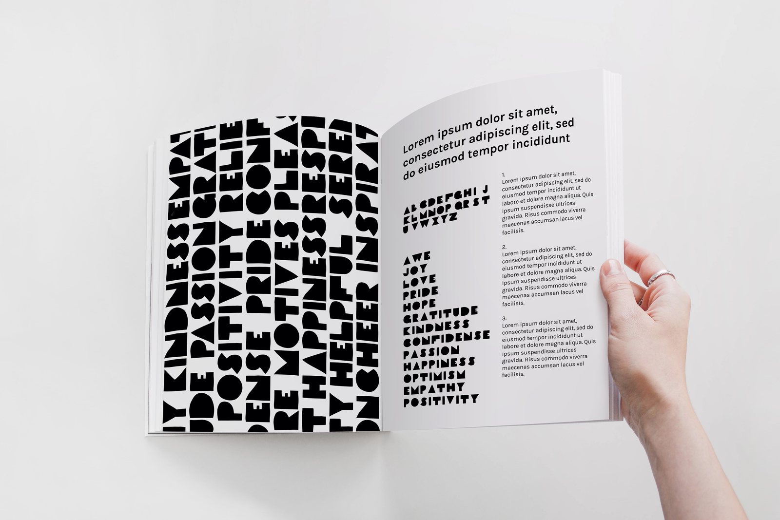
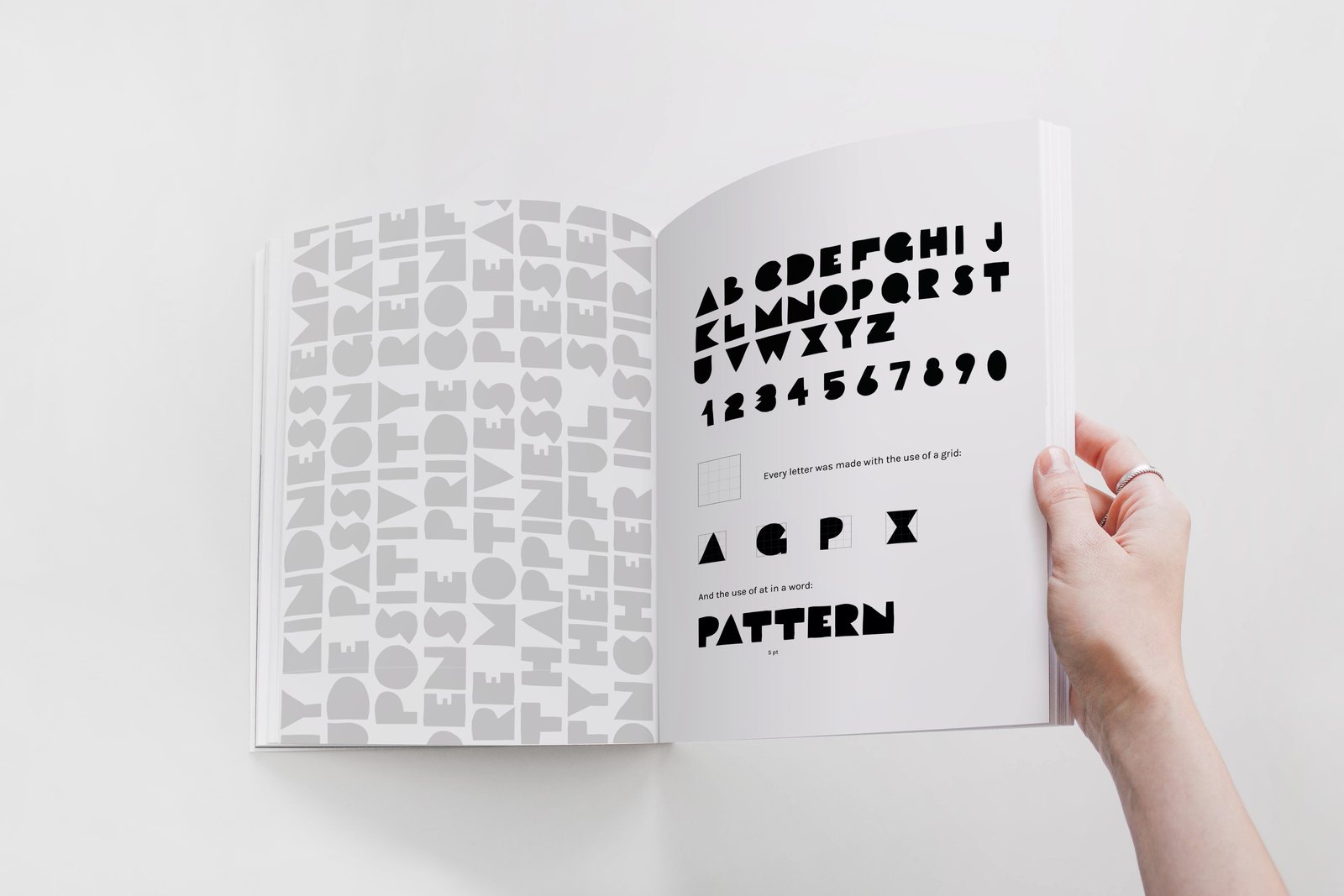
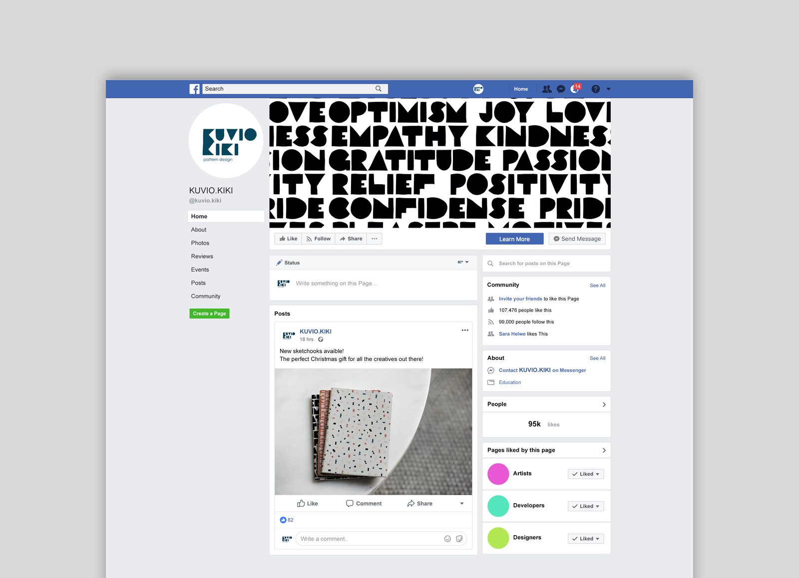
The pattern guide and social media
Reflection
Kuvio Kiki taught me to think of an identity as a system rather than a single logo. Once the rules were set (geometric shapes, a custom alphabet, a small palette), the brand could keep producing new patterns on its own.
It also showed me the value of the detour: the folk motifs felt too busy for Scandinavian simplicity and didn’t make it into the final identity, but redrawing them on a grid is what led to the geometric alphabet.