Design for Impact – Beyond Aesthetics Conference
A complete visual identity for our one-day design conference, from the first moodboard to posters, handouts, stickers and the slides on the day.
The brief
Beyond Aesthetics: How to Create Impact Through Design was a one-day conference run by my class for other students and anyone interested in design. We organised the whole event, from finding the venue through design and marketing to running the day itself. Four speakers talked about how design impacts people, companies and work, through femtech, GenAI, introversion and private life.
The identity had to do what the conference promised: make an impact. It needed to catch attention on busy social feeds, work in print and on screens, and stay recognisable across every piece.
My role
I led the communication design and marketing team. I set the visual direction together with the team, then guided, iterated on and approved every design before it went out. I also kept the design in sync with the other teams and their leaders.
About the conference
My class took on the job of organising this event, with the motto:
Our class did everything (with some help from our professor), including finding the venue, inviting experts to speak about their experience, and the design itself. My team took care of the design.
Vision
It was hard: the design itself had to make an impact, spark people's interest and stay in their memory so they would connect it to the conference later.
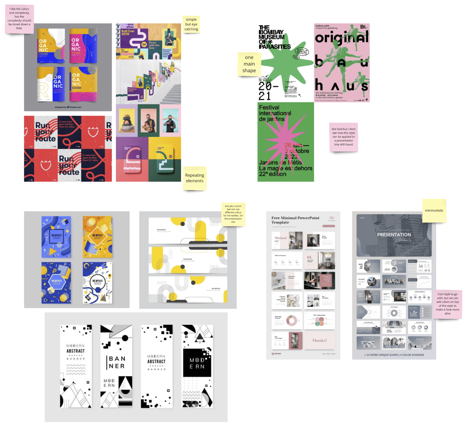
First, everyone made a three-picture moodboard of their vision. Then we came together and talked about what we liked in each one. This gave us the basics of our vision:
- Colourful
- Geometry based
- A repeating element
- A shape as the logo
- Between minimalistic and chaotic
Visual identity
We turned the vision into a small, strict system, so that everyone in the team could design their own pieces and they would still look like one event.
Shape
A square with cut corners is the repeating element. It frames the speakers' photos, holds the timetable items, shapes the stickers and becomes the BA logo. Tilted at 45°, it cuts every layout into bold diagonal blocks of colour: minimal in structure, chaotic in colour.
Colour
Eight colours in strong and soft pairs. Every piece uses two or three of them, so the set feels varied but always related.
- Royal blue
#173598 - Purple
#4E096B - Green
#06604F - Yellow
#FCD839 - Pink
#FE97AA - Soft pink
#FFD0DA - Lilac
#CFB4D7 - Light blue
#A3E2EF
Typography
- Beyond AestheticsJomhuriaA tall, condensed display face for the event name and speaker names. It fits long titles into narrow diagonal bands.
- Aa Bb 10:15InterA clear sans-serif for the details: times, roles and descriptions, readable even at sticker and handout size.
Design
With the system set, we made the very first drafts together, which became the final direction. Then everyone designed their own part in this style, and we iterated, implemented and approved them.
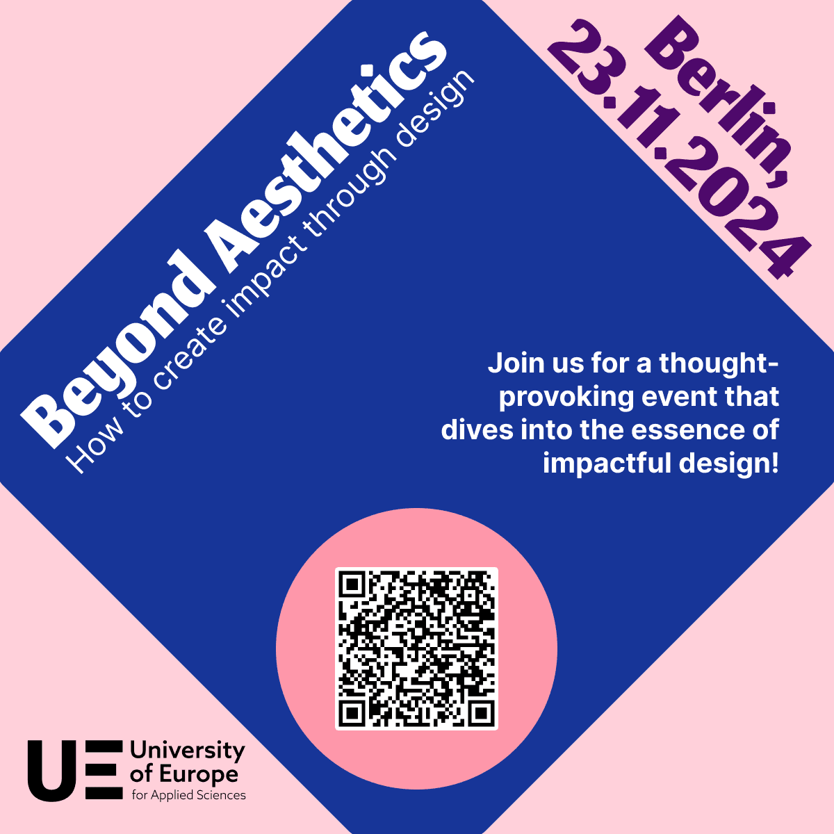
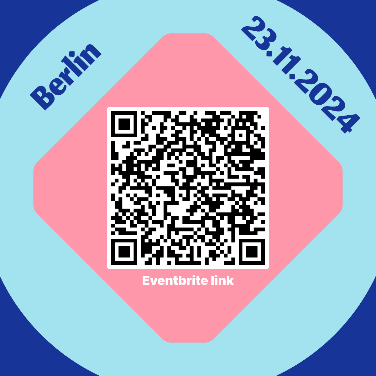
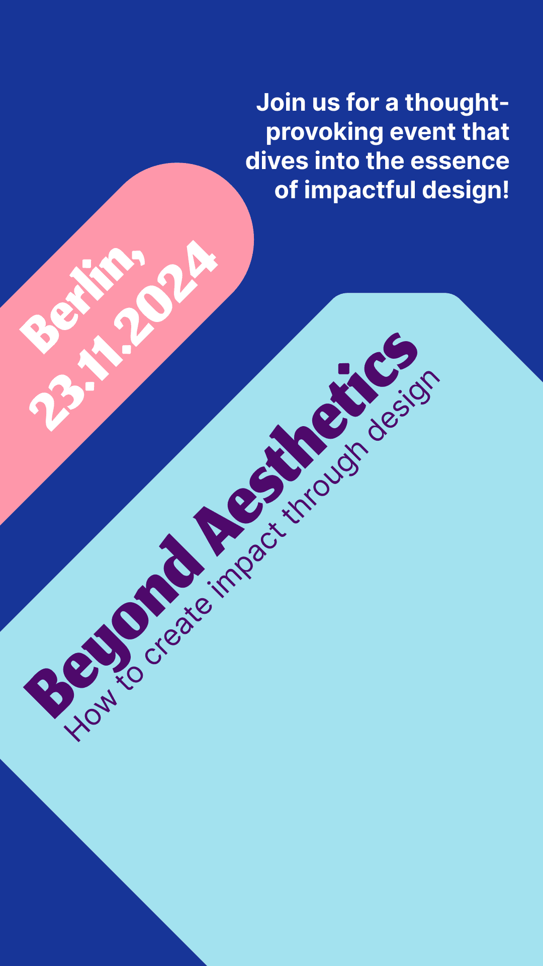
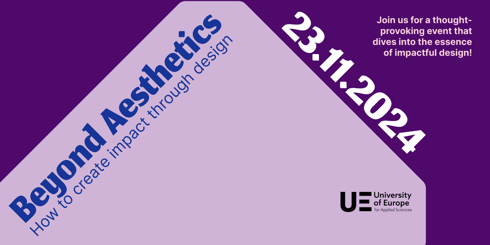
Teasers for the university’s social media accounts and the Eventbrite cover
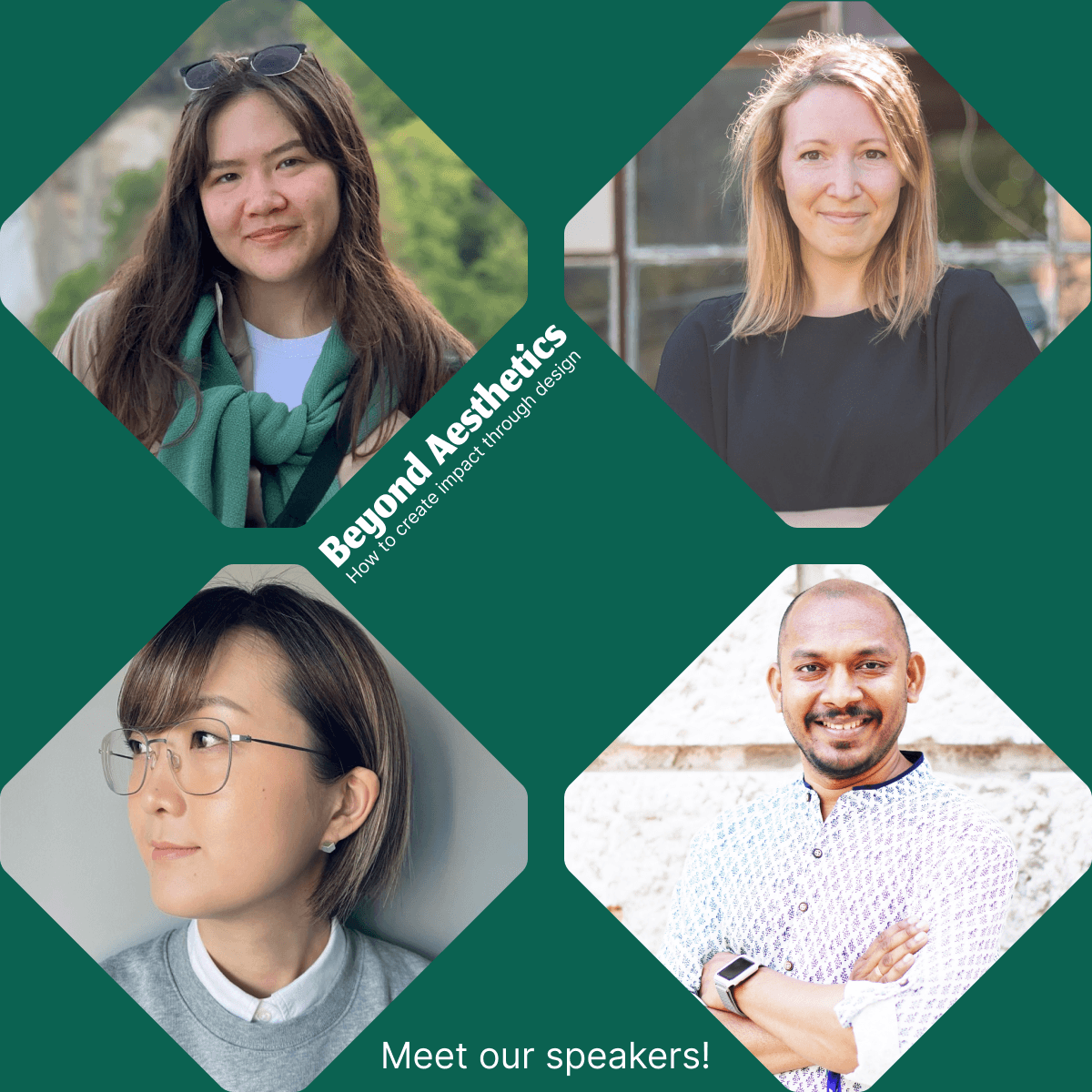
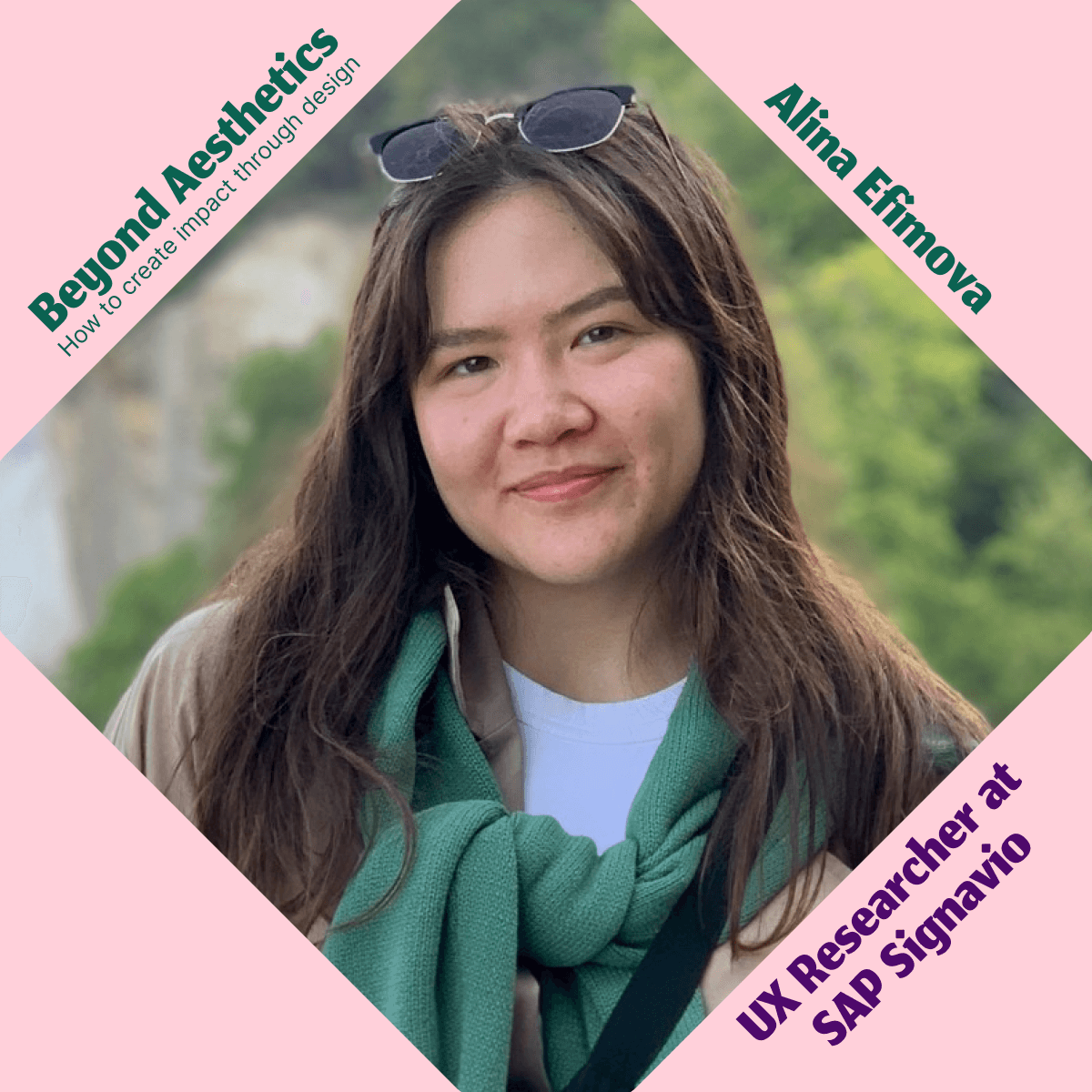
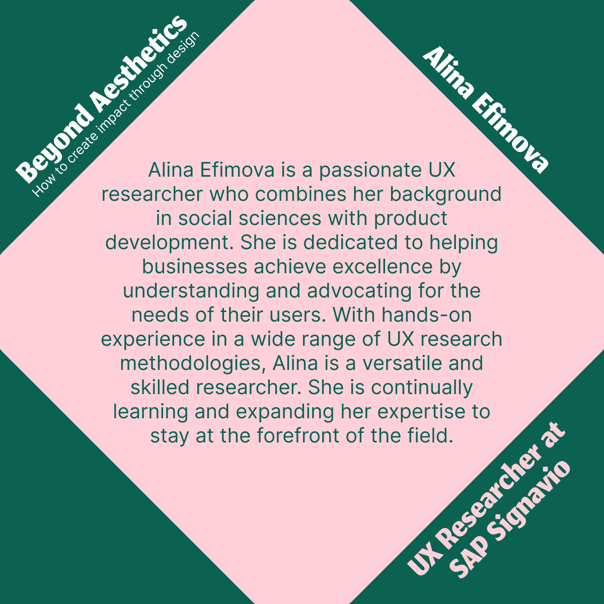
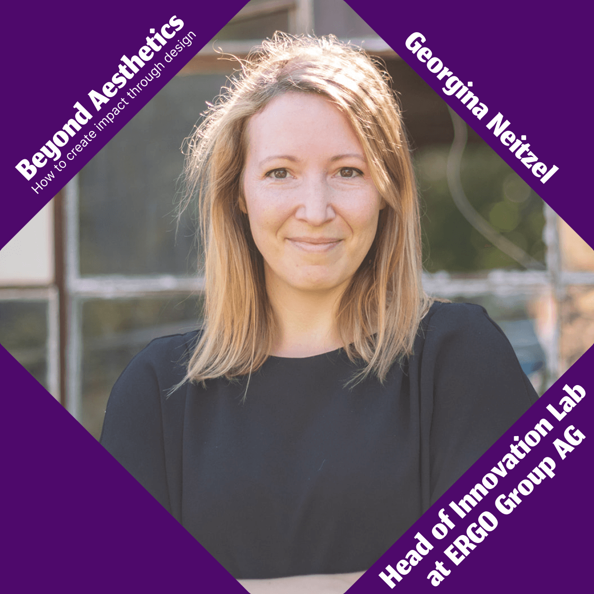
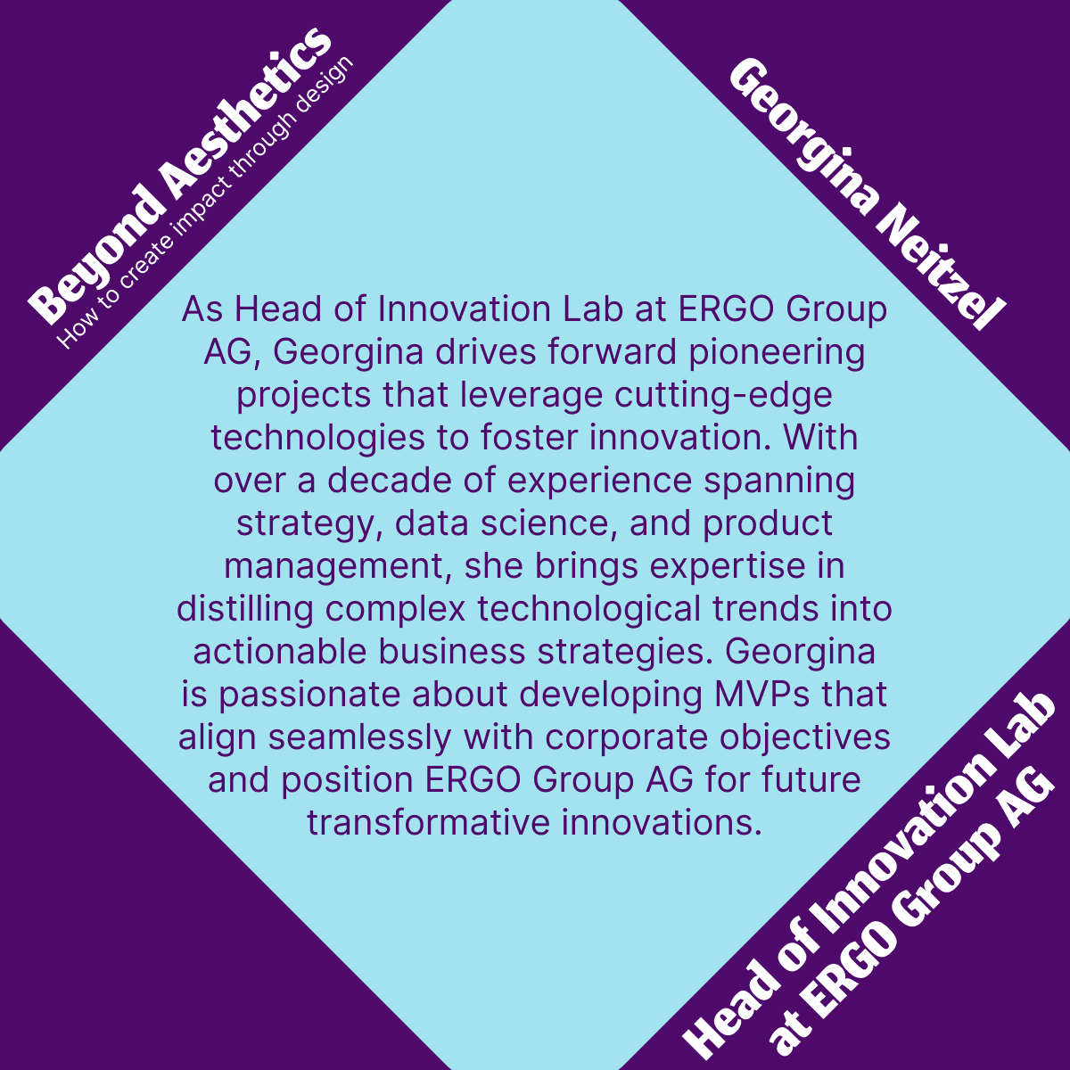
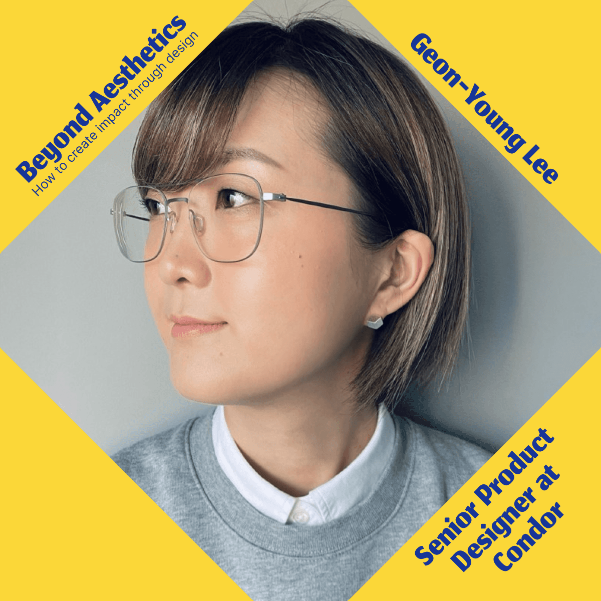
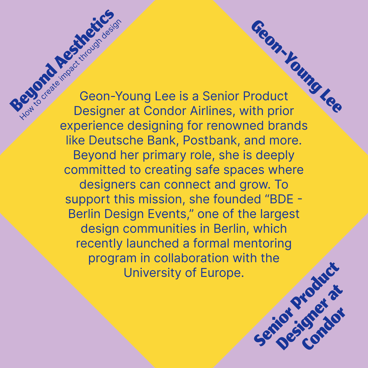
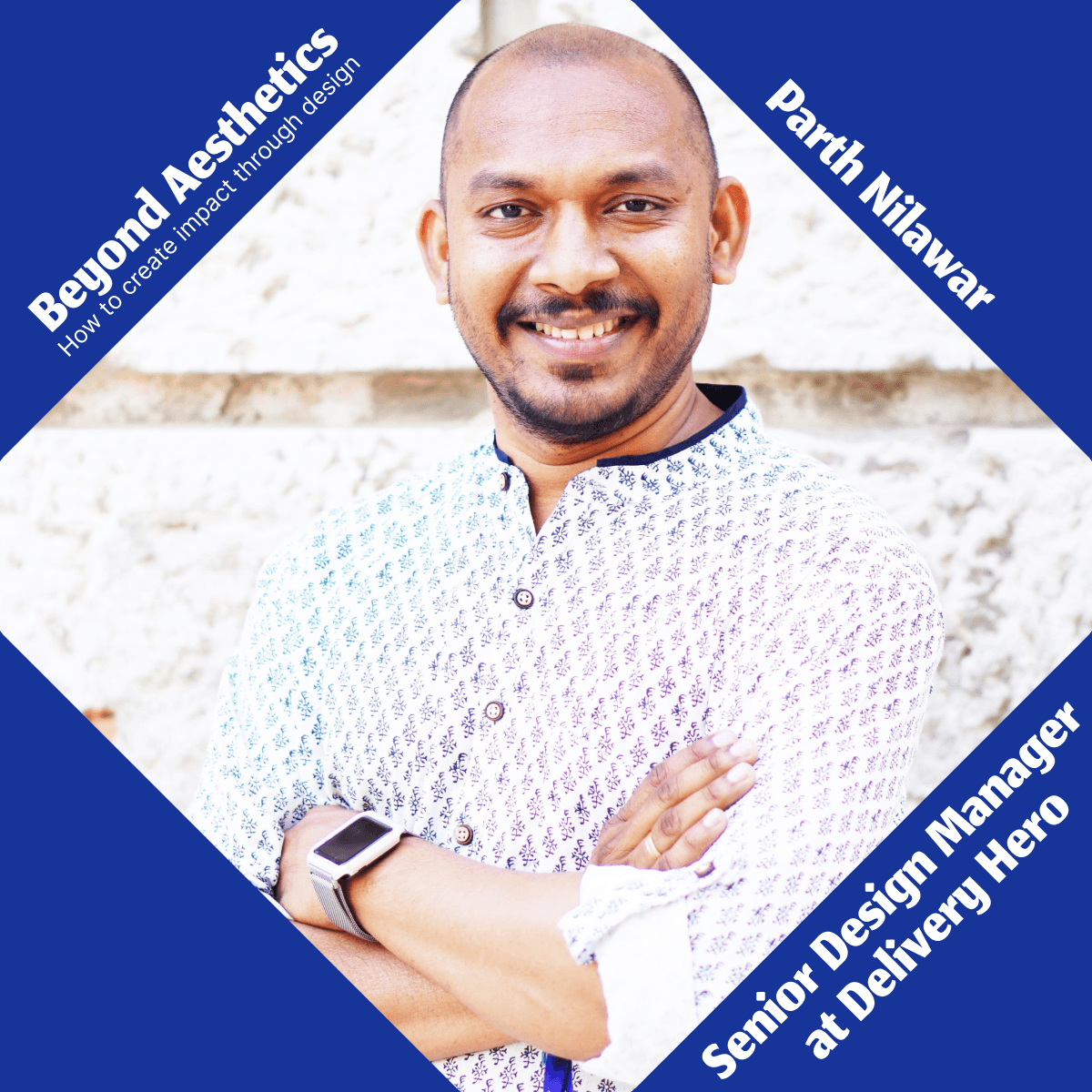
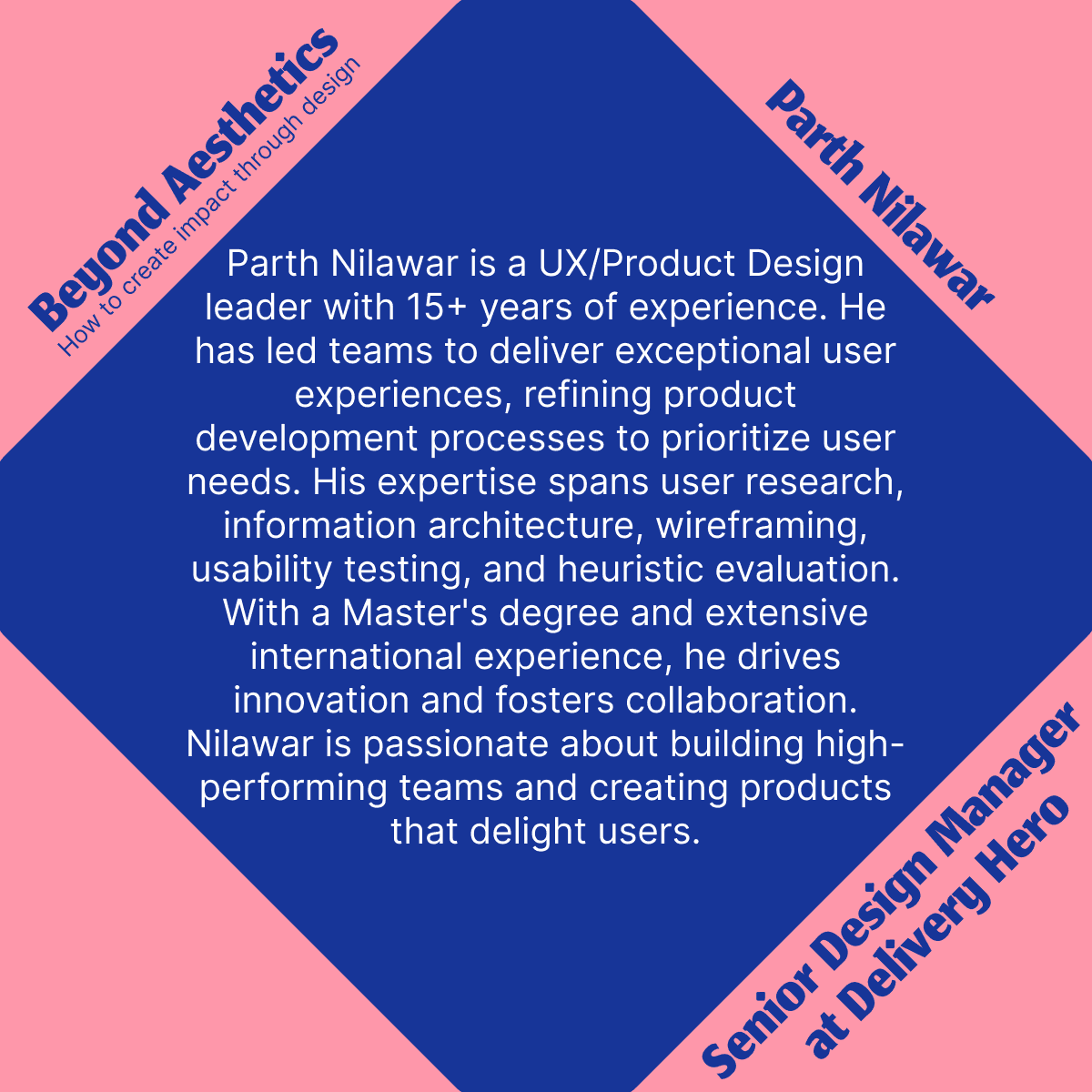
Social media posts: each speaker gets a photo post and a bio post in a different colour pair
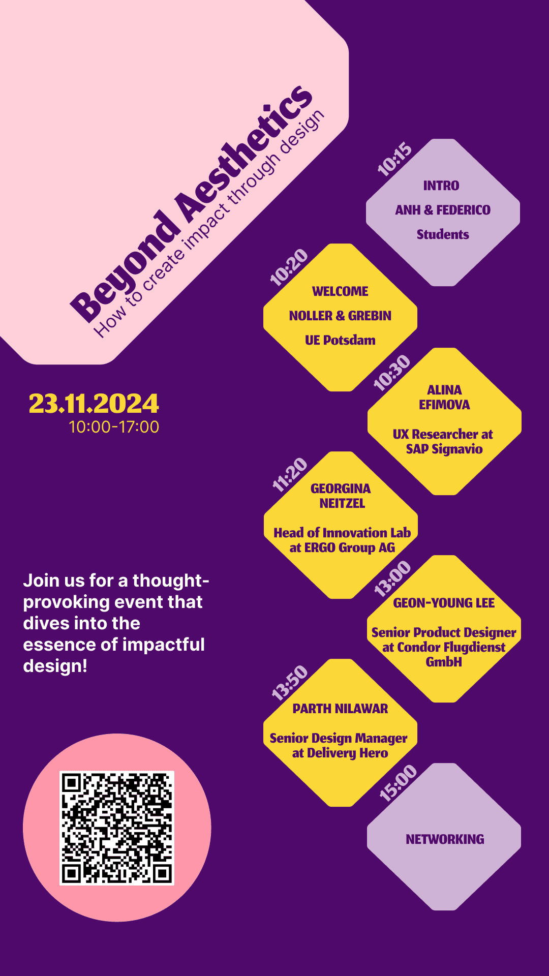
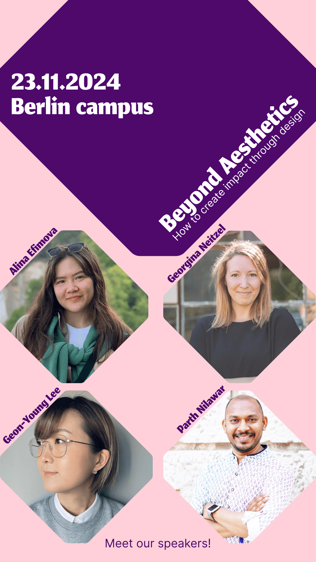
Instagram stories with the programme and the speakers
The printed pieces were the ones people would hold on the day, so they got the most iterations.
Poster
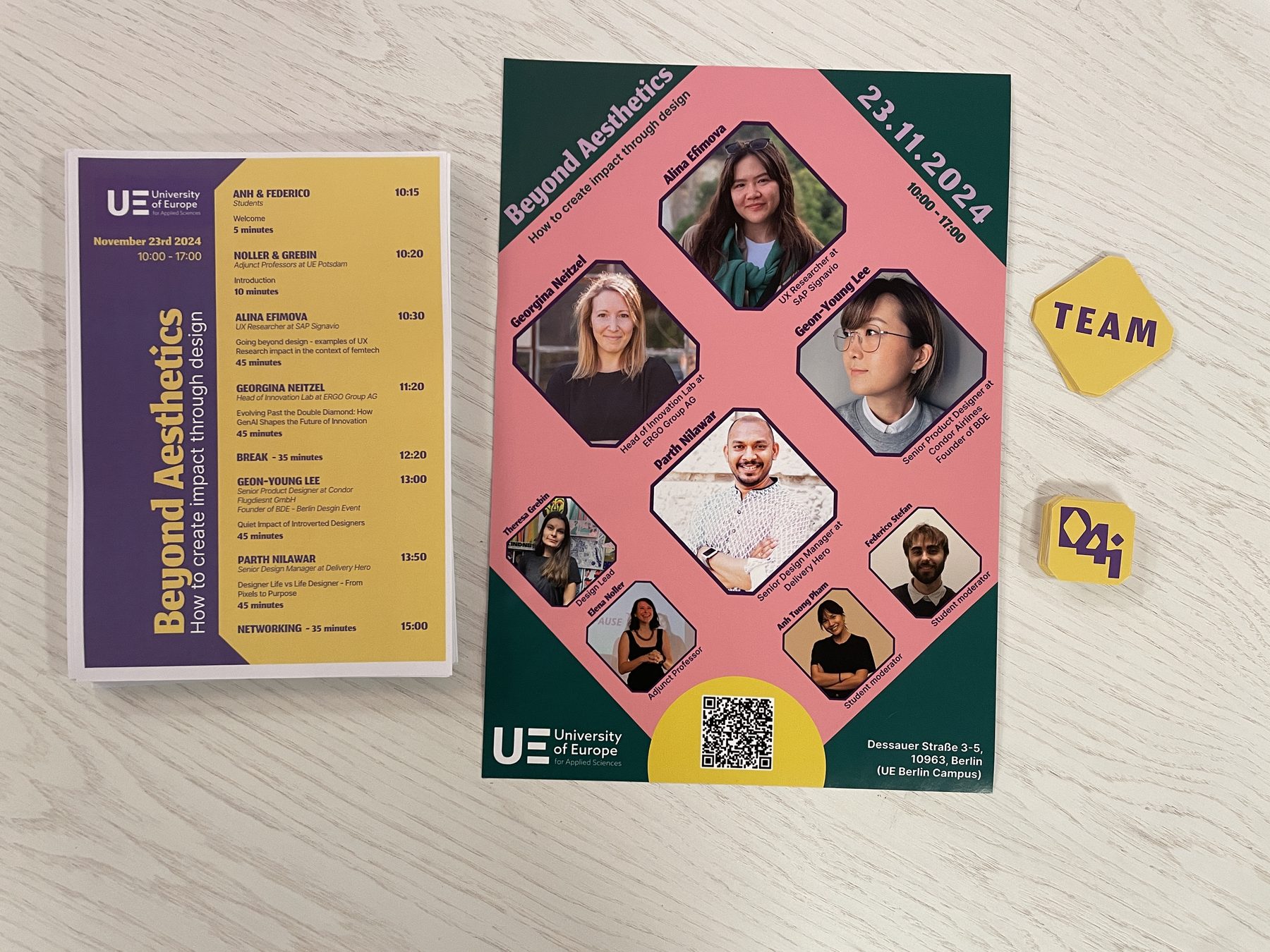
The poster started as a quick sketch of the hierarchy: title, a short description, the speakers and the practical details. In the final version the cut-corner frames turn the speakers into a pattern, with the date running along the diagonal and the QR code sitting in a yellow half-circle at the bottom. It was printed in A3 and A4 and used as a digital version too.
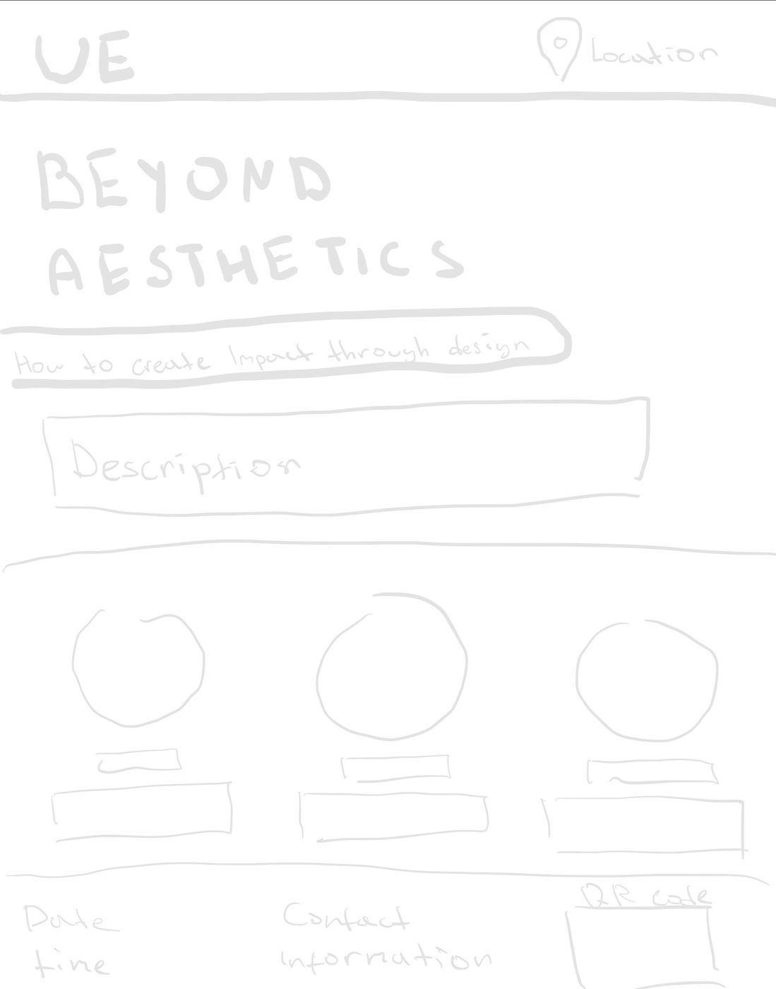
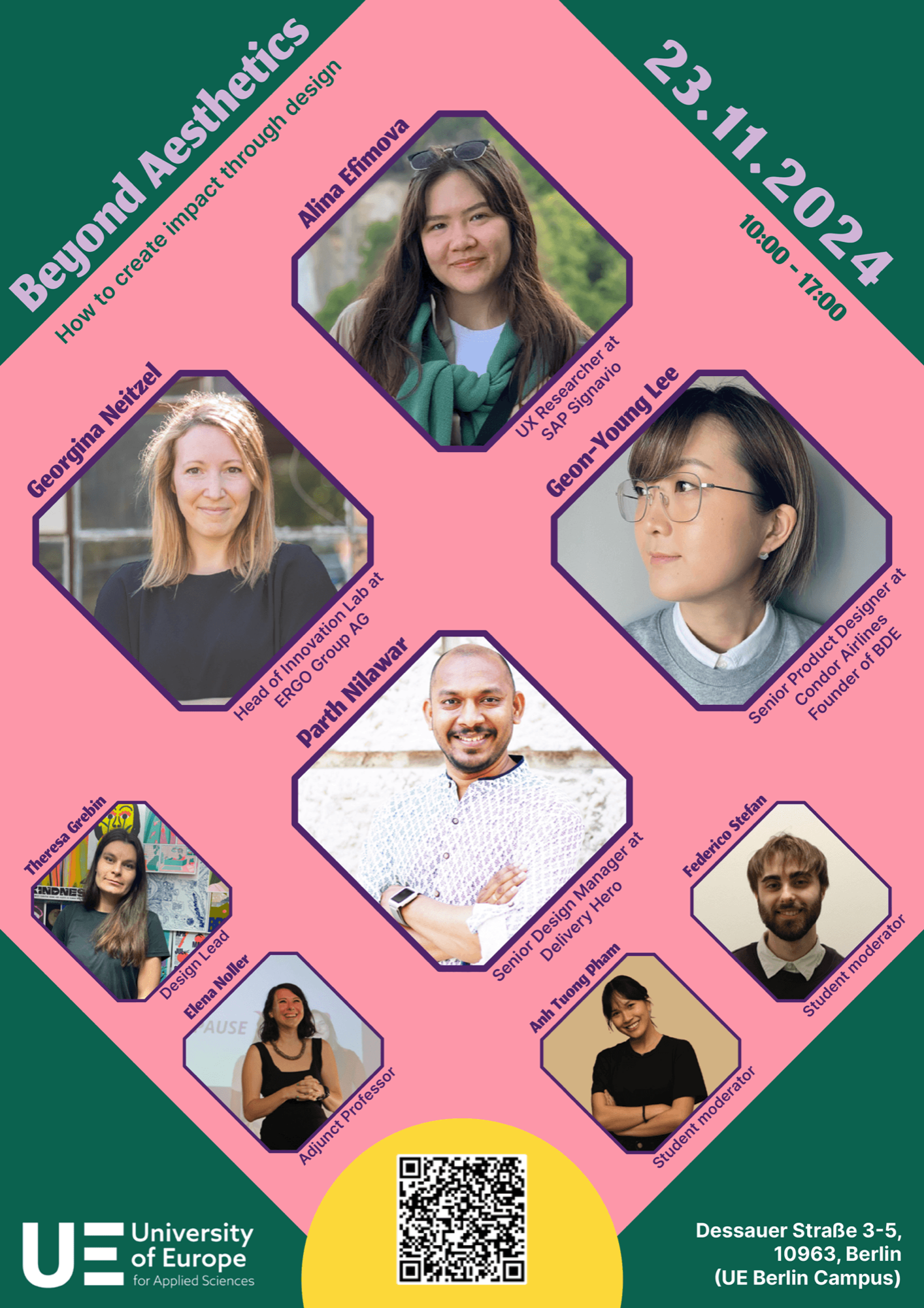
From sketch to final poster
Timetable handout
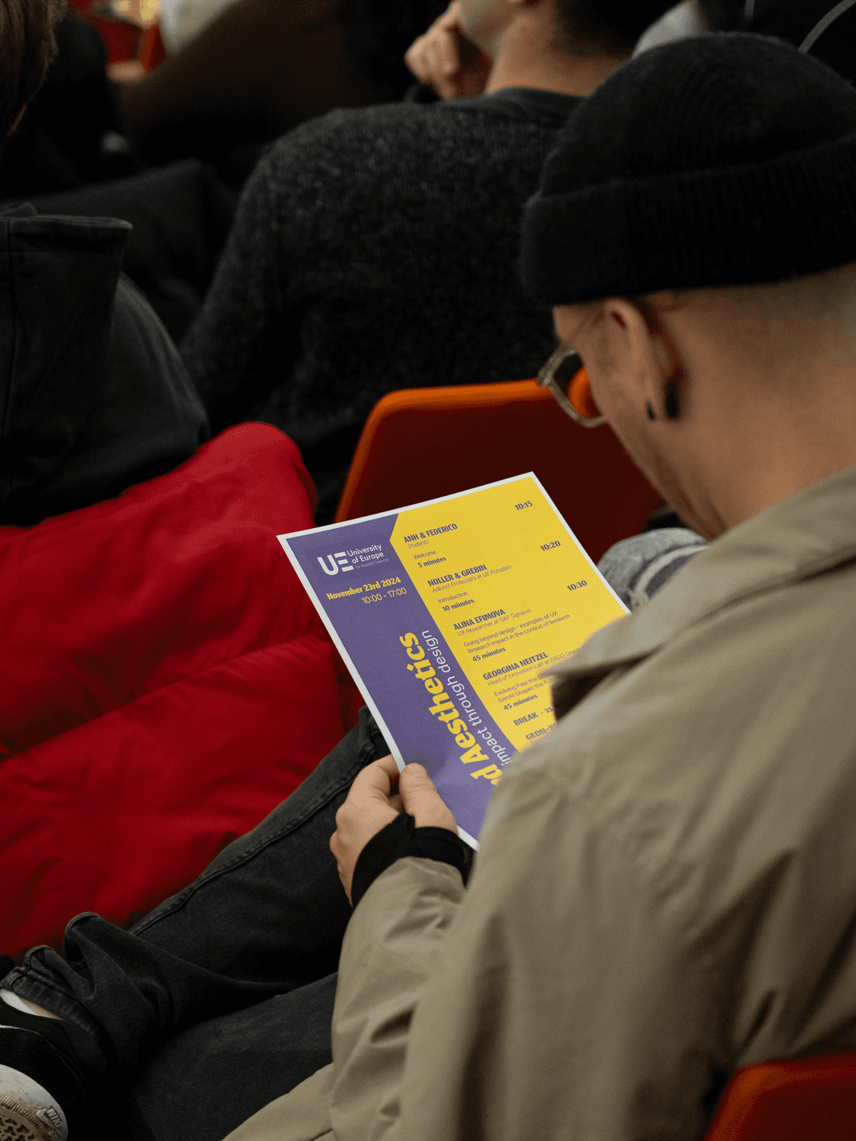
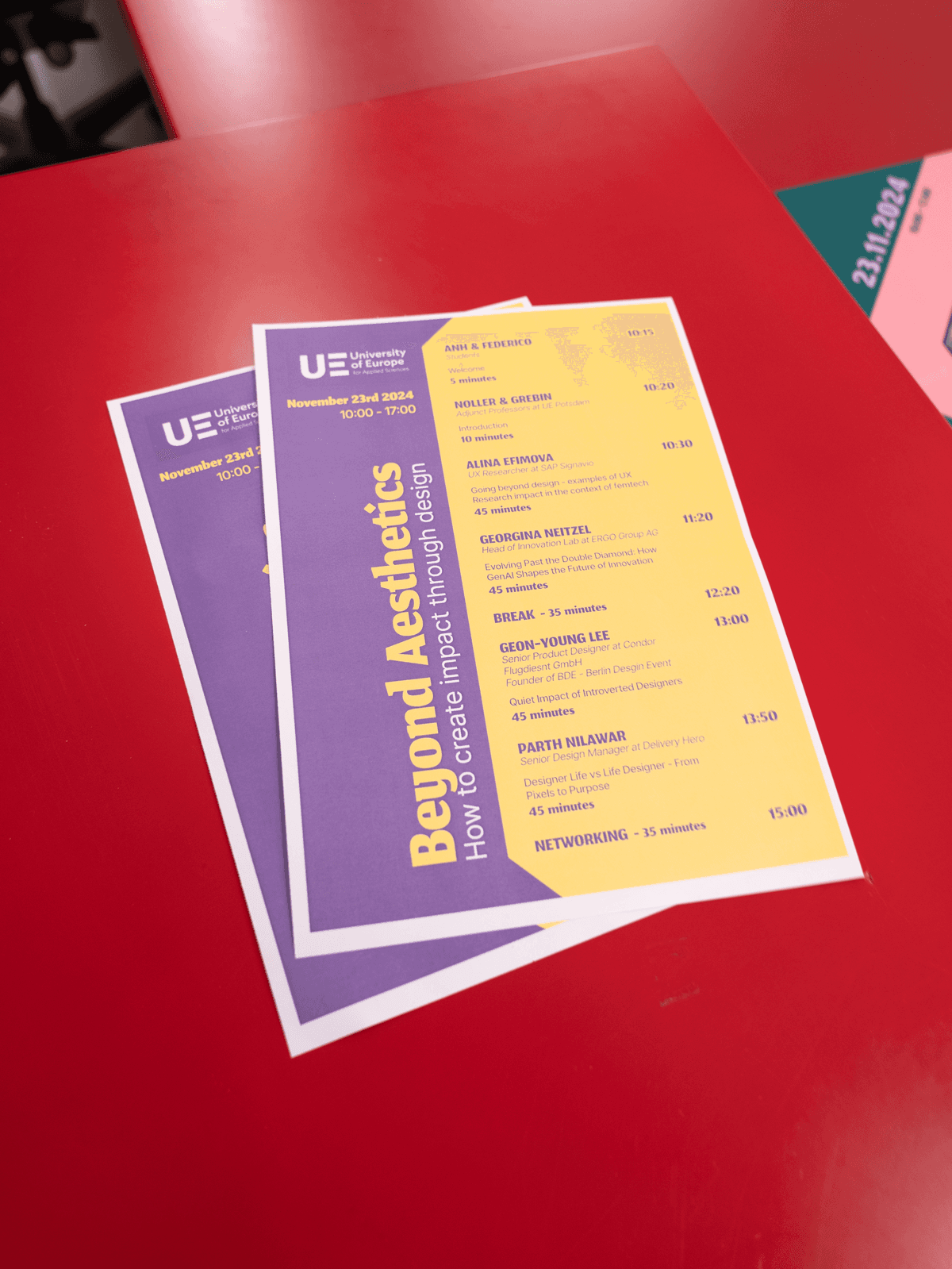
An A5 handout with the programme, with the event name running sideways on a purple band. It went through several rounds, refining the header, the spacing and how speakers, talks and times line up, so the day can be scanned at a glance.
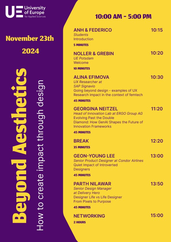
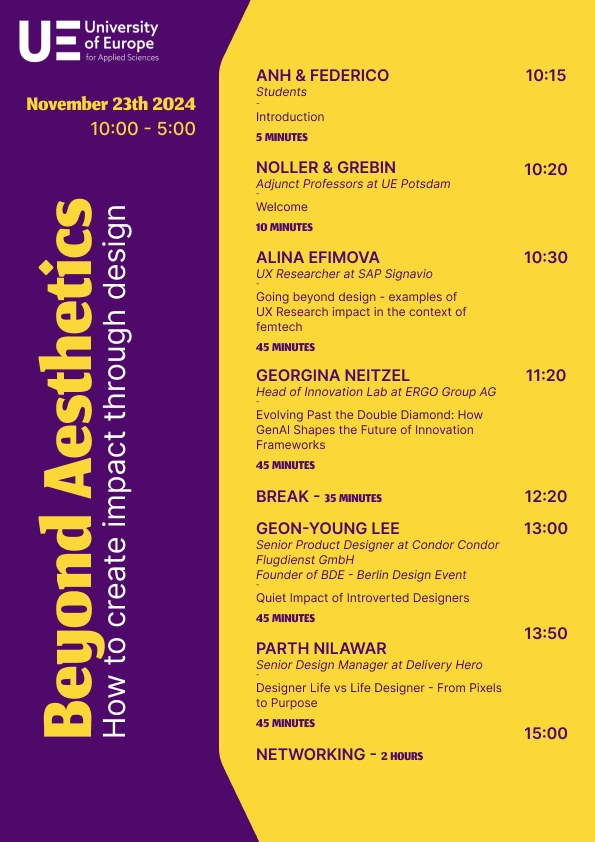
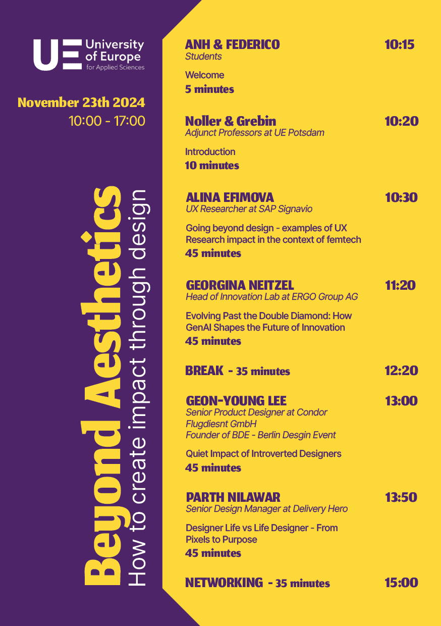
Handout iterations, from the first draft to the printed version
Stickers
Sticker sheets with the D4i mark, and TEAM badges that made the organisers easy to spot on the day.
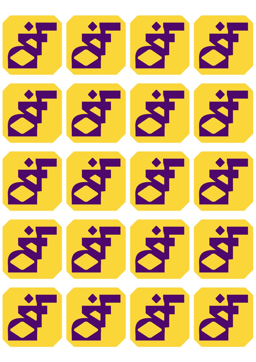
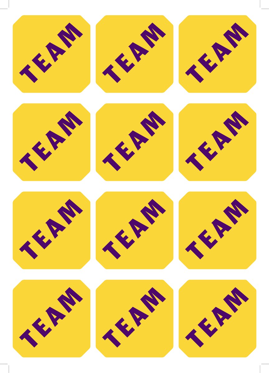
D4i and TEAM sticker sheets
On screen
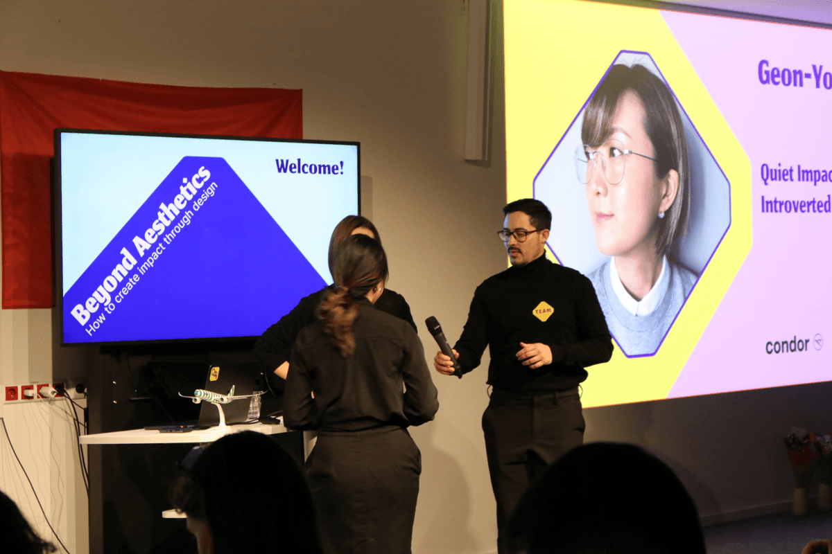
The presentation and TV slides carried the identity through the day, from the welcome screen to each talk, the mood check and the lunch break.
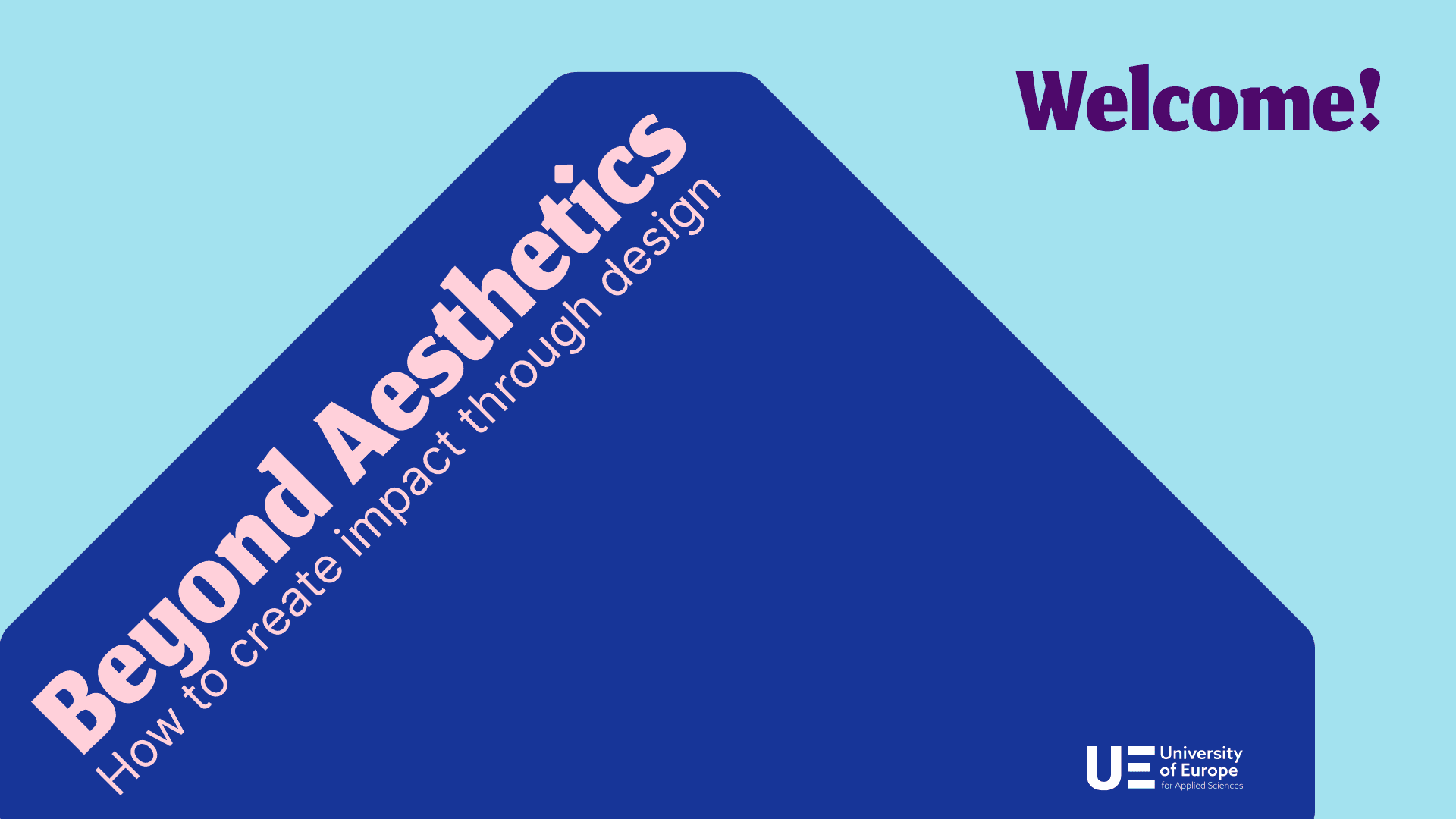
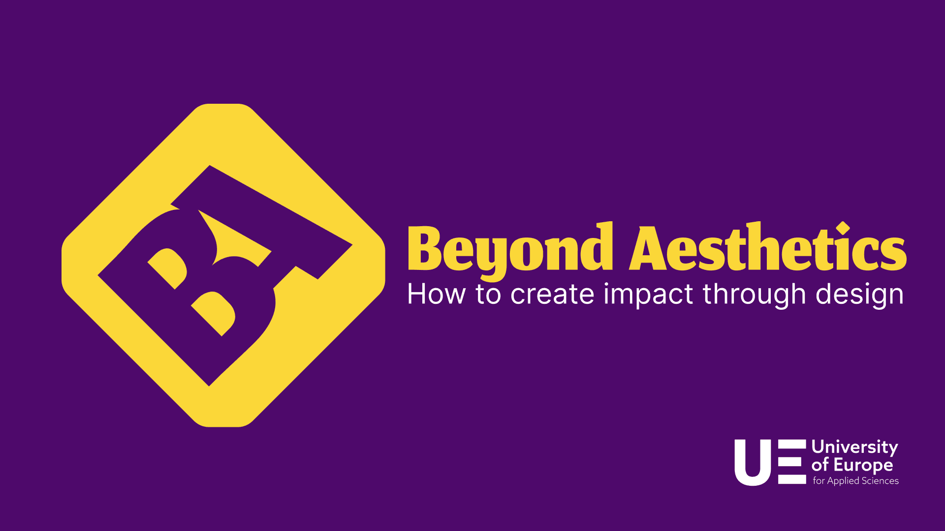
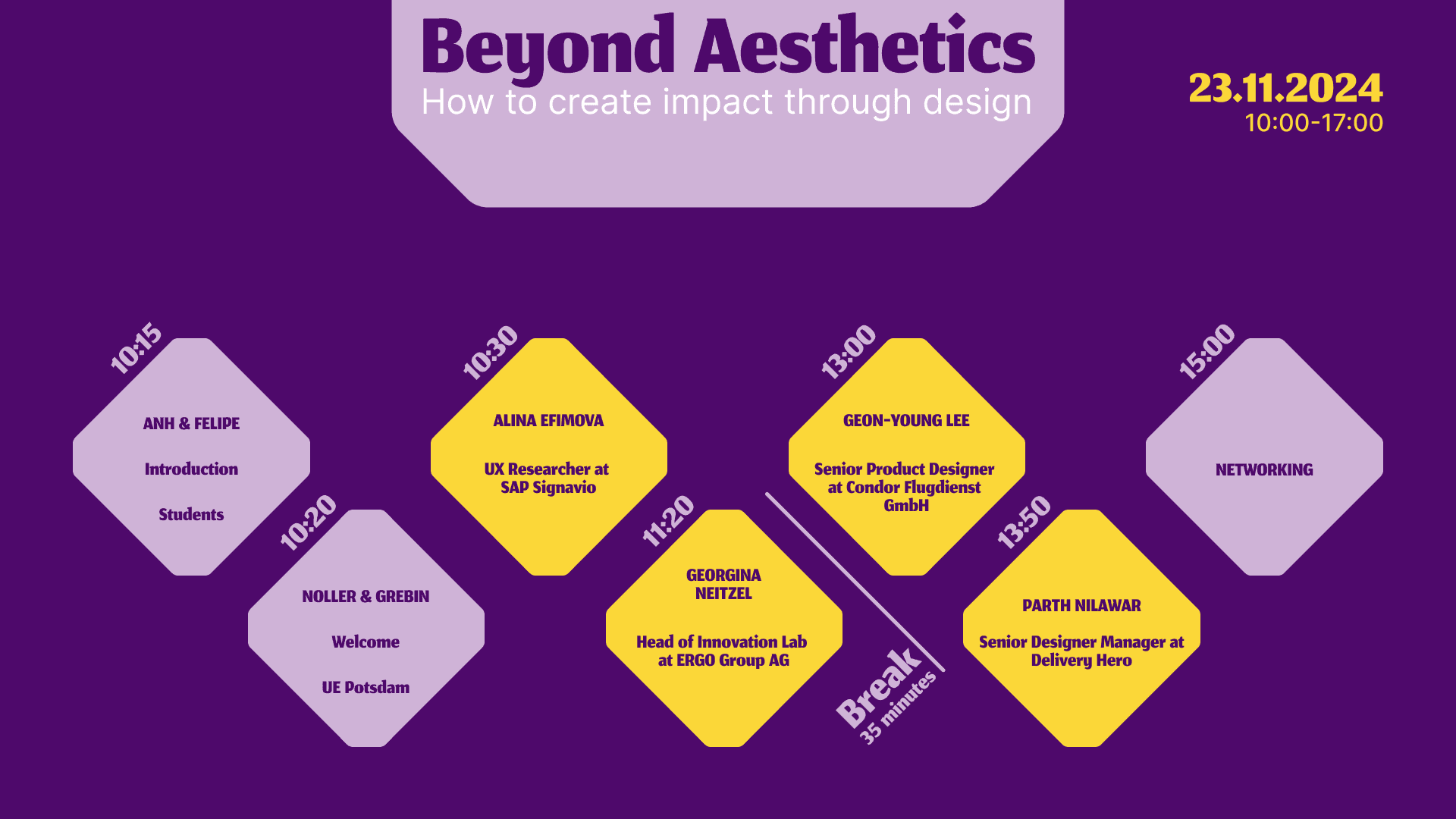
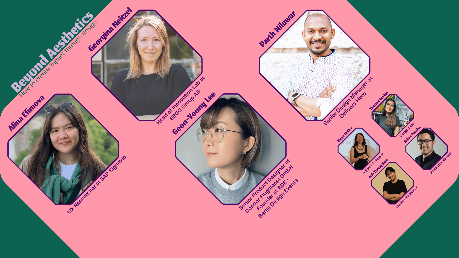
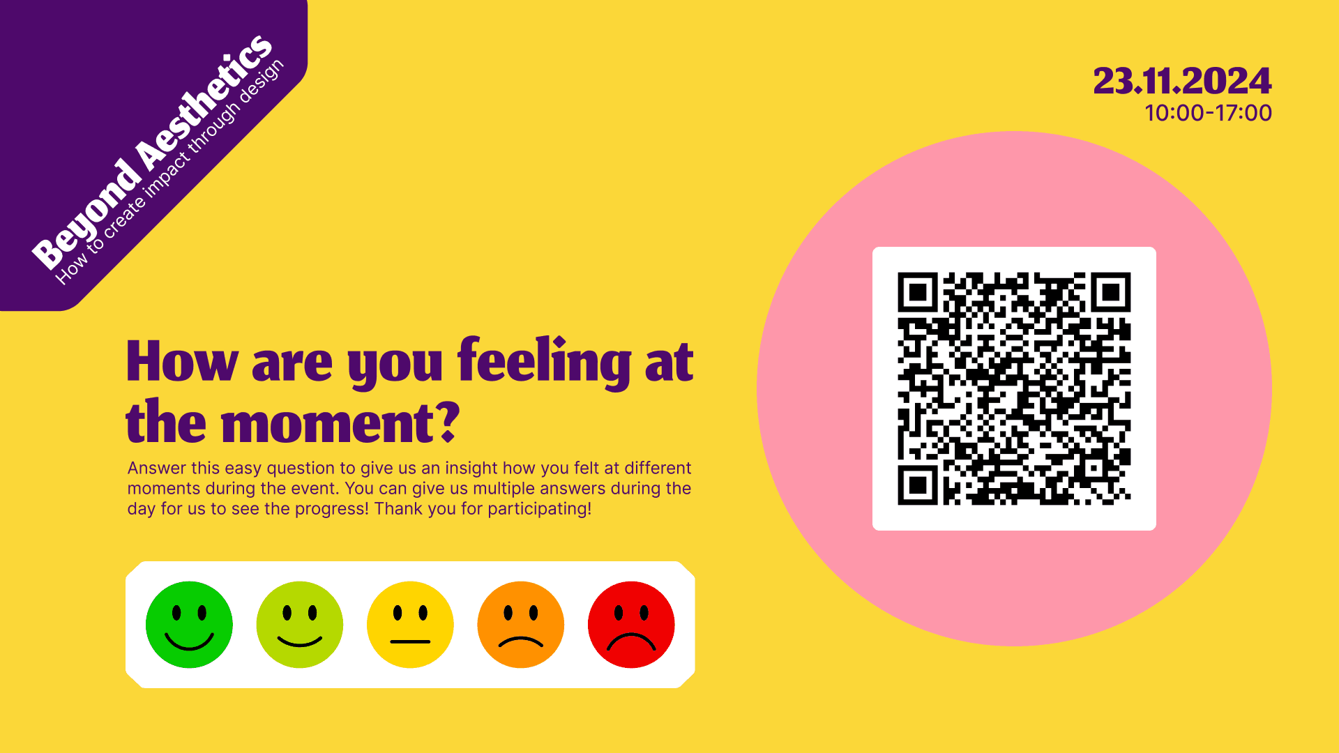
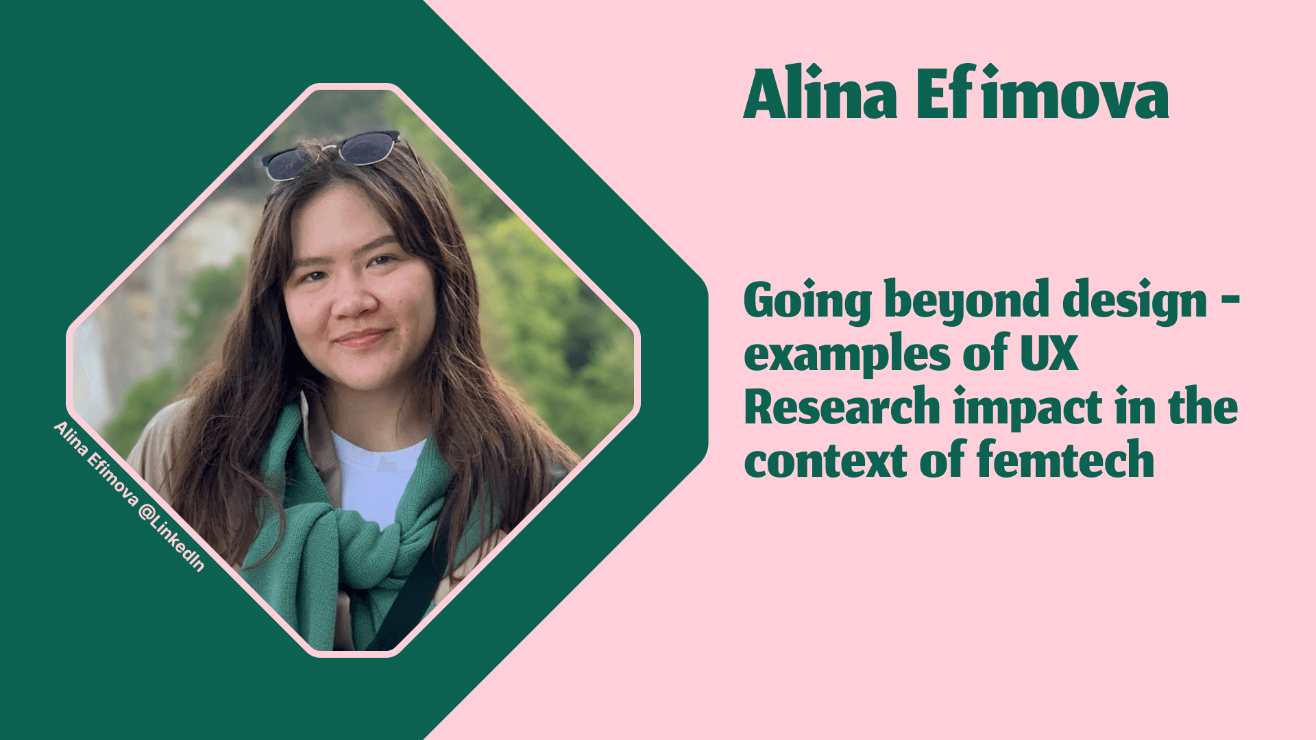
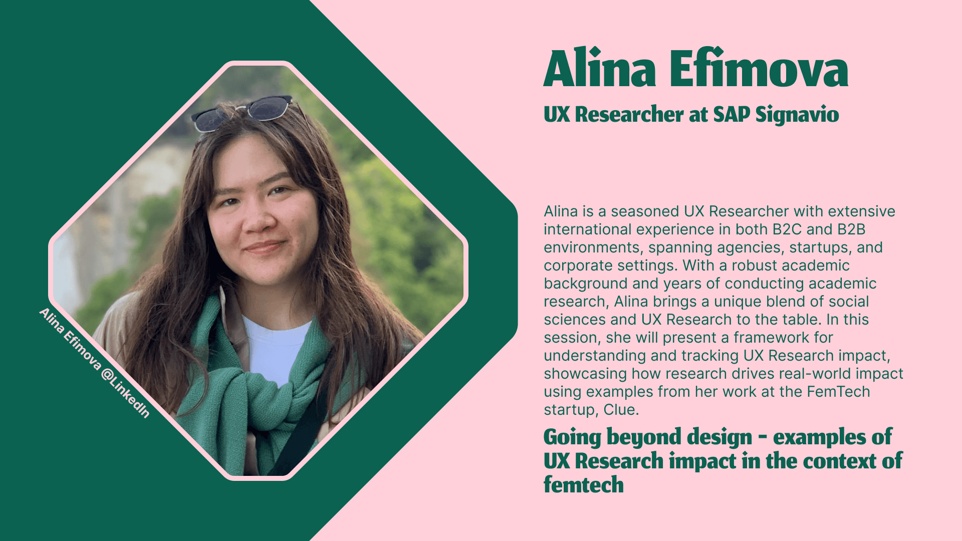
Presentation and TV slides used during the event
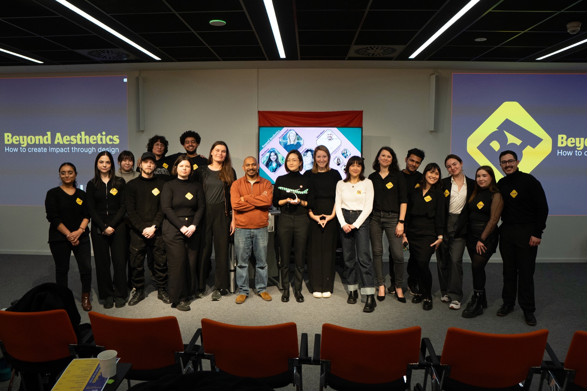
Pictures from the conference
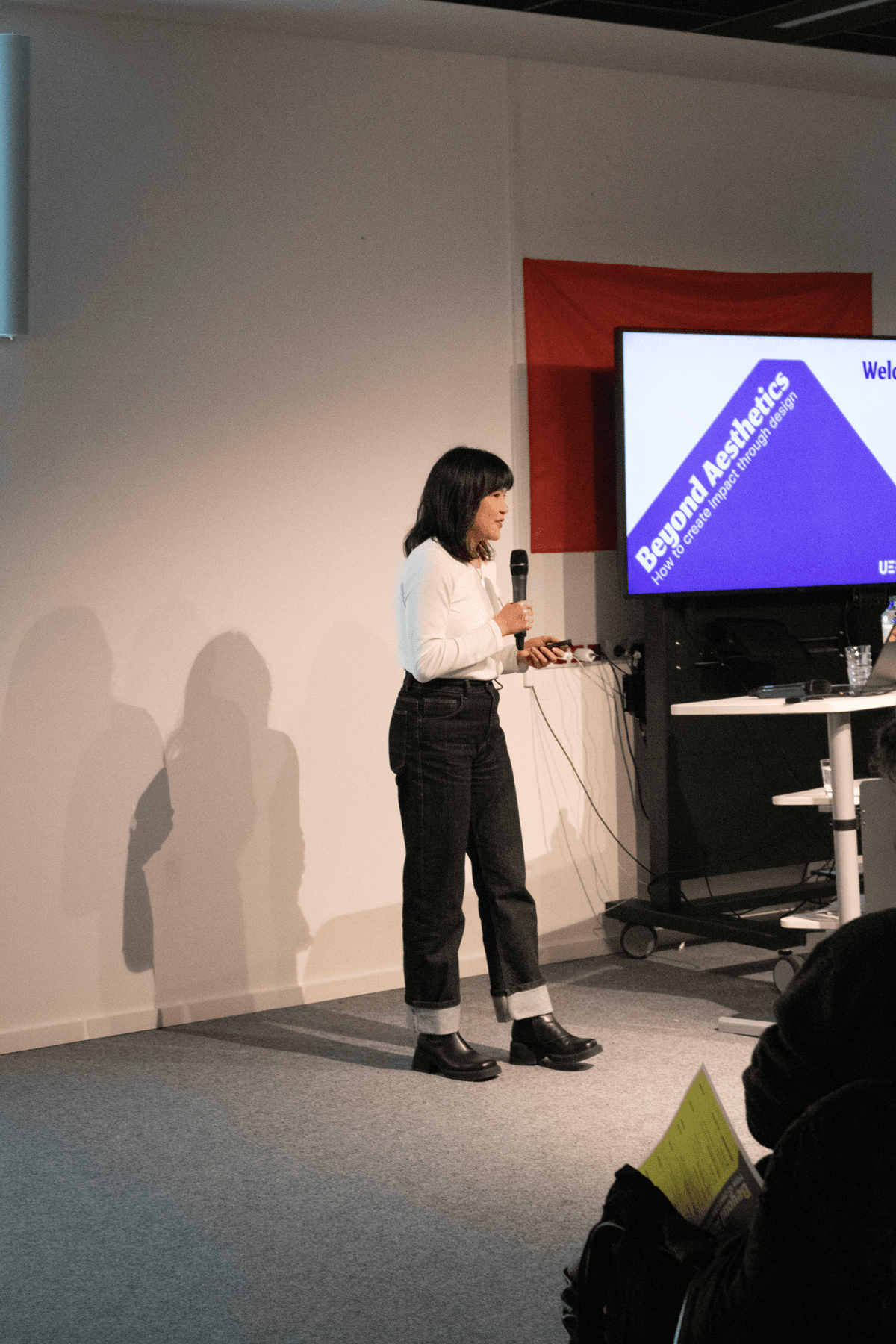
After all the work on the designs, we saw everything come together at the conference.
Conclusion
As it was my first time as a team leader, leading was the hardest part. I had to find ways to lead and motivate my group. I know I didn't always manage it well, but I grew a lot in this area.
The design itself came more naturally, thanks to my graphic design background. This came in handy, as I could give constructive feedback on typography, layout and colour to raise every piece to a professional level, and keep the whole set consistent.
We were aiming to make an impact, and we concluded that we succeeded: we got many compliments on the design, were told it looked professional, and even a week or two later people were still complimenting it.