Bringing “Vision” to Life
Bold social media posts, short animations, a logo and print materials for two optics shops, designed to stop the scroll and bring people into the store.
The brief
Small optics shops compete with big chains for attention. They needed visuals that are colourful, direct and instantly readable, on Facebook, on in-store TVs and LED walls, and on paper.
My role
KodakLens was my first graphic design job, and Feszl Optika a freelance client. I designed the shops’ social media posts, TV and LED animations, posters, printed materials and a logo, and wrote many of the post texts too. At KodakLens customer numbers went up by 20%, and Feszl Optika’s glasses repair designs raised customer numbers by 50%.
Social media
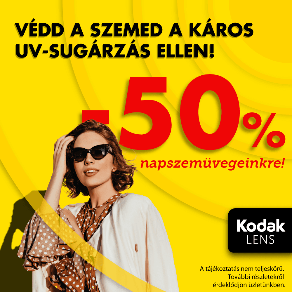
Discount posts work when the offer is the first thing you see. I made the percentage the hero: huge numbers in heavy type, set on the vibrant yellow and red of the Kodak brand, with the product or a playful character as a second layer, like the giraffe astronaut in heart-shaped glasses.
Each post also had versions for printed posters and TV animations, so the same message followed customers from their phone to the shop window.
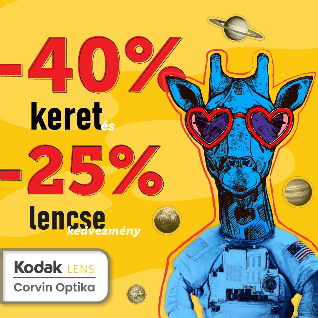
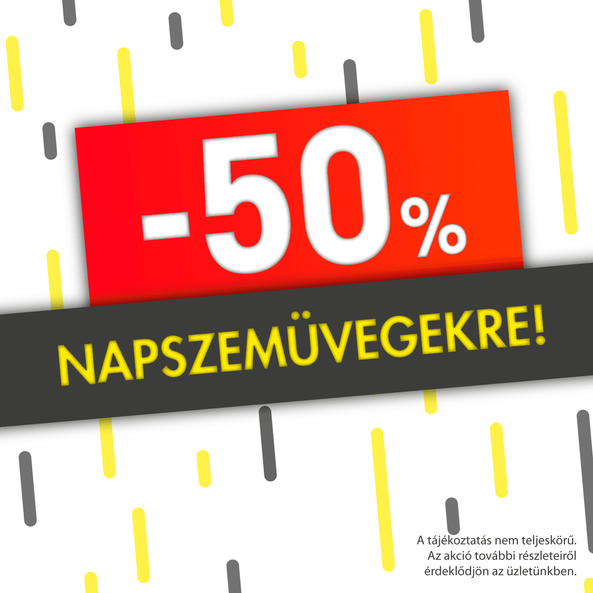
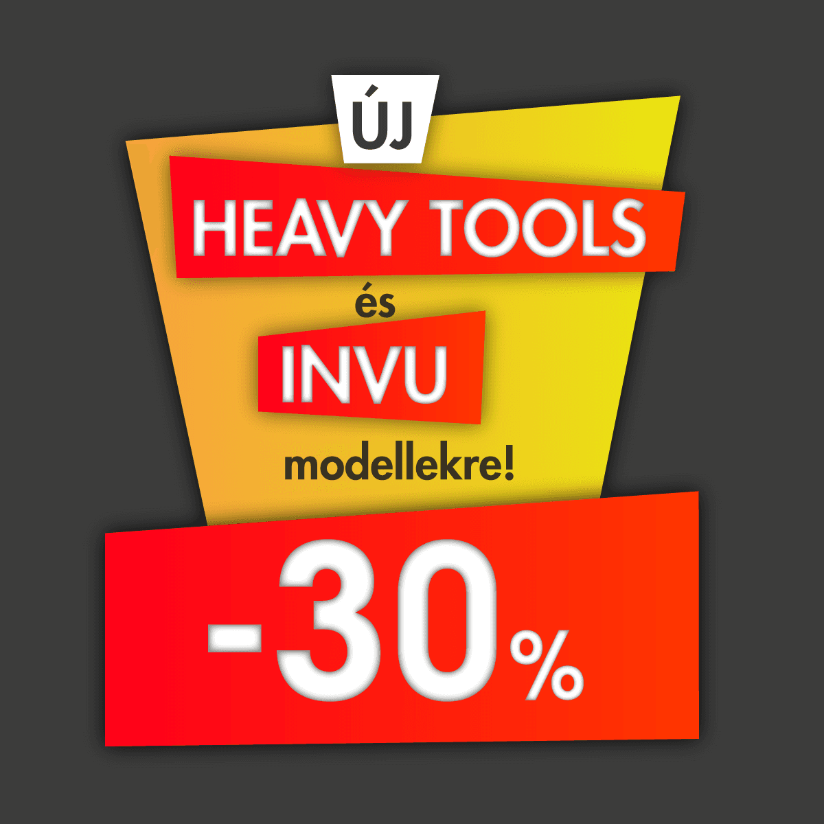
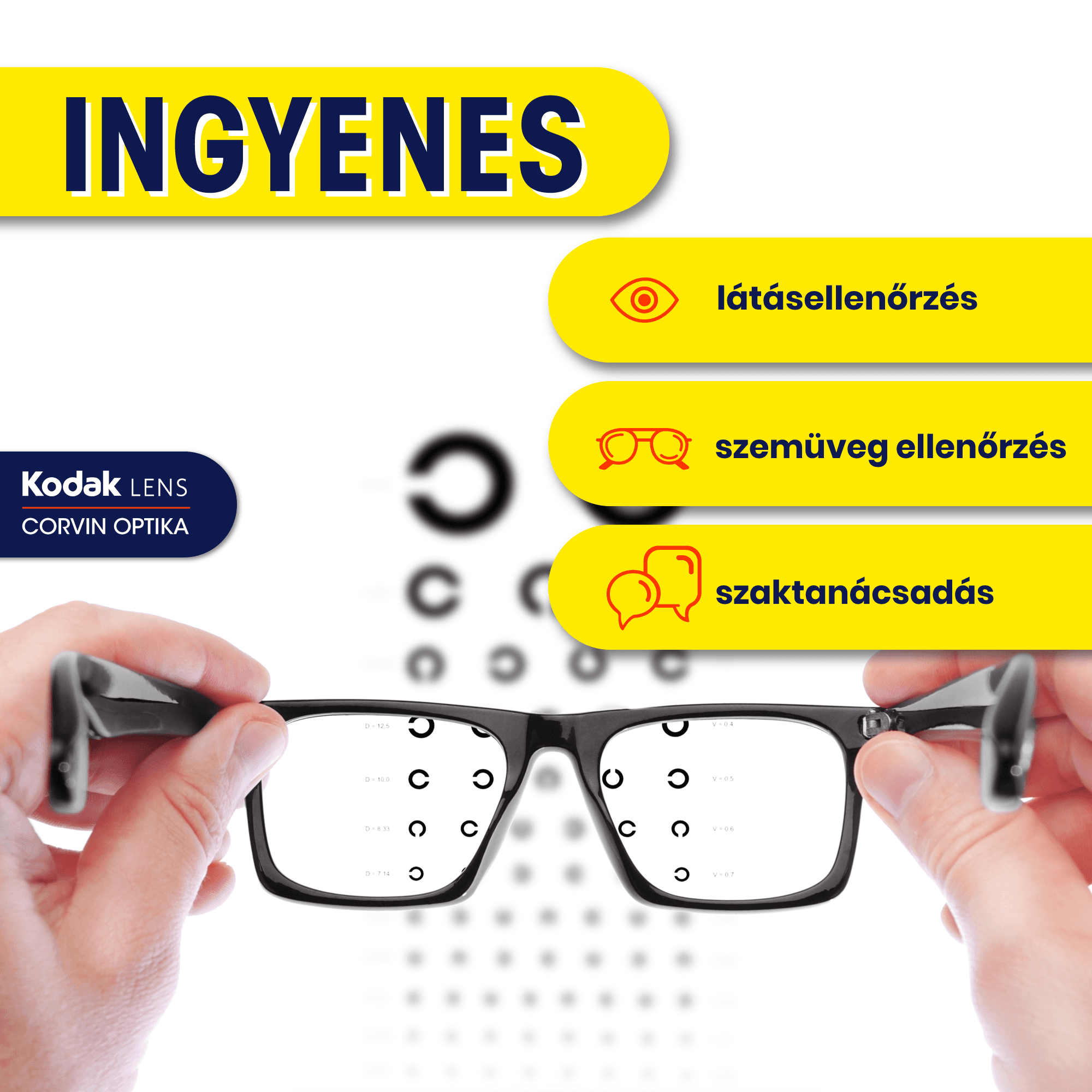
Sale and service posts
Animations
For topics that needed a stronger impression, I made short looping animations in a flat illustration style with bold gradients. They explain a service in a few seconds: how blue light reaches the eyes, or how a broken frame is repaired with a laser on the spot.
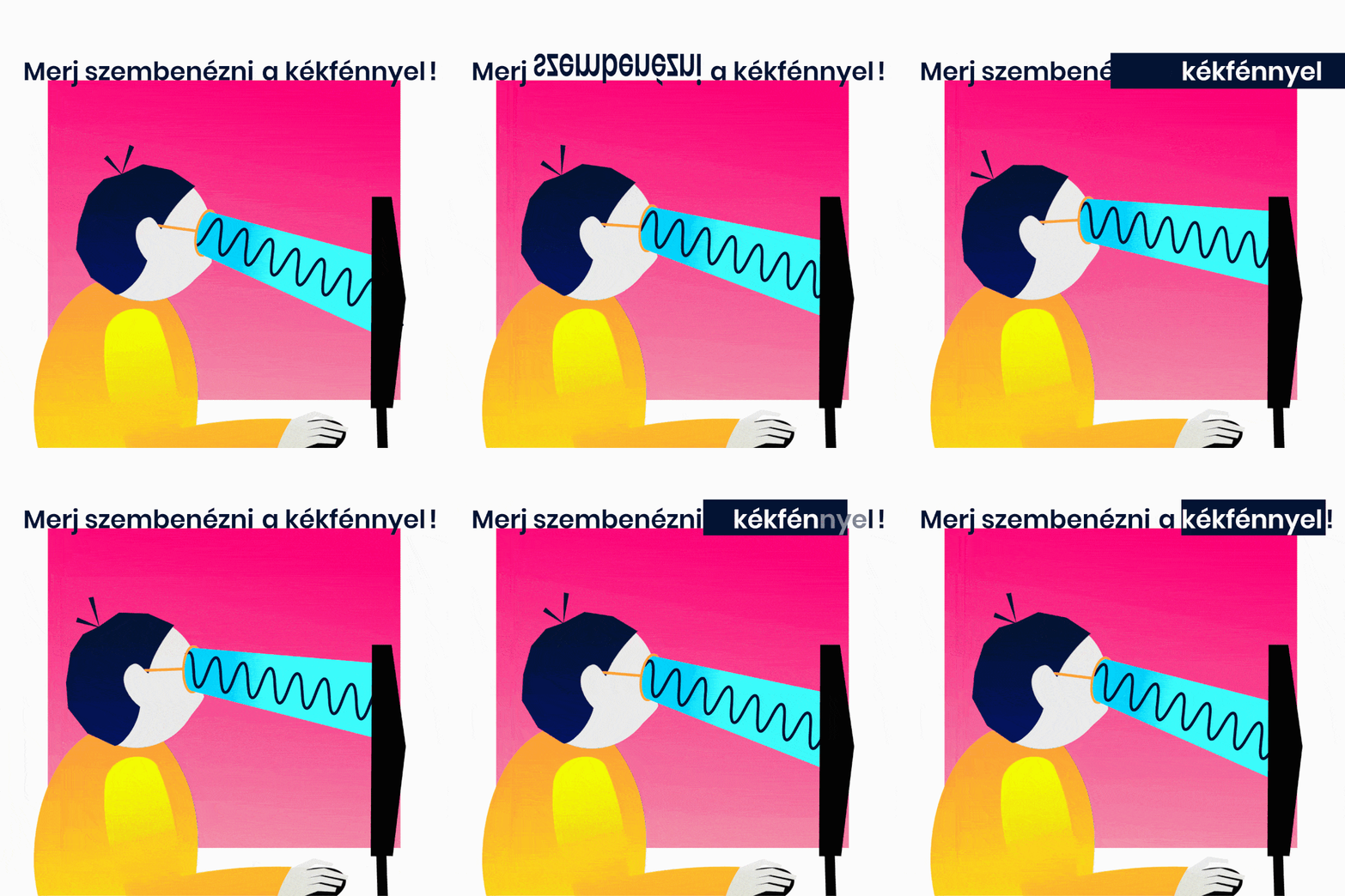
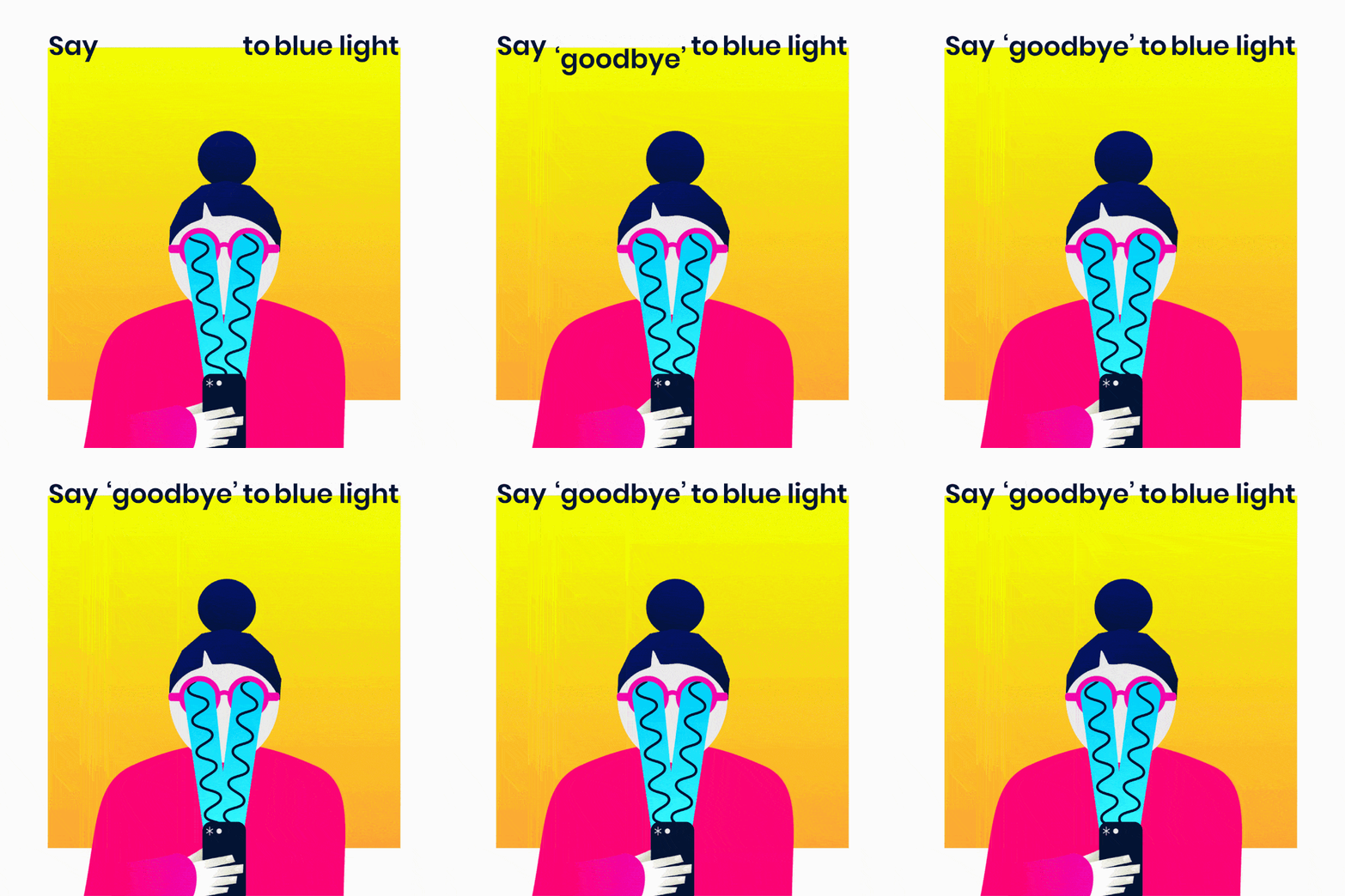

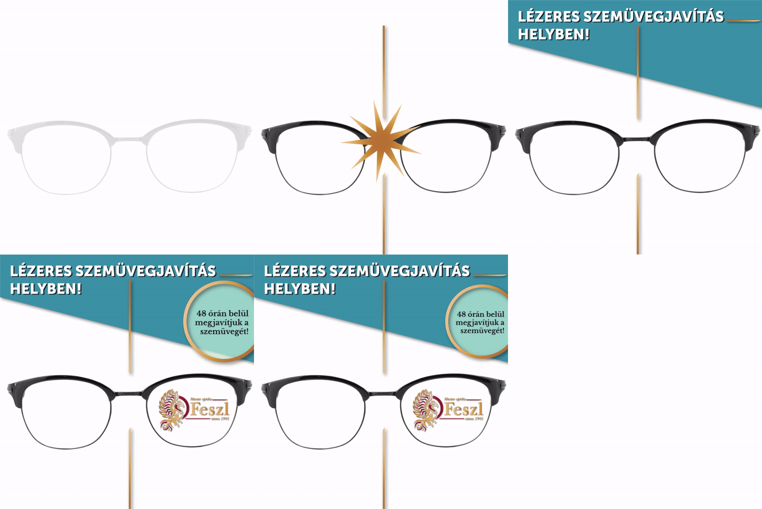

Blue light and laser repair animations
Working within a campaign system
October is the month of vision in Hungary, and a country-wide company offers smaller shops a joint campaign. The colours, icons and style were given; I chose the topics and photos and adapted the system to Feszl Optika, keeping the red side band and the logos in place so every post still belonged to the national campaign.
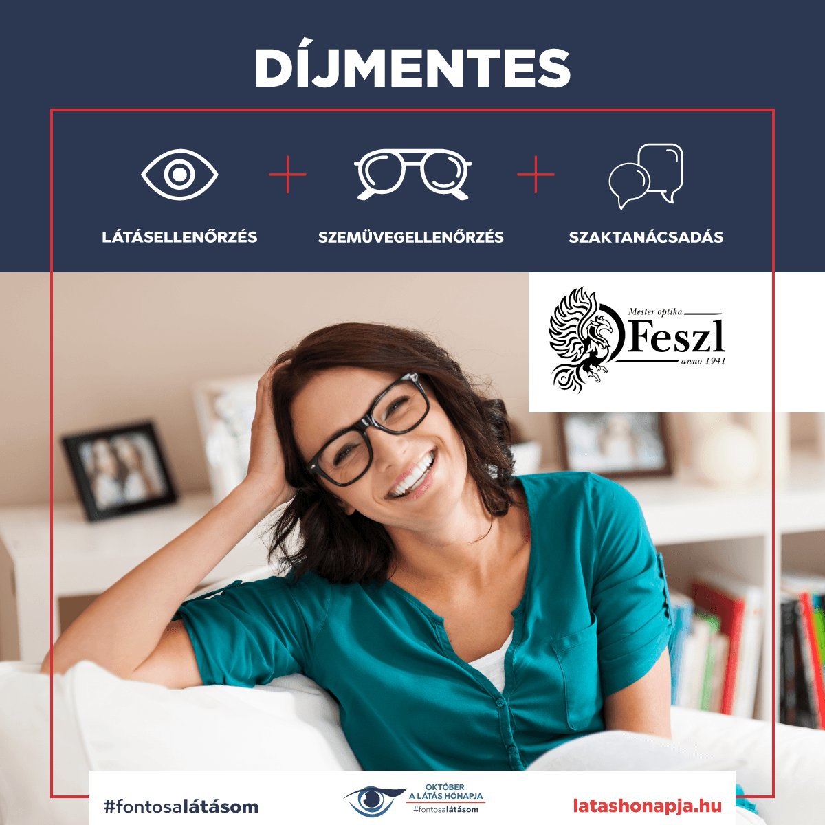
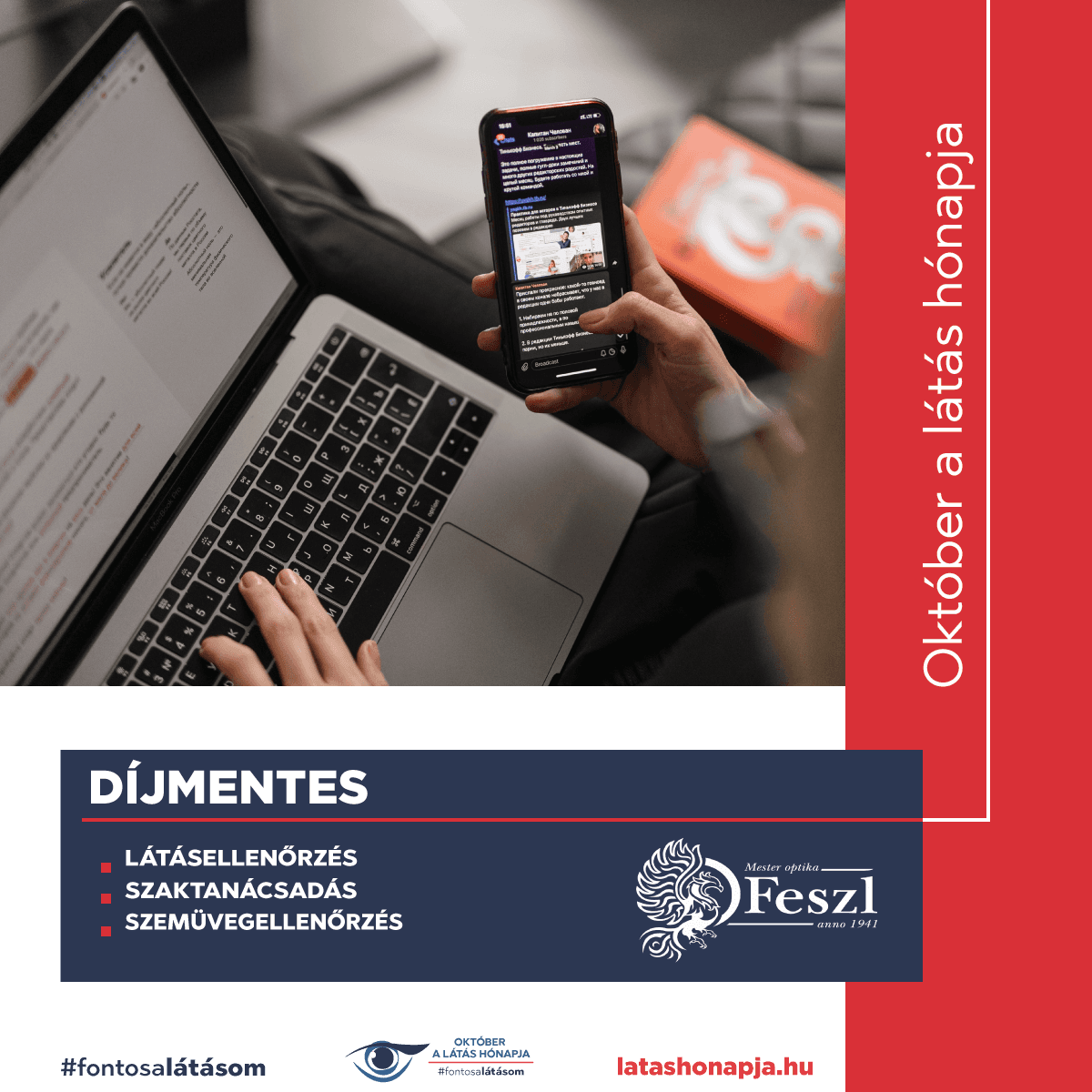
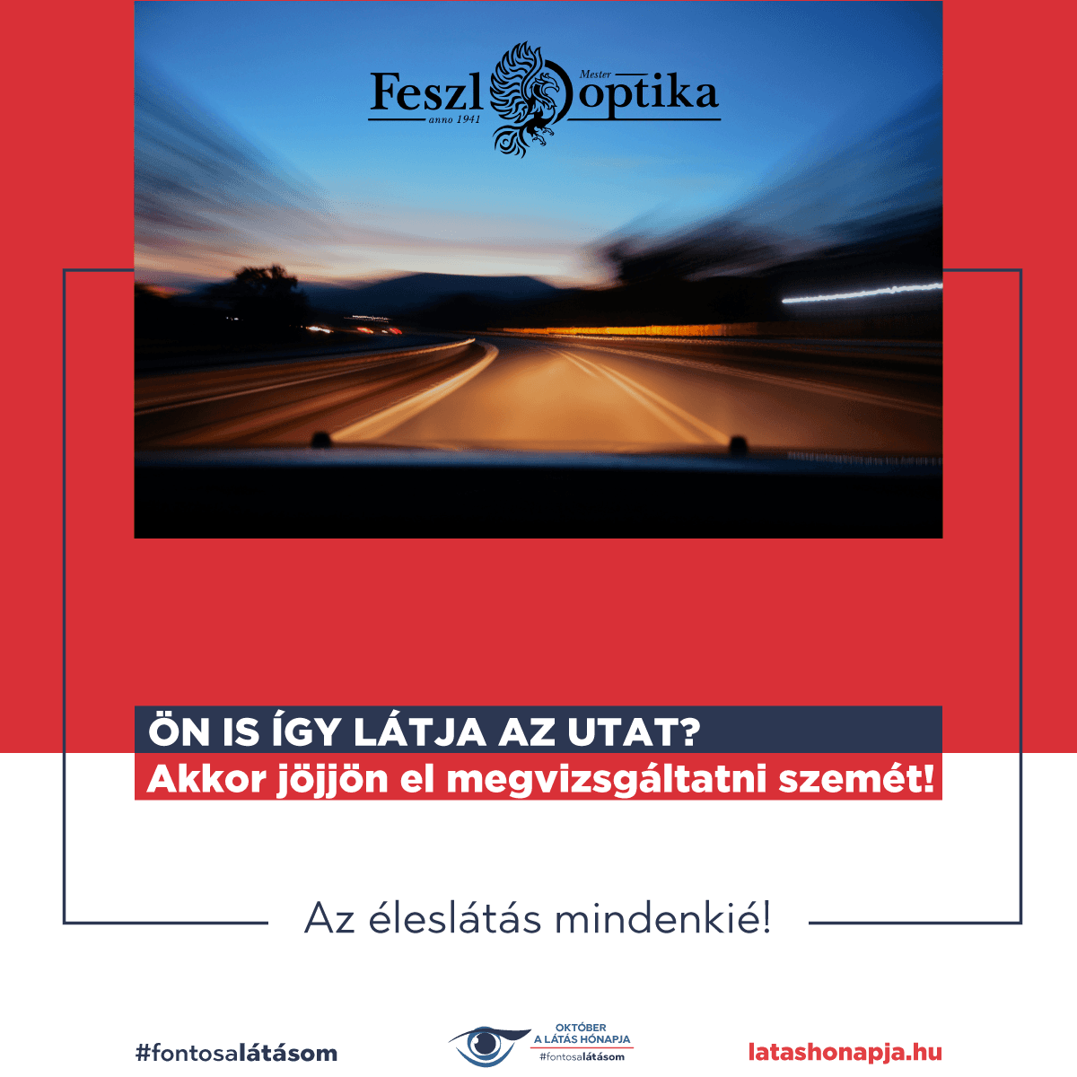
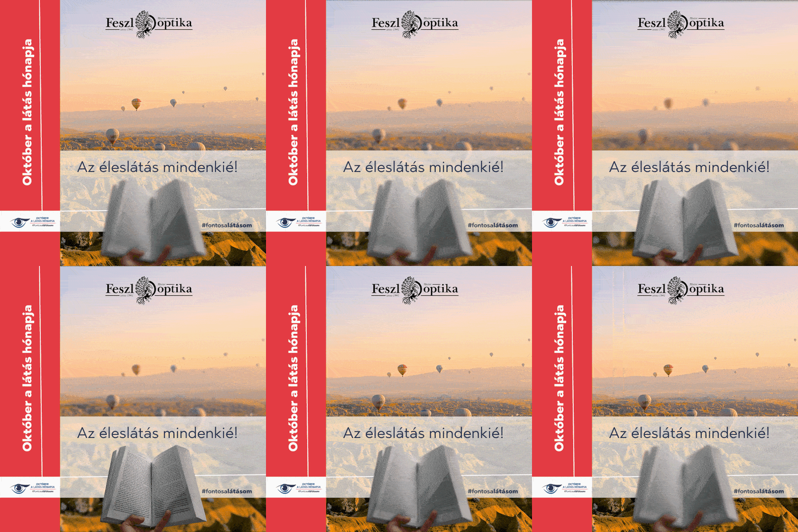
Month of vision campaign posts
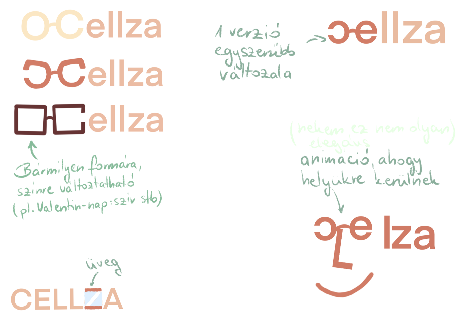
Logo design: Cellza
I designed a logo for Cellza, from the first sketches to a final set. The final logo is built around the C, drawn as an open ring that suggests a lens. The final set comes in rose gold, white, black and grey, in horizontal and vertical versions, with the motto “Szemrebbenés nélkül minden nap” (every day, without batting an eye).
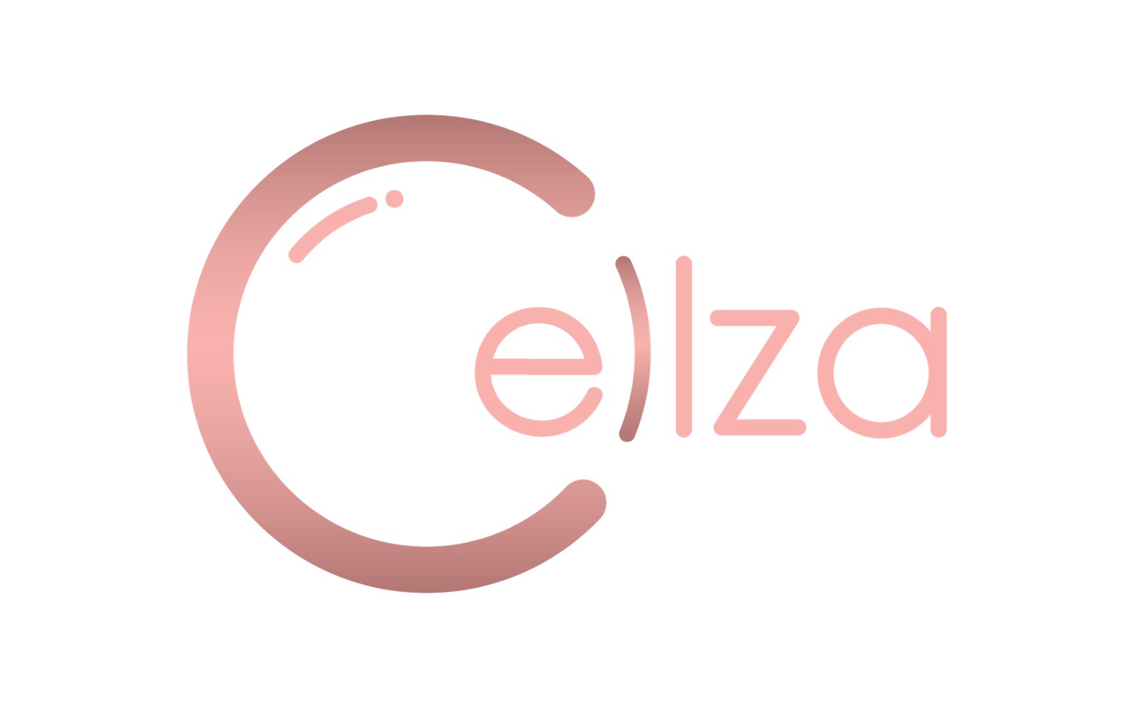
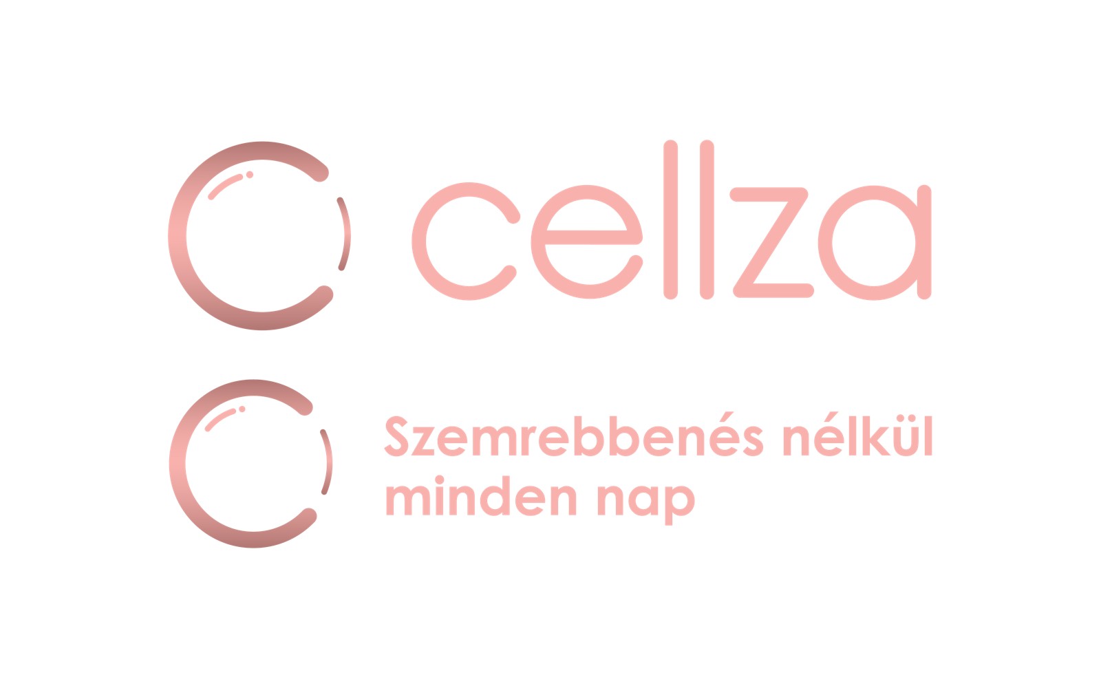
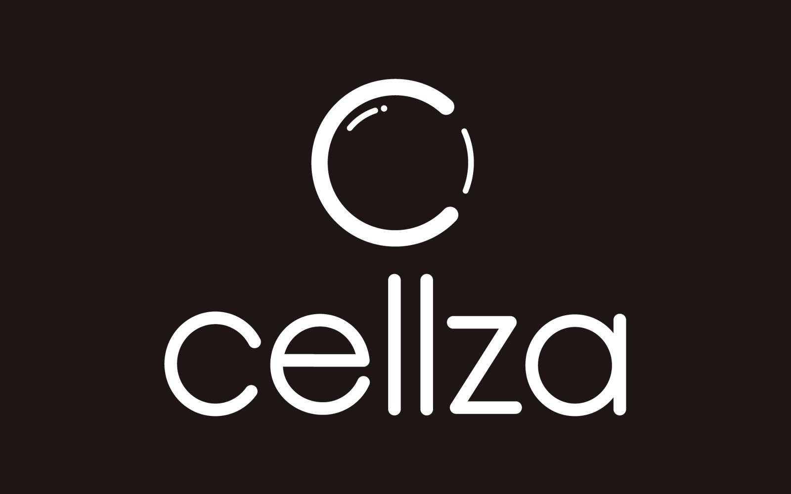
The final logo versions
For the shops I also designed printed materials, from price lists to loyalty cards. The eye examination packages are named after gemstones (Emerald, Ruby, Sapphire) and each one is illustrated with a close-up of an iris, turning a plain price list into something memorable.
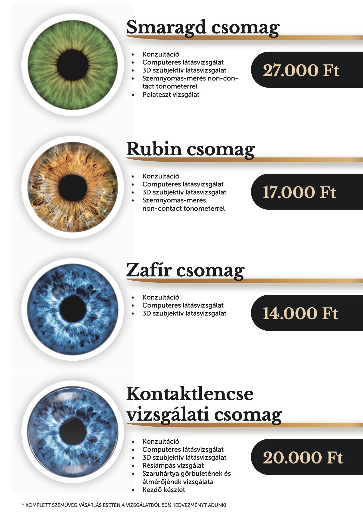
Price list of the eye examination packages
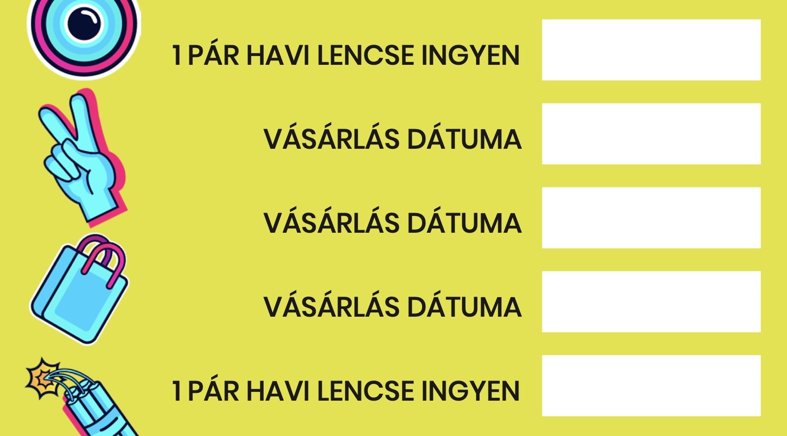

A contact lens loyalty card, front and back
Reflection
This was my first real work experience, and it taught me the basics I still build on: how much a strong hierarchy matters when people only glance at a design, and how to keep one message consistent across a phone screen, a TV and a printed poster.
The biggest lesson was working with people who aren’t designers, and finding ways to get my ideas across to them.