OBI – Making Small Displays Count
Retouched product imagery, posters, brochures and in-store signage for OBI Hungary, all designed within a strict international brand system.

The brief
OBI is a multinational DIY retailer. In a busy store aisle a poster gets a few seconds of attention, and online a product photo has to sell on its own. Everything had to be clear at a glance and follow OBI’s corporate design: its orange, dark grey and white, and fixed templates.
My role
I retouched and edited over 2,000 product pictures, designed POS materials, posters and leaflets for more than 15 campaigns, and helped colleagues with their everyday design needs. I worked with the German online store department, merchandising, marketing, purchasing agents and suppliers.
Picture editing
Many suppliers, especially smaller ones, don’t have professional product photos. I monitored new and old images on the website and edited them to look clean, consistent and desirable: cut out onto pure white and colour-corrected, so a whole category reads as one set.
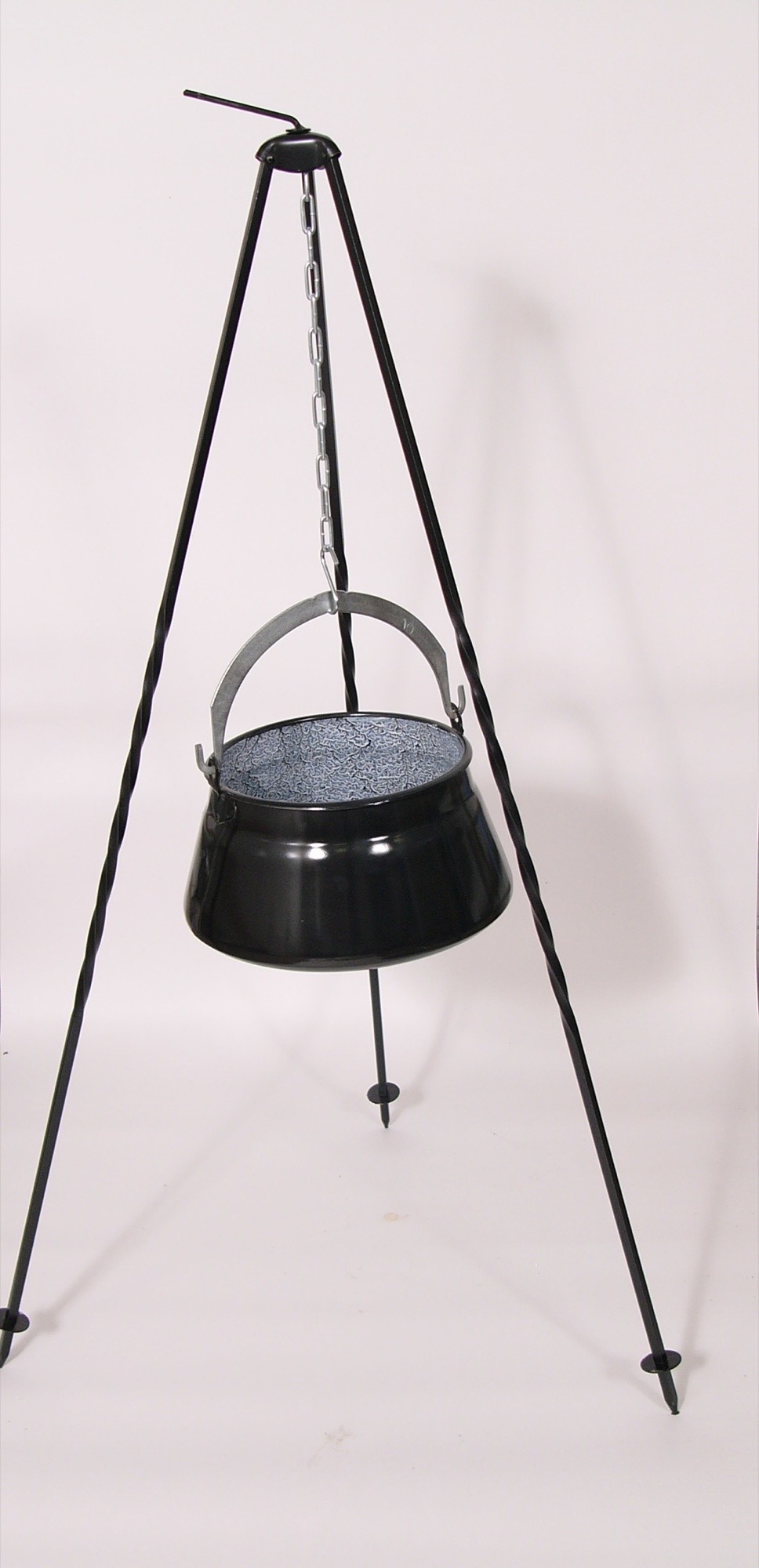
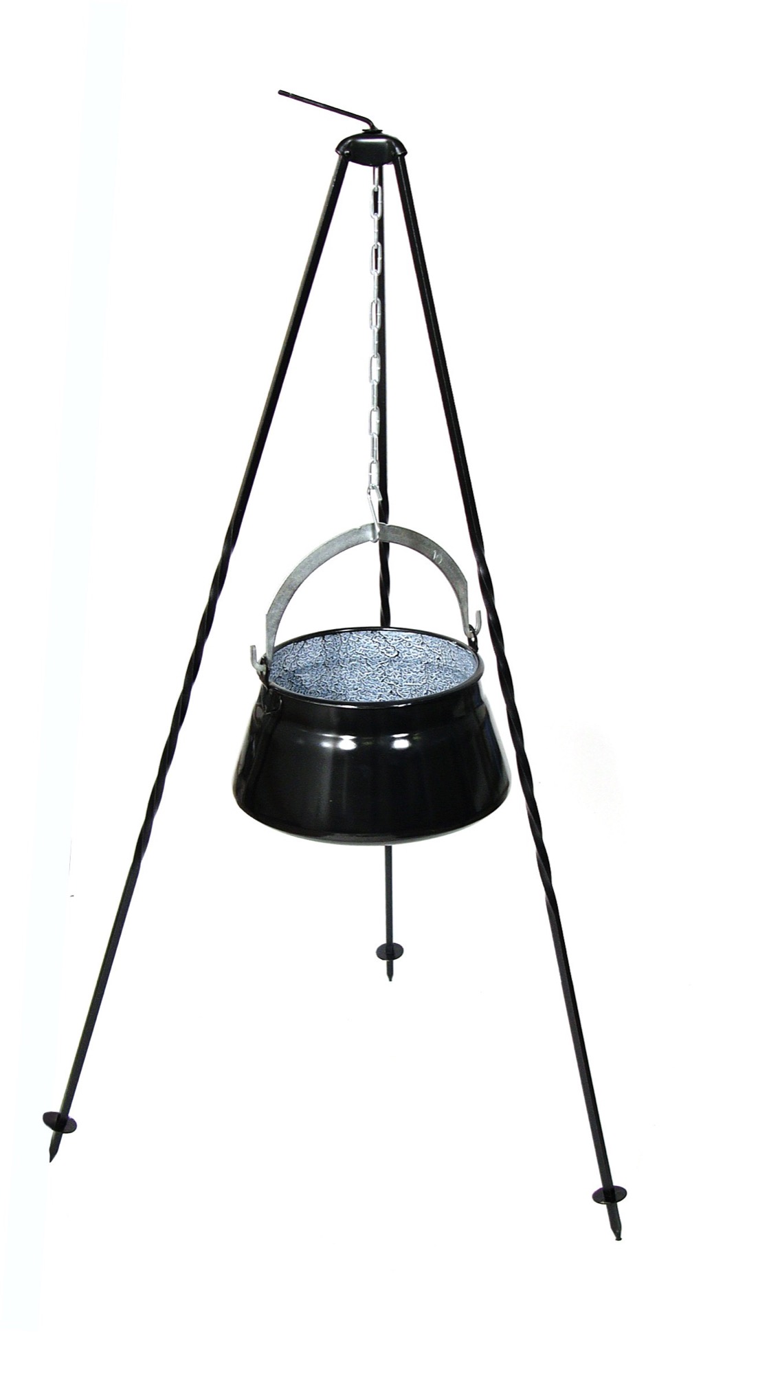
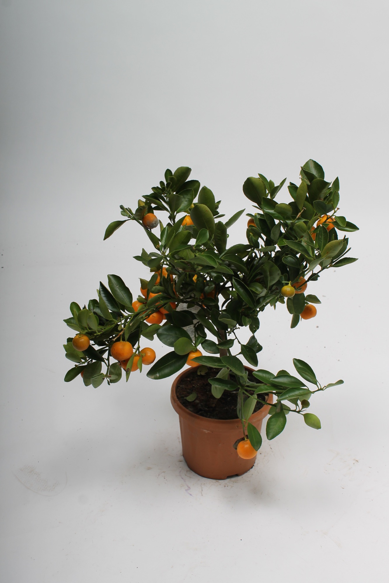
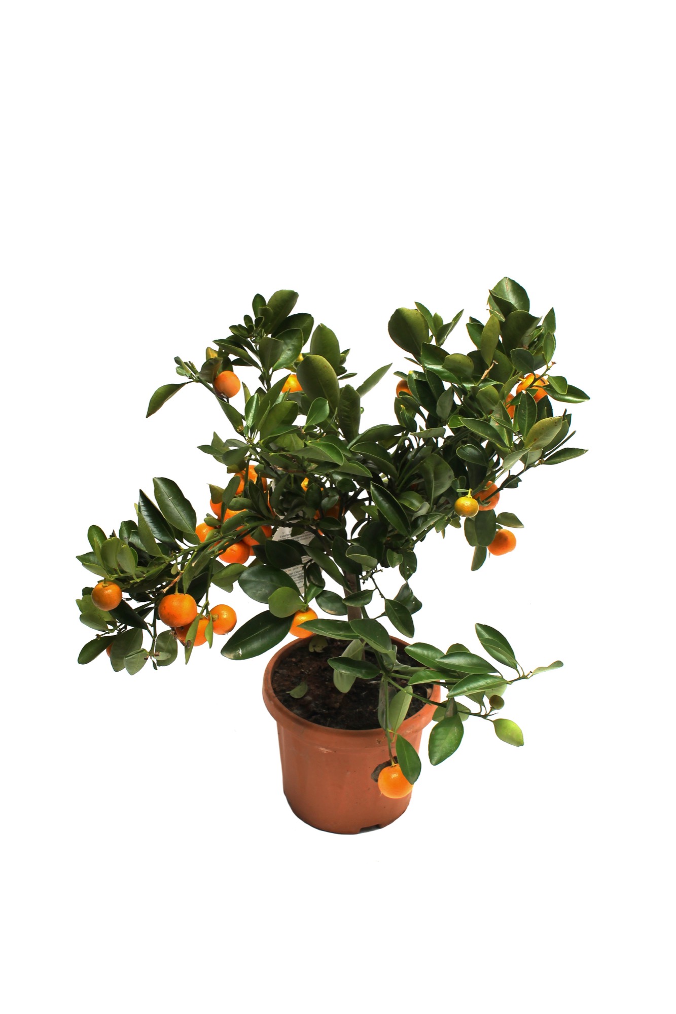
Before and after
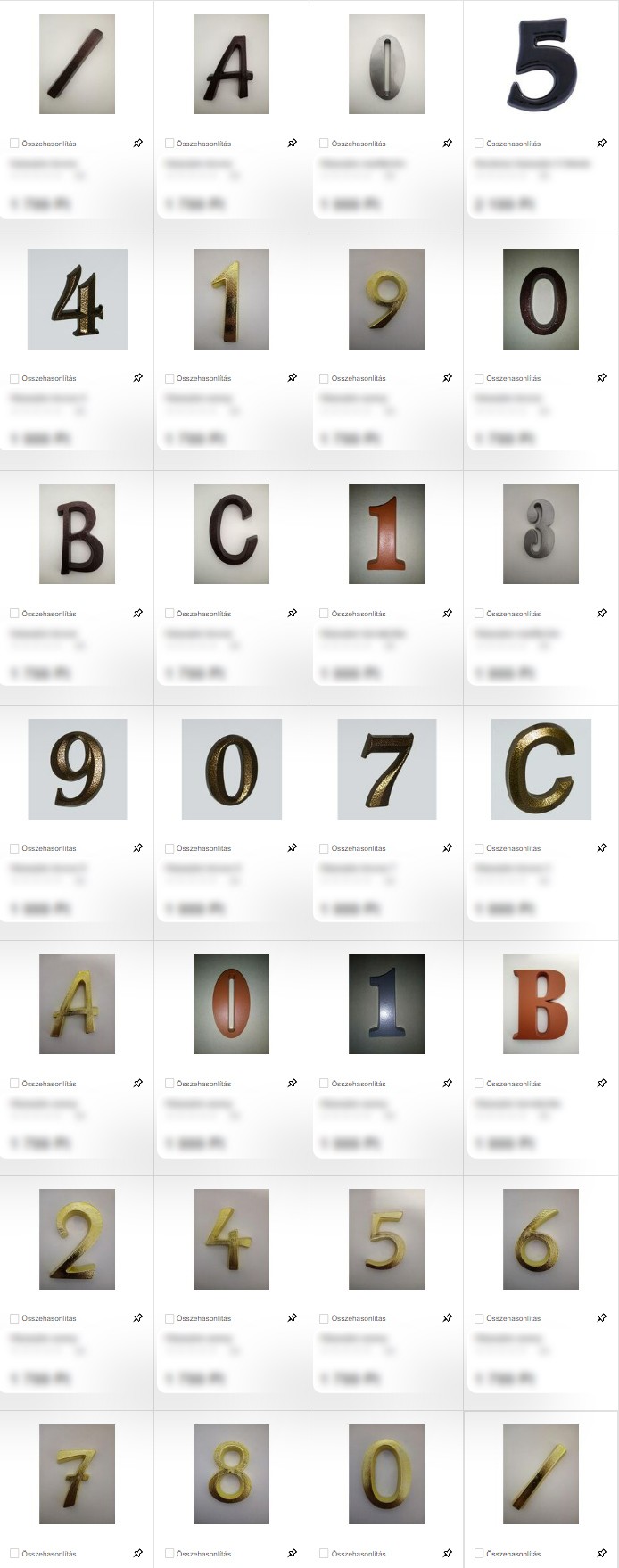
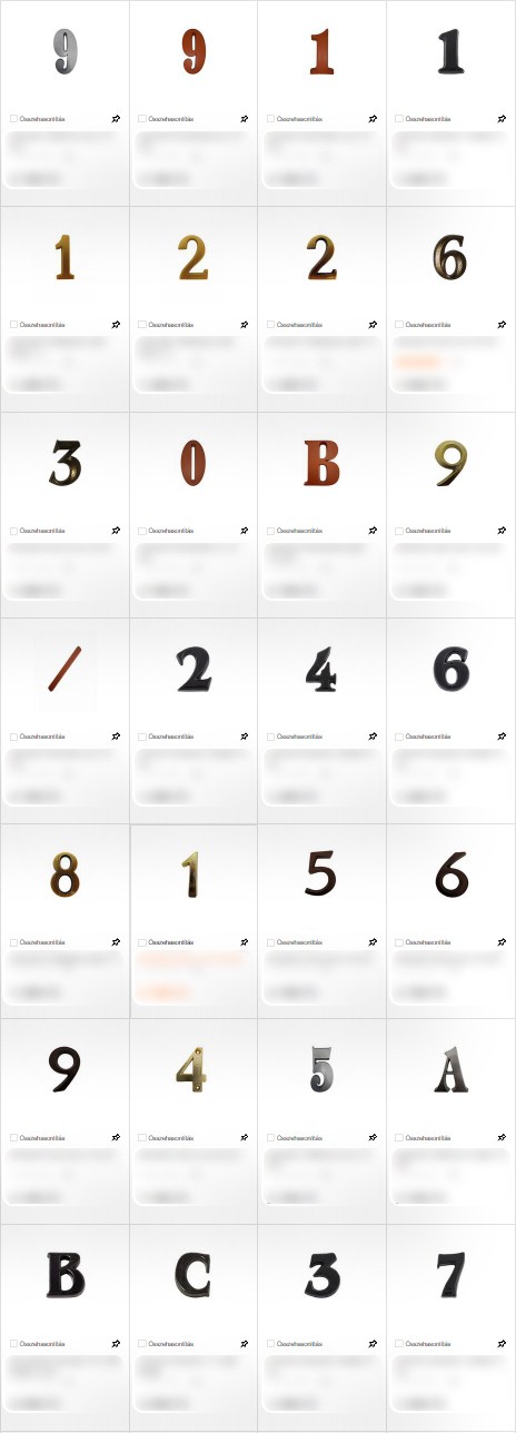
House number plates: from mixed backgrounds to one consistent set


A decorative lamp: the cut-out product and a lit-up version
Plant posters
For the garden department I designed information posters that help customers choose: an introduction to herbs with care instructions, and a top 10 series of air-filtering houseplants. The series uses the same layout for every plant, with its place in the top 10, so customers can compare the plants as they walk along the shelf.
As the only designer on the project, I looked at these posters a little differently from my colleagues. A poster in a busy store has only a few seconds to work, so every extra line makes it harder to read, while the team wanted to give customers as much information as possible. It took quite a few conversations, but we found a middle ground: a little more text than I would have chosen, and much less than first planned. It taught me how to explain design decisions to people who see things from another angle, and that a good compromise can still make a clear poster.
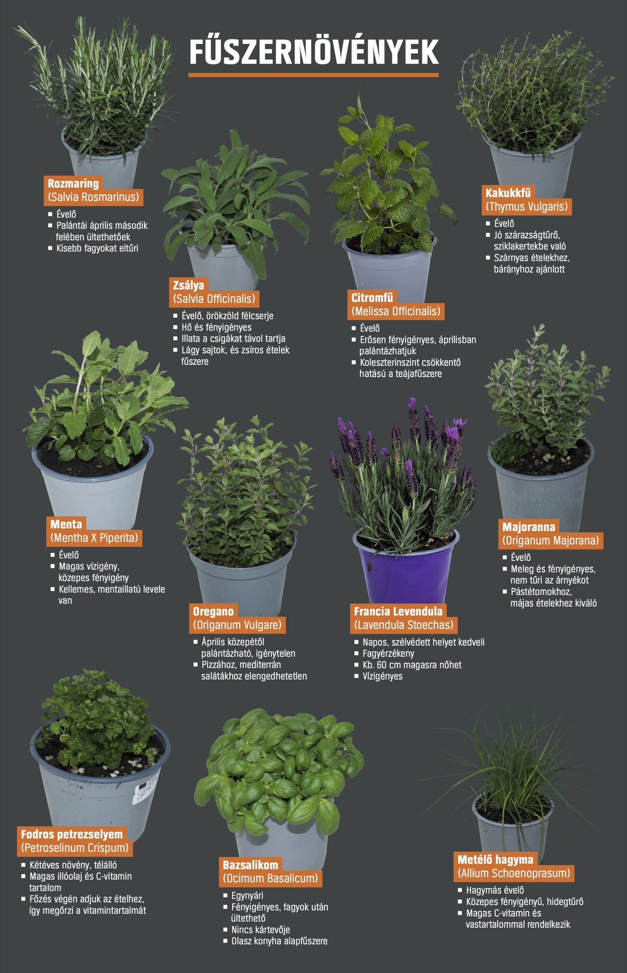
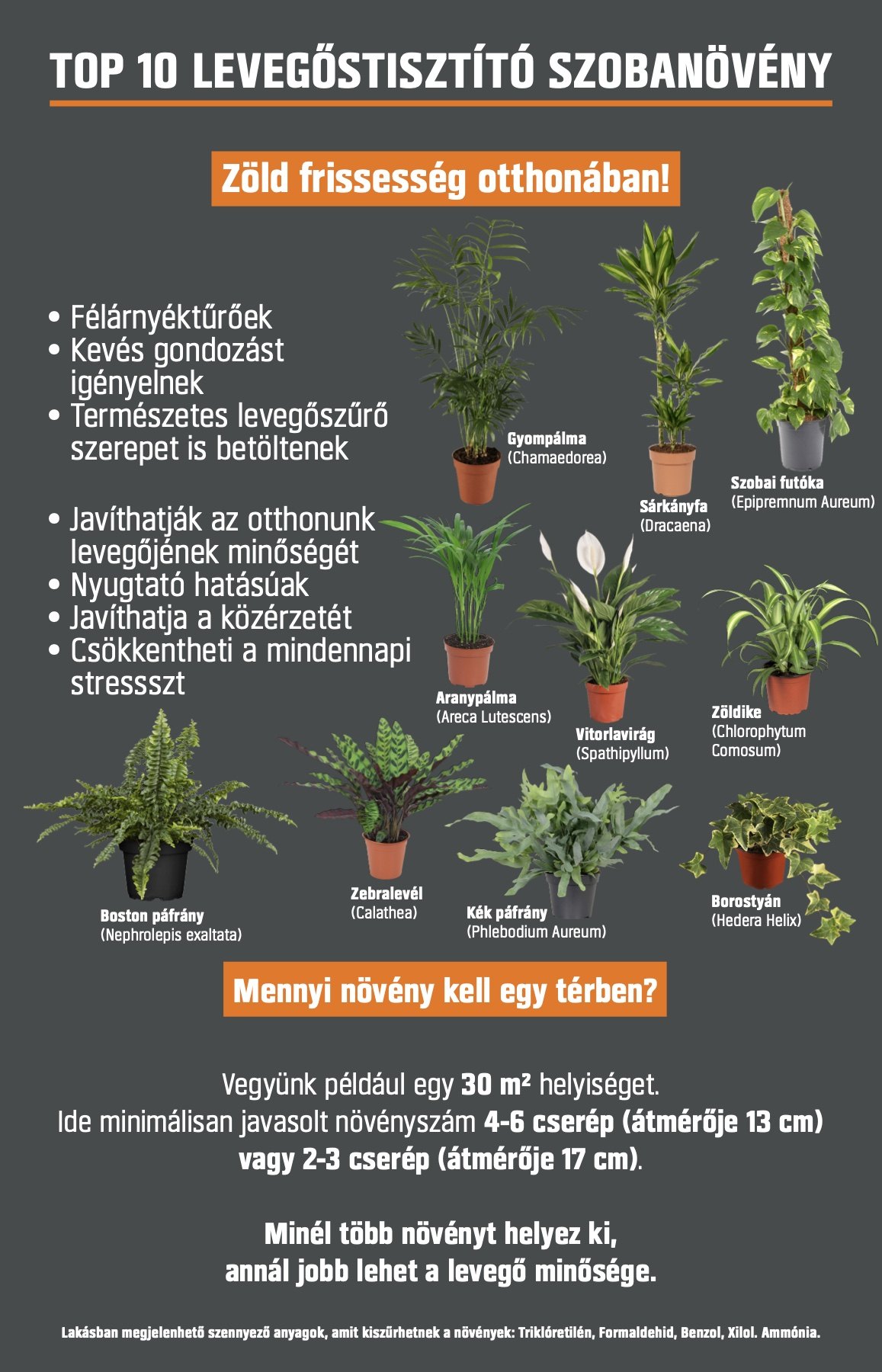
The herb poster and the top 10 overview



Posters from the top 10 series
Building material posters
Building materials all come in similar sacks, so the poster has to do the explaining. Working from one template, I made posters for around 20 products in two sizes: landscape A1 and portrait A0. The hierarchy is always the same: product name in heavy capitals, three short benefit points, the brand logo, the pack shot and the weight large enough to read from the aisle.
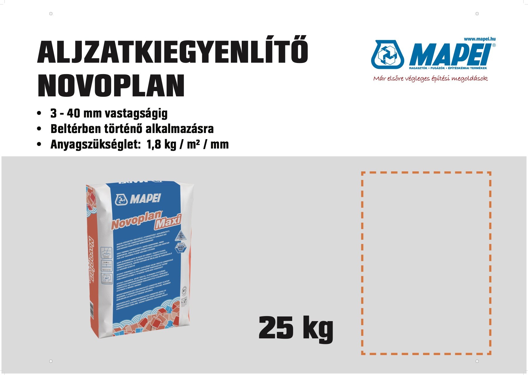
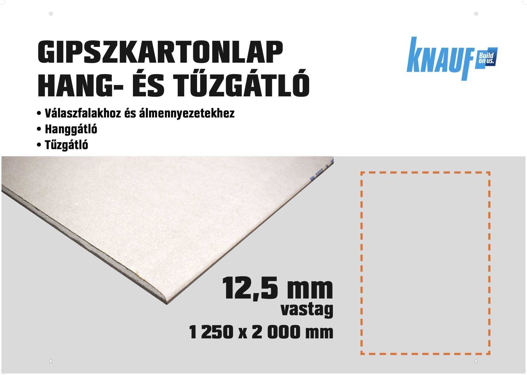
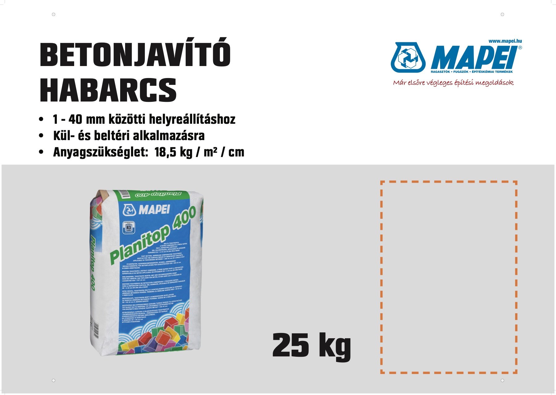
A1 posters
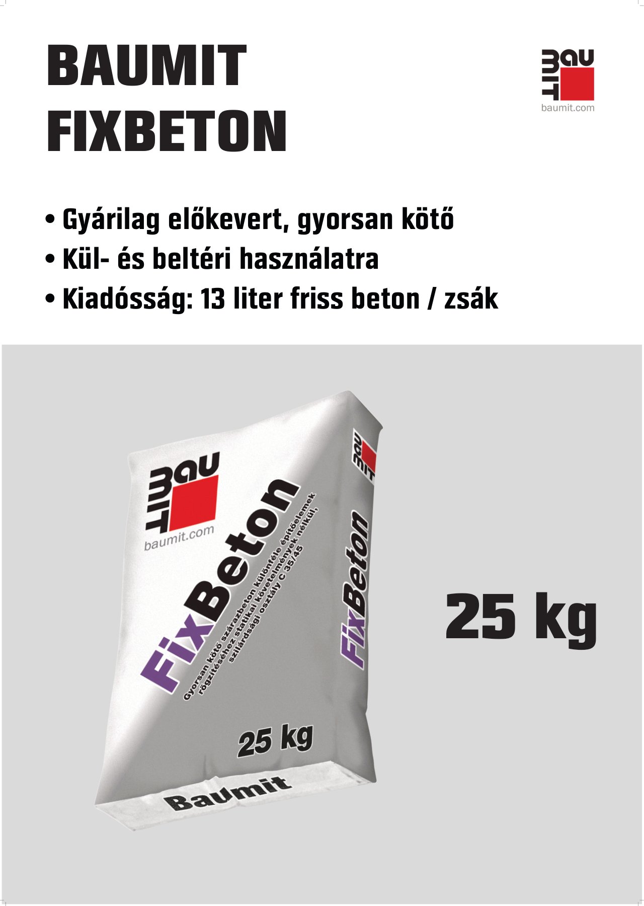
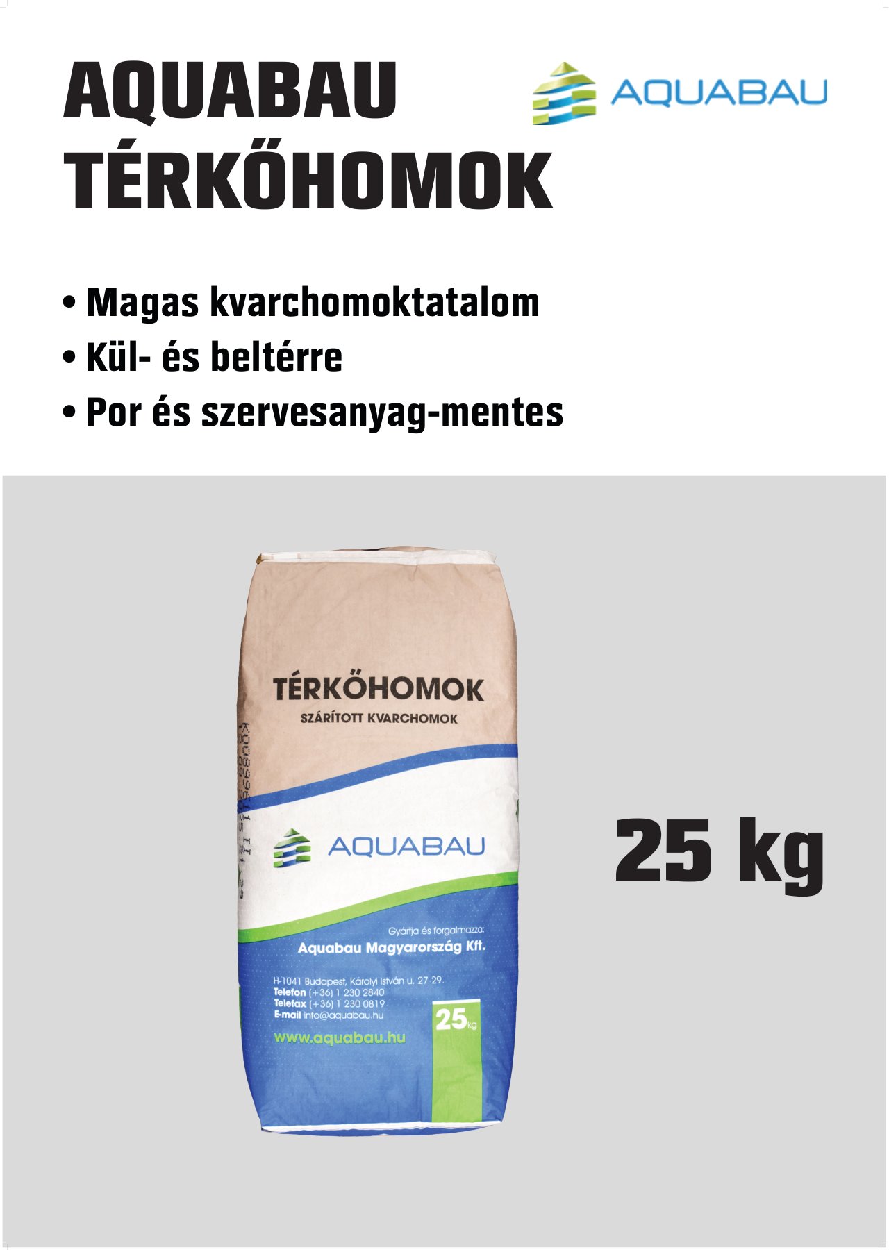
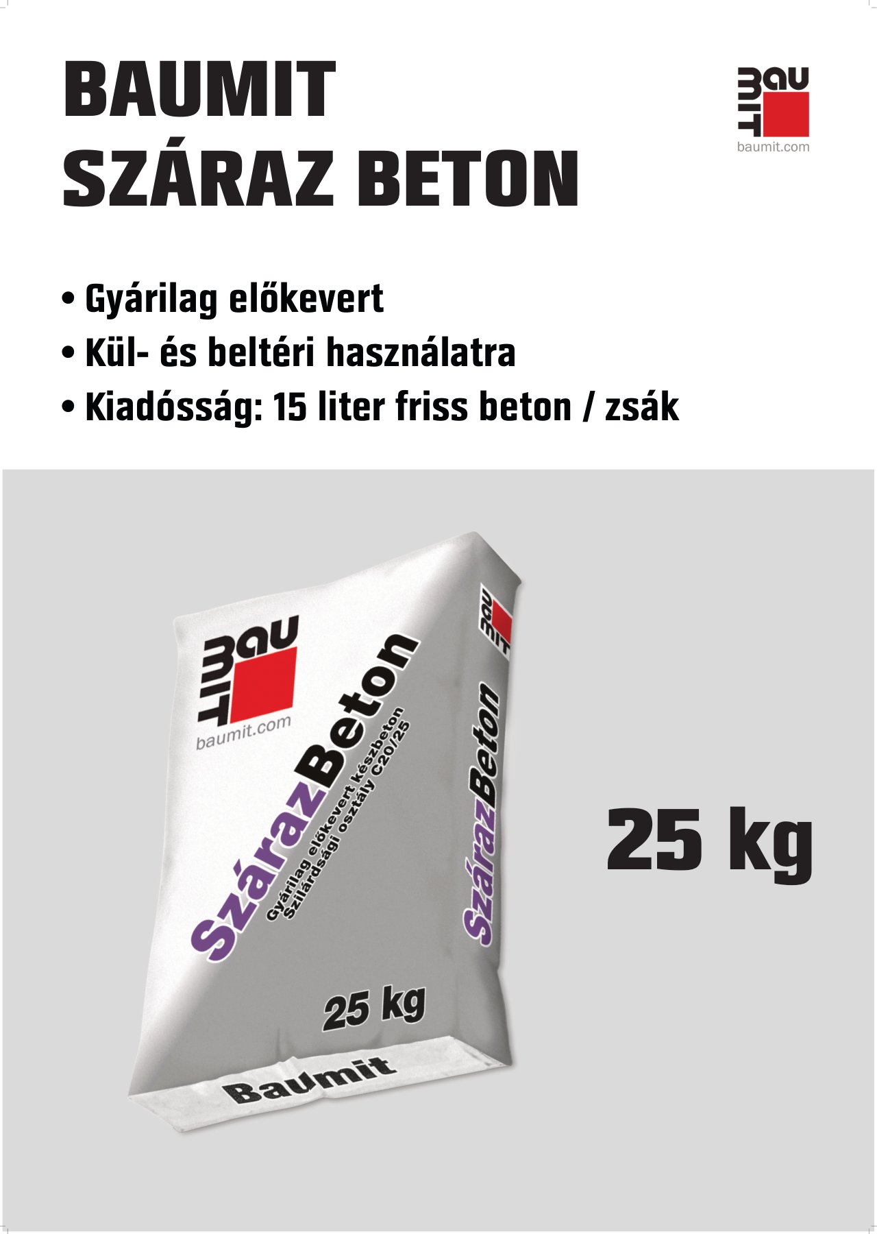
A0 posters, from the same template
Kitchen brochures
Each kitchen furniture set got its own A4 brochure, built on OBI’s master template: a large room photo and the set’s name on the front, and on the back a description, every cabinet as a cut-out product image, and a table of sizes and prices. The orange service band at the bottom keeps the whole series recognisably OBI.
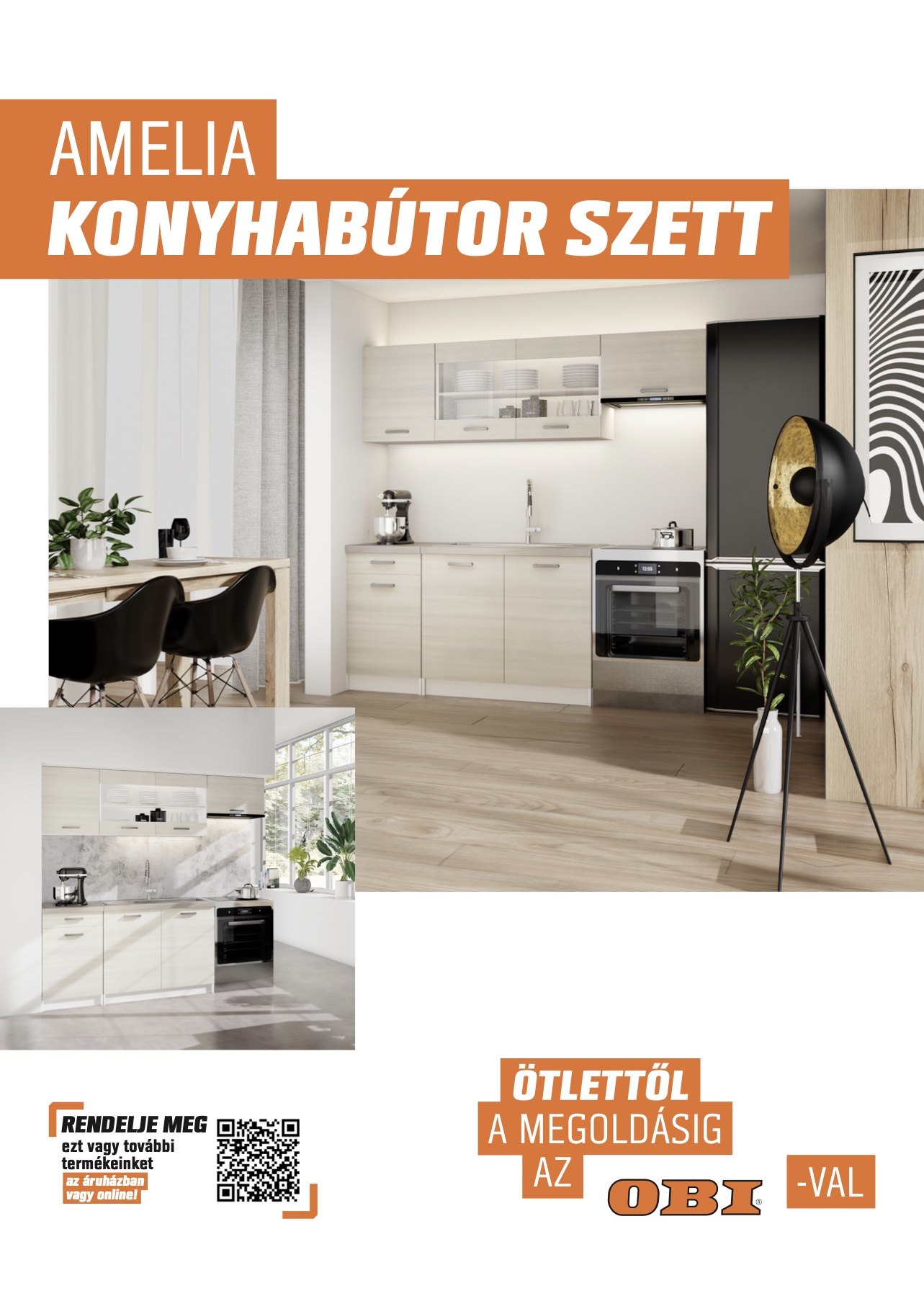
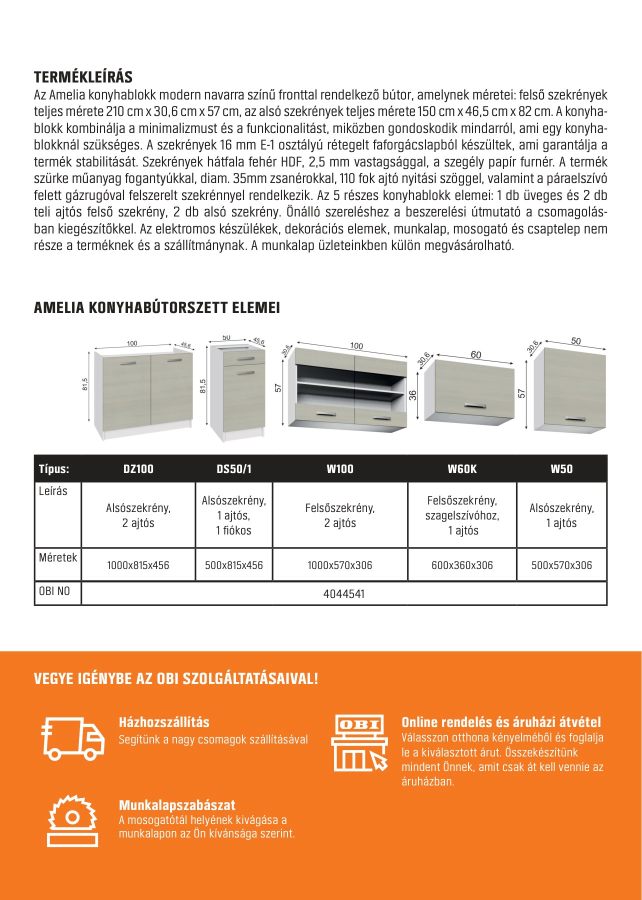
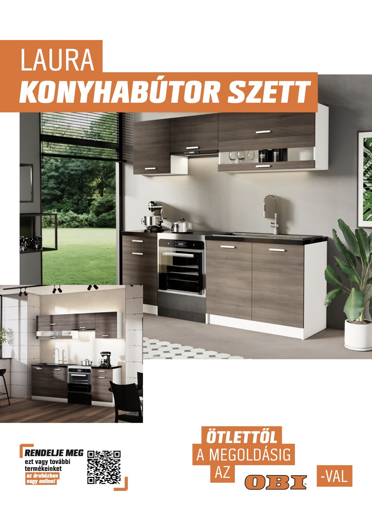
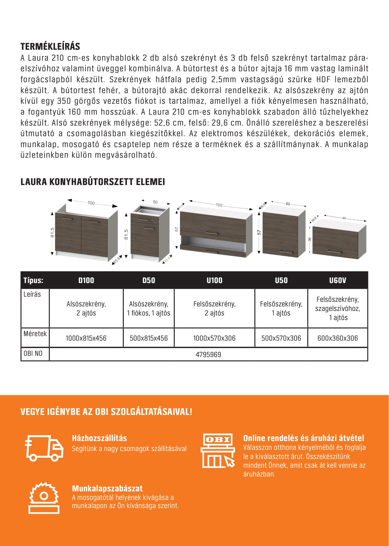
Amelia and Laura, front and back
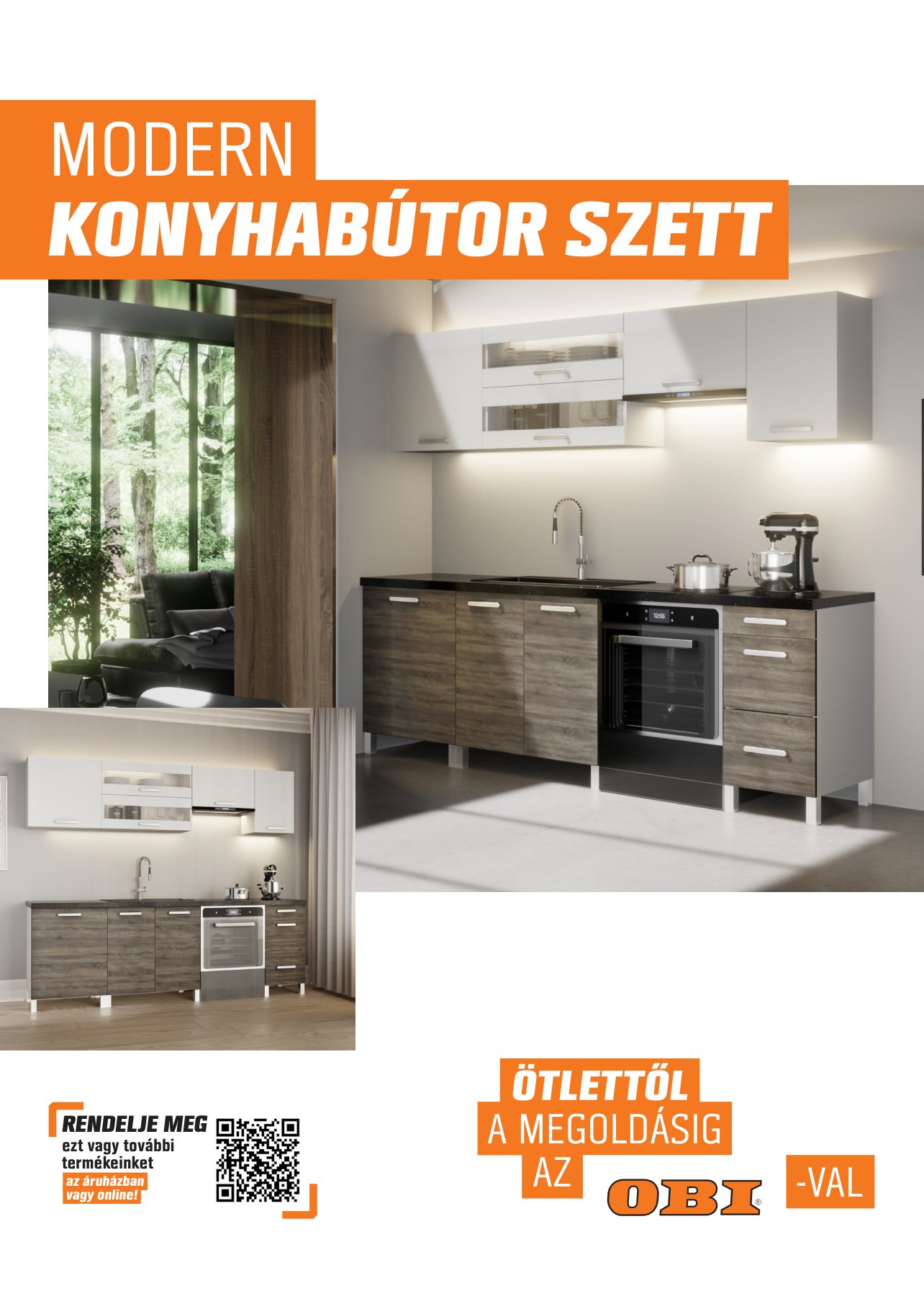
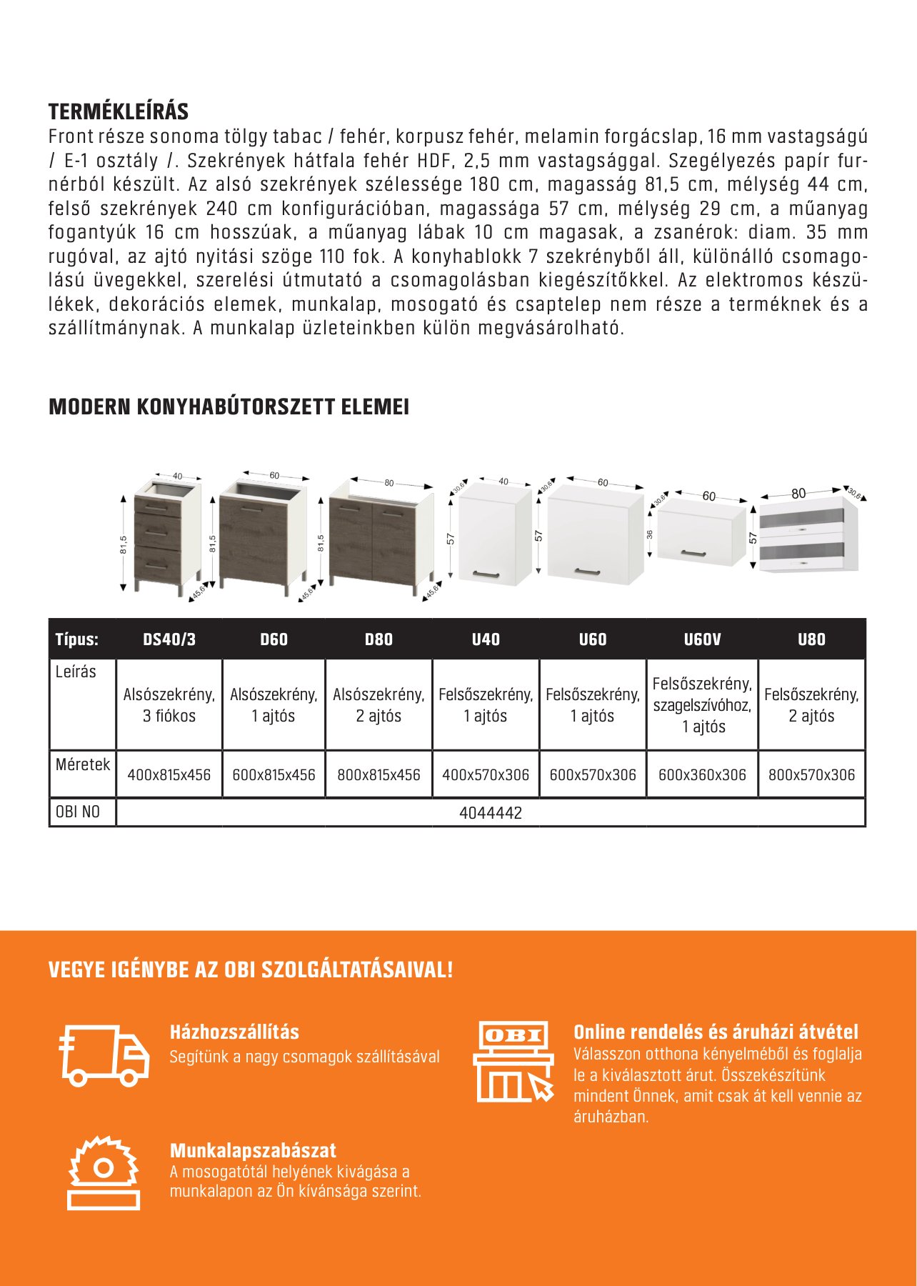
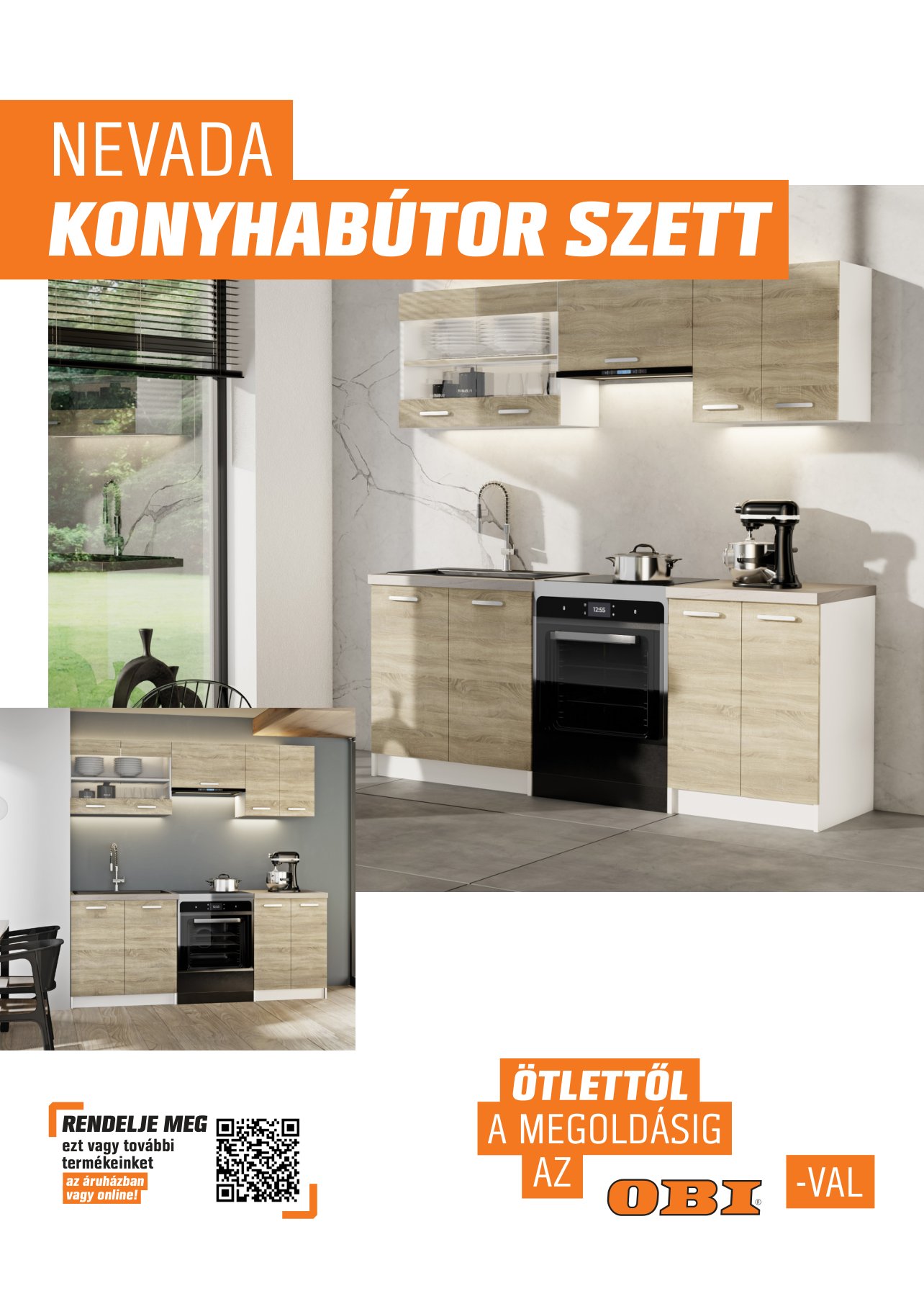
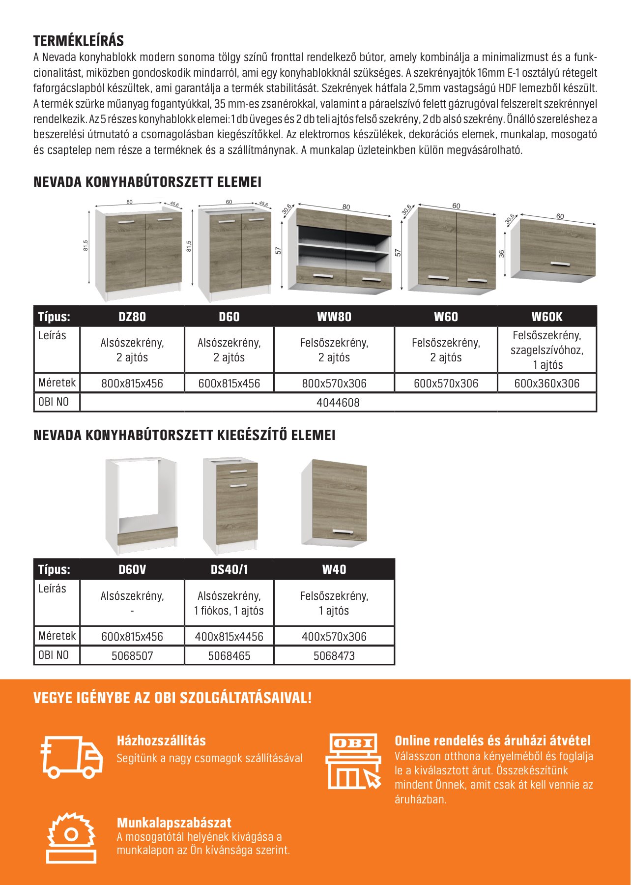
Modern and Nevada, front and back
Store signage
The signs for in-store services follow one clear visual rule: a white line icon on dark grey, the service name on an orange bar, and a short promise underneath, so the set looks like a family wherever it hangs.

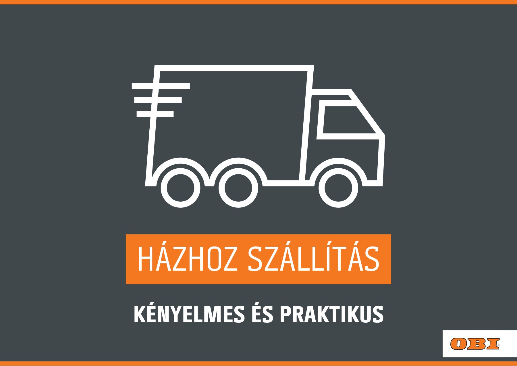
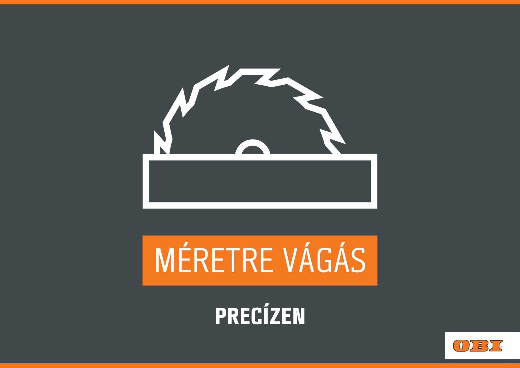
Signs for tool rental, delivery and cutting to size
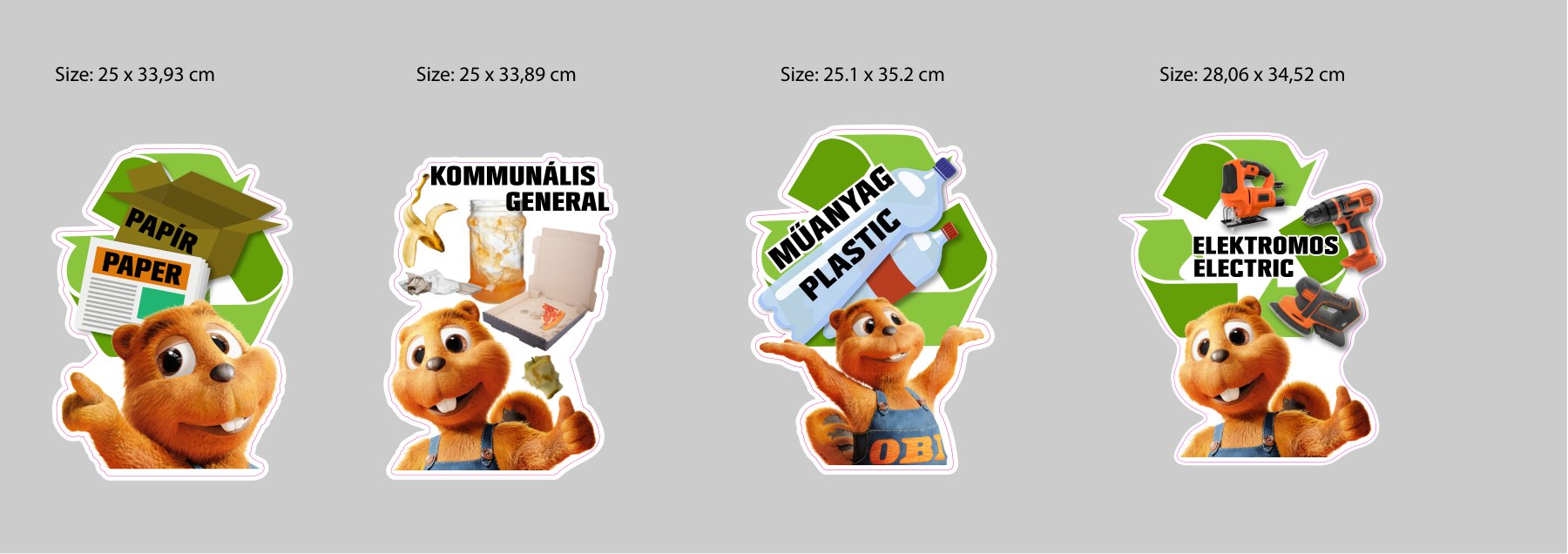
The recycling bin stickers use a friendly beaver mascot and a clear label for each waste type, so the right bin is easy to spot.
Reflection
After working for small businesses, a multinational was a big change. Designing inside strict brand guidelines taught me that templates aren’t a limit: a good template is what lets twenty posters or ten brochures stay clear and consistent.
Seeing the materials in the stores and online, I learned that even a not-so-special-looking display counts: a clean photo or a well-ordered poster really does help people choose.