Gentle Touch – Empowering Seniors in the Digital Age
A print-and-digital learning kit that teaches older adults their smartphone one gentle step at a time: a colour-coded guide, a companion app and flashcards.
The brief
Most products for older adults stop at simplification: bigger buttons, fewer options, the “hard parts” removed. For my BA thesis I wanted to do the opposite and teach how the phone actually works, in a way that feels calm, familiar and safe.
My role
Everything from research to design: interviews and literature review, the learning concept, the layout and visual system of the printed guide, the companion app’s interface, and the flashcards.
Research in brief
I grounded the project in literature and real conversations.
- 15studies read
- 7competitor analyses
- 3in-depth interviews
- 66–84age range
The barriers older adults face (cognitive, physical, psychological and motivational) reinforce each other in a loop: overload raises anxiety, anxiety kills curiosity, and without curiosity skills never build. Existing solutions either simplify the device or teach the skill, almost never both.
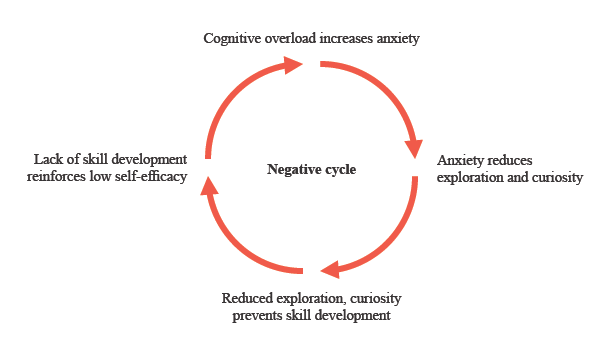
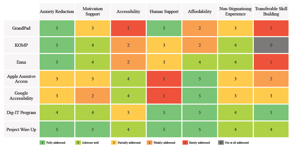
The negative cycle and the competitor matrix
- “I don’t dare to start, to touch it.”Anxiety leads to avoidance.
- “I’m 84 years old, so maybe that’s why.”Blaming age instead of the design.
- “I’m not such an old lady that I can’t do it!”High self-efficacy: errors are a challenge.
None of the interviewees asked for formal training. Step-by-step guidance, repetition, practising on the device and a real person to ask worked best. Journey maps showed the moment that matters most: the point of first failure.
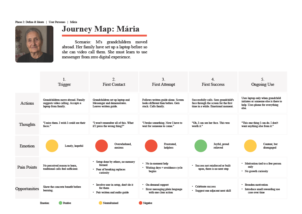
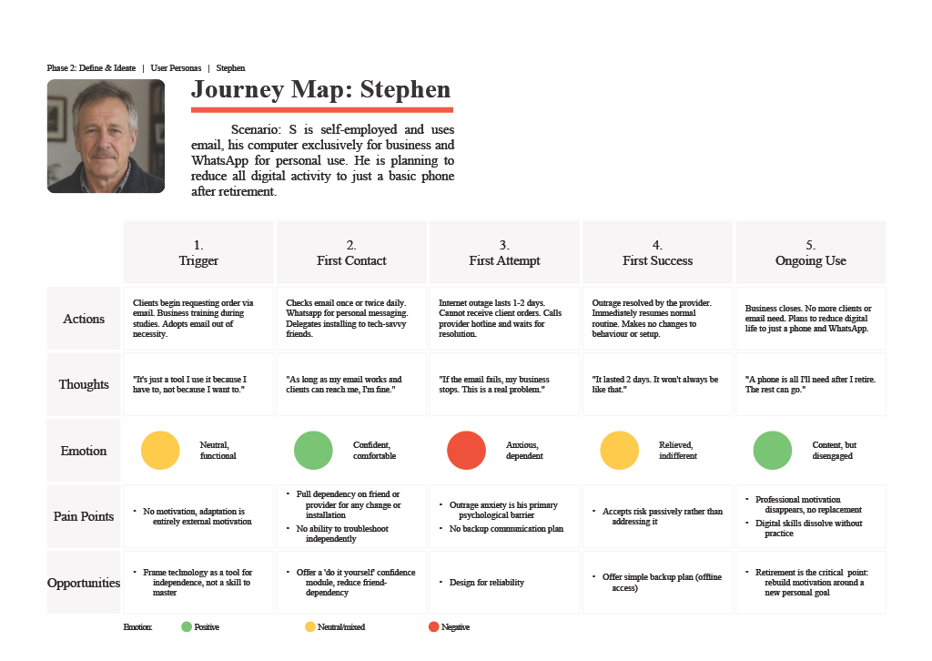
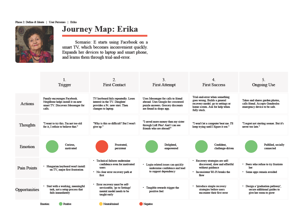
Three archetypes, three journeys, and where each one gets stuck
Design principles
The research turned into five principles that guided every layout and screen:
- Familiarity before complexityStart from what’s already known: paper, books, a printed page.
- One task at a timeOne page, one topic; one screen, one goal.
- Safe explorationNothing should look or feel like it can “break”.
- Reinforce successSmall wins are made visible.
- Transferable learningTeach the logic, not just the steps.
One decision shaped the whole product: it wouldn’t be new software, but a way of learning the phone people already own, connecting a physical, tactile experience with a digital one.
Sketches and paper prototypes
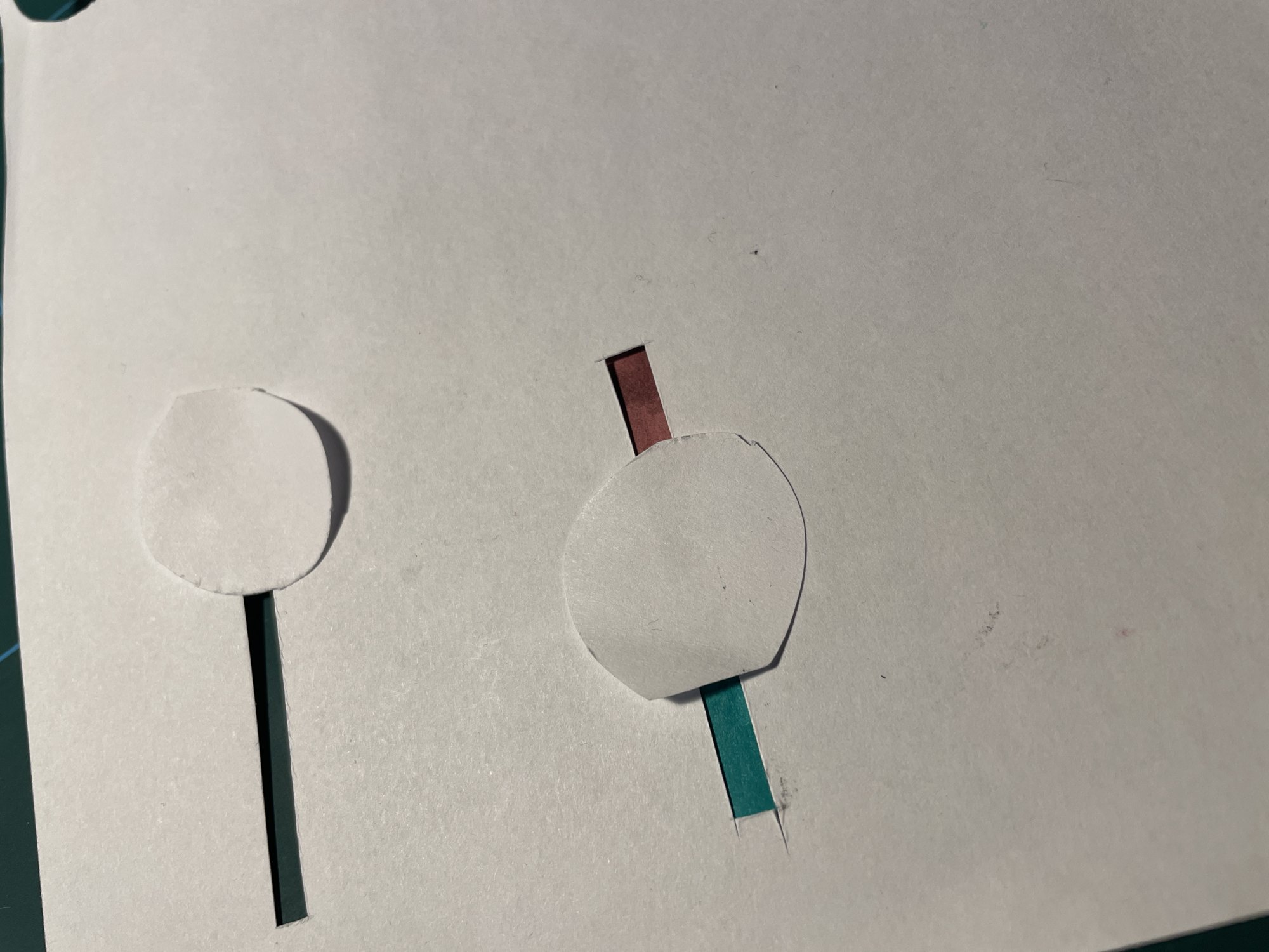
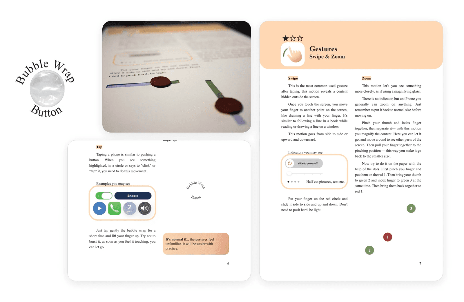
I sketched every piece before designing it: the guide page with its colour-coded header and screenshots, the practice screens and the flashcards. For the tactile exercises I tested ideas directly on paper: a strip to slide for a swipe, a rubber band for zooming, bubble wrap for a tap.
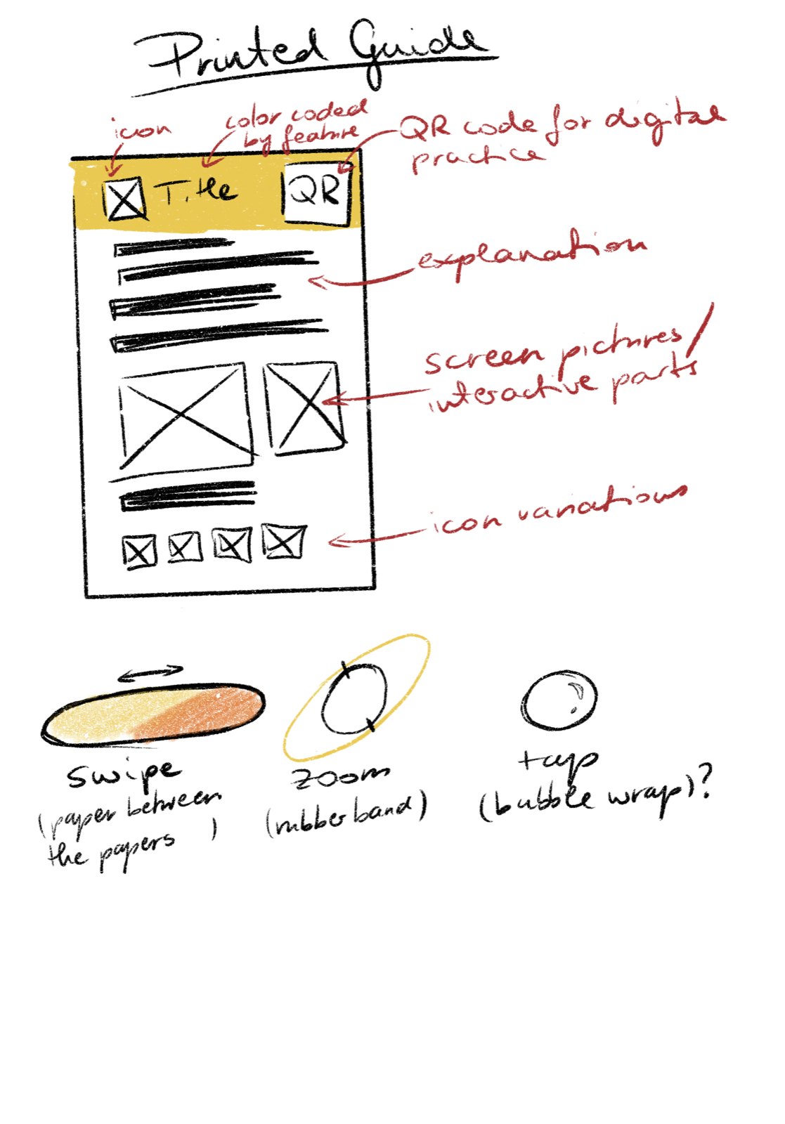
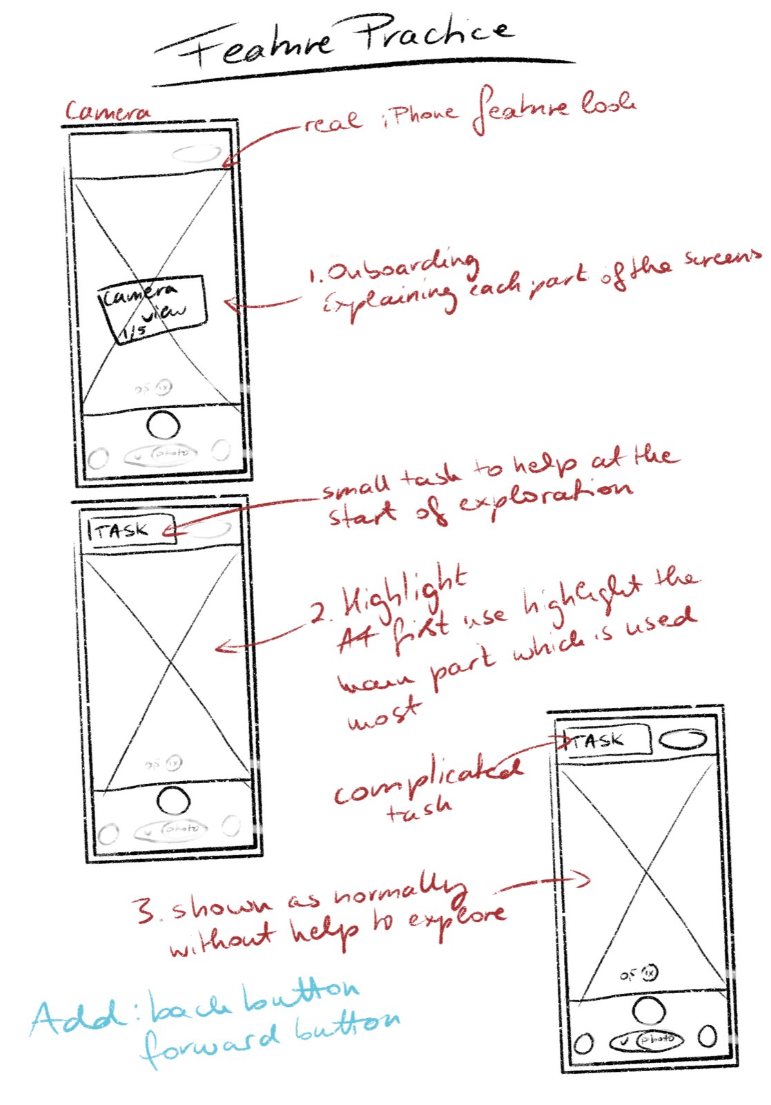
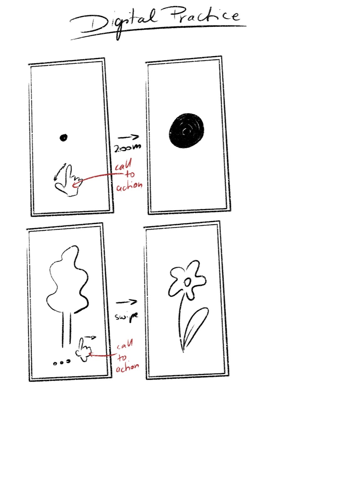
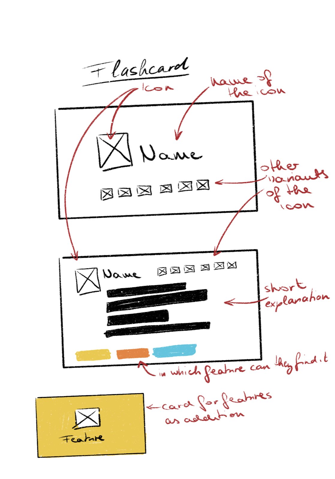
Sketches: guide page, feature practice, digital practice and flashcards
Designing the printed guide
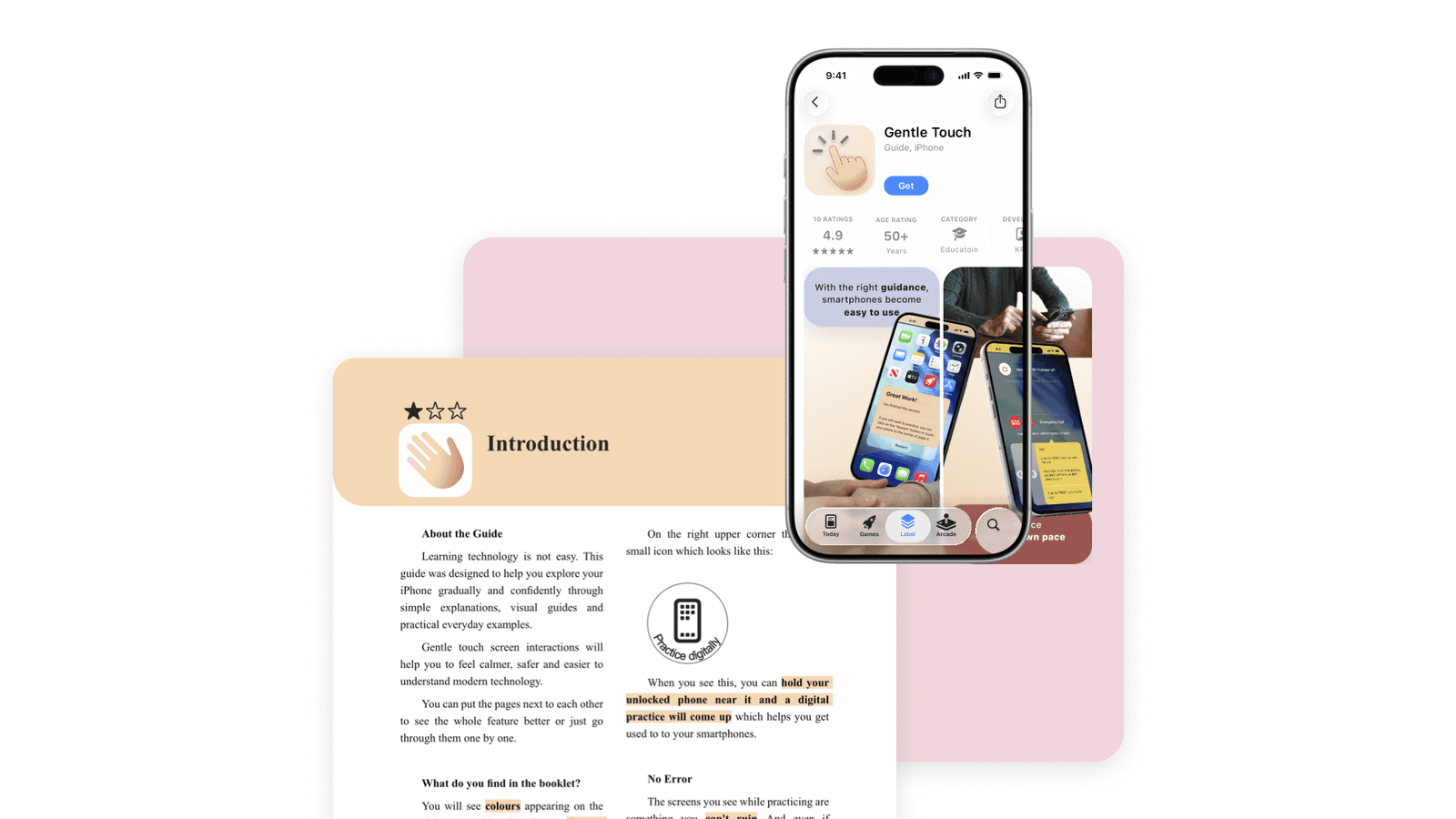
The A4 booklet is the heart of the kit, so its layout had to reduce anxiety before a single word is read. Every page follows the same structure, so once a reader has learned one page they can read them all:
- Colour-coded chaptersEach topic has its own soft header colour, so chapters are easy to find by flicking through.
- Difficulty starsOne to three stars in the header show how demanding a page is before starting it.
- Familiar typeA classic serif for the body text, like in printed books, with bold numbered steps and highlighted key words.
- Numbered figuresReal iPhone screenshots with numbered markers that match the steps in the text.
- Help boxesA dark red box answers the most likely problem on each page, so an error never feels like a dead end.
- NFC indicatorA small icon shows which pages have a digital practice to open.
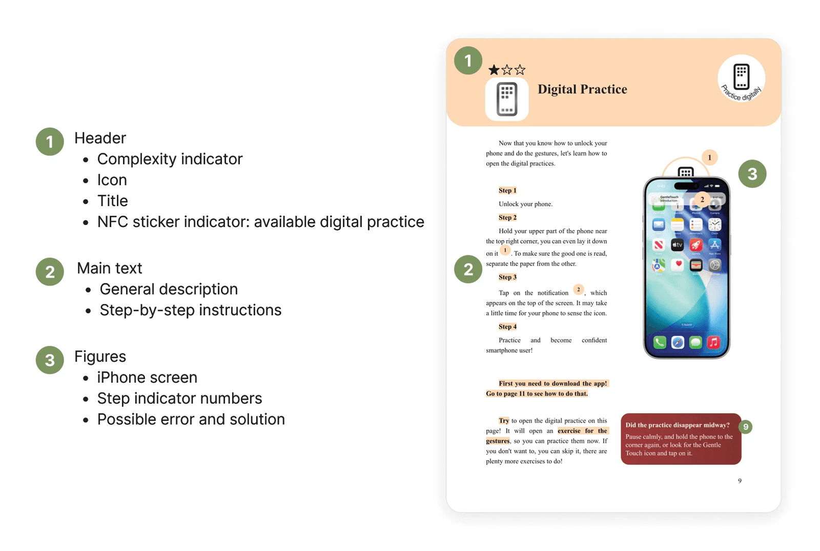
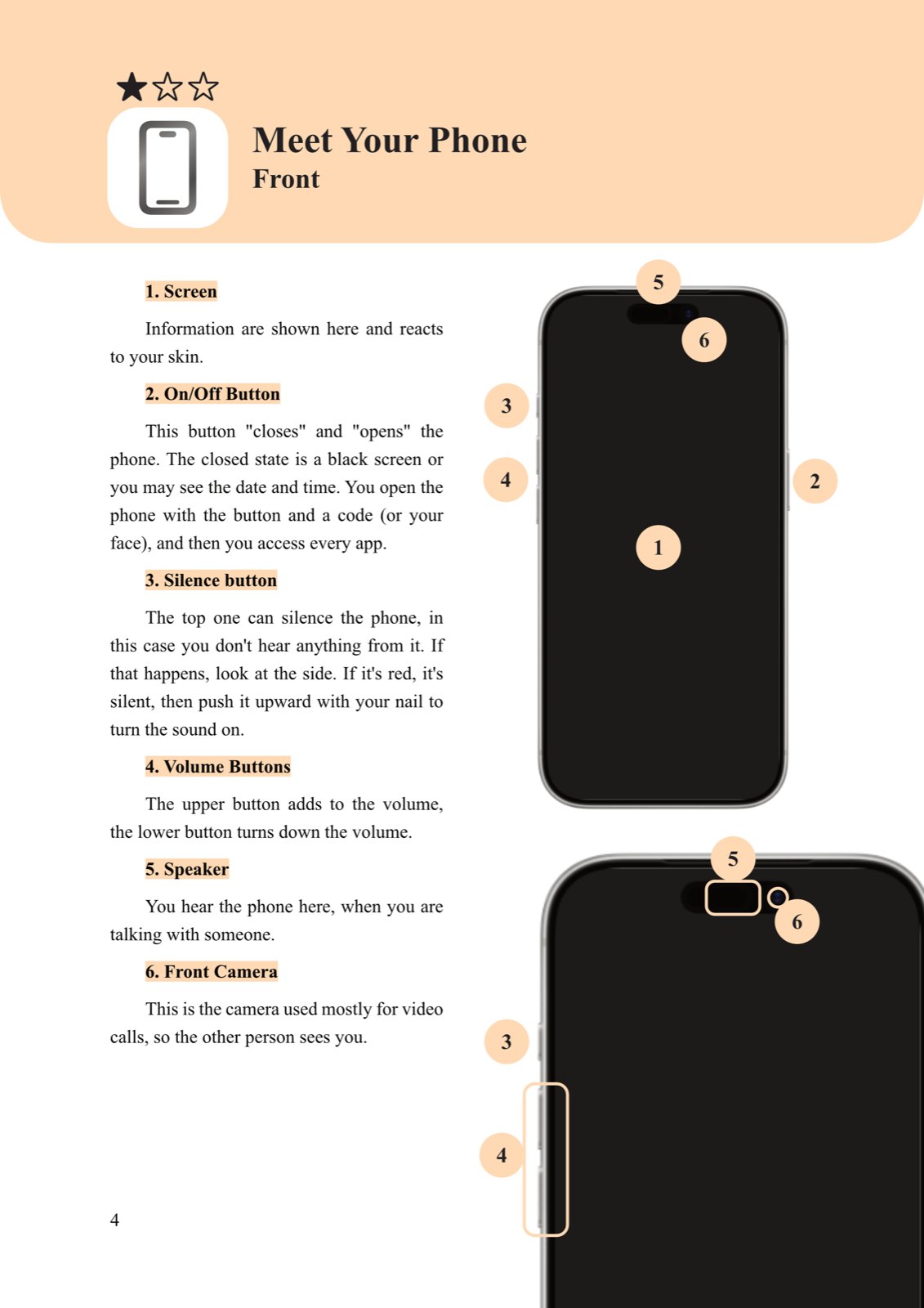
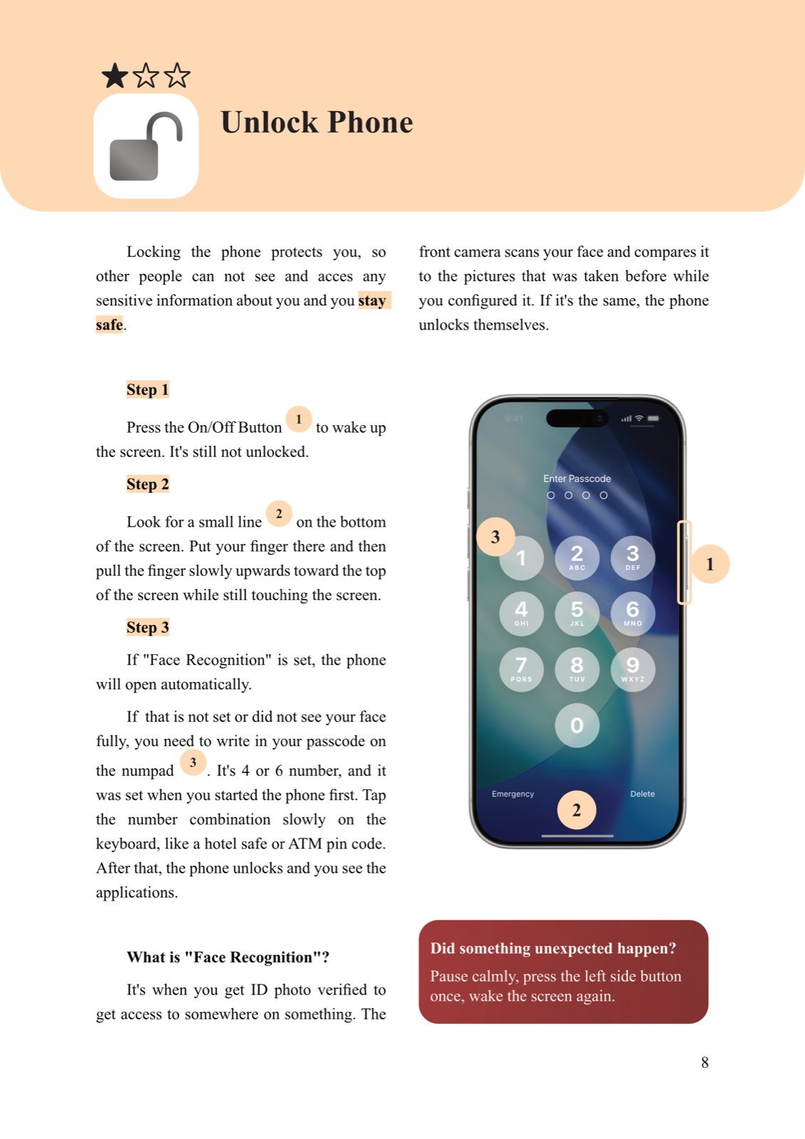
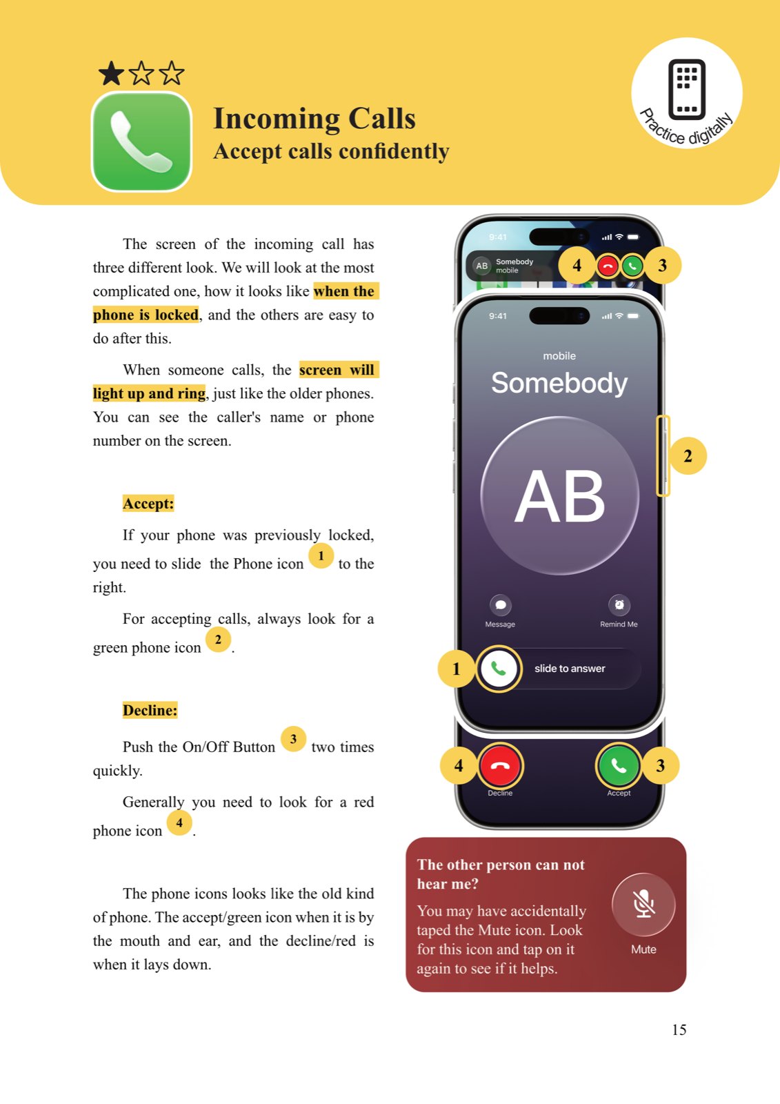
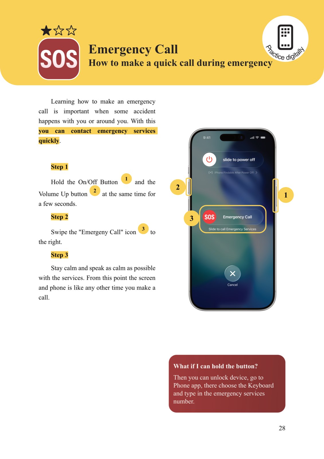
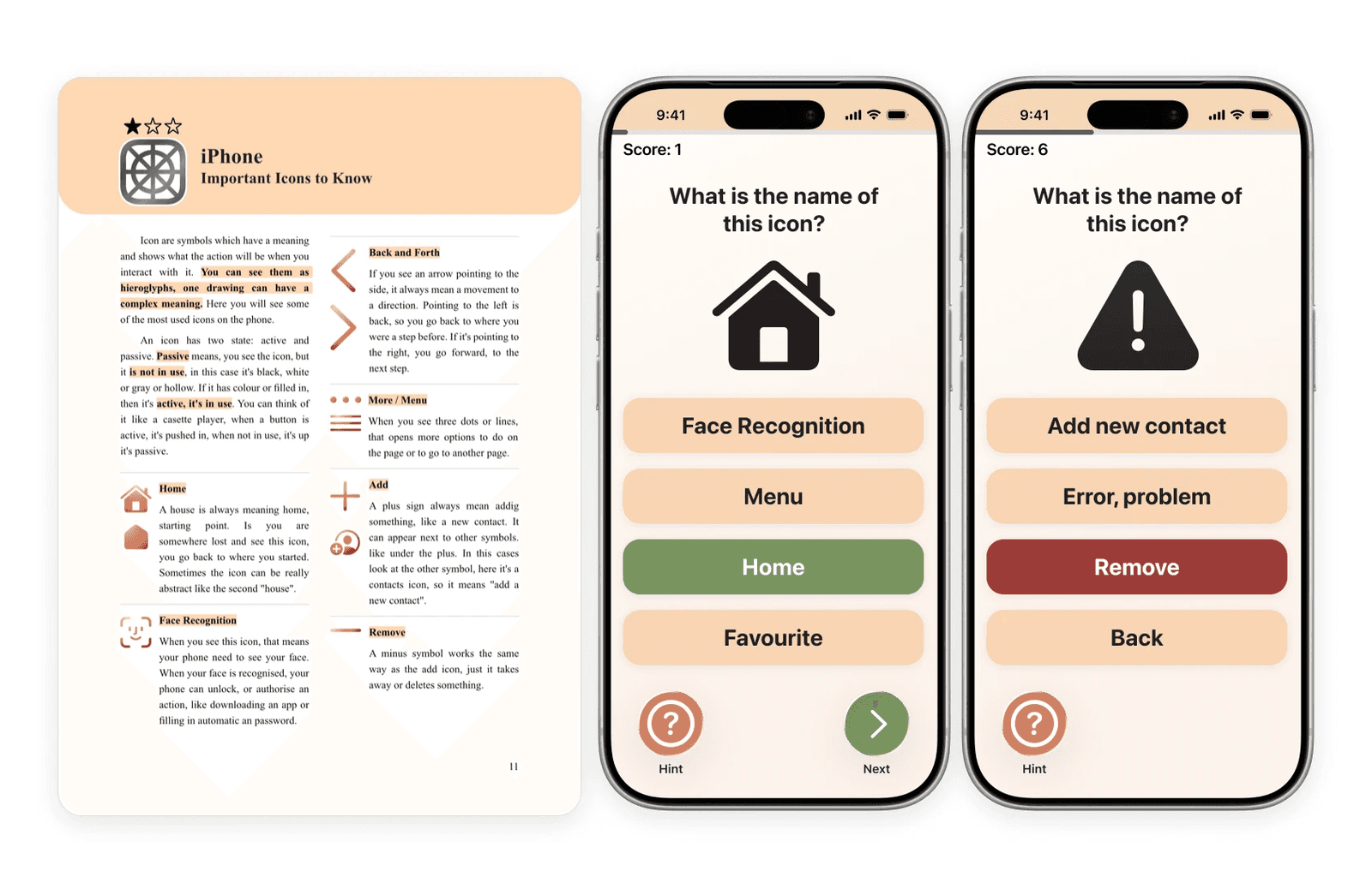
Four pages from the guide, each chapter in its own colour
Before touching a screen, the reader practises the motion on paper: a swipe becomes sliding a finger along a printed line, a tap becomes pressing bubble wrap under the page. Spreads and icon pages connect the analogue metaphor to the digital function.
The companion app and flashcards
An NFC sticker on the back of the booklet opens the app with one tap: no QR code, which is often impossible to open for a first-time smartphone user. The app continues the guide’s visual language, with colour-coded bars, soft rounded cards and friendly icons, so moving from paper to screen feels like turning a page.
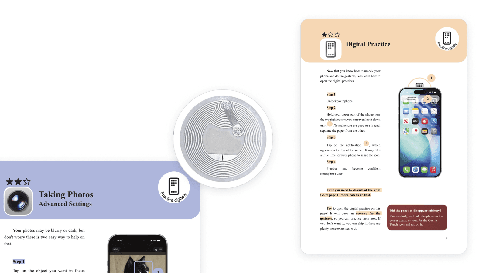
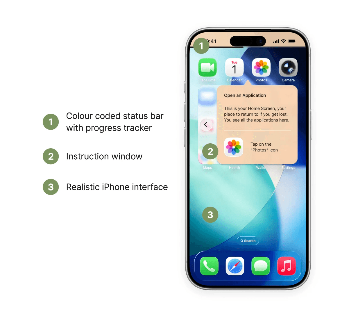
The NFC link, and the anatomy of a practice screen
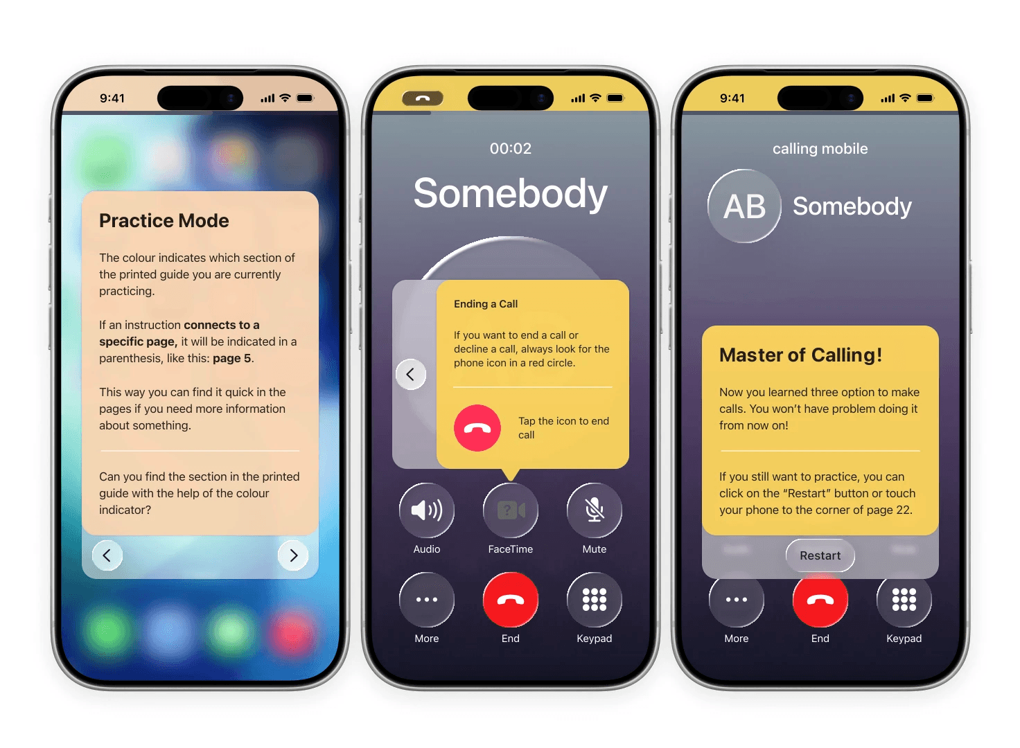
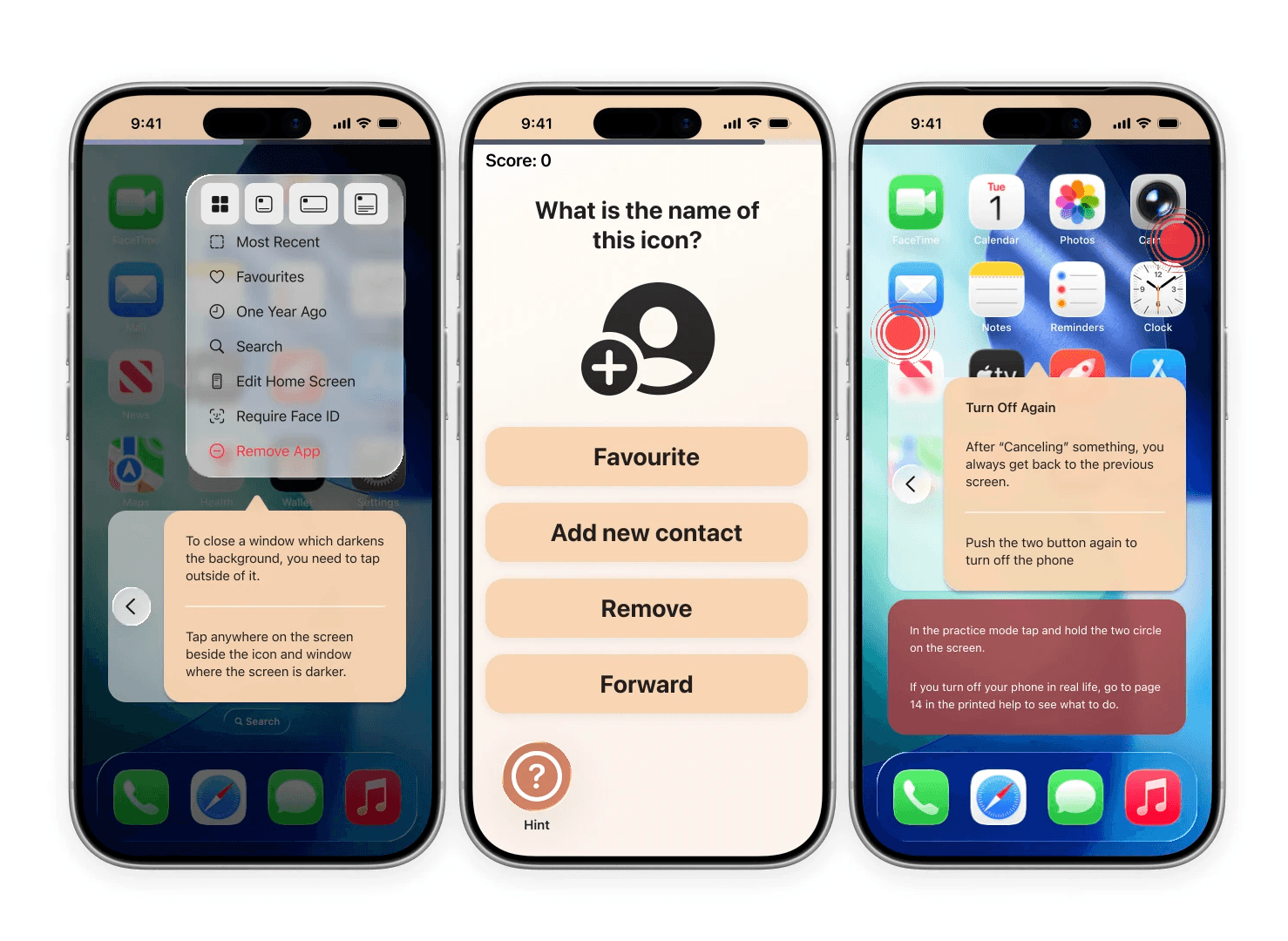
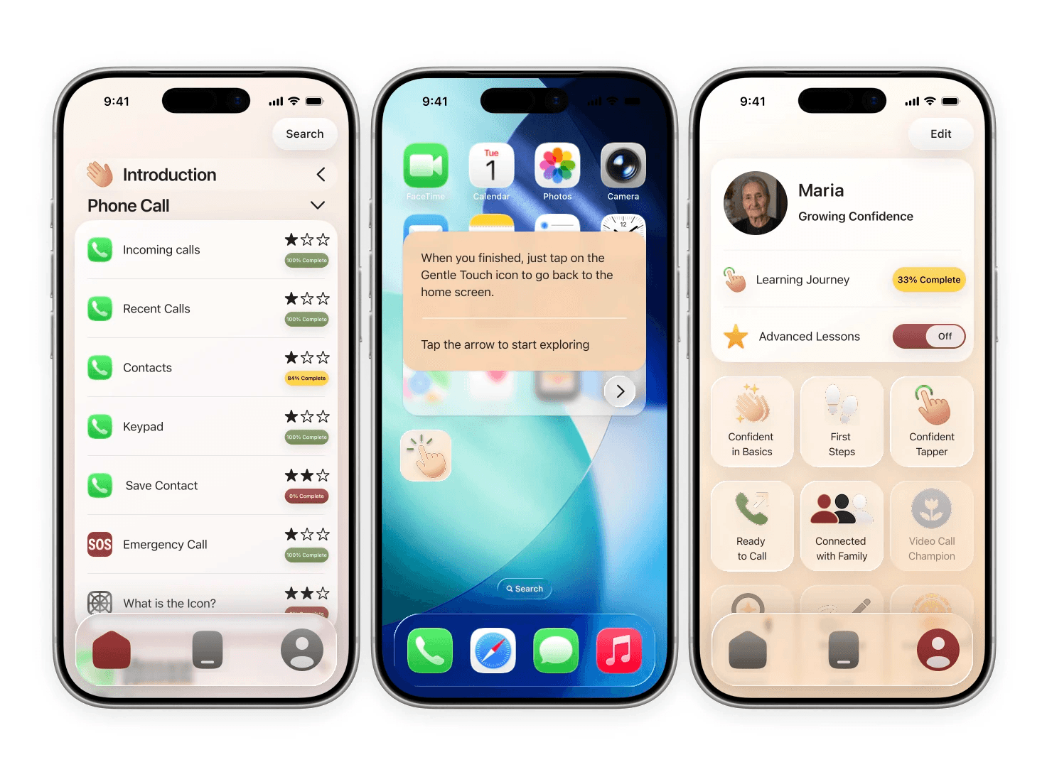
Practice screens: progress bars, calm instruction cards and visible achievements
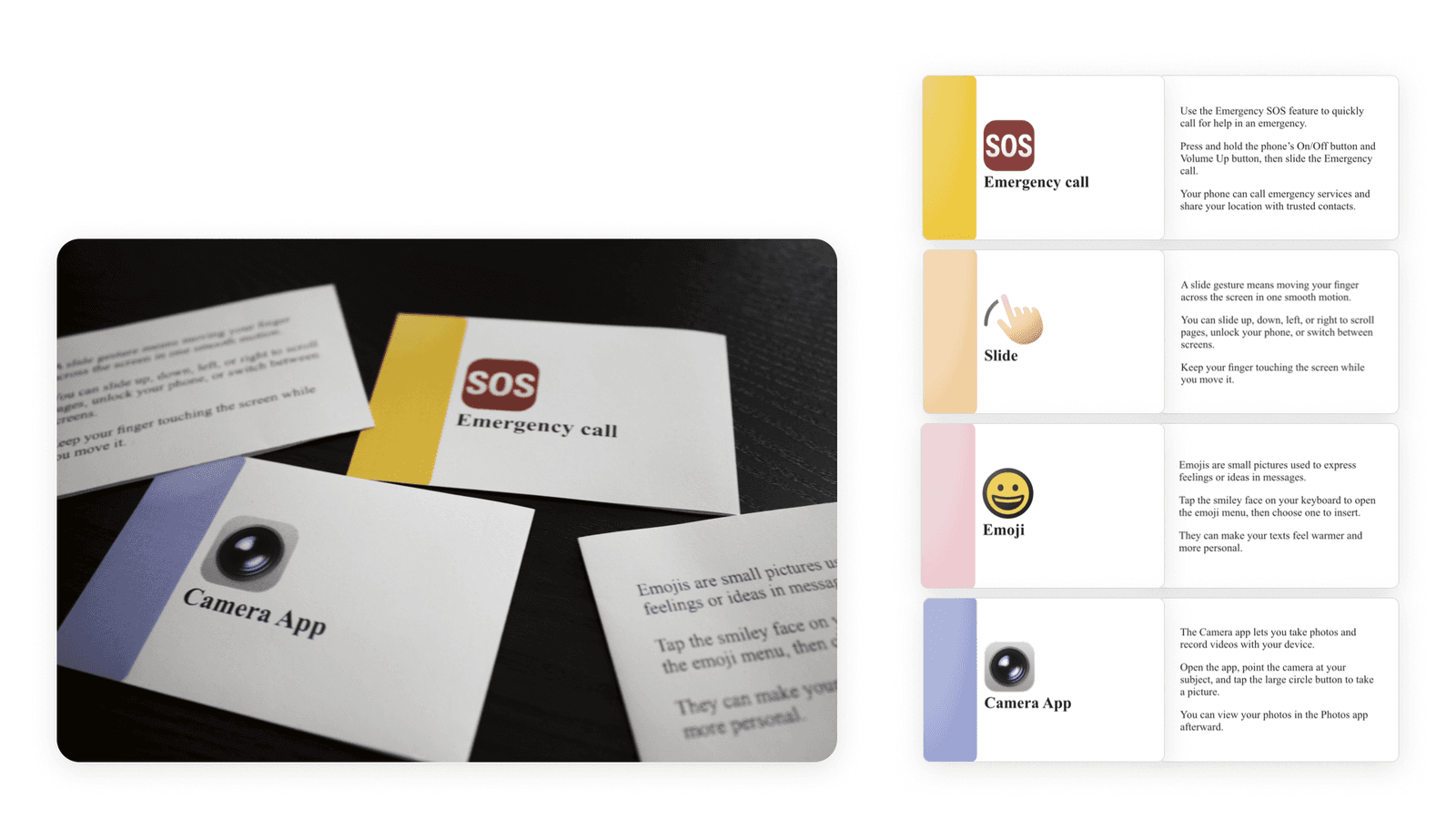
A printed set of flashcards turns icons and gestures into a small, tactile game, and later works as a quick reference.
Reflection
Designing two connected products, print and digital, in parallel was harder than I expected. Recreating existing iPhone screens precisely took more time than designing from scratch, and using them is only allowed for educational purposes, so a real product would need Apple’s involvement.
The research has limits too: three relatively healthy, well-supported participants can’t speak for all older adults, and the kit still needs testing with real users.
What I take with me: layout can be a form of care. Colour codes, predictable page structures and a calm typeface do as much to lower anxiety as any feature.