Blue System – A Clear Visual Language for an HR Platform
A new logo that joins two companies, a colour system that tells you whose data you see, and a calmer, consistent interface for a ten-year-old HR platform.
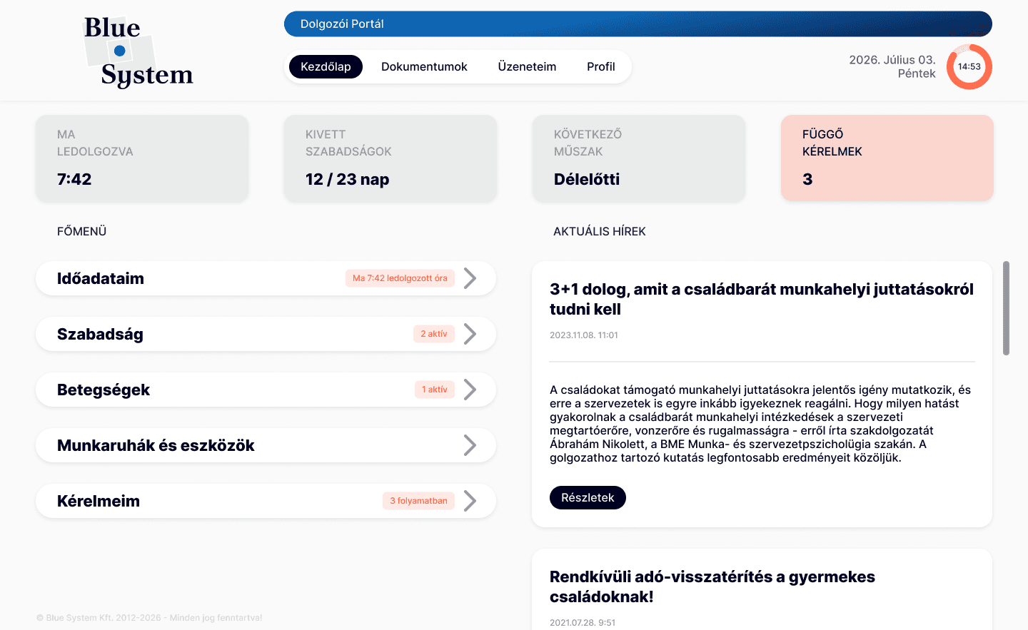
The brief
Blue System’s HR self-service platform lets employees and their superiors track working hours, request time off, handle documents and follow HR cases. After the company was acquired by e-Best Consulting, the goal became a modern-looking platform that holds its own in 2026. It had grown for more than ten years without a redesign, and its layouts, colours and components had drifted apart.
My role
I proposed and designed the new logo, set the brand colours, reorganised the information architecture, and redesigned both the employee and the superior side, including the components and micro-interactions. I’m now building the web platform myself through vibe coding; the mobile app is next.
Starting point
Over the years the interface had collected inconsistencies in layout, components, colours and information structure, and wore an overall “old-time” style, as if time had stopped. That look no longer matched a company that wanted to sell a modern product.
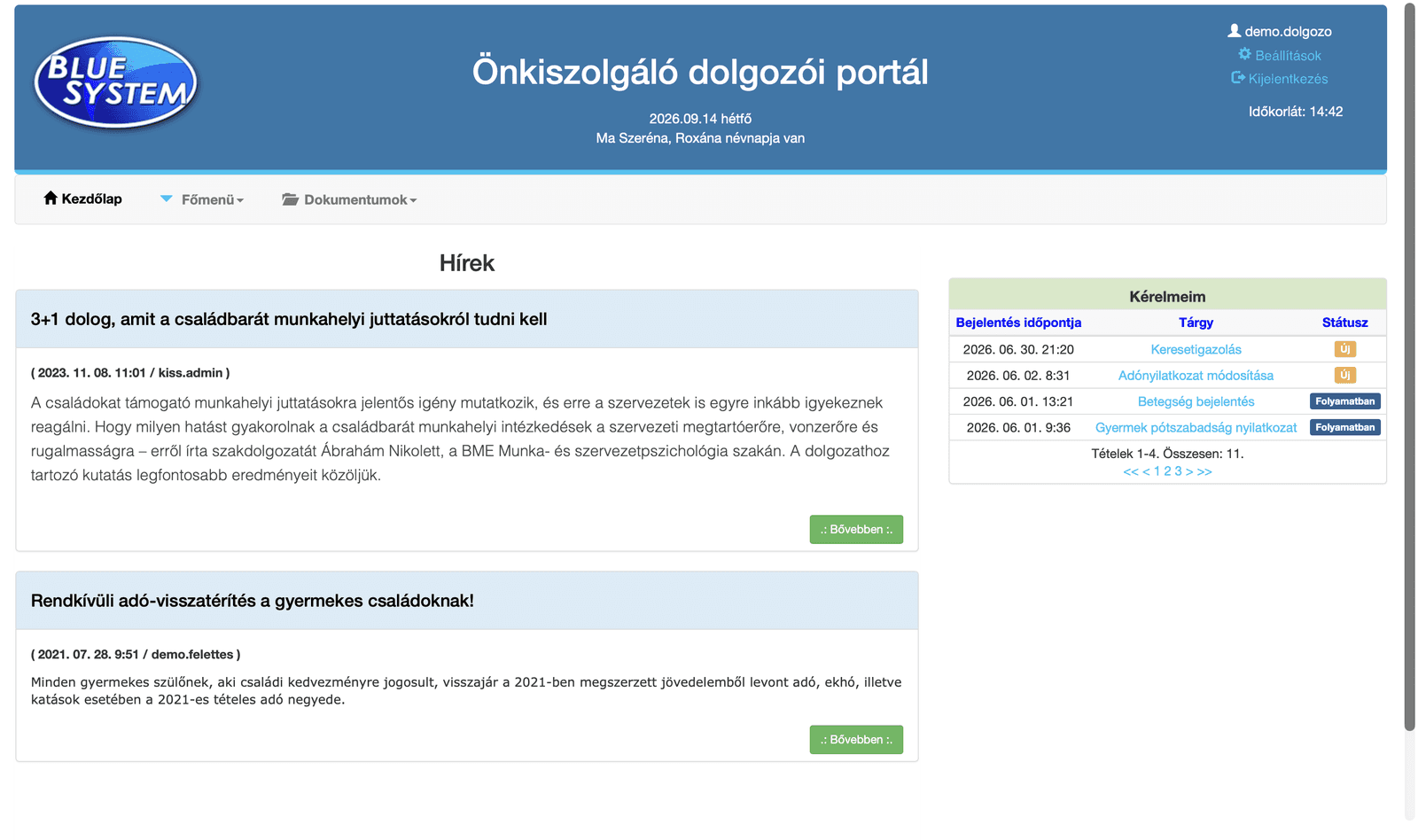
Research and structure
I compared four workforce-management platforms (Nexon, Shiftbase, Clockin and Planday) and spoke with an HR professional who uses such tools daily. The biggest problem wasn’t missing features: existing ones were hard to find. The research also showed that employees, superiors and HR each need to see different things first, which later shaped a separate dashboard for every role.
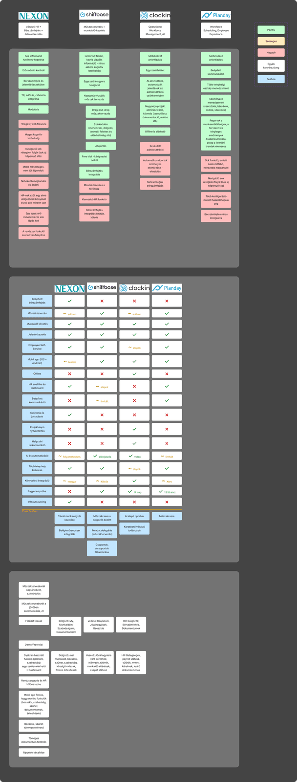
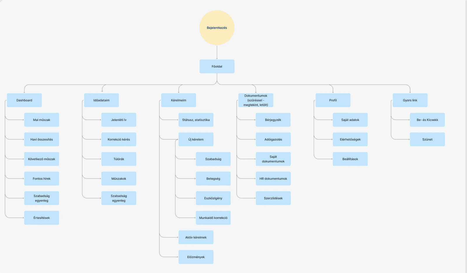
Competitor research and the new information architecture
Logo and colour
The brand came first, as everything else builds on it. Since Blue System now belongs to e-Best Consulting, I proposed unifying the two logos, so the new mark shows the connection between the companies at first glance. The idea was my own, and it went through several phases before the final version.
The palette is built on blues with neutral greys for the interface, plus a green and an orange for status indicators and highlights. Keeping the brighter colours for meaning rather than decoration makes the screens easier to scan.
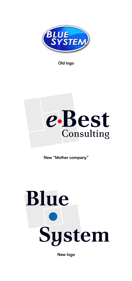

The logo phases and the brand colours
Interface redesign
I designed several variations of the main page, and the company chose the one they felt most connected with. It set the grid, spacing and type hierarchy for everything else: one clear heading per view, content grouped in white cards on a light background, and status shown as coloured labels instead of plain text.
Dashboard, before and after: a clearer overview and stronger hierarchy
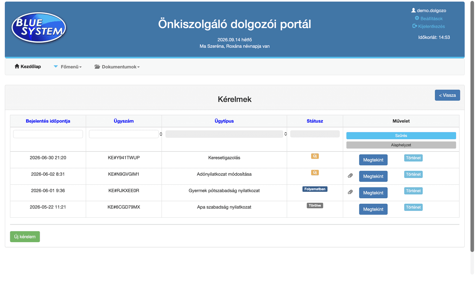
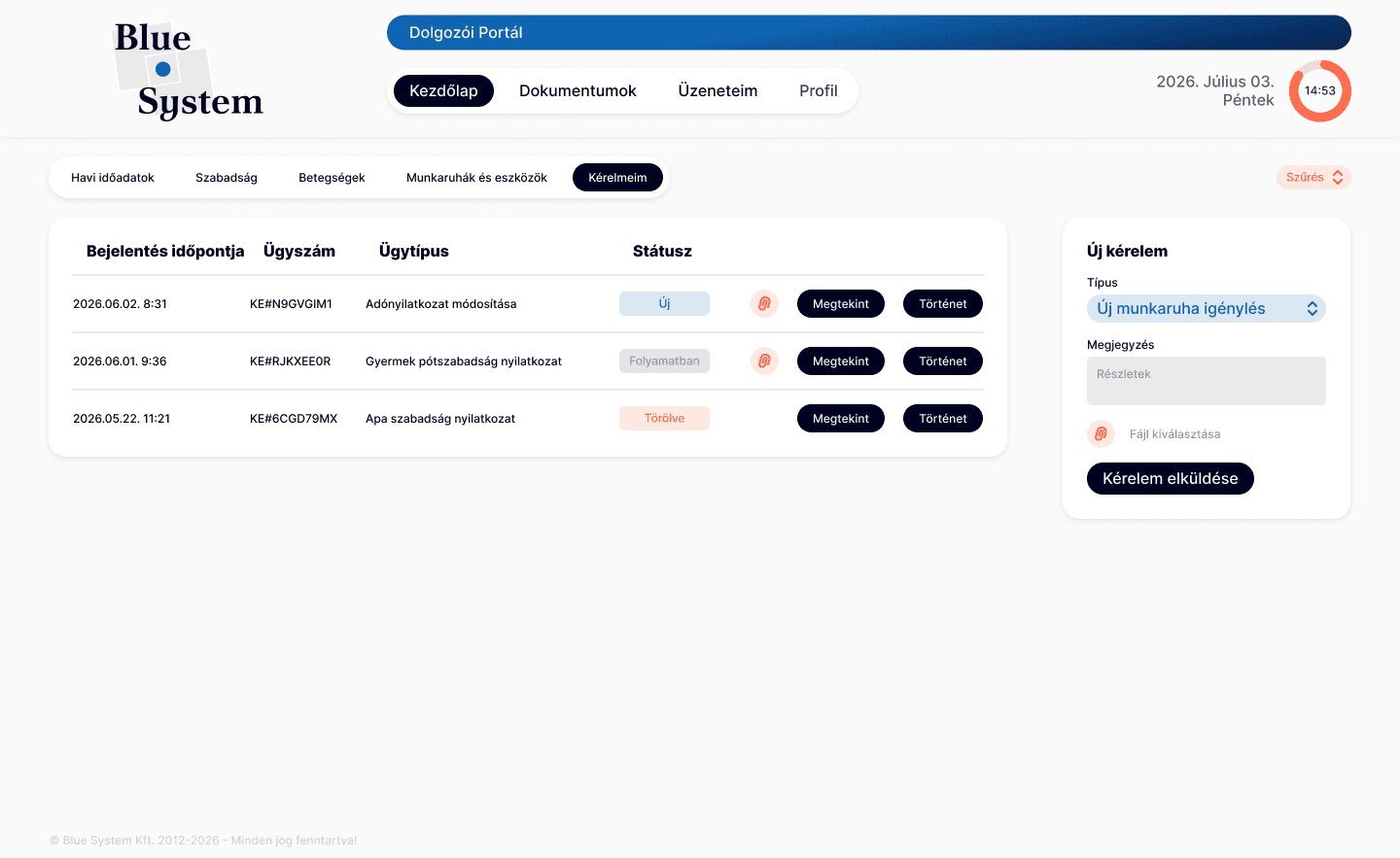
Tables: more whitespace, aligned columns and status labels
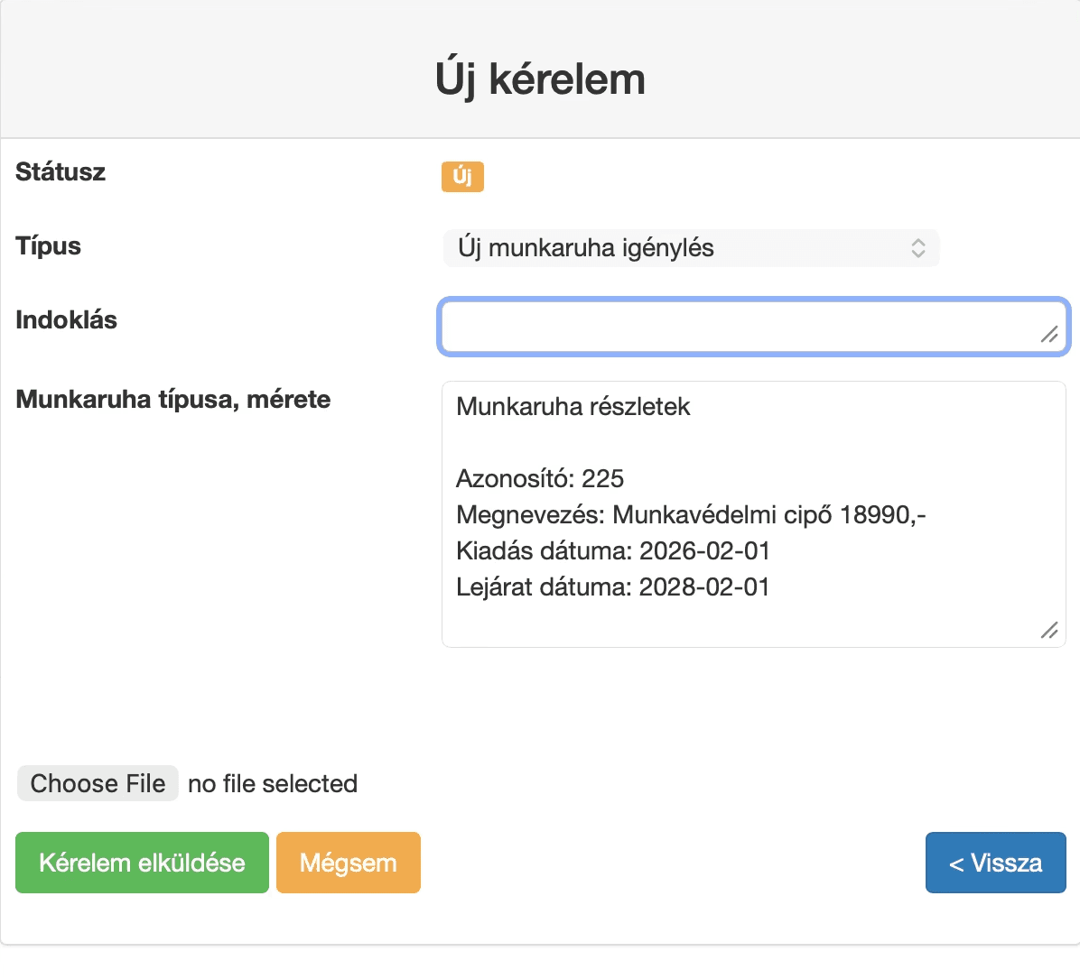
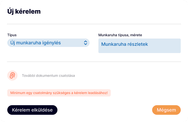
Forms: grouped fields and one clear primary action
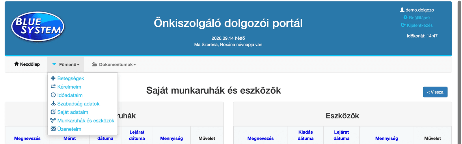

Navigation: grouped by how people actually use the platform
Colour that tells you whose data you see
Superiors use the same platform to approve requests and plan their team’s work, so they constantly switch between their own data and their team’s. I solved this with colour: everyone’s own portal has a blue top bar, and on the superior side the bar turns orange and reads “Superior interface”. One glance is enough to know where you are.
Inside, the same colour logic continues: working-time deviations are counted and highlighted in red, so the people who need attention stand out, and problem days in a time sheet carry a warning icon.
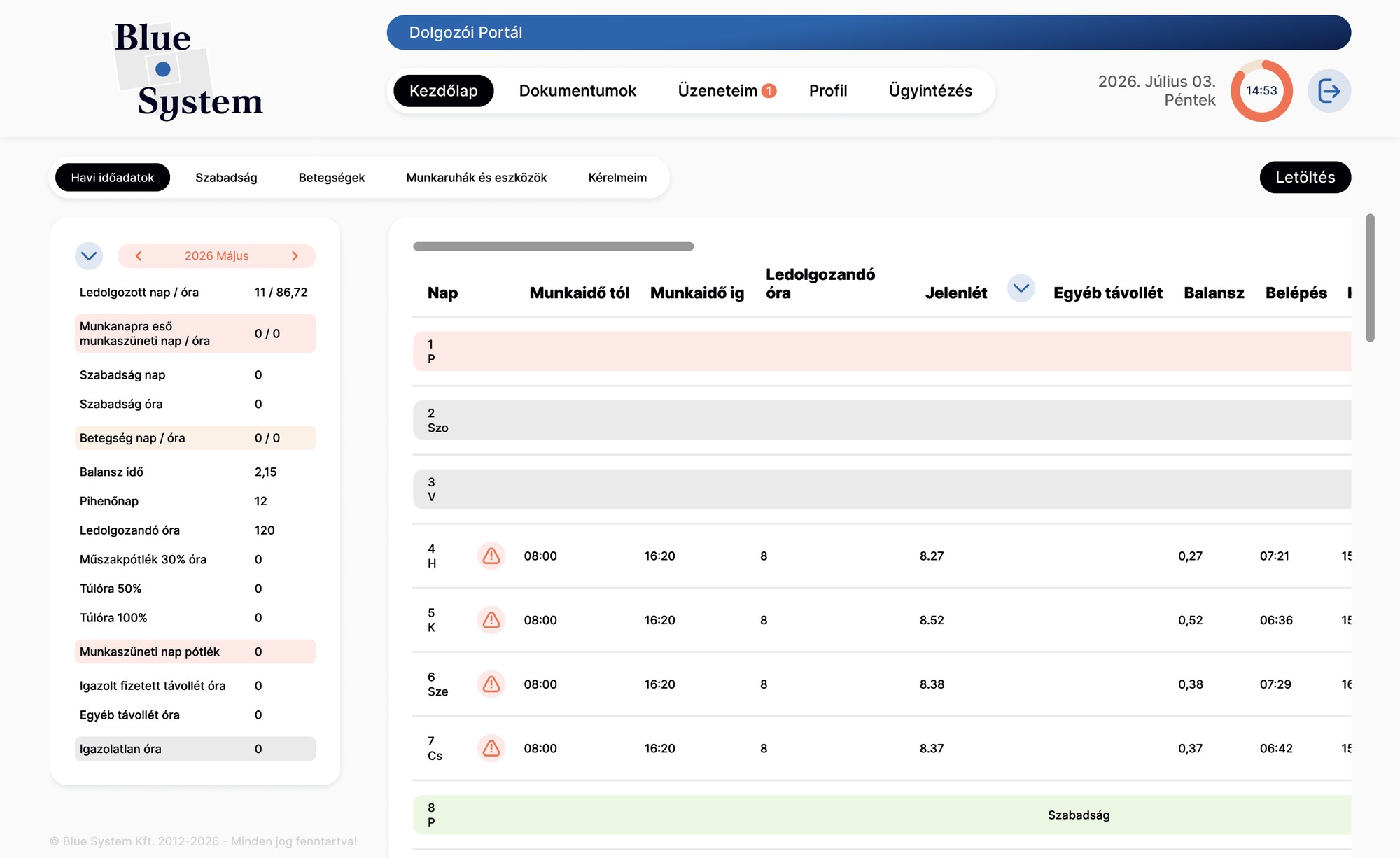
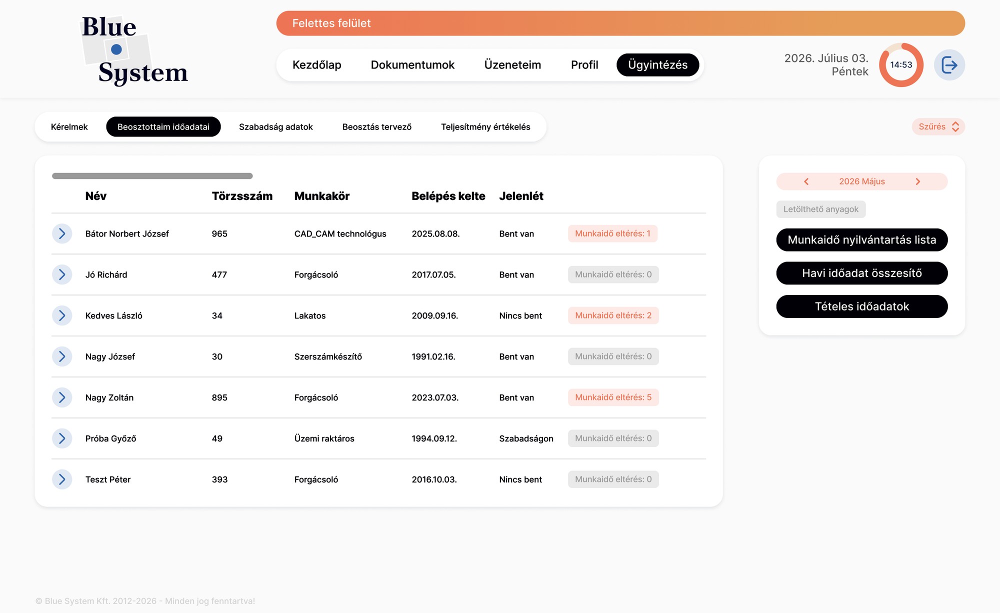
Blue for your own portal, orange for the superior side
Monthly view
The old monthly view was a dense table full of coloured boxes. The new one keeps all the numbers but groups the summary (worked hours, leave, sick days, overtime) on the left, next to a clean day-by-day time sheet that can be corrected and saved in place.
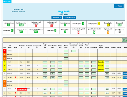
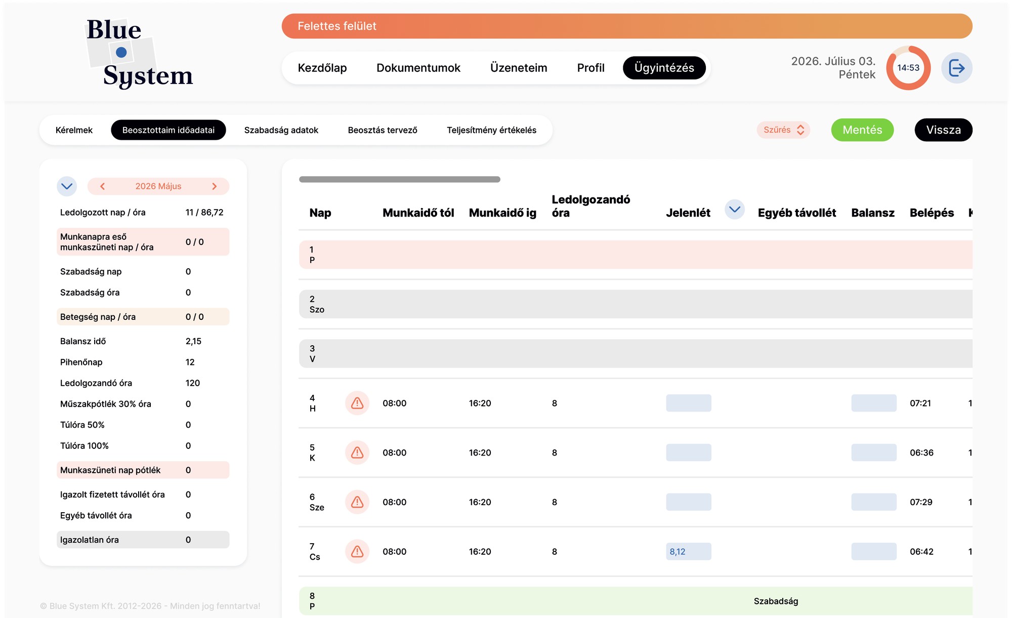
An employee’s month: the old design and the new one
Designing the weekly schedule
Weekly scheduling was the hardest part, a problem the developer had tried to solve over many iterations. My solution was accepted and became part of the new design, and it is mostly a visual one: a small visual language for shifts.
- A code and colour for every shiftMorning, afternoon and night shifts have their own icons; fixed working hours are labelled by length (4h, 6h, 8h).
- A legend beside the weekThe exact times of each shift sit next to the grid, so the cells can stay small and readable.
- A timetable layoutOne row per person, one column per day, so gaps are visible at a glance, and a warning marks anyone with no shifts yet.
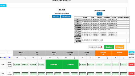
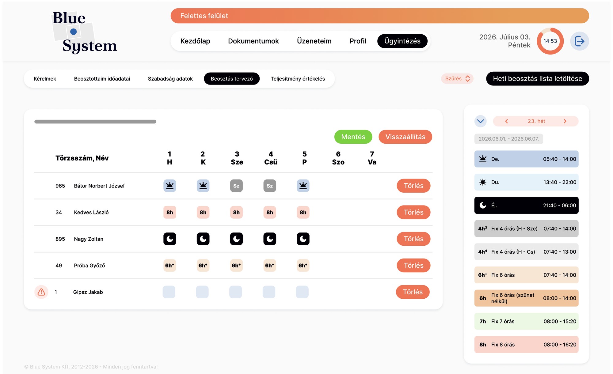
Weekly scheduling: the old design and the new planner with its legend
Micro-interactions
The old platform was static and often gave no feedback at all. Small animations now confirm that an action worked, and the navigation shows where you are. They follow the same colours and shapes as the rest of the system.
What’s next
The web platform is in progress: I’m building it myself through vibe coding, turning the Figma designs into the working interface step by step. Next is the mobile app, which I’m redesigning with its planned new functions already included, so the same visual language can grow with it without another redesign.