Berkenye Hűtőház – Fresh Visuals for Frozen Fruit
Product visuals for a new website, a refreshed emblem and a creative company history for a family-owned frozen fruit producer in Hungary.
The brief
Berkenye Hűtőház has quick-frozen fruit since 1992 and is one of the largest frozen fruit processors in Hungary, supplying food manufacturers, foodservice distributors and retailers. For the redesign of their website, they needed visuals that make frozen fruit look as fresh as it tastes.
My role
I made the product visuals for every fruit in Hungarian and English, the detailed product pages, a refreshed version of the emblem, and a graphic telling the company’s history.
Product visuals
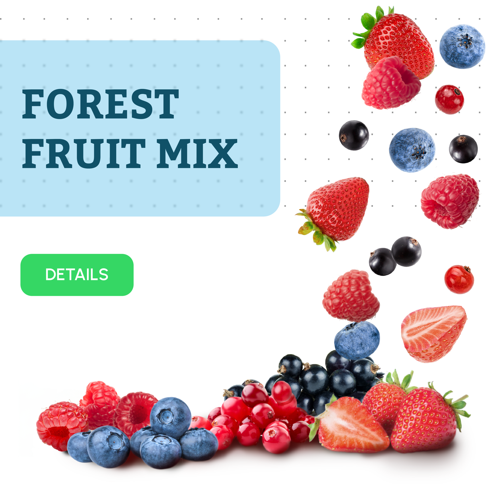
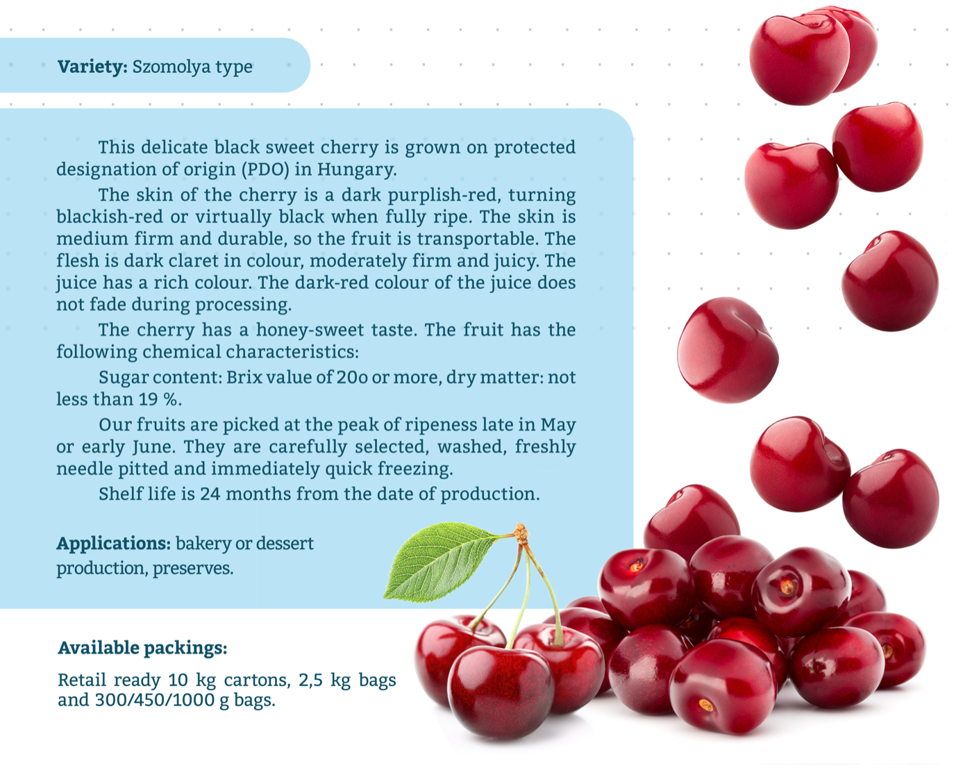
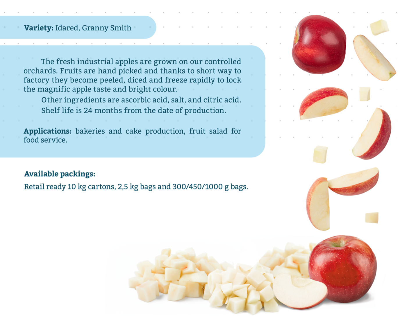
Each product got a visual in the same style: the fruit falling freely onto a white background, the name in a soft blue box and a “details” button, so the product range reads as one family on the website.
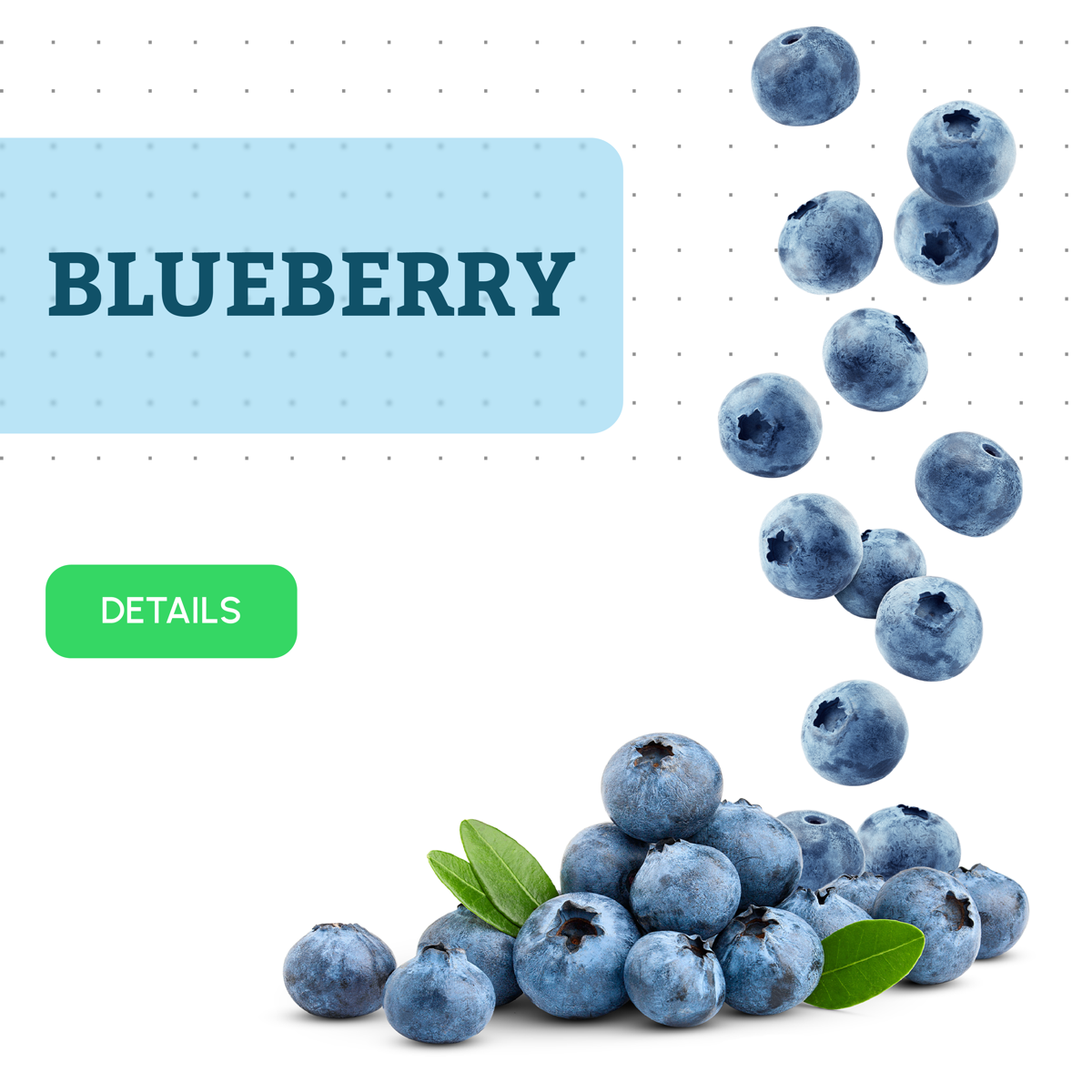
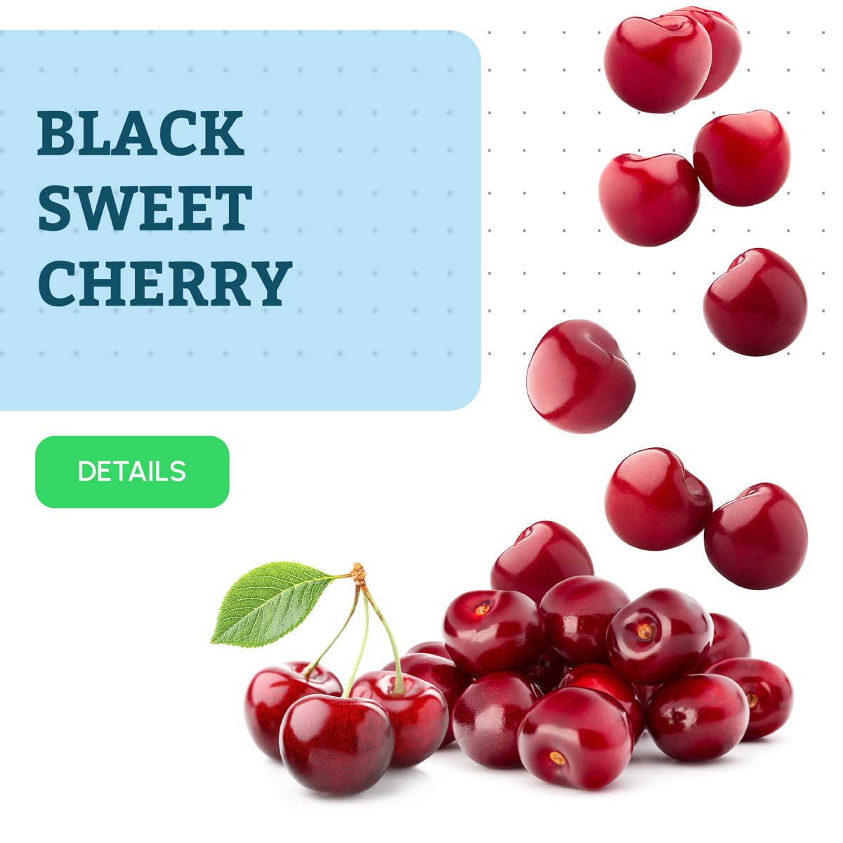
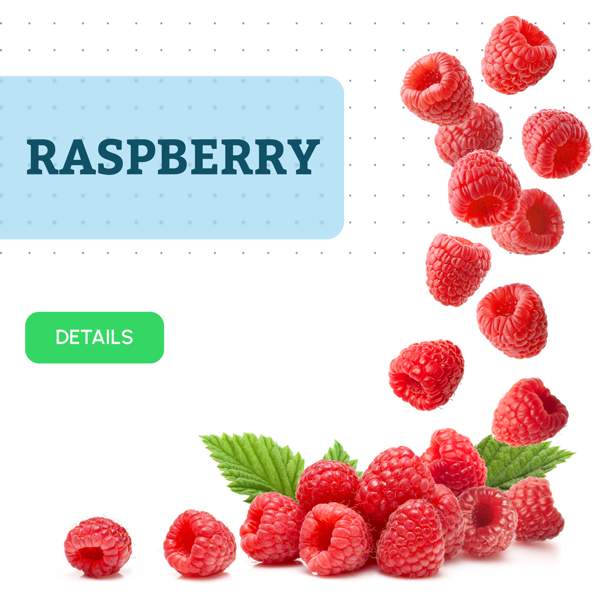
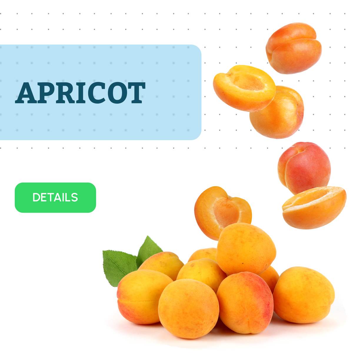
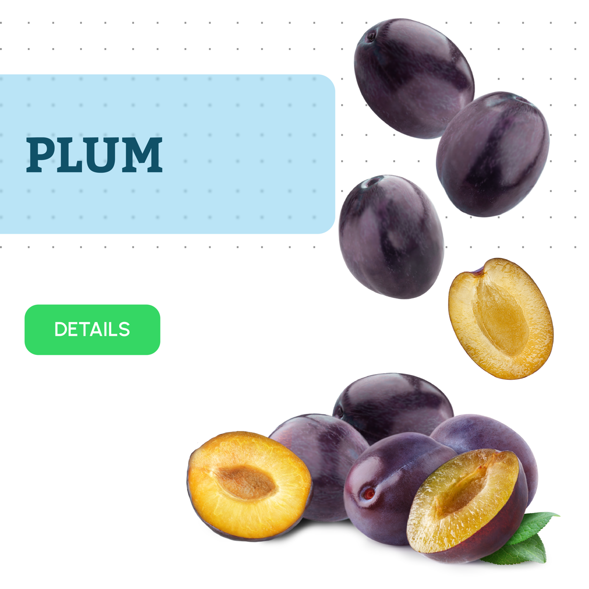
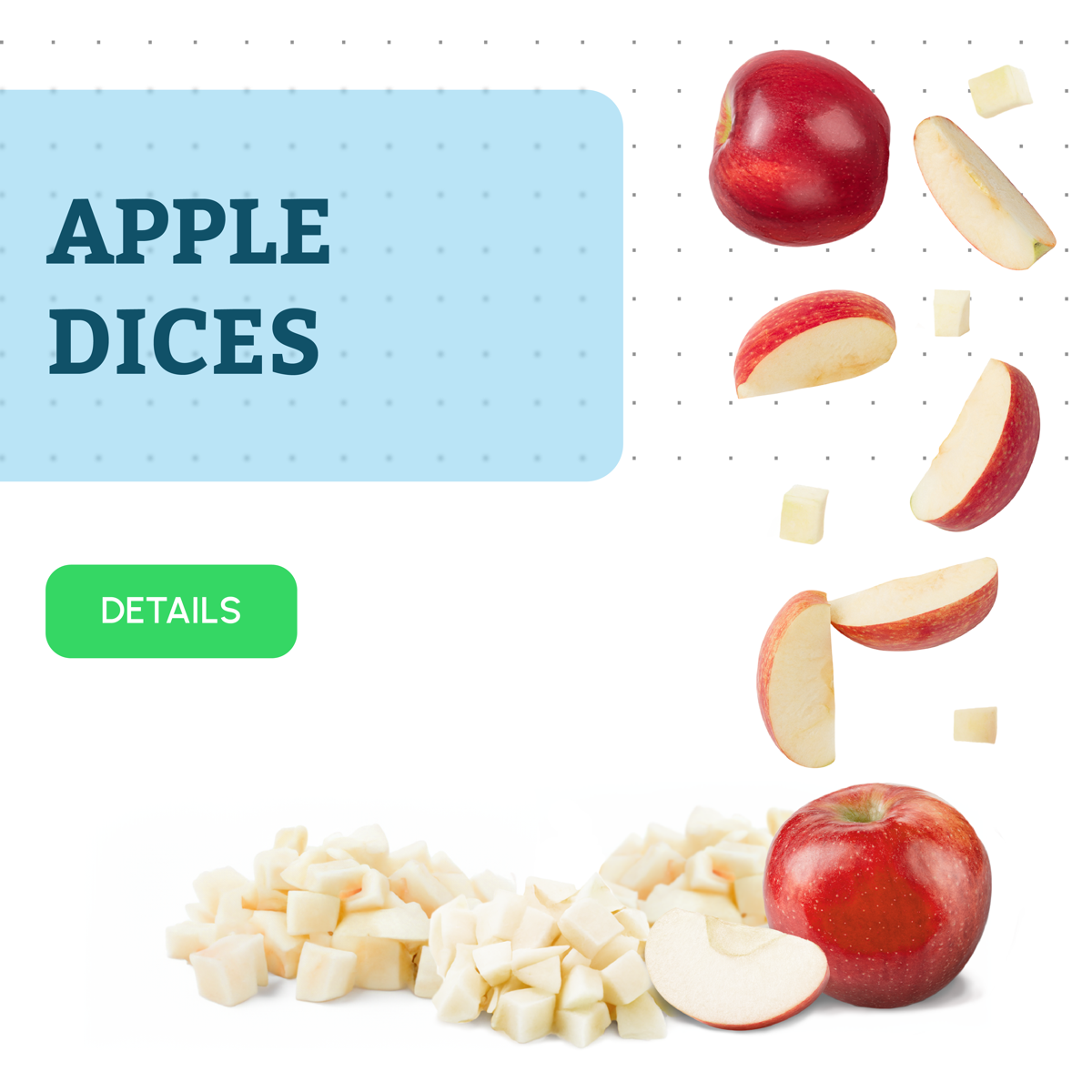
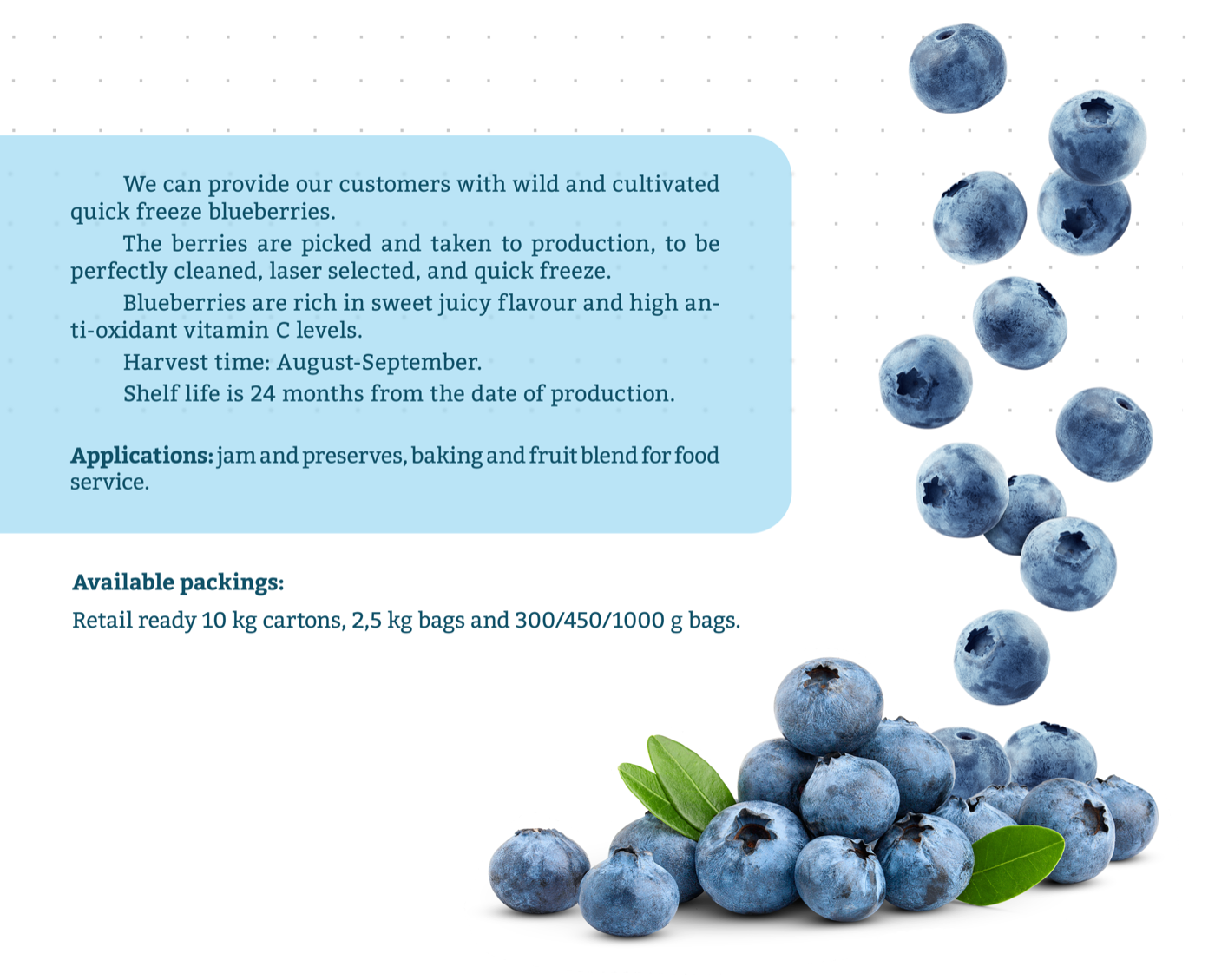
The detailed pages add the variety, harvest time, shelf life, applications and available packaging.
Emblem
I redrew the original logo, a red and blue “B” with a sparkle, into a cleaner, flat emblem with the line “Anno 1992”. In the end, the company decided to keep their original logo.

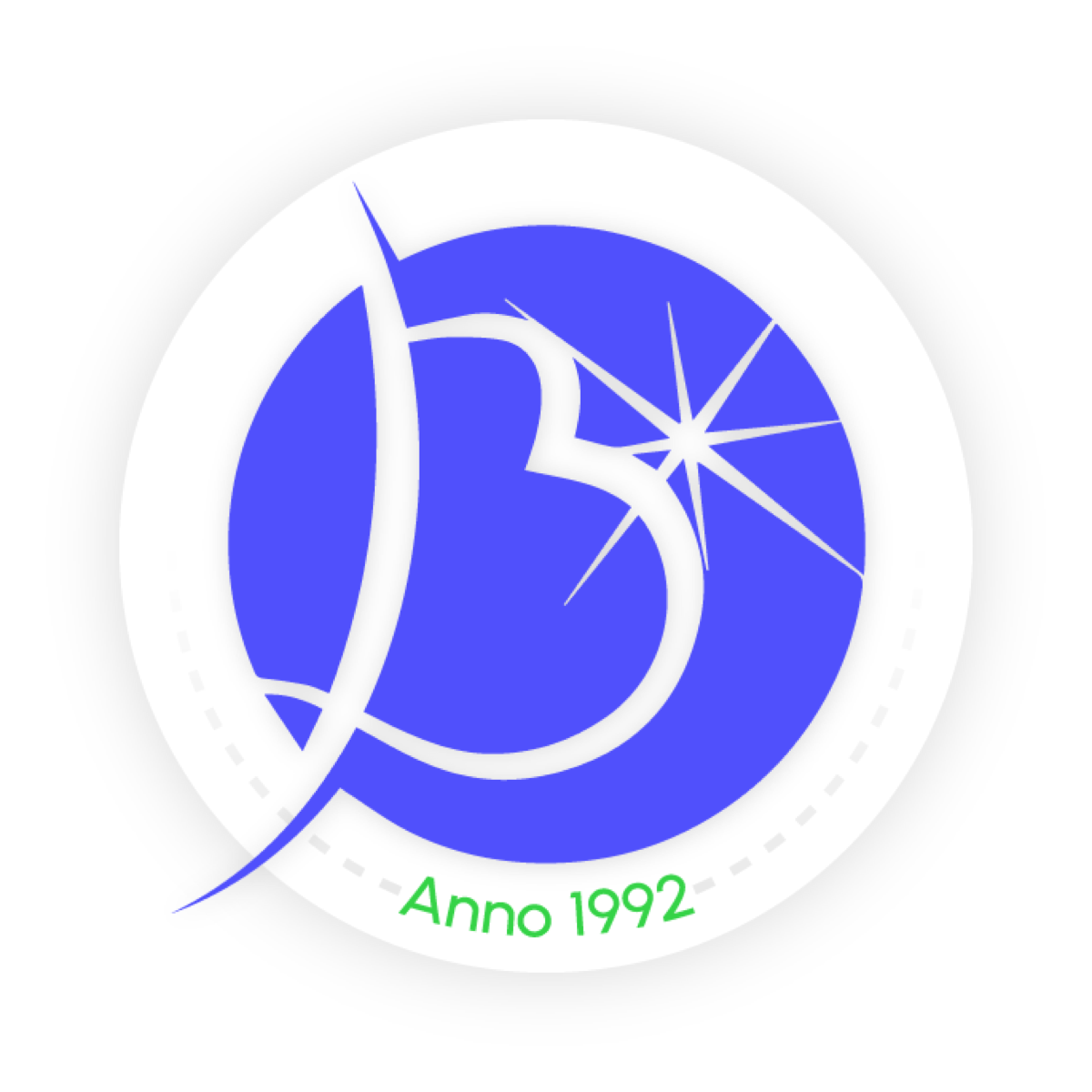
The original logo, and my redrawn emblem
Company history
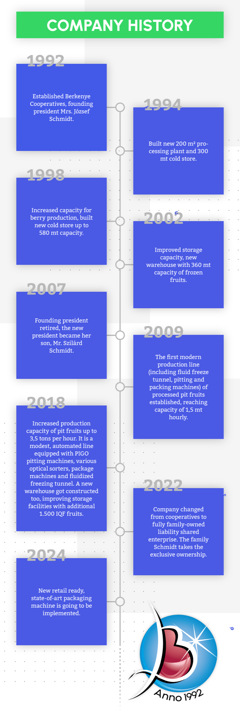
The client wanted the company history shown in a creative way. I turned the milestones into a vertical timeline in the brand’s colours:
- 1992 The Berkenye village cooperative is founded by local farmers.
- 1994 A modern cold store is built with 300 tonnes of capacity.
- 1998–2002 Two expansions and a processing unit for berries.
- 2007 A new generation takes over the management.
- 2009–2018 New lines for pitting, freezing, optical sorting and packaging.
- 2022 The cooperative becomes Berkenye Hűtőház Kft.
Conclusion
Designing for a manufacturer meant balancing appetite appeal with information: buyers need varieties, packaging and shelf life, but the first impression still has to make them want the fruit. A consistent system for dozens of products kept the website calm and easy to scan.